Subliminal Inspiration

When I turned 12 years old, I found music for the first time in my life. Up until that moment, I had been an arty kid who spent a lot of his time drawing and painting. The arts I guess had always featured largely in my future.

OMD-Organisation

One of the bands that I got into at the age of 12, was OMD. Initially attracted by the pop singles they produced, I found this album to be completely opposite to what I had imagined. It was dark, atmospheric, inspired by the sounds of Joy Division more than pop. I loved it as soon as I heard it and it opened up my mind to the possibilities of atmosphere in music. This is not the OMD of chart success that we all know, it is a brooding album and I think it's perhaps their best. If you like dark brooding electronica, then try 'Statues' on this album.

Anyway, the album was released in 1980. I've grown up with it and I've never tired of it. Sure sometimes there has been many years between listens, but I still come back to it from time to time to get re-acquainted with the teenage me.

Tonight I'm listening to it and I'm looking at the cover, and I can't help wondering if that cover has been more influential for me than I had ever considered before. The photograph, I had assumed, was of Glencoe for a long time. It encapsulates everything that is moody and dark about Scotland.

Since I got into photography, I've always been attracted to mood and atmosphere. I think I'm a product of the environment I've grown up in. With parents from the north east of Scotland (Sutherland) I've spent most of my free time up there on holidays and I think the landscape has always rubbed off on me, even if I didn't really know it at the time.

Looking at this album cover (which is not of Glencoe, but somewhere else that I know really well - can you guess where?), It strikes me that my love for atmosphere in music seeped through into my photography. The stage was set when I was a teenager so it seems.

Popular culture influences us in many ways. I'm sure the photograph on the cover of OMD's Organisation album has played a much bigger part in my development as a creative person, than I can ever know. Maybe there is a similar album cover in your collection which has had a similar impression on you?

The invalidity of spirit-levels

I've been in Norway for the past three weeks running two consecutive tours. While I've been here, I've had a few discussions with participants regarding the validity of using spirit-levels when composing.

In this post, I'd like to put forward a counter-argument for using spirit-levels when doing landscape photography. I'm sure some people will disagree with me or feel that spirit-levels have helped them a lot, but this is really just my point of view, so bear with me on this one.

Many of us use a spirit-level of some kind to help us get our horizons level. There are a couple of issues with this as I see it:

1) The first is that we are only levelling our camera with gravity. We are not balancing the objects within the frame when we use a spirit level, and this is where we get it wrong.

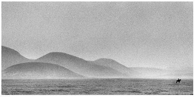
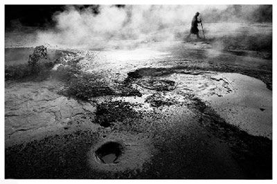
Many horizons are what I call 'false-horizons'. A false-horizon is one where the contours of the land are not in sympathy with gravity. In the image example below, the edge of the lake appears to be higher at the right-hand side of the image and lower at the left-hand side. The camera had been levelled with a spirit level, yet the false horizon is not level with the frame of the image.

False horizon is not level

What is happening here is that the contour of the lake rises as we move further towards infinity in the frame. Leveling with gravity makes no sense because the horizon is actually rising. If we are to level our horizon, there is only one thing we must level it with - and that is the edge of the frame. Here is an adjusted image to illustrate how the image was recomposed to ensure the false-horizon is in balance with the frame of the picture:

False horizon corrected

I now no longer use a spirit-level for a few reasons:

a) I need to level  objects within the frame - with the actual frame, and not with gravity.

b) balancing objects without the aid of a tool such as a spirit-level means I am more in control of the overall composition. I have to think more about where all the objects are and how they balance with each other. I believe using a spirit-level takes this level of awareness away from me, and thus the compositions I would come up with are less focussed as a result.

2) The second issue I have with using a spirit level is that they allow us to compose images while we are not able to interpret the composition correctly. The reason why many horizons can be so far off the mark for many photographers is to do with how we physically stand behind our camera. Many of us often cock our heads sideways to view either through the eye-piece, or at the live-view screen. Most of us are not aware we're doing it, but what we're attempting to do is balance a composition while our head is not level with the viewfinder. This may not seem like a problem, but it really is. It is extremely difficult to balance a composition when viewing sideways because we simply can't interpret the scenery so clearly when we do. Take this image for instance:

I've rotated this image by 40 degrees to simulate how you would see this composition if you were viewing it through an eye-piece or on a live-view screen with your head cocked to 40 degrees. In the process of doing so, we find the image a little harder to interpret and understand compositionally. But here is the point: it's not easy to tell if the horizon is level in relation to the picture's frame. It looks level within the context of the frame its in, but is it really?

In the image below, I've rotated the entire frame to 0 degrees, to simulate how you would see the above composition if you were viewing it through an eye-piece or live-view with your head level to the camera:

Looking straight on to the picture, we can now see that the horizon is actually off. That's because we're able to interpret things more easily when we are head-on with the camera. Not when we've got our head cocked sideways.

But let me ask you this... what exactly is the horizon in this image? We actually build up an 'imaginary horizon' based on the contents of the frame. In the instance of this image, it's a strange combination of vertical lines in the red house, and also the struts of the pier. But there's a degree of 'keystone' effect to this image because I actually had the camera pointed down toward the ground. If I show you the levelled image, you can still see distortion in the house:

Levelled

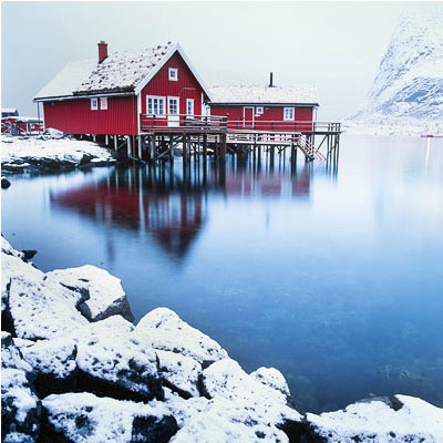
You could argue that the image is still not straight. I think the real answer is that the image is as straight as it can be, taking into consideration all the keystone distortions that are apparent in the composition. We've somehow balanced the left-had side of the house with the right-hand side, and decided there is some level of balance in there. We levelled the contents of the picture within the context of the frame. Not with gravity.

Ok, I know it's not easy sometimes to get your head level with the eye-piece of your camera, but I always make a concious effort to try to get my head as level as I can. If it means I need to lie down on the ground to keep my head level with the camera, then I do it. If it means I need to bend my legs to keep my head level, then I will do it. Because when I am level, I'm not only able to notice if my false-horizons are level, but also if all the objects within the frame balance with each other. In other words, having my head level with the camera enables me to improve my compositions.

A spirit-level only levels our camera with gravity, but it does nothing to help us understand and fine-tune our compositions, and it does nothing to help us balance false-horizons. We must learn to level our images based on what is within the frame, and the only way to achieve this, is to keep our eye level with our camera.

Let your eye, rather than a spirit-level decide what is good. It's really up to your own internal sense of balance and composition to get it right.

Behind The Mountains (Fjallaland)

Last year, Ragnar Axelsson released his 3rd photographic book. I was lucky enough to pick up one of the first copies while in Iceland running my yearly September trip there.

I'm a big fan of RAX's work (as he prefers to be called). To my eyes, he is more a photo-journalist than a traditional landscaper - someone who is more interested in the people and their mark on the places they inhabit. I love many types of photography - not just landscape, and RAX's work is interesting because of his reportage style, his use of black and white, and of course, his deep connection with the subjects he chooses to photograph.

This new book has been given two titles. In his native Icelandic it is simply known as Fjallaland, because it is about a very special region of Iceland - the Fjallaback nature reserve. The english title for this book is 'Behind the mountains', because I think it would have been hard to market a book about a relatively unknown, specific region of Iceland outside of the country. The title I might add, is very appropriate, because this book observes the farmers on their yearly roundups, gathering sheep, in one of the most difficult but also magnificent grazing terrains of the Icelandic wilderness.

I loved how this book begins. Instead of being immediately greeted with the signature style of RAX's black and white 'fly on the wall' reportage photography, we are instead prompted to look at the Fjallabak region from space. There are a number of very high quality, satellite images of the region, showing the complexity and composition of the land here. Fjallabak exhibits a range of colours from greens to reds to yellows. This is because the land is made up up Ryolite, Obsidian as well as volcanoes, rivers, sands and lakes.

As we continue to delve further into the book, the images change to ariel views of the Fjallaback region. More of a birds-eye impression that shows us how large these mountains and their valleys are. This slow zoom-in from space to the region where the farmers work is an effective introduction to the book. I liked this very much as I felt the stage was being set for RAX's photographs of the farmers working in this remote landscape.

So what of the subject matter of this book? Well, it's really an essay of images, garnered over a span of several decades about the yearly sheep rounding the farmers do up in the hills. For many of them, it is a special occasion and one not to be missed.

My own impressions of this book was that it is RAX's best to date. Whereas his other two titles were broad in their scope of subject matter - be it faces of the north, or looking at the problems faced by the Inuit of the arctic, this book is more tightly focussed on one region of Iceland. It's clear to me that this is a work of passion and love. RAX has a deep connection with his subjects and is on personal terms with many of them. He has been part of this yearly round up for quite some time, and the images convey this very strongly. I also felt that because the subject matter was more specific than his previous work, that so too were his images and his essays.

If you have an interest in reportage photography, or an interest in the life of people in Iceland, or even like me, if you just feel you have an affinity for the place, then this book should be on your bookshelf. RAX's text is often brief, but when he does speak to us, we learn a lot about Icelanders and how they view life, and how they think and feel about their own little back-yard.

If you wish to see more images from the book, they are on RAX's site here.

Behind the Mountain is available in the UK at most book stores, or online, but if you wish to own a signed copy, I believe Neil at Beyond Words book store has a limited number of copies available.

Turner-esque

Triplekite publishing has released a very beautiful soft bound book by David Baker. ‘Sea Fever’ is a photographic monograph about the power of the sea.

Like a Turner-esque painting, the cover image sets the stage well for what is to be found within its pages. I particularly like the cover image. With a break in the clouds situated right at the heart of the image, I felt drawn in - invited almost, to come and engage with this book.

Making a book is not an easy process. Having published two books myself, I fully appreciate that there are many design considerations, and plenty of discussions that happen along the way. And often the way a book ends up looking is the work of a very long and thoughtful  process.

This book is tall, and large - a decision I think to enable the power of the sea to be conveyed to the reader when viewed as two-page spreads. It is also a soft back book, and very light to hold. I enjoyed going through it as it was never a cumbersome book to handle. It felt like a very large, luxurious magazine that encouraged me to engage with it. This was possibly due to its flexibility, which worked well with the content it conveys, because it enabled me to twist and re-shape the contours of the sea to my own pleasing. Rather than the images being fixed and my viewing being forced to settle on the work from one static aspect only, I felt I could engage, and play with the book more. I liked this aspect very much.

I’m no fan of images spanning two pages and I often dislike images bleeding over the very edge of the paper, for me, I like to be able to take in the entire compositional aspects of an image in one go. Often a break in the middle of the image (due to spanning two pages) can be irritating or unpleasing at best. Many of the sea images in this book do exactly that, but I was surprised to find that it actually enhanced my viewing experience, rather than detract from it. In this instance, spanning big images of turbulent sea across two pages works like an IMAX cinematic experience - these images fill your entire field of view and the result is that we are told that the sea is powerful, the sea is overwhelming. The same can be said about the images bleeding to the very edge of the page. I think it was a very effective design choice to do this because it conveys the message that there is no end to the power of a raging sea.

page-spread

Also, because of the very abstract nature of many of the images contained within this book, there is less of a need to avoid page splitting. The images are less about order, and more about conveying power. We are not here to study graphic forms, but more to enjoy nature when things get dramatic - as the title of the book conveys. So I have to give a lot of praise to Dav Thomas whom I think was responsible for many of the design  considerations of this very beautiful and engaging book.

With regards to what this book has to offer, it is a monograph. It tells a story in visual form only. There is very little text, and that is fine by me. I often feel that many photographers wish to learn from the photographer, and they think that learning will come from reading text. I think you can learn a great deal about the photography and the photographer by simply studying their work - the answers are in the imagery. All we have to do, is be open and let the photographer take us on their journey. Submit rather than dictate. The photographer has a lot to tell us, so sit back and let him do that. And a good book will do exactly just that, and in this respect, this is a very good book.

I am looking forward to seeing what other subjects Triplekite will handle in future.

Sea Fever is available from Beyond Words book store for £25.

Probably the best filter bag in the world

Last year, I wrote a review about the Kinesis filter bag.

Before I continue, I would like to make it very clear that I love this bag very much and it has become my favourite filter bag of all time. I can't recommend this bag highly enough.

Just shortly after publishing my review, I was alerted that there is a problem with the bag ‘outgassing’. The concern seemed to be about the material within the bag releasing a gas that seems to leave a residue on the filters.

kinesis Large Grad Pouch, goes around your tripod collar, for easy access to the 'indexed' card system of filters inside.

At the time, I did some testing of my bag and found that this did seem to be the case. I was very disappointed because I love the design of the bag and it is extremely functional. But I decided to change to the Lowe Pro filter bag.

To try to cut what is already a long story short, I found the Lowe Pro bag had the same problems. In fact, I would say that probably any newly manufactured filter bag would probably releases gas or chemicals, simply because it is new.

With both filter bags, I found that after a few months, the issue was no longer there. I can only surmise that this is something to do with newly manufactured materials, and in no way does it affect the life of your filters.

I've been using the Kinesis now for the past 9 months or so and have really grown to love it. It is my favourite filter bag of all time, mainly because of how functional it is: It has a lovely little strap that allows me to hang it around my tripod collar where I have instant access to all my filters like a little indexing system. I can heep my head at camera level and if I need to change filters, there's no moving over to the bag to find them and there's no wondering where to put the filter bag either. It works 'with me'.

Also, because the filters are stored sideways and are all accessible like a filing system, I can easily drop a filter back in its slot, and pull another out.

I keep all my filters in this bag now, and I have them ordered in the following way, so I know where everything is, without any fidgeting whilst on location:

1 stop ND 2 stop ND 3 stop ND 3 stop ND (yes, I have two, as sometimes I use 6 stops ND) 1 stop soft grad 2 stop soft grad 3 stop soft grad 1 stop hard grad 2 stop hard grad 3 stop hard grad

As many of you may know, I really believe in 'process'. I keep everything in the same place all the time, because it cuts down on any delay in working in the field. When everything is in the same place, your hand just reaches for the right object based on muscle memory.

This ‘order’ works for me very well, and the bag also has enough space to leave some lens cleaning cloths inside it, or even store the entire lee filter holder (With filters already mounted) when I need to take the holder off the camera.

In short, the bag has become a spare pair of hands for me now, and I will often put in the dark slide for my Hasselblad camera, or anything that needs to be taken off the camera for a few moments. I've never known where to put things when I need to take them off the camera for a few moments, and often lie filters on rocks or on the top of my camera bag. That little strap around the filter bag keeps the filters where they need to be - within easy reach.

I should warn you that this bag is a bit bigger than most filter bags, but it's ergonomics makes me want to take it with me at all times.

If you would like to read the original review about the Kinesis filter bag, then it is here.

Beautiful Lo-Fi

I've been listening to a lot of Icelandic bands this past year and one thing that has struck me is how open many of them are to messing around with the sound quality of certain instruments in the production of their songs.

Some parts of the music are deliberately distorted, or are messed around with so much, that they have become almost shadow facsimile's of themselves. Instead of hearing the actual instrument, I feel I hear an imprint, some kind of aural residue. It's a really effective way to take the listener on a journey, one where you engage more with the music.

Here's one example, by an Icelandic duo (twin sisters), called Pascal Pinon. The song is very beautiful, but also, so too is the lo-fi quality of the piece.

https://www.youtube.com/watch?v=ds6miVqD9ZE&width=400

The song was produced and mixed by Alex Sommers (he is the partner of Jónsi (pronounced Yonsi for those who are not familiar with Icelandic) of incredibly famous band - Sigur Rós fame). Alex is a genius at production.

So this has got me thinking about image quality, and how we often strive for the best resolution we can. And I believe many of us think that by having utmost image quality, the image will be more enjoyable to view. That is certainly true some of the time. I think there is a valid place for utmost resolution in imaging, but so too, is there validity in all forms of image quality, be it soft, blurry, fuzzy, noisy, underexposed or overexposed.

Seeking perfection in image quality is not a symptom of the digital imaging age. It has always been a preoccupation for photographers through the ages, regardless of whatever medium they were using. In the instance of film users, there has always been a portion of the photographic community who strive for finer grained films, or larger negatives in the pursuit of high-fidelity imaging. This is of course a nobel quest and one I would not disparage. It's just that I think that going the other way - reducing  image quality, intentionally, is just as valid and nobel a pursuit as any.

With music, we can create depth to a piece by using different frequencies - we can also add a sense of 3D by mixing high-fidelity sounds with low fidelity ones, as well as bright and dull sounds. Complex interplays of varying audio quality lends a sense of space to the music.

Similarly, messing around with the tonal range of an image is just as valid. Not everything has to be 'punchy', or have high contrast. Mixing in low-contrast areas with high-contrast areas opens up an additional dimension to an image. But this does not stop with tonal range.

We can add additional ways to interpret an image. Most of us think about tones and contrast, but varying the level of detail within an image can bring an extra dimension to the work. It is just as valid to have areas of the frame where there is lack of detail as it is to have areas where there is a lot. Softness tends to make the eye pass over an area of the picture, whereas sharpness attracts the eye. So in my view, I believe that images where there is a deliberate degradation in resolution is welcome, and can be beautiful if the treatment is appropriate.

I think there's beauty in softness. Softness lends ambiguity to an image or a part of an image. There's something fascinating about the unknown, about wondering what something meant, when we only have a fragment, a clue to work with. When areas of the frame are soft, we have to fill in the gaps.

Similarly, any flaws can be beautiful. Flaws introduce a sense of randomness, which often lend a certain uniqueness or 'character' to the images we create.

Low-fi images have a way of engaging our emotions and dreams, in a different way than hi-fidelity images do, simply because there are things left unsaid, or half-revealed.

We should embrace low-fi quality as an additional tool to our imagery, and not attempt to banish it. After all - all images are wonderful if they capture the spirit of a mood or emotion or feeling, since seldom do we throw something out if it possesses such beauty, even if it is flawed in some way.

Diminishing Solar Activity

On the BBC news website today, there is an article stating that, although the sun is at the height of its 11 year solar activity cycle, the solar activity is actually very low. Scientists are comparing the low activity to a time way back in the 17th century when winters got so cold, the Thames froze over for many months. I've often wondered about this period of time and why the temperatures dropped as a result. It appears that the path of the jet stream alters when the sun's activity drops.

I personally felt we were enjoying a heightened awareness of the Aurora Borealis here in the northern hemisphere, but maybe this is perhaps the first cycle we've had, where digital cameras have become commonplace, and there are more photographers around than there has ever been.

I do hope the solar activity remains high for the next few years, but if not, well, it seems we have some very cold winters to look forward to - always a bonus for the landscape photographer :-)

Really Right Stuff, in Europe?

If, like me, you like Really Right Stuff camera plates, ball heads, and tripods, and live in Europe, then I have some good news for you. 13

Although Really Right Stuff do not have any official distributors here in Europe, there are two camera shops that buy RRS components in bulk. I know this, because I asked RRS about this. Here is what Carla at RRS said:

"There are a couple of web shops in Europe who purchase from us in bulk (we give them a very small discount to do so), and then sell our goods on their own sites. It’s not a formal distributorship relationship – we don’t offer them any payment terms (they pay in advance, just like regular customers). But we will honor the warranty if you’re able to provide proof that you purchased from them. The two that I work with regularly are:

Augenblicke-Eingefangen (Germany) www.augenblicke-eingefangen.de

CameraNU (Netherlands) http://www.cameranu.nl/

So if you love RRS products, wish to avoid being hit for import duty, and live in Europe, these two shops may have what you're looking for.


Aspect Ratio Solutions

Those of you who have been following this blog for a while, or have attended one of my Scottish workshops, will know that I have a few theories about aspect ratios. Specifically, that I believe that some aspect ratios are easier to compose in than others, and that for most beginners or amateurs, the aspect ratio of 3:2 is not an easy aspect ratio to master the art of composition with. For beginners, 3:2 is like giving yourself a handicap before you’ve even started.

https://www.youtube.com/watch?v=rbbeZ9anQPA&width=400

I wrote an e-book about my theories as to how certain aspect ratios can aid or hinder your development. I finish my e-Book with an open letter to camera manufacturers to provide selectable aspect ratios in all of their cameras, not just the pro-level models.

If you've never thought about aspect ratios before, and don't know if your camera offers different ones, then it's something worth investigating. Many models do offer such options, but they are often hidden, or at best, poorly described. For instance, Nikon calls it 'picture style' I think. Canon hides their aspect ratio options under their custom function menu. And some models offer more than others. The Canon 7D for instance, has a collection of aspect ratios available, whereas the 5DMk 1, Mk2 have none, while the Mk3 I believe, only has 4:5 and 2:3.

My e-book has not been able to offer a solution for those of you who own cameras where the aspect ratio cannot be modified in some way. The good news is that I have seen a (slow) change in camera production over the past 4 years and note that more and more models are offering different aspect ratios for the live-view preview screen (which as you will know if you have attended one of my workshops - is a tremendous aid to composition). But the truth is that still many cameras do not offer a choice of aspect ratios.

Choice of aspect ratio may seem gimmicky to some, and pointless to others. I’d go the other way and say that by using a camera with an ill-fitting aspect ratio (i.e, one that does not suit your eye), is a seriously debilitating place to be with your photography.

I’m always amazed that most do not even consider the aspect ratio of a camera upon purchase. It doesn’t even come into the equation, and yet for me, it can be a deal breaker. I’ve found that ever since I moved from 35mm film up to medium format, my compositions seemed to be much easier to arrive at.

3:2 is difficult to compose with because it is heading towards panoramic - it is a letterbox format. Too wide, and not too tall when used in landscape mode, too tall and too narrow when used in portrait mode. Going 4:5 or 6:7 yields a much easier aspect to work in, because all the objects within the frame are never too far away from each other (and therefore their relationships to one another are easier to see and associate). If you don’t know my thoughts on this already, then I would recommend getting my aspect ratios e-Book.

So, I’ve been meaning to write for a while about two solutions I’ve been informed about regarding altering your camera to a different aspect ratio. One of them is a software solution while the other is a hardware solution. I have tried neither and offer them to you for your own investigation. Please do let me know how you get on if you try some of these:

Software Option (Canon users only)

http://www.magiclantern.fm/

Magic Lantern provide a software upgrade to your camera to offer additional features. One of these is to offer crop marks on the live view of the camera. It requires that you upgrade the firmware of your camera. It sounds risky, but there is plenty of information as to how to recover in their FAQ. The instructions on the website are pretty simple for setting up. First you have to make sure you have the most up to date Canon firmware installed, then you simply update the firmware again using the magic lantern files on the root of a CF card.

You can find more about the crop mark functionality from Magic Lantern here:

http://magiclantern.wikia.com/wiki/Cropmark

Hardware Option

Probably the best way to go, is to have the ground glass of your camera laser etched, or buy a replacement that has been pre-etched for you:

http://viewfindermasks.com

and

http://www.katzeyeoptics.com

Again, I have not tried any of these, and merely offer them to you for further investigation :-) Good luck, and let me know how you get on :-)