Image Proofing.....

I’ve got the sequencing of the images completed for my next book, and the text is mostly written. We’re just working out the paper and cloth materials for the publication. Book projects always take longer than anyone would ever realise.

Here are some image proofs. I print everything to make sure it’s right before it goes for print. Often noticing things in the print that I didn’t see on screen, it’s a great sanity check. When I do notice something in the print, it’s often interesting to me to note that I can now see it on screen. But never the other way round.

Colour Temperature

I’ve been trying out a few printer papers this week. The paper on the left is a warm paper. While the paper on the right is a cool paper.

Do you notice the border around the actual images has a different colour temperature? I think the border on the left is more obvious, but the border on the right is less so. The right hand image’s border is cooler (more bluish).

warm+cool-paper.jpg

There are really always two versions of an image when you print it: what you see on your monitor without any paper profile being previewed (I’d say this is what you had originally intended while editing the work). The second version is the printed version.

With the second version, the paper we choose to print on contributes (read that as affects) the final result. If our aim is to have the paper reproduce exactly what we saw on our monitor while editing then you may set yourself up for a lot of angst and madness. We have a few reasons why our images won’t look exactly the same, but it is possible to get them close, if you’re willing to spend time on accurate colour management, good monitor profiling, and also working through loads of different papers to get one that is closest to what you intended.

I think the better option is to think of the paper choice as an artistic one. Accept that each paper brings its own character to your work, and choose a paper that allows you to bring something out in the work in a way that you like.

In my example above, the original image without paper profiling is somewhere in the middle between the warm and cooler versions shown above. I think it’s hard to make a cold image remain cold if you print it on warmer paper and you will find that some of the cooler tones are ‘smothered’ by the character of the paper. But that may be a good thing if you find that printing a cold image on a cold paper makes it look ‘too cold’.

Then there is the effort of trying to tune the original image to be more cold on a warm paper, or less warm on a cooler paper. To me, that is really a defeating point. If you want your image to be cold, chose a cold paper. Why print it on a warm paper? The warm paper is going to do everything in its power to add warmth to the image and you will have a thankless task ahead of you. You will indeed be fighting upstream against the current.

So the best approach in my view, is to choose a paper that brings along its own artistic contribution. This may mean having to demo the same image on different papers (this is where paper proofing can help), but there’s no real substitute for actually printing it to see how it comes out.

I just love printing. It is always very satisfying for me to see my work become a tangible object. Looking at my work in print form often teaches me a lot about the actual image. I often see things differently, notice something in print that isn’t so obvious on the monitor, and yet when I review the monitor version can now see it. Printing is like removing a veil from the work. To finally see what the image really is, and whether it’s as strong as you thought it was. But it’s also a highly personal and artistic part of photography. And one that everyone who calls themselves a photographer should do.

Inkjet paper de-roller

Worth every single penny

Some things don't seem worth money on paper, but prove to be worth every single penny when you finally take the plunge and buy them. One item that falls into that category is the £200 Lion paper de-roller you see below.

I’ve struggled for years to try to flatten inkjet paper that comes on a roll. I’ve tried leaving the paper under books for weeks in the vain hope that the curl in the rolled paper will be removed, but to no avail.

Then, I saw a YouTube video of someone using a roller blind to remove the curl in the paper. He claimed that his $10 dollar roller blind did the same job as the £200 de-roller, except when I tried it, I got a crease right through the middle of my prints because the roller blind fabric is too thin, so the edge of the paper tends to push through the fabric and imprint itself on itself as you roll the paper round. So as much as his claim that using a roller blind did the same job as the £200 de-roller at a greatly reduced price, he was incorrect. It did the job, but it did it badly as it damaged the paper.

Well, there are so many opinions out there, and the best way to find out if something is good or not is to try it for yourself. My good friend Kyriakos who lives nearby owns a de-roller so I went to try it out and found that it works perfectly. No creases in the paper because it has a thick laminate surface and the surface as it’s being wound round the pole is kept apart from touching the paper by a sandwich layer at the outer edges that keep the laminate away by around 4mm.

IMG_0475.JPG
IMG_0476.JPG

Why does such a simple tool cost so much? Is it worth it? I know you might be feeling that £200 to re-roll paper is a crazy amount, but it’s no different from the argument about expensive tripods.

When we all first start out, we think a $200 tripod is all we need. We find the idea of spending $1000 on a tripod crazy. It only keeps the camera steady right? But after a few years with a poor flimsy tripod that doesn’t stay where you want it to be, or the ball head creeps once you let go, you soon start to realise the value of that $1000 tripod. I know myself that the money at first doesn’t feel like it’s worth it, but I feel very different these days. I certainly wouldn’t go cheap on a tripod in future and as for ball-heads - well, they are useless if they creep at all once I’ve tried to set them.

Same goes for a paper de-roller. I will gladly upgrade from a $10 roller blind that creases and damages my inkjet prints to a £200 de-roller if it does the job and does it well.

You don’t value products by how much they cost. You value them by how good a job they do and the de-roller does its job fantastically well as you can see from the two pictures above showing the curled paper (left) and it flattened once I used the de-roller on it.

IMG_0472.JPG

Above is another photo, showing a set of curled prints (I’m preparing for my special edition Altiplano books), and further up the desk is a set of prints after they have had their curl removed.

Alternatively, buy cut-flat paper rather than roll paper?

Well you could do that, but it’s a lot more expensive. Rolled paper works out to be a lot more cost effective than the cut sheets you buy. Plus, you can print endlessly on a roll whereas with the cut paper you have to load each sheet individually (if it’s thick rag paper) into the back of the printer one sheet at a time. So I ended up abandoning cut sheets to go for rolled paper. And now that I have the de-roller, I’m no longer stressed about my prints having a curl in them.

When handling prints, it’s a good idea to use cotton gloves, so that any natural oils in your skin don’t blemish the paper. Above is a stack of prints that had a natural curl in the paper. The curl has been removed by the de-roller.

When handling prints, it’s a good idea to use cotton gloves, so that any natural oils in your skin don’t blemish the paper. Above is a stack of prints that had a natural curl in the paper. The curl has been removed by the de-roller.

We shouldn’t rate products by how much they cost us. But we do. We should rate them by how well they do their job. Tools that do an excellent job, are in my book, priceless.

The de-roller does it’s job very well. It removes the curl in rolled paper of most thicknesses, and it’s built very well to ensure that the paper isn’t damaged in the process.

As with most things - you get what you pay for.

It comes very highly recommended.

Lion paper de-roller :

https://www.lionpic.co.uk/product/Expression-De-Roller--610mm-x-38mm---24---x-1.5--Roller-,34057,0.aspx

Exhibition 2019 Mockups

I'm holding another exhibition later next year (Summer 2019), t

The last few weeks I've been working on the image selection for the forthcoming book, and we have now completed this, along with the text that is going along side the book. Currently I am awaiting Spanish translations as I feel that since this is a book about a region of South America, it should honour the landscape by also having a Spanish translation.

What I found last year about preparing my book, was that I really needed to print each image out to ensure they were optimal. When I did print them out, I noticed that some of them didn't have the 'sparkle' that they seemed to have on my monitor (even though my monitor is tightly calibrated). Some things needed to be pushed so that I was using the tonal range of the paper. It was a fascinating thing to do, as you can so often think the image is finished on the monitor, only to notice discrepancies in the tonal range once printed.

Once I had completed the printing of all the images that were to be contained within the book, I then replaced the original files with the optimal ones. So in essence, the images that were contained within my 'Colourchrome' book were the result of fine-tuning by print-review. Most important and I would urge you to do the same for any image you work on: print it out and evaluate it. Sit with it for a while and see how your impressions of it changes over days if not weeks. You'll be able to notice problems in the image that you weren't aware of on the monitor.

And so it comes to which images to prepare for an exhibition?

If you are considering doing an exhibition (I highly recommend it : everyone of all abilities should exhibit their work: it is the final stage in photography in my opinion), it's a good idea to go into the exhibition space and take measurements. My dear friend Alan Inglis suggested this to me when I was in the initial stages of looking for a location to exhibit. He came in with me and took measurements of the walls and also made some iPhone photos of the walls too (the images you see here).

Once we'd done that, I could set up mockups of the actual frames, all to scale of course, so I could experiment with a layout.

This is what you are seeing on this post today. I have chosen a selection of images and laid them out whilst trying to give them sufficient space, while at the same time maximising the number of images I can display (the more you show - the more value and interest to the viewer).

Last year's exhibition was terrific. I really enjoyed the experience: I got to meet so many people from past workshops and tours who came in to say hello. I also got to meet people that have had me on their radar for sometime, yet I was not aware of them. And the exchange in discussing your work is not to be underestimated.

Once I'd finished the exhibition, I was sitting around thinking 'now what?'. What do I do next? So I asked my favourite Photographer - Michael Kenna that, and he said:

"Hey Bruce,

You should have a show every year - include a few classics and show new work.
It will keep you on your toes. Sales may not increase - that remains to be seen.
But, it’s a good way to measure your own progress. Specific goals and deadlines always make us work a little harder."

Well, you heard the man. He knows a thing or two about exhibitions. So I chose to listen to what he has to say and decided I would do another one this year.

About the mockup's : that is exactly what they are. They have given me the opportunity to see what the final exhibition may look like, and I have been able to move and swap things around till I get the 'flow' right. What is most inspiring of all though, is that by visualising the final exhibition this way, it all just begins to take on a more 'real' aspect. You feel you are one step closer to your goal! I always try to use visual pictures to help me see where it is that I am wanting to go, whether it is mockups of exhibition spaces, mockups of books I want to produce, or even mockups of future workshops I hope to hold.

Bruce-Percy_WhiteSpace-wall-5.jpg

Printing is a vital part of image Editing

I've just completed the image selection and sequencing for my Altiplano book, which is due out later this year. 

As part of checking the images are ready for publication, I've printed them all out. There are a number of reasons why I've printed the images but it's mostly because no matter how calibrated my computer monitor is: no one should trust what they see on their computer screen. The only way to validate and prove that your images are as good as you think they are, is to print them out. 

You should invest in a daylight viewing booth to verify your monitor is calibrated (by comparing a print target). And also to evaluate your prints.

There are a number of reasons why you should print out your images:

1. The human eye is highly adaptive. Stare at a computer screen for too long, and your eye adjusts to discrepancies in the white balance and also in the tonal range. 

2. I've often noticed things in the print that I never noticed on the monitor. Yet, when I go back to check if the problem exists on-screen, I now see it. See point 1.

3. Loss of highlights or blocked shadows become more obvious once printed. It takes a lot of time and skill to be able to 'read' a computer monitor and know what it's telling you. See point 1.

Mostly it's all about point 1.

I'm a big fan of Charlie Cramer, the American landscape photographer and once protege of Ansel Adams. I was fortunate to meet Charlie a year or so ago and listen to him talking about the value of printing and in particular how the human visual system works (and deceives us!).

The most memorable point that Charlie made is this (which I am paraphrasing):

"An image can look good on screen, but not good in print. But if you get it to look good in print, it will also look good on-screen"

I agree entirely. Printing *should* be part of your editing process. When you are dodging and burning areas of your picture in Lightroom or Photoshop, you should be printing it out to verify your edits. Editing and printing are therefore highly iterative. You should be circling around between them as you continue to edit your work.

Here is Charlie's talk from the On-Landscape conference I attended. There is a lot of wisdom in what he has to say so I would stay with the video to the very end:

If you want to create great images, then you need to optimise them. The only way to do that is to print them out and evaluate them with a daylight viewing booth. If you're not printing your images, you're not really finishing your work, and it most probably still has a long way to go to being complete.

Printing is the only way to truly evaluate your work

It is only when we print, that we can truly see what we have. Until we print, we are dealing with a half-realised, half-baked image.

My calibrated & profiled monitor and daylight viewing booth. The daylight viewing booth is essential in print evaluation and also in calibrating my monitor.

My calibrated & profiled monitor and daylight viewing booth. The daylight viewing booth is essential in print evaluation and also in calibrating my monitor.

Even though my computer monitor is calibrated and profiled to a tight tolerance, I still find discrepancies in my photographs once printed.

One of the most obvious errors is to discover that the brightest tones in the image, aren't really bright at all. The weird thing about this, is that once I notice that the tones aren't as bright in the actual print, I can now see the same problem when I view the image on the computer monitor. Even though when I looked at the image originally on the monitor, I thought it looked fine.

Our vision is often tricked and what we think we're seeing, isn't the case at all. Let's look at how our computer monitor may fool us. Take for instance this image below. It's a snow scene and I've chosen to work on it with a black background. The image looks pretty bright to me, almost white.

But if I change the background of my monitor to a light-grey tone, the snow scene doesn't look so bright any more.

And this problem just gets worse if I change the background to white as you can see below. The snow scene isn't looking so white any more, but instead, it looks quite muddy. Those bright tones are really mid tones.

Interestingly, if my monitor is calibrated correctly, the white background should simulate what the image will look like if printed on a white piece of paper, and in the example below, I may find that the image will be too dark once printed.

In the final image below, I've brightened it up a bit more to convey what I was looking for originally. This has only been possible because first I viewed the final edit on a white background on my monitor, but more importantly, once I printed it, I noticed it really wasn't as bright as I'd hoped. Now that I've corrected it and printed it, I'm happy, but surprisingly, it also stands up on my monitor also.

My monitor can only take me so far in evaluating my work. I really need to print it to get a better feel for how far I've taken the work, and how much further I still need to take it.

There is certainly some form of perception 'error' at play here and I'm sure it's to do with the fact that when looking at a file on a monitor, the light is transmitted, while looking at a print the light is reflected.

Either way, what I do find to be true, is that prints show up any discrepancies in my images more easily than any computer monitor can. This has nothing to do with the quality or correctness of my monitor, but more to do with the simple fact that there is some perceptual errors introduced by looking at something that is electronically transmitted. 

So printing can be used as a kind of reference, to find discrepancies in the work so you can go back and work on ironing them out. The thing that is most surprising about this, is that if you are able to work on your images until they look great in print, they will also look great on the monitor also. But the same is not true the other way round.

If you really want to push your image editing forward and get the best out of your work. You really have to start printing it.

Just make sure that you have your monitor calibrated and profiled as best as you can get it (use a decent colorimeter for your monitor - X-rite i1 display pro for example), but even once you have calibrated and profiled your monitor, there is only one way to confirm that it is correct: that is to use proof print that is guaranteed to be close to the file it was printed from. I use Neil Barstow's ICC verification target. Once I have calibrated my monitor, I check it's accuracy by comparing the ICC verification target against the file it was created against. The target is placed under a daylight viewing booth such as my GTI viewer below, and I open up the file in Photoshop. I also ensure that the right ICC profile is selected and proofing is switched on. If there is a difference in the colours between my target and file on my monitor - then I need to redo the calibration. I often find that it is more about the colour temperature of my monitor. In the image below, you can see that my monitor is perhaps a little colder than the target is under the viewing booth. So I will turn the white point down of my monitor a little and reiterate the process until my monitor is very close to what I see on the target.

My GTI viewing booth on the left, and my  Eizo 27" monitor on the right. I have the target file opened in Photoshop and proofing switched on. This is the only way to confirm that my monitor calibration is right.

My GTI viewing booth on the left, and my  Eizo 27" monitor on the right. I have the target file opened in Photoshop and proofing switched on. This is the only way to confirm that my monitor calibration is right.

When you do print, let your gut tell you what's wrong with your work once you print it. If you notice that the tones aren't as punchy as you thought they were, then look again at the file on your monitor and I'll bet you that you will now notice that they indeed lack punch there also. Your monitor isn't the best reference for telling you how far you need to go with your edits: your prints are.

Printing for my exhibition

I'm holding an exhibition of my photography in July 2017 here in Edinburgh. 

I know it seems like a long way off, but my calendar is pretty busy for most of the year with only a few weeks now and then at home. So over the past few weeks while I am here at home for the festive break I've been preparing the mats, frames and prints that will form part of the exhibition.

Prints and frames, December 2016 for upcoming exhibition.

Prints and frames, December 2016 for upcoming exhibition.

If you have never exhibited your work before, then I would urge you to consider doing so. It can be an enormously rewarding thing to do - just the preparation, selection of images and working out how best to display them can be hugely satisfying.

One thing that I have noticed over the past few weeks of printing, is that I have had to shake up the collection a little. It was so tempting to print all of my personal favourites, but I found after a few days that there was perhaps too much repetition of themes or perhaps colour palettes. My images from some areas of the world can be muted or almost monochromatic, while other areas such as Bolivia are very colourful. Mixing up the collection of prints to be displayed has become vital in ensuring that the viewer's experience doesn't become too one-dimensional.

Then there has been the issue of discovering that some images are lacking the presence I thought they had. Computer monitors can be extremely deceiving in letting you think the work is as optimised as it can be and even though my system is tightly calibrated and I have a very real sense of how the final print will look, viewing an image on a reflected surface (paper) compared to one that is transmitted (computer monitor), the experience may fall down. So I've found that there is an iteration of printing, evaluating the print or living with it for a few days and then finding I wish to perhaps push to upper tones a bit lighter to maximise the dynamic range of the paper I'm using.

Some printed contenders for the exhibition.

Some printed contenders for the exhibition.

I certainly feel that preparing the work well ahead of the event is crucial as it give me time to let the prints settle in, to notice errors or possible improvements. Plus, I think it's just sensible to be prepared in advance, so there is nothing that you've overlooked - such as frames not arriving in time, running out of ink and paper, or just finding out that the set of images you've chosen hasn't been as wise as you thought it might be.

Either way, it's a real delight to print your own work and to see a true hard copy. There is simply too much reliance these days on the images living in the electronic world of pixels. Photography should be printed and in my view, is never really complete until at least one image has been printed per image that you have finished.

Epson Ink expiry dates

This week I've been doing some printing for my exhibition next year. But I've been having difficulty getting the prints to look as they do on my computer monitor. I've re-calibrated my system a few times and yet there was a colour shift in the prints I saw coming out of my Epson 4880 printer.

A 'before and after' simulation of what I was seeing in my prints with expired inks (1 year out of date)

A 'before and after' simulation of what I was seeing in my prints with expired inks (1 year out of date)

The expiry dates of my inks are now out of date by 1 year. I don't print that often so I seldom go through a 220ml ink cartridge in the time the inks are still valid. But I couldn't imagine how the expiry date would suggest a colour shift so prominent in such a short period of time so I checked around the web, only to find that there is a lot of misinformation and many assumptions by owners as to what happens when the inks expire.

In fact, Jeff Shewe simply stated that the coagulation of the inks would start to break up and maybe not lie on the paper correctly, but there was no mention in any internet search I did, that a colour shift may happen, despite this being what I saw.

So I took the plunge and ordered a brand new set of inks for my Epson 4880 and have just installed them. First I should point out that to do this requires a lot of inks. The old inks have to be flushed out of the system and in order to put enough ink into the print head, also requires the lines to the head to be refilled too. So for the half-size cartridges I've just installed (110ml) I've used around 1/3rd of them up just in the install.

The colours are now back to what my monitor shows me and the prints I'm making are very tightly aligned with what I see on my monitor. So I put out a question to a colour management expert I know, asking if the inks drift past their expiry date. This is what he had to say:

"Yes they do change after expiry, it's especially noticeable in proofing environments where a test wedge is checked."

Which I can confirm by my findings, since I've replaced the inks and I've compared the prints against my calibrated and profiled monitor.

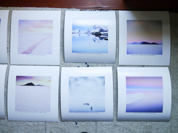
So that's the upshot for you. If you have expired inks in your Epson printer, you're more than likely not getting the full gamut of colours you may be expecting. For me, I noticed that the blacks weren't as deep as they should be, and magentas were much weaker. Some of the blues were not as deep as they should be, and yellow tended to be absent on prints. In general, I felt my prints were a little lacklustre and not as vibrant or deep as I expected. In some cases, this was marginal when comparing before and after prints, but in other cases, it was very obvious.

So my suggestion would be that if you are serious about your prints, you buy the cartridge size that allows you to use most of the ink in the allotted expiry date time, and also check when you buy the inks that the expiry date has a long time to come. Some of the inks I bought are due to expire next September and that is still too short a time for me, while others have around 18 months or more.

The proof is in the print

I've been working on my images for next year's exhibition (I know, it's a long way away, but I really need to utilise my free time - which is in short supply, when I have it). 

Despite having a calibrated monitor which I feel gives a very close representation of what I might expect to see on my prints, I have found that the only way to truly spot errors or inconsistencies in the tones of my images, is to print them and leave them lying around my house.

This does not mean there are any short comings in my monitor, nor any errors in the calibrating or profiling of it either. In fact, any issues I notice in the final print can often be seen on the monitor if I go back to check. This suggests a few things:

1. The human eye perceives electronic images differently than printed images

2. To get the best out of your work, you really need to print it.

I pride myself in having a tightly calibrated system as you can see below - my Eizo monitor is so well matched to my daylight viewing both, that I seldom find prints 'way off'. But this doesn't get round the fact that once I see an image in print form, I may find that either it's tonal aspects aren't as strong as I thought they were. Going back to the monitor to look again, I will find that the print has shown me problems in the work that are visible on the monitor, but somehow, I only became aware of them once I saw them in print form.

Daylight viewing booth and verification test print to confirm monitor is actually calibrated! (it's the only way to confirm calibration and profiling).

Daylight viewing booth and verification test print to confirm monitor is actually calibrated! (it's the only way to confirm calibration and profiling).

As much as I think that *all* photographers *should* print. I realise that many of us don't. Now that we live in the digital age, it seems as if printing is becoming something that many of us don't require. We edit, we resize for the web and we upload.

But if you do care about your work, and wish to push it further along, then I can think of no better thing to do than print it out. If you have a calibrated, colour managed system, then any problems you see in the print are most likely problems that you somehow weren't 'seeing' on the monitor. It is a chance for you to 'look again' and learn.

I've gained so much from my printing. I've realised that my monitor can only be trusted up to a point, and that if after reviewing prints I further tune them to give me a better print, I also improve them in electronic form also. But mostly, I'm teaching my eye to really see tonal inconsistencies and spot them more easily in the future. And that's no bad thing indeed, as photography is after all, the act of learning to see.

Printing - the act of making your work into a physical tangible object

Today is very windy outside, so despite being very keen to get my daily bike ride in, I can't. So what better way to spend the time than to do some printing.

I love small prints. This one is matted to 40x50cm and is a recent picture from Patagonia this May. It's actually a colour photograph, although you might not tell from the jpeg above.

Printing is enormously satisfying and dare I say it - the ultimate end-game with our photographic endeavours. I know, you love just being out there with your camera and it's all about the journey. I completely agree. But there's also something very satisfying about completing some work in print form. Your images cease existing as some electronic group of pixels on a website and instead are transformed into being tangible real-world physical objects. In this age, that alone for some of us is a rare thing indeed.