For a long while now, I've been fascinated by the power of suggestion over a more literal interpretation. I was initially attracted to this aspect of photography through the work of Michael Kenna in the late 80's. His use of shadows and night often convey a sense of mystery or at the very least mood to his imagery.
Just recently, I found out about Ray Metzker, who passed away last year. His work conveys similar concepts to Kenna's. He was interested in suggestion rather than a literal translation. His use of sunlight and shadow to conceal his subjects often lent his work a sense of mystery.
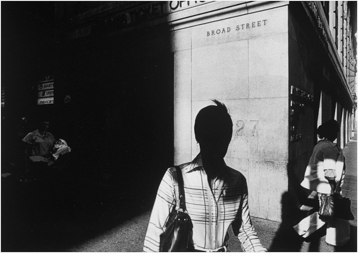
Solitary pedestrians and urban spaces transformed by sunlight and shadow. Image © Ray Metzker
Suggestion is a powerful tool to possess as a photographer - because being able to get your audience to stop and listen to what you are doing often happens through the art of suggestion.
In Ray Metzker's images, he shows tremendous skill in using sunlight and shadow to convey mystery. What may have otherwise been an ordinary scene becomes more interesting and thought provoking when shade is used to conceal or reveal.
Ray would produce portfolios based on these tonal suggestions rather than by subject matter. This resonates with me because I feel I have been doing something similar; for a while now, I have been choosing images where they are related either by tonal response or by colour palette.

Ray Metzker's use of sunlight and shadow was masterful. Image © Ray Metzker
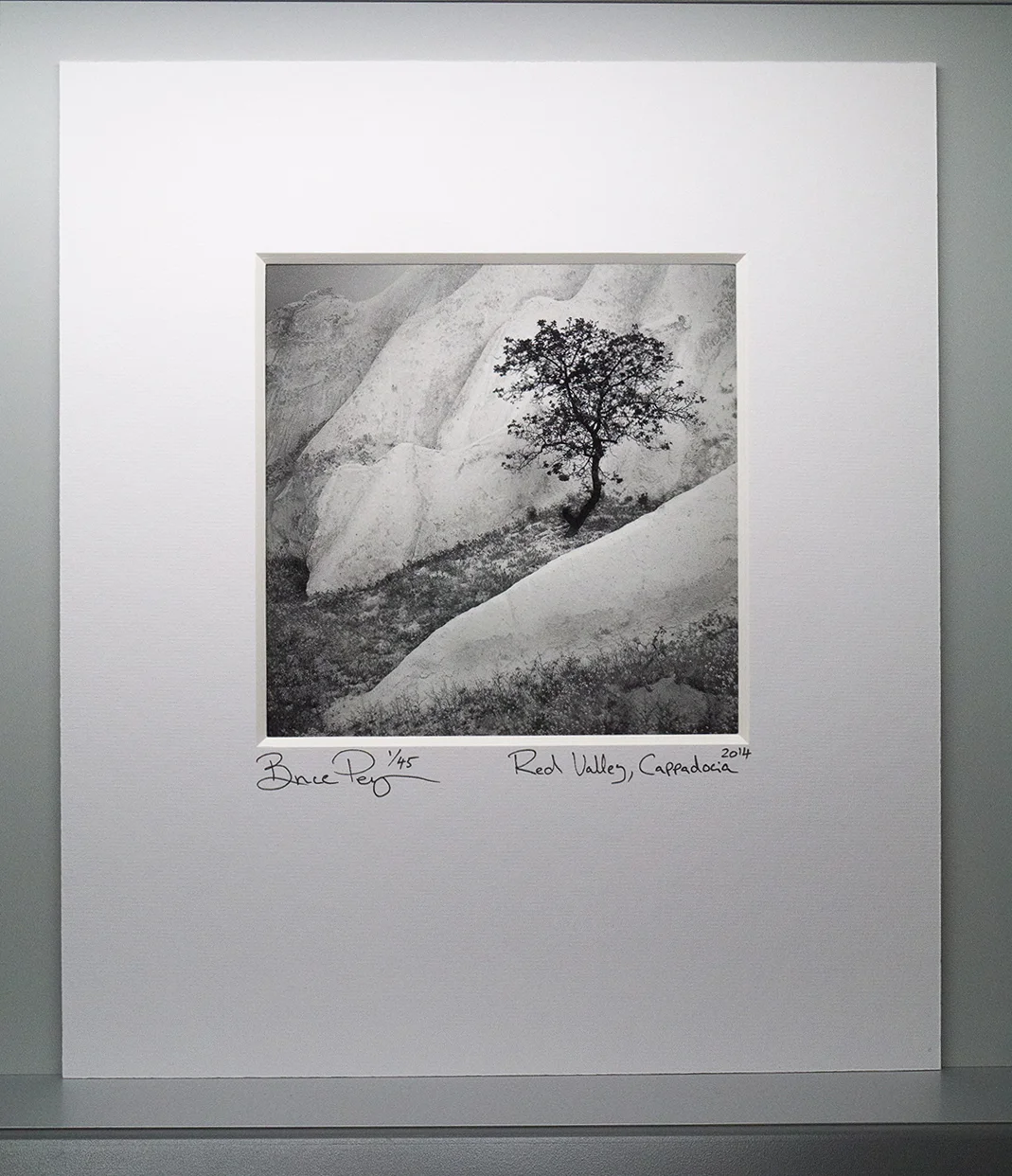
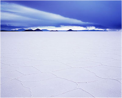
To explain further, I find Iceland to be a monochromatic place: black sand and white ice. Bolivia is about blues and reds: the lagoons of red sediments and the salt flats at twilight intertwine to offer up a particular colour palette. So I tend to go looking for subjects that fit together tonally or by colour - as a collection. These two places are responsible alone for me branching out into monochrome work. They have taught me that the portfolio - the whole is greater than the sum of its parts.
I see a similarity in Ray Meskier's work where he chooses subjects that are collected together by tonal similarities. People in the city often photographed as silhouettes, or with their identities concealed by use of shadow strengthen his portfolio as well as lend a very decisive look.

Images don't always have to utilise the full tonal range. Here Ray Metzker uses mostly shadow to mid-tones only. I find the deliberate concealment of the people's faces adds further mystery to the image. Image © Ray Metzker
His work has a style - something that we are all trying to develop or bring forward in our own work. And this is perhaps the most important lesson from looking at this work: it's clear that Mezkier has thought about the aesthetic qualities of his final selection of images and also the subject matter in such a way that we are clear each photograph is by the same author.
I learn a lot by looking at work that I find inspiring. It doesn't have to be landscape related for me to 'get it'. I just have to find a connection in the work - to see something that I find intriguing, or that makes sense to me in some way that I hadn't thought of. With Ray Metzker's work, I do exactly that. I learn about image selection based on using tonal responses but I also learn that his choice to make people very anonymous or to conceal their identities through his use of shadow and sunlight can lend the work a thematic quality which goes a long way in conveying a photographic style.
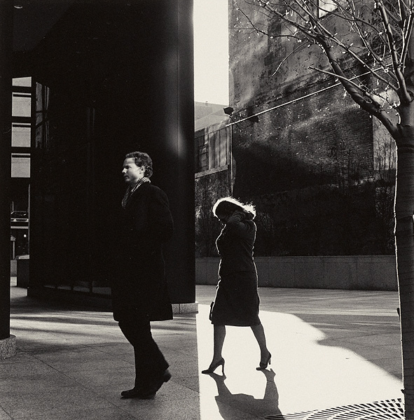
And sometimes it's the sudden split between shadow and sunlight that throws a contrast; like two images spliced together, providing a sense of tension between the two subjects in the frame. Image © Ray Metzker
And then there are his choices in composition. I've always thought that street photography has less to do with aesthetics and more to do with narrative. But in Ray's work the story is missing. He has deliberately chosen to conceal most of his subjects so we know very little about them. Instead we are presented with compositions constructed through form and tone only. They are like landscape studies about the people in a city.

A study of graphic qualities. Image © Ray Metzker