The Creative Process

I’ve been making photographs for over twenty years now, and during that time I have found the creative process to be an elusive thing to describe. How do we define something which at its heart is free-form? 

Creativity should know no boundaries, should have no rules. The results, however they are gained, should speak for themselves.

But how should one describe the creative process? Despite thinking that it is near impossible to do so, I think describing one’s own motivations, thoughts and feelings towards what it is that they do, goes a long way towards trying to pin down what creativity is.

I’ve put together a small e-book of just over one hundred pages, where I’ve culled my favourite creativity related entries from my blog. I often consider this blog a journal of some kind, a way of sorting out my ideas, of figuring out what it is that I just did, and why I did it.

There have been some minor changes to some of the entries to make the english more correct. A few posts have been almost totally re-written in an attempt to gain clarity. It seems that not all my blog posts are as lucid as I’d like them to be.

I hope, if you choose to buy this e-book, that you can appreciate that it is often hard to describe what one is trying to describe. Especially when it is about the nature of creativity.

The Creative Process

Illusive, all encompassing, being creative is our life’s work.

I’ve been writing about creativity for some time now, and I think it’s time I put together something in a more formal format, something that is convenient to read through.

So I’m busy collating all my favourite blog entires over the past few years.

I’m finding I have been doing a lot of re-writing to give more clarity to some of the entries. It might be the perfectionist in me, but I do find that sometimes when I write on my blog I almost need to write the post twice: the first time to figure out what it is I’m trying to say, and the second time to say it as best as I can :-) So I’m busy re-editing the entries right now. So far the e-Book is up at around 120 pages.

I hope to have it ready by the summer.

Thanks to everyone for buying my Printing masterclass e-book. I was surprisingly inundated with orders for it. I’ve obviously been living under the misconception that few photographers print these days. Printing isn’t a black art, nor should it be difficult to achieve great prints that match your monitor. So I was very pleased to find that the e-book sold very well. Thank you :-)

Creative-Process-Cover.jpg

The value of understanding Colour Theory

I'd like to say a big thank you to those of you who bought my Tonal Relationship series of e-Books so far. If you've been reading and following them, you should know by now, that I'm big on working with tones in a photograph, much like how an artist painter would.

colour-theory.jpeg

Photography is not just about clicking a shutter and 'getting it right in-camera'. Camera's do not see the way we see. And besides, if one considers that anything after the shutter has been clicked is 'manipulation', then they are forgetting that the choice of lens they used, the position they were in, are all interpretive.

For me, photography is no different from being a painter. I may not paint with oils or watercolours, but I have to abide by the same rules and concepts that a painter has to: if you do an art class you will learn a lot of valuable lessons about composition. Indeed, I encourage you to attend an evening art class. You will learn so much about tone and form that is all applicable to the art of landscape photography.

Which brings me to the point about my post today: as landscape photographers, we not only need to understand tone and form, but if we shoot colour, we also need to understand colour. How many times have you thought you could boost a certain colour in your picture only to find that although it seems as if it's present in the scene, it actually isn't there. This my friend, is all down to a lack of understanding colour, how certain tones are made up by multiple colours. 

For me, understanding colour, is paramount in removing colour casts, and by tuning certain colours to fit with others. Rather than boosting a colour, I often find myself reducing colours that are at the opposite side of the colour wheel to the colour I want to boost. And it's not just a case of boosting / reducing colour that is required. Often I find I have to 'tune' a colour - by adjusting its hue I can remove casts or even 'tune' the colour to fit more in-line with other aspects of the photograph.

So I think this is what I want to write about in my 3rd instalment of my 'Tonal Relationships' series. Right now, it's more a flicker of an idea. I haven't really figured out exactly what the e-Book will entail and I find that sometimes leaving it for a while helps me clarify the aim of such a book. This is what happened with the Tonal Relationships part 2 e-book. That one took me more than a year to work on. I got stuck at times, unclear if I was heading in the right direction and when that happens the best thing you can do is back off, and go and do something else for a while. So when you return to the problem in hand, it is often much clearer to see.

So that's my intention. I wish to write an e-Book about colour, and how it applies to editing photographs and also what it means when we are out in the field choosing our compositions. You may have noticed that over the past while, I've become a colour obsessive. Perhaps you feel my photographs have become more muted, almost monochrome (and for some of you they probably do look monochrome now), but colour once you begin to really work with it, becomes something that you want to apply delicately. Overly-vibrant, loud colour photographs, I have a theory - belong to the beginner. Once you start to really see all the colour distractions, it becomes a case of trying to calm things down a little (or in my case: a lot). I'm not for one second saying that everyone should go for the more muted look that I have adopted of late: I'm saying that if you are able to interpret colour and understand it better: you'll make more sensitive and worthy choices during your editing.

Please don't hold your breath for this e-Book. I'm pretty sure it will take me a while to find the right approach to tackling this subject, and due to my workshop schedule, time is in short supply.

Advanced Photoshop Curves e-Book is here

Last night I released my new e-Book on Photoshop's Curves. It is part of my 'Tonal Adjustment' set of e-Books.

Perhaps you feel that learning Photoshop isn't for you, or that you are very happy with Lightroom's toolset. It is a really nice software package after all, and easy to get to grips with.

But Lightroom only goes so far, and I find the controls rather too broad (as I type this in July 2018).

I've prepared some  on-line tutorial videos for my Curves e-Book which are included as part of the purchase.  Above is an excerpt from the videos. I hope it will show you the power of the curves adjustment tool for doing nuanced edits. 

There is also a message in this tutorial that has nothing to do with Photoshop. I discuss very much how the eye can be tricked into thinking an image is bright enough when it isn't. So if you edit in another software application, it is still worth watching.

First draft of New e-Book is complete

Part 2 of my Tonal Adjustment Series

It's been slow progress, but I'm really delighted to discover to day that I've finished writing my new e-Book about Photoshop's curves adjustment tool. I've been trying to write this e-Book since last year - I remember doing some work on it in December, and then it got shelved while I was so busy running tours and workshops.

tr.jpg

It is my 'holiday' time at the moment. I'm at home for the next few months, and the only work I have to do is finish this e-Book and also one other special project. 

All I can say is that I had no idea I could write 50 pages about the curves adjustment tool. One of the best things about writing this e-book is that it's helped me clarify in my own mind just what is actually going on when I do any curve adjustments.

The new e-Book now needs to go into review mode, where I will check for errors and discrepancies. It comes with around eight Photoshop files to illustrate some of the more difficult to understand features of curve adjustments. And I'm hoping to put some QuickTime movies together to show you some screen sessions.

But it's all come together well so far. I'm very pleased with the results and I think it's going to be a very nice e-Book if you're interested in developing your knowledge of curves. The curves adjustment tool really is the most powerful way to modify and transpose tones.

Tonal Relationships e-Book Part 2 Update

Just a very short post today to update you. I'm around 2/3rds of the way through writing my new ebook, but it's taking some time. I just haven't had much free time over the past year. I am coming up to a quiet spell this June where I will have a few months at home. I'm hoping to have most of the work done on the remainder of the eBook by then. But I just don't want to rush it. If it takes longer, then so be it.

7d1a2b47-432a-4a56-971e-0f151fdff5be.jpg

Curves is, in my view (this is what a blog is about - someone's point of view), the most powerful editing tool available for adjusting tones in a photograph. Your mileage may vary from mine. 

On the surface the Curves tool seems relatively straight forward, but I've learned that many of my workshop participants have a rudimentary understanding of it. The curves-tool is the tool I've been using for 18 years and I'm still learning about it each time I edit. It is a tool that you do not master overnight.

I'm aware that my views may be contentious to many: a lot of people like Lightroom and love it. For me, there is still a wide gap between what Lightroom offers and what Photoshop offers. I do believe that the gap is narrowing with every release of Lightroom, but it still isn't there. Lightroom's tonal adjustment tools are broad, and they don't give you the degree of control I feel is required for very fine editing. Although Photoshop is not an intuitive program, and neither is the curves tool, with some dedication and time applied to it, it is worth the investment for finer tonal editing.

I hope to have the e-Book finished this summer. But it is kind of growing as a project. I'm now thinking I need to have some accompanying videos to go with it, but I will see.

New e-Book announcement


I'm pleased to announce that today I have released a new e-book - part 1 in a 2 part series:

In this e-book, I aim to give you some thoughts with regards to tone, and its use in photographs to strengthen and weaken relationships between areas in the frame. 

In essence you will learn that subjects may be related to one another through tonal similarities. By ‘tuning’ the tones of one subject to be more similar to the tones of another subject, you can introduce, or strengthen an existing relationship further. 

By using the principles discussed in this ebook selectively during your editing sessions, you can reduce tonal distractions, help emphasise the right areas of the frame and aid in balancing the overall feel of your images. 

The book is split into the following sections:

Section 1 - Tonal Relationship Examples

By giving you some real-world examples of how Bruce chose to edit his work, you will gain a clearer insight into the power of tonal relationships.

Section 2 - Tonal Evaluation Techniques

These Techniques will aid you in developing your own visual awareness of tonal relationship. They also help you in finding areas of conflict in the image and also of correcting / adjusting tonal properties to the right degree.

This one has been a while in the making and  It could only come about because of the work I've done holding my twice-yearly Digital Darkroom workshop. I hope you enjoy it. 

Part 2 isn't far away :-)

Transposing Tones

I've been working on a new e-Book for some time now - 'Tonal Relationships'. 

Each time I begin work on a new project, it can really take a while to move off the landing pad. I found this to be particularly true when I wrote my Fast-Track to Photoshop e-Book, which actually took me about two years. Most of it was a sense of procrastination because each time I approached it, I felt I was tackling it from the wrong perspective.

A work in progress. It's better to release something when it's right. It may be some time yet :-)

A work in progress. It's better to release something when it's right. It may be some time yet :-)

I'm a great believer in sleeping on things if I don't know the answer. Backing off from something and giving my mind the time to collate and make sense of something works really well for me. I've found that adopting this approach to my photography, as well as writing e-books and also in life experiences, has been invaluable.

I found that just by leaving my 'Fast Track to Photoshop' e-book idea on the shelf for a long long while, I seemed to get clarity on how it should be formed, and when I did get round to writing it, it all came out very easily and I felt I wrote one of my most clear and concise efforts to date.

Well, I'm not there yet with my Tonal Relationships e-book, as I've been having difficulty trying to figure out how to proceed, but I've noticed that over the past few weeks I've started to formulate a structure for how the e-book should be laid out and things are getting clearer in my head.

One aspect that has become clear to me over the past few years, is that tonal relationships do not just have to work within each single image, but in order to help with defining your own style, I think the tones should remain consistent through any body of work you produce. For instance, I've noticed that when I convert my colour work to monochrome, I'm able to see how consistent my work is - strip away the colours, and the images still appear to be very balanced.

It was only when I converted some of my existing colour work to mono, that I discovered how consistent I was with my tonal ranges in my work.

It was only when I converted some of my existing colour work to mono, that I discovered how consistent I was with my tonal ranges in my work.

Anyway, I digress a little. Here right now, is a rough idea of how I feel the e-Book may be laid out. I'm always open to things changing, and trying to not be too fixed on things, because creativity needs the space to go where it wants to go.

Main ideas of book:

  • Relationships throughout the frame - by strengthening one area of the frame, other tones are affected
  • If you make two areas of the frame the same tone - they become related.
  • If you make two areas of the frame different, they become unrelated.
  • The odd tone out is the dominant one. If you keep one area of the picture different from the rest, it becomes the dominant tone. White stone on black background, or black stone on white background

Fieldwork Awareness Section

  • learn to think about tones while out making pictures: abstraction versus association
  • being aware of colour constancy / chromatic adaption while you work under different lighting conditions, and applying this to your choice of subject
  • Avoiding overly complex tonal compositions

Darkroom Workbook Section

  • Transposing Tones - take one tone in the image, and shift it (harris hills in harris photos)
  • Look for images in your collection that have very few tones. Edit them so all the tones become more similar
  • Simple compositions aren’t necessarily of one or two objects. Sometimes they are simple because they contain one or two dominant tones. Busy images can have too much tonal information in them. 
  • Image selection: choose those with simple tonal relationships, because it will make the task of editing them easier.
  • image selection: when toning one image, refer to others in the collection for guidance. Often one image will dictate how the others should be edited, so they 'sit together' better.
  • Is your eye being pulled all over the place by too many tonal distractions? Apply localised contrasts, or reduce contrast in other areas to bring emphasis to other areas.

New e-Book - Simplifying Composition 2nd Edition Available

I'm pleased to let you know, that as of today, I've released a second edition of my popular 'Simplifying Composition' e-Book.

completely re-written and expanded (now 68 pages long).

completely re-written and expanded (now 68 pages long).

I felt that since writing the first one in 2010, my abilities as a workshop teacher had moved on quite a lot. Over the years I've been teaching my workshops, I've added to my thoughts on composition, so much so, that I felt I needed to update the book to reflect this.

But rather than updating the e-Book, I've chosen to totally re-write it from scratch. So it's definitely worth getting if you liked the first one, and want to learn some new things :-)

Flow..... and relationships between similar shapes and patterns.

Flow..... and relationships between similar shapes and patterns.


More about the new edition


The new edition is double in size - 68 pages long to be exact, and is packed with lots of new advice and tips on improving your compositional awareness while out in the field and when reviewing the work later on.

In writing this edition, my aim was to utilise the experiences gained over the past six years teaching workshops, to give you an updated view on how to simplify your compositional skills.

The book is split into three sections:

  1. Flow. Learning how to guide the eye through the frame in a comfortable and pleasing manner    
  2. Compositional Devices. By using certain features within the landscape,  we can strengthen and simplify our compositions    
  3. Fieldwork. Best practices, techniques and approach while out in the field

And here is the table of contents to the new version:

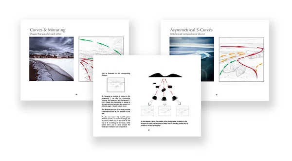
S-curves and also background emphasis with focal-lengths.

S-curves and also background emphasis with focal-lengths.


Table of Contents


3    Introduction Part 1. Flow
6    The flow of your eye
7     Interpreting the flow within an image
10    An example


Part 2. Compositional Devices

13    Introducing the diagonal line
16    Looking for diagonals in the ground
20    Looking for diagonals in the sky
23    Introducing the curve
25    Curves & mirroring
28    Introducing the s-curve
31    Asymmetrical s-curves
33    Patterns, mirroring & tonal separation
35    Cohesion in the landscape


Part 3. Fieldwork

39    Foreground emphasis
41    Background emphasis
44    Vertical spacing between subjects
47    Avoiding the fish tank effect
52    Visualising in 2D
56    Working with parallax
59    Strengthening composition
62    strengthening cohesion
65    Improving your workflow
68    epilogue

Mirroring in the landscape, asymmetrical shapes in the landscape and parallax issues.

Mirroring in the landscape, asymmetrical shapes in the landscape and parallax issues.

I feel particularly pleased with this updated edition. I felt I got the sequencing of the chapters right because one aspect of composition seemed to lead onto another in a way that has made the book very easy to get into.

I do hope you enjoy reading this one. I fully intend it to be a reference that you can return to time and time again.

Simplifying Composition, 2nd Edition, almost done!

Since becoming a full-time workshop leader in 2008, I feel I've experienced and gained so much more than I ever imaged I would. One aspect of this, has been my own development as a teacher. It's been a great experience for me to teach others - sometimes intense, often a lot of fun, very sociable and highly rewarding. 

2nd edition - a complete rewrite

2nd edition - a complete rewrite

One of the biggest privileges of being a teacher is that it's not just your students that learn. You learn too.

I feel very privileged to  regularly have the opportunity to get a better understanding of many of the core competencies of photography, simply by having to teach them. I now look at each workshop I do, not just as a place to teach others, but also as a space in which to strengthen my own understanding of what I do and why I do it.

It's been quite some journey and every now and then I like to look back and review things. See where I've been, how far I've come.

Way back in 2010, I published an e-book titled Simplifying Composition . It has been one of my most popular titles and I've used it as the basis of my workshops here in Scotland for many years.  

This year I've been feeling that it's about time the e-Book was updated to reflect where I am now as a teacher. Because of this, I've gone back to scratch and rewritten it.

I'm pleased to tell you that the first draft of the new edition is now complete. Other work commitments aside, I hope to have the new edition released early in the new year.