
A life of its own?
It's just over a year now, since my Iceland book came out. Which I can't believe. In some ways, it feels as though it has been a lot longer, but a year isn't much time at all, so I'm finding it interesting to feel as if the book has been around for a long time. Perhaps it was already a thought in my mind long before I even began working on it?
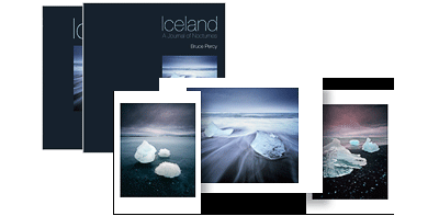
It was really interesting to decide on the special edition print runs for the book. It was also a lot of fun too.
I spent a bit of time deciding which group of three images would go together to form the triptych. The idea being that if they are put together, they are complimentary and can be framed as such. The final touch for me, was to create a dedicated envelope for them. The envelope has the same layout and font-set as used for the slipcase. The idea being that the prints will be stored alongside the book in this special edition envelope, as a collectors edition. Well I've just done a stock count, and it seems I only have 8 copies of this edition left.
When creating special edition sizes, it's a difficult task to decide upon the quantities. Make the edition size too small, and the edition will sell out too quickly. Make it too large, and the stock will sit around for some time.
But selling books should not be entered upon, if you are going for a quick-win result. Books take a long time to sell, and even small print runs of 1000 copies need a few years at least to sell out, if they are going to sell at all. Creating books and selling them, is ultimately a risky endeavour, and one that is embarked upon, if you feel you really need to do it, and can accept the possibility that you might not get your money back. Books are not cheap to print, and even more difficult to store somewhere dry.
The idea when I decided to put together my two books, was to create products that I could offer to workshop participants, and visitors to my website, for several years to come. If I sold all the books out in a year, then I would have nothing left to offer.
Like my prints, I feel a well printed book is a 'calling card'. It is a statement of who the photographer is, and the aesthetics / design of the book, right down to the layout and font-set used, should give you a sense of who the photographer is. The entire thing, not just the photos contained inside, should be carefully chosen, and should fit the aesthetic tastes of the photographer. In fact, I can't imagine any photographer who wouldn't want to be involved in the design of their book as much as possible. It is such a personal thing to do. So many photog's get that part wrong, and I've come across books that have wonderful photos in them, but the overall design or layout is at odds with the work contained within.
I'm still hoping to do a 3rd book sometime. My initial plans were to come out with a book about the Altiplano of Chile and Bolivia sometime next year, but I feel this is too soon. The work I have begun to create in Bolivia, seems to be getting stronger each year I return. So I think I need to wait a while and see what transpires there when I go back this June.
Well, just some thoughts and observations. It's good to check in on where things are, and I find christmas and new year a time to reflect, to look back and think about how far I have come as a photographer, as in life, as in everything.
It seems that making the photos, and designing the layout and appearance of this book with my friend Darren Ciolli-Leach, was just the start. It seems that even a year after publication, the book is still finding its place in my heart and mind. It's a grower, and it's heartening to note that sometimes, when I think I've finished a project, it's only really just begun. I think my iceland book has taken on a life of its own. So I will be watching it with interest over the years to come.
Abandoned Window
Music inspires me. I have SONOS all around my home and I have music on most of my time while there. The TV is seldom on. Where do you get your inspiration from? https://www.youtube.com/watch?v=t365KdoiHTM&width=400
Here is Jon Hopkins playing 'abandoned window'. The album version has a lot more electronica added to the piano. He writes music for films (Monsters), and has worked with people like King Creosote on the wonderful Diamond Mine album.
What I love about Jon's work, is that he can move from classical to electronica, to ambient, to folk, and always retains his signature sound.
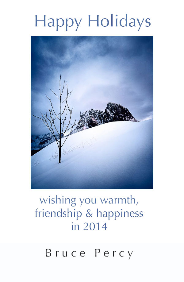
Christmas Print Orders
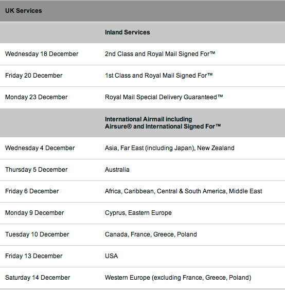
I've been receiving a lot of limited edition print orders for Christmas, and wanted to let you all know that the closing date for printing and shipping is Wednesday the 11th of December. Any orders placed after this date can't be honoured, I'm afraid as I will be out of the country then.
Please check below for the last posting date for your country (see below for table).
If you wish to order a print, you can browse my print selection here.
If you wish to have any of my images from my portfolio made up as a print, that is not available on my store, please just email me.
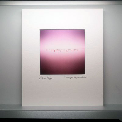
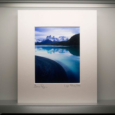
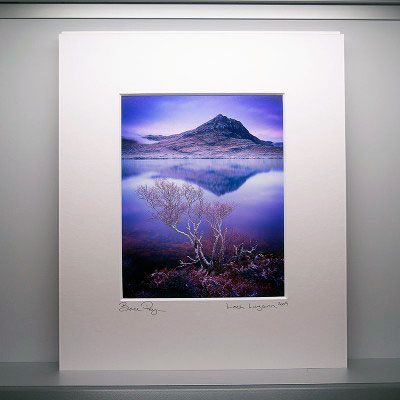
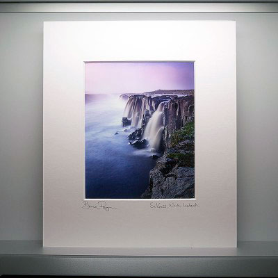
All prints are 7" x 9", matted to 14" x 13" or if the image is square, the print is 7" x 7" and mated to 13" x 14". All prints are £150 and signed, numbered to an edition of 45 only. They are shipped in a strong ready-pack carboard carton and are insured for transit.
- Printed on Museo Silver Rag Paper - Epson 4880 Print - Mount 14 x 13.5 inches (35.56 x 34.29 cm) - 9 x 7.2 inches image size (22.86 x 18.28 cm) - Signed, titled and numbered on front - Stamp of authenticity, titled and numbered on back
Acid Free Tape
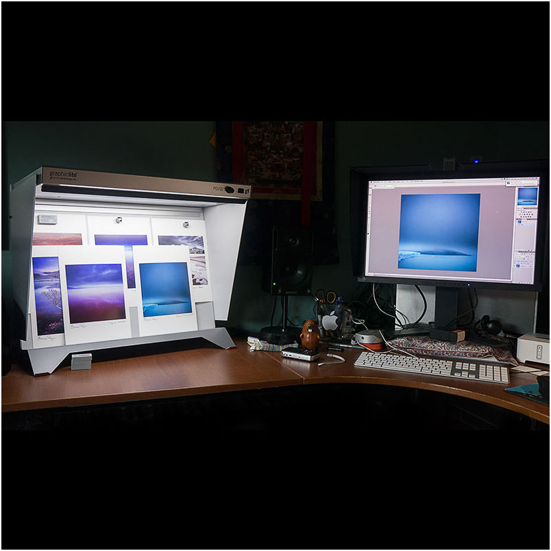
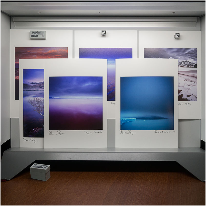
You can probably tell by now, that printing is on my mind of late. I've been matting a lot of my work for overseas clients - I guess Christmas must be calling. I thought it would be good to discuss the use of linen hinged tape - in particular - why you should use acid free tape.
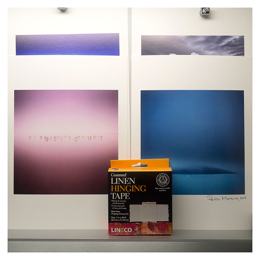
As my framer says. Putting normal tape over your prints to hang them behind mats will eat through the photograph in a matter of months. I haven't seen that for myself, but the best thing to do when matting your own work is to use acid-free materials where possible.
What I particularly like about linen tape though, is that it's all water based. If you're not happy with the placement - just add some water to remove the tape and reposition.
If you're interested in getting some, one of the best places here in the UK for presentation material is Silverprint.
Matting & Signing
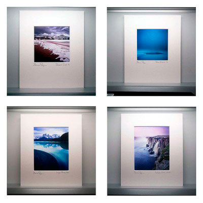
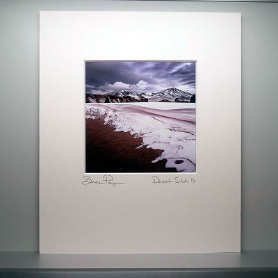
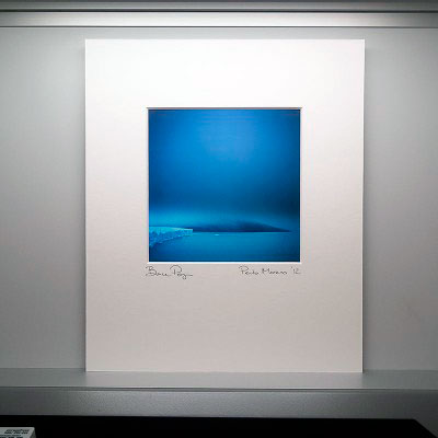
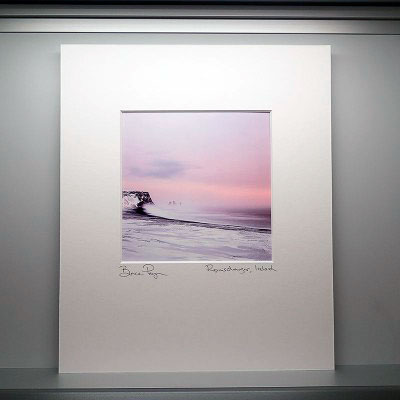
I've been busy printing a few images as special orders. You might have guessed I've been busy of late with the printing side of things due to the subject matter of my recent posts !
Tonight I thought I would share some of them with you. Each of these images is around 7" inches wide by 7" inches high. Printing, matting, the whole presentation side of things is really a very personal decision, I feel. It should be taken into account as part of the photographers 'signature'.
To my mind, printing is a further extension of the photographers 'voice'. As I said a few days ago - the print is the ultimate calling card, it goes out there into the world, as a representative of who you are as an artist.
So treat your prints well. Give them a lot of care and special love.
Do your utmost best.
Black & White Printing with Piezography inks?
I'm in the process of thinking of setting up a second printer to specialise in black and white printing. I've known about the Piezography black ink set for a while. This is a custom system whereby each cartridge slot in your colour printer is replaced with a separate black tone ink. The printer becomes a dedicated monochromatic printer.

In my mind, I am reasoning that having a dedicated printer set up with different tones of black inks will produce a much better black and white inkjet print, than if I were to use the standard Epson colour inks.
I would really love to hear from you if you have experience of this system, or if you know of any other specialist black and white inkjet system. Specifically, any issues you had, how you feel about the final results compared to doing black and white prints using the normal Epson inks.
Your thoughts are appreciated, and if you feel going 'public' on my blog is too much for you - as was the case a few years ago when I asked for input about colour printing - you can e-mail me directly instead.
The Art of Printing
If we were to gather some stats about photographers, we would discover that few actually print their images, or ever get them printed. The truth is, most images, if they get any further than the hard-drive of a computer, get as far as a website.
Which I think is a real shame, because I think there's something very beautiful about the print. It is for me, what I always thought was the ultimate aim with photography.
Way back in the 80's when I was a teenager, I remember looking at some Ansel Adams book's that my friend Craig brought round for me to look at. At the age of 19, I was more interested in music and writing songs. But when my friend showed me these beautifully printed books of Ansel's work, I was really taken in. I still look back at this moment and realise that for me, I've always thought that the final result for any photographer is the print.
I understand that things have changed. We live in a more electronic world these days, and one where everything lives on-line. We enjoy music streamed down from the internet, and we often do the same with photographic images. But I've always been at a loss as to why we're satisfied with this? It's different for music, because the quality of the audio is pretty good. Whereas the quality of a photographer's work can't be enjoyed to the same degree as it would when viewing a well produced print of their work.
When I released my first book, I had so many emails from buyers who told me that it was so nice to discover there was so much more detail present in the prints, that they hadn't been able to enjoy on my website. It was a very heartening thing to know that others were keen to get closer to my work - because that's what prints do - they allow us to have a more intimate audience with someone's work. I think this is because of two main reasons: the first is that the image is brought into the real world. It exists as a piece of paper and we can touch it and enjoy the quality of the paper it's printed on. Secondly, it's much easier on the eyes to look at work that is printed, rather than being transmitted at so many hertz from an illuminated panel. We tend to interpret work differently when it is presented on different mediums. The way we look at a print, is very different from the way we look at a computer screen.
I would love to see more photographers printing. Because printing is an art-form. It takes a long time to master printing, and it is one half of the photography story. As photographers, we should feel a need to strive for excellence in how our work is presented. And printing our work well is a craft.
In the screen shots you see above, you can see some of my prints. But what you can't see is how much work has gone into them. It's not simply a case of sending a file to my inkjet printer. It's only part of the story to get the entire thing colour managed. It's mostly about being able to convey your vision on a paper medium, and that takes a lot of interpretation skills. Just like deciding on how much editing to do on an image for the web, I have to decide on what kinds of things I need to do to convey my work well on paper. I will often use contrast-masks to achieve this, I will also use creative sharpening applied where needed.
Printing is not only an art form, it is also an immensely satisfying thing to do. To see your images finally come to life, as real objects - ones that you can hold and touch, takes our photography to another level. Our work becomes more defined, because we are no long working in a virtual world. Our work becomes committed, because unlike the electronic world of pixels and websites, the print is an immutable object. It is a fixed constant, a statement of your intent. Above all, it is the ultimate calling card of who you are as a photographer.
How would you cope, if you lost your sight?
I really liked this movie. It made me think about how precious my vision is to me, as i'm sure it is, to all of us. Beautiful work, inspiring video, captivating ambient music. It's great to see that he found photography as a way of dealing with the outcome of some permanent physical damage. This man speaks much wisdom. He is a poet.
[embed width=400] http://vimeo.com/79138449 [/embed]
Osmosis
Osmosis - A gradual, often unconscious process of assimilation or absorption.
Some landscapes come to us when we are ready to receive them. Not the other way around.
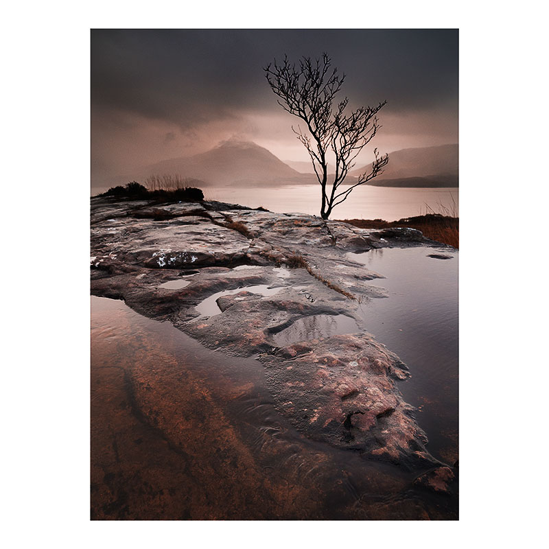
Lumix GX1, 12-23 lens, Lee 0.9 hard grad. This image was taken quickly to illustrate compositional and tonal relationships during my weekend workshop.
Last weekend I was running my umpteenth workshop in Torridon - a very special mountainous place here in the Scottish highlands.
Although I've always had a love for the place, I've often found it extremely difficult to make images here, until recently. I think I've learned to understand this landscape more through the act of being a workshop teacher. Consider this statement by Brian Eno:
"You don't really understand your own ideas, until you try to articulate them to somebody else. Also, in the process of articulating, you find yourself saying things you didn't know you knew" - Brian Eno
This has often been a case for me whilst running my workshops. I discover that I knew something I didn't know I knew. And also, that through the process of having to explain something to someone else, my own understanding of a place, or a photographic concept becomes clearer.
I've found teaching workshops in Torridon immensely rewarding in this respect. The landscape is fractured and complex. It is not a simple landscape to make good images from, and it requires you to see that many of the stones, trees and bracken all have similar tonal relationships. When these tones are compressed down into a 2D image, they often merge, and become very confused and jumbled as a result. 'Separation' between objects within the frame becomes key. Through this awareness, my eye has become more finely-tuned.
The image you see at the top of this post was made last weekend while we were busy trying to work with competing elements. It has taken me around 13 years to get to a point where I can look at a scene and know how best to deconstruct it down to a few elements that will work as a photograph. Through this time, I have often asked myself questions about my work, and I've often had to explain it to others.
As creative people, we have to listen to ourselves and become more aware of our own thoughts. It is only through a sense of internal-dialogue, and a sense of inquisitiveness about how we choose to approach landscape photography, that we are able to progress as artists.
In the video above, you'll see Brian Eno and Ben Frost discuss the creative process. I found it fascinating to hear Ben mention that he finds his work seems to be a kind of diary. I think this is true of my own photography: my images are a sounding board that show where I was, creatively speaking. They are a record of my photographic development.
Ben is in-tune with his creativity - he understands where he has been and where he is now. This is perhaps a fundamental skill that all creative people should possess, or at the very least, be learning to tune into.