New baby

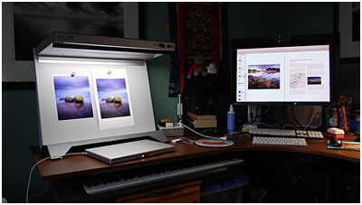
On Thursday I received my Epson 4880, which you can see installed in my studio below.

Needless to say, the place is starting to look more like a laboratory, but that's fine I guess. It is where I work.

I've got some set up to do on it, and feel there's a bit of a learning curve with it all. Getting familiar with equipment takes time, and I'm very much in the frame of mind about reading manuals now, and taking time to get used to all the features of a new product.

Anyway, I must thank Neil Barstow from Colourmanagement.net for all the advice and time he's spent with me. There's been a lot of correspondence and I'd really like to get him up here to work with me at some point to help me fine tune the colour process.

But I think seeing the actual process in flow was very important for me in making the decision to go Inkjet. I have Kyriakos Karlokoti to thank for getting in touch with me when I initially put out a feeler on this very blog for advice and help. He has been very instrumental in showing me the process and of course the results. I'm quite a technical person, having worked in IT for a long time (that's another story), but there is really a lot of misguided information out there about colour management.

I've always believed very much in the traditional print and I still love Silver Gelatin papers and a well made print in the dark room, but I feel now that Fuji Crystal Archive and light jets, isn't a road I will pursue any longer. It seems that Injket quality really has arrived. So much to my own surprise.... I remember trying it around 10 years ago and being severely dissatisfied with it and the reviewer (who shall remain nameless) who claimed it was a ready technology. I'm only glad to report that it now is a superb medium.

Colourmanagement.net

Over the past few months, I've been delving into colour management - specifically in the printing side, as I feel I understand enough about monitor profiling. But I have to confess that I wonder if monitor profiling is as understood as it should be?

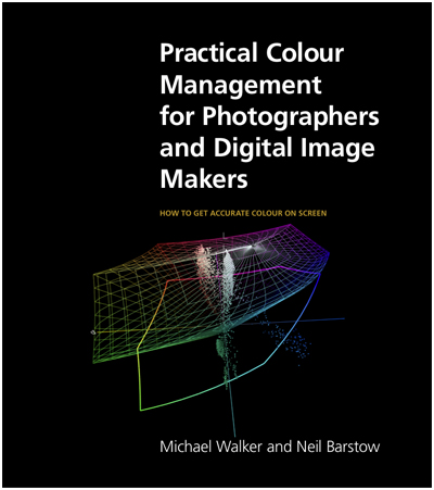
Neil Barstow of Colourmanagement.net has produced along with Michael Walker, a nice little e-Book about getting accurate colour on screen, and I think it's very much worth a look at even if you think you're already up to speed on calibration and profiling of your monitor.

The biggest thing for me, is how our perception of white changes depending on our environment. I edit in a room with a Solux lamp these days, because the bulb produces an even level of luminance across the spectrum. It's not ideal, but it's an improvement upon normal tungsten light bulbs. Many beginners edit their images in a tungsten light room in the evenings, and they have no idea that this has an impact on how they perceive the colours they are seeing on screen.

I also use a neutral mid-grey onscreen desktop background, because this also affects my judgement regarding colour.In the eBook, this is discussed, also the difference between calibration and profiling, which are very different processes. Calibration for instance, is all about getting your monitor to a specified condition with regards to targeted white and black luminance, colour temperature and gamma or tonal reproduction curve. Profiling is about measuring the characteristics of how colours are displayed at it's calibrated state.

This is where an ICC profile comes into play. It both holds the display system's calibration and is a way of describing the actual characteristics so that colour management software can display the correct colours. What is in your file, i.e. the actual numerical pixel values should be represented at best on your monitor, i.e. each pixel is displayed as it's numerical values truly relate to human vision and this can only happen once your monitor is calibrated and then profiled.

The eBook finishes off with suggestions and bugs found using colour management within OSX (Snow Leopard is discussed here - especially regarding ICC profiles and the issues with type 4 Profiles), and of course Windows is covered too.

In general, this is a good eBook about a very complex subject and in it, Neil and Michael give enough information so that you're not too confused, but a bit more aware of the issues involved in getting good colour accuracy on your monitor. You may be interested to note that I recently purchased a copy of the CMnet/Pixl Verification Kit proof and a viewing booth (for print evaluation). An accurate, measured and certified proof is the best - in fact the only way to determine if the calibration and profiling of your monitor is spot on.

Here's a little snap of my studio desk at home with an Eizo monitor and the viewing booth to the left (note the work in progress eBook about TPE that I'm slowly getting my way through!). These things are really worth the money if you intend to evaluate your prints and also, to get the monitor profiling spot on too.

For more information about colour management and some expert advice, Neil Barstow can be contacted at Colourmanagement.net and of course, if you'd like to try to learn more about monitor profiling and calibration, then I can suggest buying his eBook as it will do you no harm whatsoever.