
I’ve been working on some notes about printing lately. So this post today is all about colourspaces and what happens when we move an image from one colour space to another.
In the article I point out that colour management is not about colour accuracy, but more about how we choose to work around physical limitations as we move from one device to another, each with different colour gamuts.
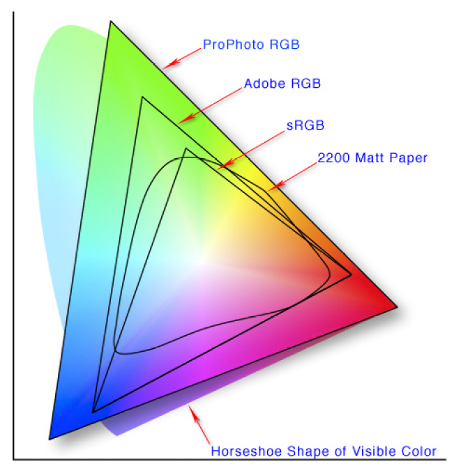
2200 Matt paper has a small colour gamut, than Pro Photo RGB. So what can we do to make our image look good on 2200 Matt Paper even though it is physically impossible to do a direct conversion?
The problem
Each device has its own physical limits to the range of colours it can record or reproduce. This is the problem: what do we do as we move an image from one device to another?
For example, when sending a file with a wide gamut of colours to a monitor or printer with a smaller gamut of colours, something has to be done with the colours that fall outside the physical range of the device’s effective gamut. Do we ignore those colours, or should we do something else with them?
The solution : Rendering Intent
The answer is : we decide, and we tell the colour management system our decision by way of a feature called Rendering Intent. Rendering Intent is where we tell the colour management system which rules to apply with respect to out of gamut colours.
There are several different rendering intents available. The two most commonly used rendering intents are Perceptual and Relative Colourmetric, which kind of do this:
Perceptual : shrink all the colours from the larger colourspace to fit the destination colourspace.
Relative Colourmetric : out of gamut colours are clipped, moved to their nearest relative within the new colourspace. All the other colours remain unchanged.
That’s a brief summary. Let’s consider them in more detail:
Perceptual
This rendering intent as the name suggests tries to adjust the content of the image so you perceive it as similar to the original image even though the colourspace is smaller. It does this by adjusting all the colours while keeping their relationship to each other intact. Although it is not ‘colour accurate’, most photographs look about right when it’s chosen as more often than not, it’s the relationships between the colours in the picture rather than their colour accuracy that is important. Here is an illustration to show how all the colours are shifted to fit the new colourspace:

The other most common way of working around out of gamut colours is to choose relative colourmetric:
Relative Colourmetric
This rendering intent keeps all the colours that were within gamut unchanged. It’s a useful rendering intent when you want to ensure colour accuracy for certain colours - perhaps skin tones for example. Only the colours outside the gamut are clipped. They are moved to their nearest available in-gamut colour relative. As you can see below:

As you may now realise, colour reproduction is a compromise. And colours often have to get compressed if we are moving from a device with a wide gamut to a device with a smaller gamut.
We have to make the decision about which rendering intent to use. And the best way to choose the right one, is to demo them. If you are printing, then under the proofing preview, you can move between the different rendering intents to see how the colours are changed. Choose the rendering intent that suits your image the best.
No right or wrong way
Rendering Intent is best auditioned on a per image basis. Further, although an image may suit one rendering intent when printed on paper X, you may find that the same image prefers another rendering intent when printed on paper Y.
So you need to experiment on a per image basis.
But what about monitors? Do we have to compromise with them also?
As it happens, yes. Standard monitors have their own colour spaces (profiles), and when viewing something that comes from a larger colourspace on the monitor, a compromise has to be made.
Monitor Profile Rendering Intent
From what I understand, Monitor profiles are matrix based and this means that they have no idea how to deal with out of gamut colours. So they are simply clipped. In other words, when displaying out of gamut colours on a monitor, the monitor is essentially using a rendering intent of ‘Relative colourmetric’ (as illustrated above). We don’t have a choice about rendering intent when displaying an image on a monitor. It’s always ‘relative-colourmetric’.
In the diagram below, I have a Pro Photo colourspace image open in Photoshop, but I am viewing it on a monitor that has a smaller colourspace than Pro Photo. The colour management system responsible for the conversion from the image profile simply displays the colours unchanged, and any colour that it can’t display is just clipped to its nearest relative within the monitor colourspace.

In summary
Colour management is not the same thing as colour accuracy.
To manage colours, we need to have profiles that describe the colour gamut of each device, but we also have to make decisions on how to deal with colours that fall outside the gamut of a particular device. This is called the rendering intent.
We can choose which rendering intent to use when printing.
But we have no control over how out-of-gamut colours are displayed on computer monitors, they are just clipped to fit the nearest colour within the destination colour space.