It's often been said that the eye is attracted to the brightest part of the frame. And I have added to this by saying that I think the eye is attracted to the tone that is less like the rest of the picture. So in a bright image, your eye is attracted to the darker tones, and in a dark image your eye is attracted to the brighter tones.
In my image below, I find my eye is pulled right towards the middle of the frame to the darker tones of the curve of the foreground slope and also the thin dark line of the hill.

I've deliberately brightened the edges of the picture: it is in effect an inverse vignette. Can you see it now that I've mentioned it?
As with all good edits, they should touch you in some way without you being consciously aware that anything has been done. You should instantly buy the illusion that is being cast upon you.
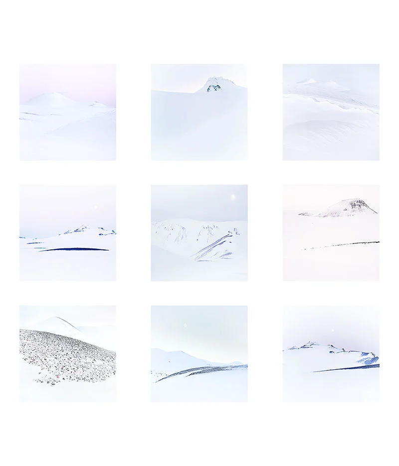
One final note today: I felt there was a danger that everyone would think that these images had no colour in them, that they are just black and white. I've found that some of us are very aware of colour casts and can spot when white snow is really blue-white, or magenta-white, or grey-white. I've chosen to show you the work here now with a white background, as I think it allows you to notice the colours in the pictures more. You should perhaps ask yourself what colour is the snow in each of these images, or in particular, what tint does the whites in each picture have?
