Inspiration from Printing one's own work

I've just finished printing and mounting one of my prints for an order I received a few weeks ago. Here is the very picture - an 8" x 8" print of Cono de Arita in the Puna de Atacama of Argentina.

Cono de Arita, Puna de Atacama, print, framed.

Cono de Arita, Puna de Atacama, print, framed.

When preparing images for framing, you should always use acid free materials. To not do so, would render the print prone to future damage. As time goes on,  the acids in the gum or tape leak onto the back of the print and can cause discolouration.

Here in the UK, I get all my supplies from Silverprint.co.uk.

Once you have a mount with an aperture cut into it, you should also have an accompanying backing board. Both should be made of museum grade acid free materials.

The next stage is to create a hinge so that the front board hinges to the back board at the very top. I use Lineco gummed linen hinging tape, which is acid free and extremely strong. You can get it here.

Once I have both front aperture board and backing board hinged, I then need to attach the print to the backing board. First I position the print on the backing board and move it around until it's centred in the front aperture window of the front mount board. Once I have that. Then, I attach two strips of acid free paper tape to the print in vertical orientation with the gum side up and attached to the back of the print. The vertical strips are going to form the vertical part of a 'T' shape with two horizontal strips attached to the top of each vertical strip. The reason for creating a 'T' shape is to allow the print to expand and contract with temperature changes and still be completely flat on the backing board. If you just attach the print to the backing board with one horizontal strip, you will find that the print will contract and expand at a different rate to the backing board as temperatures change in the room and the print will never be entirely flat as a result.

Image © www.reframingphotography.com

Image © www.reframingphotography.com

For the inscription on the front of the print, it's best to use a pigment ink liner pen, or pencil. Either of these will not fade, whereas a standard ink pen will easily begin to fade after just a few years being subjected to daylight.

And that's it.

It's been a while since I prepared a print for a customer. Truth is: very few people actually buy prints and I think that even fewer photographers buy anyone else's work at all  (but perhaps that's a subject for another post sometime in the future).  

I've always thought that the ultimate journey with my photography has been to have the images in print form. Making this print has been enormously satisfying for me. It has allowed me to reconsider setting up an exhibition.  I'm currently working on a 3rd hard-back book to be released sometime either next year or in 2018..... some projects are never finished and I'm finding that the Atacama regions of Chile, Bolivia and Argentina seem to be an exhaustive area for me to make photographs in.

Maybe when I get round to releasing the 3rd book, I can coincide it with an exhibition of my work over the past few years. Who knows, but one thing is for sure - printing my own images is a hugely rewarding exercise and it has given me inspiration to think about a possible exhibition sometime in the future.

For more information about mounting, this is a good page to visit: http://www.reframingphotography.com/content/mounting-matting-and-framing

Small adjustments go a long way

For me, improving my photography is really all about improving my visual awareness. 

The original image unaltered.

The original image unaltered.

So in today's post, I thought it would be good to try and discuss how the tiny details can often make a huge improvement to the overall composition. The way I'm going to do this, is by cloning a tiny part of the above image out. Now before I continue, I wish to make it very clear that this post is not about 'here's how to clean up your images using cloning'. Instead, the point I wish to make is that by 'noticing small distractions at the time of capture you can strengthen your compositions'. The most effective way to illustrate how the above image may have been improved is by using cloning. But it's not a tool I would encourage you to use, except for maybe seeing where things could have been more tidy.

A side note: I would suggest that if you are using cloning to clean up your images a lot, then it might be an idea to ask yourself why you aren't seeing the problems in the first place. Failures are really an opportunity to see areas of our photography that require further improvement. If your visual awareness isn't good, then it will show in the tiny distractions you will see in your final images and if you spend time fixing the issue at source, you'll find you won't have to continually cover up the cracks later on. This is feel is at the core of our photography skill - being able to notice distractions (even small ones) at the point of capture, because they can help us strengthen our compositions by a large margin.

With this in mind, I'm going to show how much stronger the image would have been if certain distractions had not been present. I'm going to do this by cloning an area of the scene out. I use this technique in my workshops as a way to help improve participants visualisation technique - so they can understand that if these small distractions in the frame hadn't been present - the image may have been much stronger. Again, I'm not saying 'here's how to clean up your images using cloning'. Instead, I'm really saying 'let's look at how the image may have been stronger if we'd taken care of some of the distractions'.

Below is the altered image. I've chosen not to tell you what I've changed, because I think it would be really useful for you to look and try to find it. Suffice to say that if you do notice it, ask yourself why I maybe chose to remove that particular area and also ask yourself 'which photo feels the calmest?'. My belief is that when something is wrong or jarring in a photograph, we tend to feel it. And feeling things in your photography is key. Your gut should lead you in the right direction not only with how you choose to balance a composition whilst out in the field, but also in your choice of edits. Photography is an emotional art.

In this version, I've removed something from the image to 'simplify' the composition and hopefully make it stronger.

In this version, I've removed something from the image to 'simplify' the composition and hopefully make it stronger.

Personally I feel this edit is simpler, more elegant and I think the message is clearer. But you may be asking 'that's all fine Bruce, but how could I have removed the part of the scene while I was there, rather than use a cloning tool later on?'. My answer would be that you have to weigh up the errors you see at the time of capture and whether you can do anything to remove them whilst there. Perhaps if I'd repositioned the camera, the distraction may have been hidden by other branches? I do remember thinking there was no way around it - whatever I did - the distraction was still there. So I feel a sense of pragmatism was employed: I asked myself - can I live with it? Or does it kill the image?. In the case of this photograph, I felt I could still live with the distraction and you'll even see that if you go into the respective image gallery on this very website, the unaltered version is there. Because I felt that there was more working in this image than not.

So in general, here is my thought processes about distractions:

1) Can I reposition to remove it? And will it upset the balance of the composition if I do?

2) If I can't reposition without upsetting the balance of the composition, can I leave it in without it killing the image?

3) If the distraction is going to kill the image, then I would prefer to walk away and find something else to work with. Otherwise, I'm happy to leave it in.

4) Don't over-edit your work. It's fine to leave tiny errors in the picture if you feel the entire image still works. You can over-do cleaning things up so it's always a balancing game. Too much editing will leave the image looking very contrived. Too little and the image isn't fully realised.

So how does anyone go about improving their visual awareness? 

One way I would suggest, is to look at your work on your computer and ask what might have been improved if it wasn't present in the photograph. You can even go as far as cloning distractions out to see if the image would have been improved - but just to see if any improvement would have been made only - I'm not advocating you start to clone things out all over the place - that's not the point of the exercise - you're just doing it to exercise your visual muscle.

The simple act of imagining how an image may have been with something removed is a great visual technique to exercise regularly. If you do this while editing your work, it will become second nature while out in the field.

Visual awareness is all about asking yourself questions - by having a sense of inquisitiveness - at all times about what you're doing.  Rather than accepting a photograph doesn't work and discarding it, you can learn a lot about what went wrong by looking at the errors and asking yourself 'why doesn't this work?, what would have happened if I'd managed to get rid of the error?'.

I think that good imagery comes from going that extra 5%. if you can improve a good image by that 5%, it can be transformed into a very fine image indeed. It's up to you to notice and work with distractions whilst you are out in the field and that will only happen once you start to ask yourself questions all the time.


Making Things more difficult than need be?

I remember Daniel Lanois, the Canadian record producer and artist was once asked 'how do you record a good guitar sound'? to which he replied, 'first find a guitar that sounds good'.

As I've progressed with my own compositions, I've noticed that I tend to be very selective about the places I shoot. I don't choose them because of how famous they are, but instead, I choose them because of how simple they are, and how little work they require make an effective composition.

So in today's post, I thought I would show you an example of that.

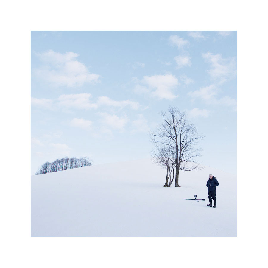
Myself in the landscape, Hokkaido, December 2015

Myself in the landscape, Hokkaido, December 2015

Last December I spent a week on the Japanese island of Hokkaido. The above image is included in this post to illustrate that the location I shot, was pretty simple to start with. This is my 'selectivity' at play - I choose certain locations because I know there will be little resistance or errors in the landscape that I will have to wrestle with later on. Like Daniel Lanois' statement about finding a good guitar sound to record, I too believe that finding a location where there is little in the way to correct is much better, than trying to make a difficult location work better once I'm behind my computer editing.

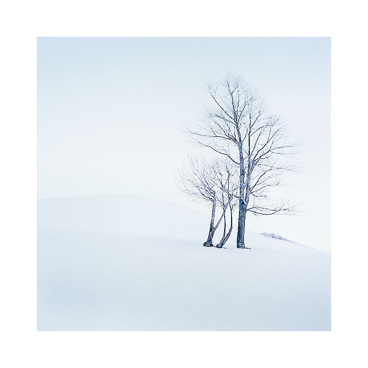
Below is the final image I made of this location:

Despite the simplicity of the location, I still felt there were many many options available to me at the time of capture.

Where one might feel that all I had to work with was a group of trees and a snowy hill, I felt I had to be very careful with the placement of all the objects in the frame. Despite this location being quite easy to make a decent image of, I think the real skill in photography is to try to improve upon 'decent' and look for that extra special something that will hopefully transform my images from 'decent' to 'great'.

For instance, I was aware of the background hedges that I had to try and reduce in the composition. I felt that including the hedgerow at the back of the image (that is clearly seen in the first image in this post) would have been too distracting to the main subject (the trees in the foreground). 

I also had to make sure that the foreground tree's branches didn't collide with the hillside (as subtle as the hillside is - If the branches had touched it - I think the image would have been reduced back down to 'decen't rather than something hopefully better than that). You can see in the first image to this post that my tripod is lying completely flat on the ground - that's because I realised I had to get the camera down low to avoid the branches touching the edge of the hillside.

My definition of a great location, is somewhere that I don't have to wrestle with the subject matter too much to make things work. I've been to many beautiful places that don't work as a photograph and I've learned that 'great scenery does not equal great photography'. In many beautiful places I may find distractions that I can't avoid. For example, If I had found that no matter where I placed my tripod, the branches always touched the edge of the hill side, I would have made a decision at the point of capture as to whether this would kill the image or not.

So ultimately, what I'm really saying is that with a location where everything is simple, you shouldn't have to work so hard to make it 'click'.

Keeping things simple is the best advice I've ever had. It applies to how I make all my decisions in life, and it should also be applied to your choice of location that you are hoping to photograph.

Of course, the real skill is to see distractions in the landscape and to know whether they can be lived with or have to be removed. That only comes with time and us working on our own awareness skills.

Landscape photography I feel, is often the art of subtraction. Of being able to isolate one tiny part of the landscape and make a strong photograph from it. But this can be achieved much more easily, if we work with very simple locations to begin with, and not the other way round, as is often the case for many of us.

Scots for wet weather

I'm in Reyjkavik tonight, ready to do some scouting tomorrow for the next few days. It's very wet here, and so I thought I'd teach you all a bit of Scottish.

In Scotland, when the weather is very wet, we often say it's driech (phonetic: dreech), or sometimes we may say it's drookit. I looked them up and they are actually in the English Dictionary. It turns out that both derive from old Norse. So I'm going to ask my Icelandic guide tomorrow if he knows how Driech it is, or how Drookit it's been, because Icelandic is pretty much old Norse. I'll get back to you on that.

Dreich |driːx|
adjectiveScottish
(especially of weather) dreary; bleak: a cold, dreich early April day.
ORIGIN Middle English (in the sense ‘patient, long-suffering’): of Germanic origin, corresponding to Old Norse drjúgr ‘enduring, lasting’.

Drookit |ˈdrʊkɪt| (also droukit)
adjectiveScottish
extremely wet; drenched.
ORIGIN early 16th cent.: origin uncertain; cf. Old Norse drukna ‘to be drowned’.

Watching and waiting and watching some more

When you're making photos out in the landscape, do you stop for a moment, and watch? In particular, do you pay particular attention to the speed of moving clouds? I do.

Sometimes participants on workshops ask me 'how long should I make the exposure for?' when they want to get blur in their photos. I think the answer can be found without asking me. You just need to look at the clouds and watch them as they drift across the sky, and while you're doing that, count the seconds it takes for them to move. It's really as simple as that. Only a lot of us aren't looking. We're not watching. We just fire the camera and wait to see what pops up on the screen.

But I love to anticipate. To study. To get to know the movement of clouds, waves, even the vibration of the trees due to a light wind. I'm a studier of movement in the landscape.

Particularly where long exposures are concerned. If it's a windy day, then I'm all excited as I know 20 or 30 seconds is an eternity and I'll get long streaks like the ones you see in my Harris photo above. If it's a calm day, then I know there's almost little to no movement and most probably - no point in using a long exposure.

But I still stand and watch, and wait, and watch some more. Just to make sure.

Finding your own path, and following it

We all have our own path. But I think it takes us a long time to find it. If we are ever lucky enough to do so. 

I don't tend to look at a photography sites as my sole source of inspiration. Instead, I get my inspiration from all around me - music, books, art, life experiences, things that happen to me, life.

I think that we are basically sponges. We soak up our experiences and they all combine to make us who we are.

Tonight I’m listening to someone I’ve been a huge fan of for the past twenty years. Laurie Anderson may not be to everyone’s taste, and that in itself I think, says something. Her music has often allowed me to think outside the box. To embrace the idea that there should be no boundaries, and that being an individual is a good thing. No, it’s a great thing.

My musical tastes are quite broad, and I think that all of the artists I love, give me something and have also taught me a thing or two about being creative. Each artist I love is good at what they do, because they have found their own voice. They are leaders, not followers.

To be you, you have to find yourself in all the noise out there. That can be hard because I think we're never too sure where we end and where external trends or forces begin. To be true to who you are requires you to ignore what everyone else is doing. We're not into creating work for the sake of following what everyone else is doing, but in order to follow who we are.

Being creative is about being yourself.

And this requires us to be comfortable to fail. Failure is good, because in order to experiment and find your own voice, we have to try things out that we don't know if they will work or not. If we went with what we did know works, then we're just following what the majority are doing. Having no fear to experiment is a vital attribute to have, if you are to progress at what you do.

When I listen to unique or distinctive musical artists out there, I don’t hear a need to conform or go with what is 'in'. They are following themselves. That’s why I love artists like Laurie Anderson. She has been labeled 'alternative', but this  just means that she’s following her own path. And that’s what we should all be doing.

Do you filter down (reduce), or build up (introduce) objects into your compositions?

I'm always intrigued by the journey from the moment I step out with my camera and come up with the final image. It's a filtering down process for many, but for me it's the opposite way around. Let me explain.

Many workshop participants tell me that when they are confronted with some new location, they find it hard to filter it down to one or two main subjects. I remember one participant telling me that they 'start with everything and have to reduce it down to one or two things over a matter of an hour or so'. Certainly, I'm aware that for some - being confronted with some new scenery can make things very hard to distill into a coherent composition. Everything is vying for your attention and it can be hard to give some elements priority over others.

In the main image to this post today, I show you the final image from a shoot in Hokkaido last December. For me, I tend to be drawn to a subject instantly. It's the opposite of the 'filtering down' approach that some of my participants describe. For me, what tends to happen is I see one thing in the distance and I'm so attracted to it, that everything else around it disappears. Let's zoom out from the image above and have a look at the surrounding landscape near it in the image below:

This is exactly what I saw from the side window of my guide's car and I felt compelled enough to ask him to stop so I could go and make a photo of the tree. In fact - if you look closer - you'll see i'm in the shot - making my way across a river bed…

This is exactly what I saw from the side window of my guide's car and I felt compelled enough to ask him to stop so I could go and make a photo of the tree. In fact - if you look closer - you'll see i'm in the shot - making my way across a river bed that was covered in snow, to get to the tree. 

Can you spot the tree I photographed? 

I like to think that if something is worth photographing - is strong enough as a compositional subject -  it will tend to catch my eye. Like window shopping, I often find something jumps out at me. I think this is a combination of visual awareness and visualisation at play. The awareness to spot something and the visualisation to imagine how it could be with other items removed or reduced in the composition.

I often find I start with one object, and introduce others. In the instance of the main image in this blog, I did exactly that - despite all the clutter and confusion of other trees at the roadside, I could 'see' the lone tree sitting on its own, and I knew there was potential. I also understood that I would have very little else in the frame to draw attention away from it once I got closer. I saw all this from the passenger seat of my guide's car and I believe I utilised my visualisation skills in order to 'see' it.

Once I was closer to the tree, I started to think about the surrounding landscape and which elements, if any, I could introduce into the scene. I've introduced the sun into the frame, as this was more a fortuitous event rather than something I'd noticed in advance. I made several shots - some without the sun and some with, because I can never tell at the time whether I'm overcomplicating something, so I like to make insurance shots for later on. I'm convinced I can only do good editing while at home behind my computer, not while on location. But the key point I'm trying to make is that I started with the tree and slowly started to introduce the surrounding landscape into the scene.  

So which way do you tend to visualise your compositions? Are you a 'start with everything and filter it down to a few objects', or do you start with one thing that grabs your interest, and slowly introduce other objects into the frame?

The undefined line

Sometimes, what we're really attracted to in a picture, is not the form or the subject, but the contrast between where the subject begins and where it ends.

Kitami , Tanno, Hokkaido, Image © Bruce Percy 2015

Kitami , Tanno, Hokkaido, Image © Bruce Percy 2015

I think that's why I love images where the main subject in the frame isn't so clear. My mind has to 'fill in the gaps'.

These Hokkaido images were made with this in mind. But the editing had to be done carefully. Just like writing a story, I needed to decide on the correct amount of detail to provide. If I had given too much away, the viewer's interest may wane, and if I hadn't give enough away, the viewer may have been confused and lost. 

Kitami , Tanno, Hokkaido, Image © Bruce Percy 2015

Kitami , Tanno, Hokkaido, Image © Bruce Percy 2015

It was interesting for me to shoot these images. I was confronted with absolutely nothing (and I mean nothing). I felt like I might get snow-blindness because I could not discern the sky from the ground and I found that my mind wanted to fill in the emptiness with something.

Just the hint of a tree, and my eye's seemed to latch onto it, like I was clutching at a lifebuoy ring.

Our visual system 'constructs what we see'. This is why we see faces in the shapes of rocks for instance. So when I was working in these empty places, I couldn't help but find my mind was going into over-drive, trying to imagine more than what was there. If you've ever been driving in a white out, you''ll have experienced your mind imagining obstacles that come out of the snow in front of your path.

So with these edits, I wanted to ask the viewer to work a little harder. The first image requires more work than the last one does. I love playing around with different strengths of contrast, not only while I'm editing work, but also at the time of capture. I was well aware that sometimes the trees would come and go, surface and sink behind a veil of snow.

You see, not everything is so clear cut - in art as it is in life, and why should it be? Through concealing elements within the frame, we invite the viewers minds to imagine what may be there - to fill in the gaps, and that's no bad thing at all :-)

Four views of Lake Kussharo

I visited lake Kussharo in Hokkaido, Japan one day last December, on what was a murky grey day. I love overcast days and days when the to most non-photographers the weather would be considered 'bad'.

On the horizon I could see the snow-covered hills that surround Kussharo veiled in mist and low-pressure clouds. The lake itself had taken on a milky greyness to it (light reflected from the grey sky) which I felt complimented the black volcanic beach.

I saw many similarities with this location, weather wise and also subject wise, with Patagonia's Torres del Paine national park. Both possess a stark beauty which only becomes apparent to us photographers once we embrace muted colours and tones. I see a beauty in landscapes when they appear to most as bleak - I hope you do too.

But Kussharo had much to offer with overhanging trees leaning towards the water, and I spent much time roaming up and down its edge looking for suitable trees that had separation from their neighbours like the image below.

I spent quite a bit of time on this tree, positioning the far-off hill between the branches, and ensuring that the branches themselves didn't protrude out of the confines of my frame. I think I have two or three rolls of images (30) shot at this very spot where I experimented with my tripod height until I felt I'd fully explored the compositional possibilities here.

And sometimes removing lake edge trees seemed to be the way to go. I like to try to get as many different interpretations of a place that I can. I think it's easy to get lost in searching for great foreground subjects all the time, when there may be an image there that doesn't require one. 

And just before we left, I noticed some coastal decorations in the water. Hokkaido and indeed Japan, seems to have many coastal defences around its periphery - I'm not sure if they intended for Tsunami defence, or just coastal erosion, but it was interesting to note that a small 'coastal defence' had been put here at the edge of Lake Kussharo.

The weather was rather murky and wet, and my guide had a lot of work with the last image helping me shield the lens of my camera because it was pointing straight into the wind (and rain). But I feel I made a collection of images that have a certain character and feel to them on a day I feel that many people would prefer to stay in-doors.

I often feel that the difference between the impression we get from a photograph and how it felt to be at a location are often quite different. So many times I could be overwhelmed by the bad weather and choose not to go out, only to miss great potential. If I get soft light and a good composition, I don't sit at home going 'yuck - really horrible weather'. Instead I'm often pulled in by the tonal shifts that happen through a picture where soft light played around.

I'm not a fair-weather photographer, because that would be extremely limiting to what I photograph. I made (in my view) four really nice images on a day that many wouldn't consider ideal and I did it not just because of the soft tones present, but because I felt there was atmosphere and mood present, and also, because experience has taught me that these kinds of days are beautiful in their own way.

Veiled landscapes

When I researched my trip to Hokkaido, I had wanted to include the famous 'blue pond'. Many of you will know it from one of the desktop images that is available on the Apple Mac OS.

The blue pond, Hokkaido, Japan December 2015Image © Bruce Percy

The blue pond, Hokkaido, Japan December 2015
Image © Bruce Percy

I'd been told by my guide, that this pond is frozen over from November until late April and there is often a lot of snow covering the surface. So the chances of seeing any colour would be minimal.

The winters here are extremely cold. I mean really, really cold - Siberia cold. So I turned up in mid December expecting to use snow shoes and wearing all my clothes and underwear at the same time ;-) Only, I think the weather was really messed up due to El Niño. I found Hokkaido practically balmy with temperatures above freezing.

One positive aspect to this change in the usual December climate was that the landscape was covered in a mist, which I think was brought on by the warm air mixing with the cold snow covered landscape.

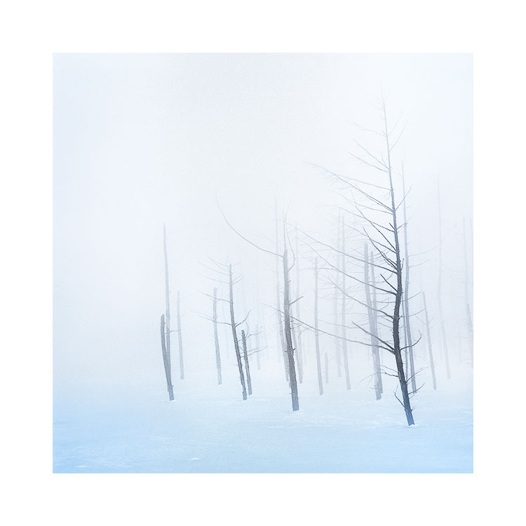
So when I met my guide on the very first day of the trip, I asked him if the blue pond would be visible. What I didn't understand until after I'd seen it shrouded in fog, was that this is a very unusual situation to have. In fact, I think my guide told me that he had never seen the blue pond like this before.

The Blue Pond, Hokkaido, Japan, 2015Image © Bruce Percy

The Blue Pond, Hokkaido, Japan, 2015
Image © Bruce Percy

It's often hard to judge your feelings on visiting a place for the first time. When I think about some of the places I go to each year as a repeating schedule of my workshop itinerary, sometimes I see a landscape in very unusual conditions and despite telling my participants how unusual it is, I think we all come away from our first experiences with an assumption that this is how it always is.

Certainly for me, I loved the blue pond so much that l asked my guide if we could stay nearby so I could try to photograph it again in the morning. What I discovered the next day though, was that not only had the fog dissipated over night, but so too had any atmosphere to the place. I made zero photographs this day as a result.

I love fog. It can reduce backgrounds to nothingness, and can give a sense of depth to 3D objects when converted into 2D

Fog also adds mystery. We enjoy not knowing the full story and I'm convinced that our minds enjoy filling in the gaps - what we can't see - we imagine.