I remember Daniel Lanois, the Canadian record producer and artist was once asked 'how do you record a good guitar sound'? to which he replied, 'first find a guitar that sounds good'.
As I've progressed with my own compositions, I've noticed that I tend to be very selective about the places I shoot. I don't choose them because of how famous they are, but instead, I choose them because of how simple they are, and how little work they require make an effective composition.
So in today's post, I thought I would show you an example of that.
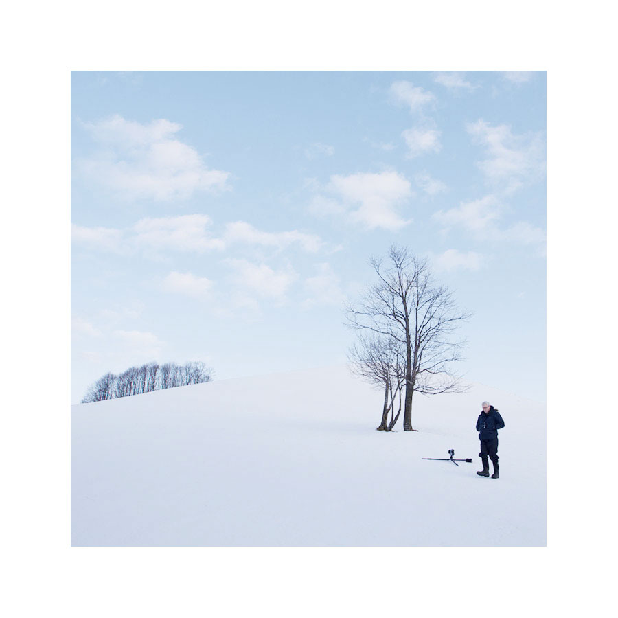
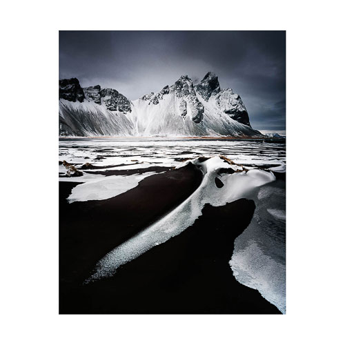
Myself in the landscape, Hokkaido, December 2015
Last December I spent a week on the Japanese island of Hokkaido. The above image is included in this post to illustrate that the location I shot, was pretty simple to start with. This is my 'selectivity' at play - I choose certain locations because I know there will be little resistance or errors in the landscape that I will have to wrestle with later on. Like Daniel Lanois' statement about finding a good guitar sound to record, I too believe that finding a location where there is little in the way to correct is much better, than trying to make a difficult location work better once I'm behind my computer editing.
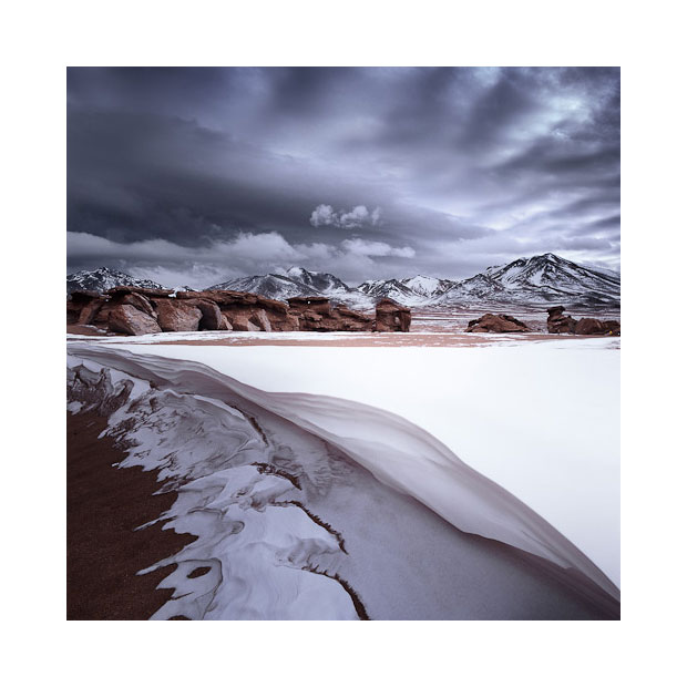
Below is the final image I made of this location:
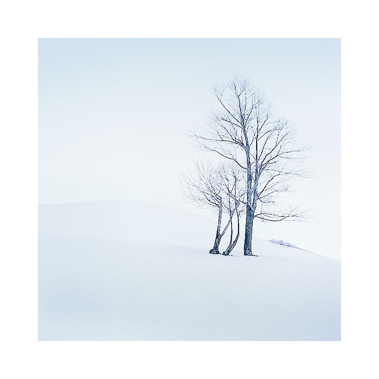
Despite the simplicity of the location, I still felt there were many many options available to me at the time of capture.
Where one might feel that all I had to work with was a group of trees and a snowy hill, I felt I had to be very careful with the placement of all the objects in the frame. Despite this location being quite easy to make a decent image of, I think the real skill in photography is to try to improve upon 'decent' and look for that extra special something that will hopefully transform my images from 'decent' to 'great'.
For instance, I was aware of the background hedges that I had to try and reduce in the composition. I felt that including the hedgerow at the back of the image (that is clearly seen in the first image in this post) would have been too distracting to the main subject (the trees in the foreground).
I also had to make sure that the foreground tree's branches didn't collide with the hillside (as subtle as the hillside is - If the branches had touched it - I think the image would have been reduced back down to 'decen't rather than something hopefully better than that). You can see in the first image to this post that my tripod is lying completely flat on the ground - that's because I realised I had to get the camera down low to avoid the branches touching the edge of the hillside.
My definition of a great location, is somewhere that I don't have to wrestle with the subject matter too much to make things work. I've been to many beautiful places that don't work as a photograph and I've learned that 'great scenery does not equal great photography'. In many beautiful places I may find distractions that I can't avoid. For example, If I had found that no matter where I placed my tripod, the branches always touched the edge of the hill side, I would have made a decision at the point of capture as to whether this would kill the image or not.
So ultimately, what I'm really saying is that with a location where everything is simple, you shouldn't have to work so hard to make it 'click'.
Keeping things simple is the best advice I've ever had. It applies to how I make all my decisions in life, and it should also be applied to your choice of location that you are hoping to photograph.
Of course, the real skill is to see distractions in the landscape and to know whether they can be lived with or have to be removed. That only comes with time and us working on our own awareness skills.
Landscape photography I feel, is often the art of subtraction. Of being able to isolate one tiny part of the landscape and make a strong photograph from it. But this can be achieved much more easily, if we work with very simple locations to begin with, and not the other way round, as is often the case for many of us.


 It's been a few years now since it was published, and I've run many workshops during that time. I've discovered along the way, that each workshop I conduct has provided me with some new level of awareness about composition or my approach to photography in general.