This week I was interviewed by the UK photographic magazine 'Black & White Photography'. It was interesting to find out that they were particularly interested in my isle of Harris photos below.
During my chat with Mark Bentley, we got on to the subject of style and that of finding your own voice.

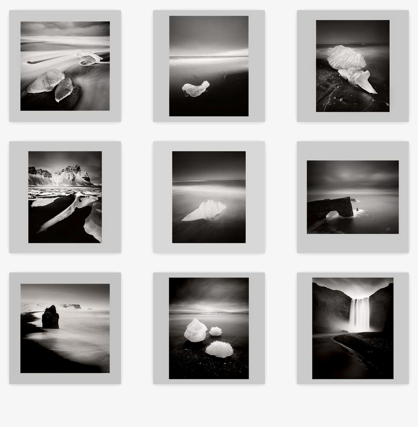
Isle of Harris images as requested by the Uk magazine 'Black & White Photography'. I'm always surprised by the choices others make when choosing which images of mine to use for publication.
I've learned that I can't guess how some of my images will be received, and I never hear the same things about them. This has taught me that I just need to listen and trust my own intuition first and foremost. I can't anticipate what others will like or dislike about my work, and the only person I need to satisfy is myself.
I've worked with many participants through the years on my workshops here in Scotland. The subject of finding a style is never far away from our daily critique sessions, so it's only natural that I should have formed some views on this.
To my mind, a voice is a unique thing. to be recognised, you need to stand out from everyone else in some way. So I think the main characteristic of those who create very personal work is that they have a deep trust in themselves to be independent and do their own thing.
Anyone who does something unique does so, because they do not to pander to trends or others opinions. Take it from me: I hear opinions about my work from others all the time and there is so much variety in what others tell me, that I've come to the conclusion that if I tried to follow it - I'd get lost pretty quickly. Instead, what I choose to do (note that I'm the one choosing what to do here) - is listen to the stuff that makes sense or enlightens me in some way. The rest - the stuff that I feel doesn't make sense or can't see any value in, I just take as someone else's opinion. Interestingly, I find that most of the time, others opinions usually tell me more about them, than me.
No one else can live my life or make my creative decisions for me. The only person who knows where I want to go with my photography is ultimately me. I can glean some advice from others but in general, the impetus to do anything in my work has to come from within.
So here are my thoughts on finding your own voice.
- Your own voice, is something you find when you go it alone.
- Your own voice, is something that only you can find.
- Your own voice, is something that comes through a process of self enquiry.
- Your own voice, is something that becomes apparent over time.
- Your own voice, is something that comes to you when you listen and observe the changes within you.
- Your own voice, can't be found by being part of the derivative. Follow others and you quickly get lost in a sea of ubiquity.
- Your own voice, is something that happens when you are free of current trends.
- Your own voice, is something that comes when you don't try to please others.
- Your own voice, is something that comes when you are free of expectations.
- Your own voice, is something that comes when you are free of ego.
- Your own voice, is something that comes when you know yourself (i.e your capabilities and limitations).
- Your own voice, comes when you stop copying your influences. Embrace your influences and use them as the basis for where you start, but don't get tied to them.
- Your own voice, comes when you do your art for you and you alone.
In a nutshell, you need to have the courage to follow your own path, and above all, believe in yourself.