.... not the other way round.
Have you ever thought that some of your best images came from places that you didn't particularly feel an affinity with to start with? And some places just don't work when you finally get there? Some places, for some reason just seem to work when you had no expectation of finding something there to begin with?
Looking back, I never intended to go to Bolivia, and I never even considered it would have much to offer. But I went anyway, and I found that the landscape spoke to me.

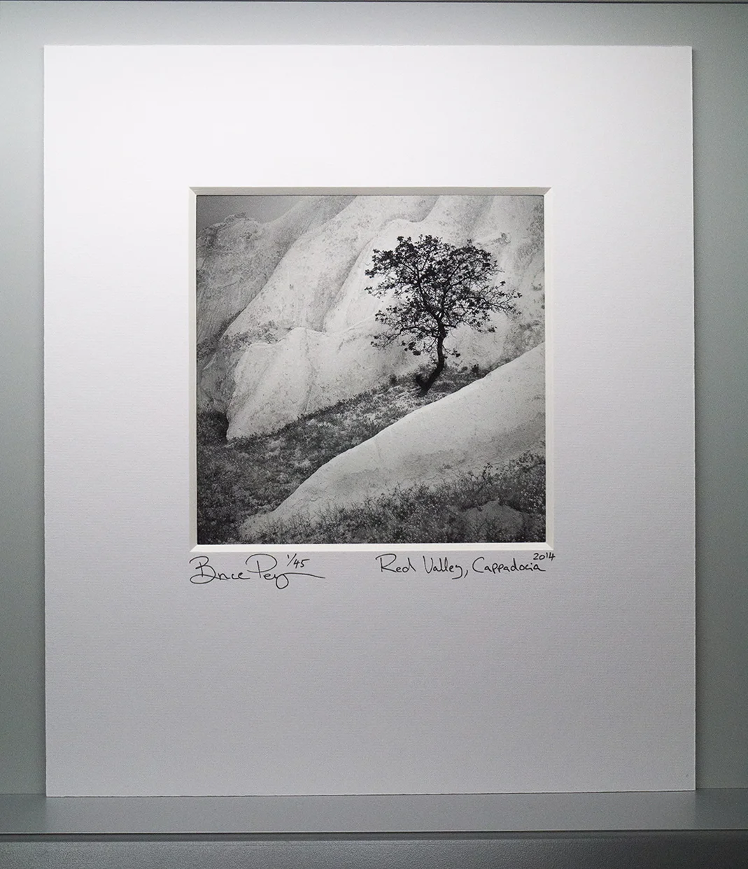
Siloli Desert, Bolivian Altiplano, June 2013.
It would be easy for me to think that the reason I've felt at home in this landscape, is because it suits my photographic style. But maybe it's the other way around, maybe it's responsible for it.
I think some landscapes dictate a photographic style - one that resonates with you. They tell you how they should be photographed and as a result, direct your photographic style.
I think some landscapes are like that; they offer us clues, suggestions, hints at what we may become and it's up to us to run with what we're given.
I think Bolivia chose me, rather than I chose it.
It has been a six year love affair. A place where I know I have learned so much about working with negative space. It has also offered up different colour palettes that I've integrated into my style of what I am seeking in a landscape.
Just recently, while I was in my dentists office, I read an article in a Travel magazine about another part of the Altiplano, that I'd never heard of. I turned a page and the images spoke to me. It also felt oddly familiar and I knew I had to find out where it was. I had no idea at the time that I was reading about a related landscape to the Bolivian altiplano, that is situated in Argentina, just across the border from where I've been spending my time.
I now have plans scheduled for next July to go.
I didn't go looking for this new landscape, it just seemed to find me and I feel I've been invited.
Is there a landscape you feel has chosen you?