My good friend and client Stacey Williams made this shot on our Eigg workshop last week. I think it's highly atmospheric, effectively simple in composition and tonally very finely balanced. It tells me all I need to know without trying to spell it out either: there are no loud colours or over the top contrasts here, just an inner confidence to show you the beauty of one of Scotland's most photogenic beaches.
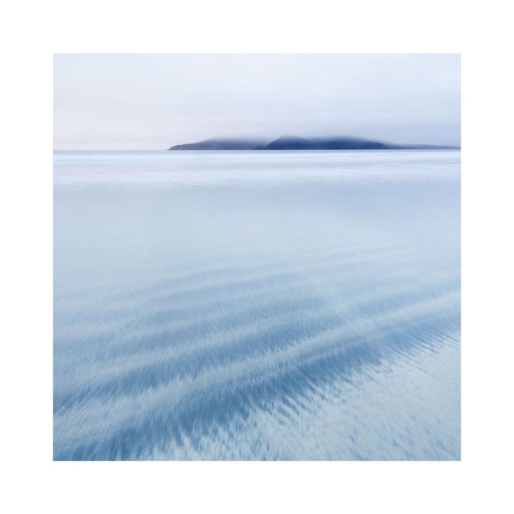
Bay of Laig, Isle of Eigg, Scotland.
Image © Stacey Williams 2016, post-edit Bruce Percy
And yet, to pull of a very simple composition like this is not easy for many of us. We struggle with the reduction that's required to distill a scene into one simple message.
I have a theory why this is.
For a long while, I've realised that when most of us start off making pictures, we tend to over complicate them. The final image often has a lot going on and within this complexity is the added dimension of tonal / colour conflicts. Photography is one of the few past-times where we start complex and spend a life-time aiming to make our photographs more effective by simplifying what we put into the frame (or perhaps more importantly, what we choose to leave out).
The reason why we start with overly-complex pictures is because we haven't learned to truly 'see'. Photography is a life-long discipline on being able to really see what is before us and translate that into an effective photograph and if we aren't really aware of tonal conflicts, or distracting objects in the frame, we will tend to leave them in. This is why we can often find our final image doesn't look the way we thought it would. We tend to 'see' differently at the time of capture than the way we 'see' when we look at an image on our computer screen later on.
I've been asking myself for a long while: why this is so? And the only thing I can come up with, is that we tend to look at scenery differently than we do when we look at images. The art behind many successful images is to be able to see the photograph within the scenery while we are on location. Many of us don't do this because we are overwhelmed by the elements of being there, and we still can't abstract a 3D location down into a 2D image.
But composition isn't just about where to place objects within the frame, and choosing what to leave outside of the frame. It is also about understanding the relationships between colours and tones within the scene. In fact, both are interrelated.
Again, if you aren't able to truly 'see' the relationship between colours and tones within the frame, then the final image may be fraught with overcomplexity. 'I never saw that red telephone box in the corner of the frame', or 'the stone in the foreground is really dark and I can't recover it in post, I wish I'd noticed how dark it was at the time of capture'. This is a typical response because at the time of capture we were too busy thinking about stones rather than the tone or dynamic range of them and whether they would render enough detail in the final picture.
Visual awareness of what is really in front of us, is really at the heart of all of our photographic efforts. If we can't see the tonal distractions or see the conflicting colours at the time of capture, then it means a lot of massaging and coaxing in the edit phase, which isn't a great idea. In sound recording the idea of 'fixing it in the final mix' was always a bad approach and it's better to be aware of the problem at the time of capture and do something about it. If the colours are conflicting, then look for an alternative composition, if the stone is too black to render and will come out as a dark blob in your photo, then maybe go find a rock that is lighter in tone and will render much more easily.
Back to Stacey's picture. She chose a very empty part of the beach. She also chose some very simple foreground sand patterns that she knew were strong enough tonally, to attract interest. She also gave the background island a lot of space. The edit was very simple: we added a lot of contrast to the island to make it the dominant object in the frame, but we did it while doing almost nothing else to the picture because the picture was already working.
If you are struggling with composition, my advice would be to seek out simple empty places and work with one or two subjects within the frame. Add a rock into the picture and experiment with placing it at different areas. Also try rocks of different tonal responses. How would a jet-black rock look in this scene? Will it stand out from the background sand tones? How about a rock that is similar in tone to the beach? Will it stand out just as effectively?
The problem is, that what our eye thinks is pleasing, is often overly complex for our imagery. Good composition is not simply just the act of reducing down the subjects within the frame, but also of understanding which ones will work best tonally as well. Our eye loves more complex objects around us but they don't work when they are all crammed into one picture.
Good landscape composition is not something we master in a matter of weeks or months. It is a life-long journey in building up one's own visual awareness, of noticing what will work, and just as importantly what won't. If you're in it for the long haul, and you have a curious mind, then that's a very good start indeed.