When what is outside frame influences what is inside the frame

Preamble - this is a post that was originally published back in October 2020. I am finding much value in digging back through this blog.


This little area of Hokkaido is rather special to me. There are many rolling hills with bunches of copse together. When I am here, I am always striving to isolate groups of the copse with maybe a few single trees around them, but it’s so hard because there are often more complex, less attractive aspects of the landscape trying to creep into the shot.

‘To me, what you leave out of the frame is often just as important
or more important than what you choose to leave inside the frame’

As simple as this shot may appear, it took quite some effort to do, because I was constrained by a large forest just outside the bottom area of the frame. I found I had to go higher and higher up a hill to get enough clearance, and even then, in order to completely remove the unwanted forest, I had to settle on this composition:

Hokkaido-2018-(5).jpg

Due to the large forest (just outside the bottom part of the frame) being so close to the little trees, I couldn’t give the trees enough space below them. This forced me to push the two little trees towards the edge of the frame.

At the time of capture, I remember thinking ‘this is a little unusual’, as everything in the frame of interest is really bunched down at the bottom of the frame. Can I live with it?

‘I think all you can do is make the shot,
and leave the pondering for another time’
(we are best being editors when at home)

I think all you can do is make the shot, and leave the pondering for another time. And indeed, as I’ve lived with this image over the past two years I’ve grown to really enjoy it. To me, those little trees are so keen to be part of the copse. But they’re almost being pushed out of the scene.

So sometimes it’s ok to put subjects at the very edge of the frame. Sometimes it’s ok to create tension. I just think that it has to look like it was intentional. Otherwise most viewers will assume it’s a bad composition.

I would also like to add that by being restricted to composing this view because I was trying to avoid what is outside of the frame, I was forced to create a composition that is / was outside my normal habits or comfort zone.

Sometimes (if not all the time) restrictions and limitations are a good thing, and encourage an attitude towards innovation.

Evolution in Compositional values

I’ve been thinking lately, how I’m finding I’m becoming more attracted to compositions that may ask the viewer to look again. What might appear at first to be one thing, may turn out to be something else entirely.

For a very long while, I have been drawn to images that do not resolve. Foggy images or images where things become less and less easy to discern - such as the faint line between snow ground and a white sky have intrigued me. I love it for instance when I can remove that line between ground and sky so that trees in the Hokkaido landscape begin to float.

I think ‘composition’ can evolve. It might even follow a common journey such as this:

  1. things are all over the place

  2. removal of extraneous subjects to make the composition cleaner

  3. a further refinement on point 2, where tonal differences are considered just as importantly as subjects are.

This I think is fairly standard. But it is only really partially complete (if composiitonal technique is ever complete - as each new subject we meet, much like a new relationship is always a new puzzle to be worked out). I think that getting your compositions to a point where things feel clean, strong and simple can lead the images to become predictable, or perhaps even boring.

After many years of finding that I’ve been on a path to simplify (without really aiming for this - it just happened for me), I am finding now that these clean compositions are fine, but that I’m now looking for something that provides a bit of an unusual angle to them. I seem to be introducing things, or being attracted to compositions where things are deliberately unclear, or slightly confusing.

Take for instance the image in this post. The main reason why I shot it was that I liked how the light sand bars in the foreground intersect with the river in the midground. I was aware at the time that they would ‘join’ in the minds-eye once compressed down into a 2D image.

For me, every time I look at it, I have to work hard to get away from the mid ground river and foreground sand being one subject. My mind immediately joins them and the result is that they no longer are a river and dunes, but instead have evolved into becoming interesting graphical curves and lines.

This is part of what happens with visual construction. Let me illustrate this by the diagram below:

3 variations of the necker cube. Some are more easy to ‘construct’ in our vision than others.

All three wire-frame objects are cubes. Except that some are more easy to see as cubes than others. I would say the easiest to understand as a cube is the middle drawing. The left image is the 2nd easiest to see as a cube while the right image is the most difficult.

Our vision is a ‘construction’. We aren’t aware of it, because the process is innate. It happens without us knowing we are ‘constructing’ what we see. Using visual illusions such as the three cubes above allows us to see the ‘construction’ in construction :-)

For a moment while you stare at the left hand drawing you don’t ‘see’ the cube, but once you do, the entire drawing seems to morph in your mind’s eye.

This is the kind of optical confusion that I enjoy in some compositions. The image I shot in Lençóis Maranhenses last May does exactly the same thing. Upon first glance you see shapes and lines, and it is only after some understanding that you notice that the sand in the foreground is intersecting with the mid ground river. That what you are looking at is sand and water, not a graphical shape made up of curves and lines.

In a sense, most of my editing life, I would have tried to avoid this confusion, and would have worked to make these two areas of the picture separate. But I quite like marrying two areas of the frame together via tonal similarities if I feel the result may bring forth an image that is less conservative compositionally speaking.

I do think there is room in our imagery and compositions to introduce tension or deliberate confusion. But I think if these things happen during the early stages of us learning to compose we look at them as problems we have to eradicate. It is only after some time of working with compositions where things are clean, clear of intention, that one starts to wish to introduce some kind of tension back into the work.

When what is outside frame influences what is inside the frame

This little area of Hokkaido is rather special to me. There are many rolling hills with bunches of copse together. When I am here, I am always striving to isolate groups of the copse with maybe a few single trees around them, but it’s so hard because there are often more complex, less attractive aspects of the landscape trying to creep into the shot.

As simple as this shot may appear, it took quite some effort to do, because I was constrained by a large forest just outside the bottom area of the frame. I found I had to go higher and higher up a hill to get enough clearance, and even then, in order to completely remove the unwanted forest, I had to settle on this composition:

Hokkaido-2018-(5).jpg

Due to the large forest (just outside the bottom part of the frame) being so close to the little trees, I couldn’t give the trees enough space below them. This forced me to push the two little trees towards the edge of the frame.

At the time of capture, I remember thinking ‘this is a little unusual’, as everything in the frame of interest is really bunched down at the bottom of the frame. Can I live with it?’.

I think all you can do is make the shot, and leave the pondering for another time. And indeed, as I’ve lived with this image over the past two years I’ve grown to really enjoy it. To me, those little trees are so keen to be part of the copse. But they’re almost being pushed out of the scene.

So sometimes it’s ok to put subjects at the very edge of the frame. Sometimes it’s ok to create tension. I just think that it has to look like it was intentional. Otherwise most viewers will assume it’s a bad composition.

I don’t like to constantly look at my work and prefer to ‘let it go’ and move on to other things, but when I have some project to do (such as preparing images for inclusion in a book), then I feel this is the perfect invitation to return and review older work. I often find I feel quite differently about the images, and I must say that this particular image has grown on me over time.

Camera height

I am in Hokkaido this month and I’ve been reminiscing about some of the images I have made over the past few years here, and one in particular required me to be high above the ground to accomplish what I saw in my mind’s eye.

Hokkaido-(14).jpg

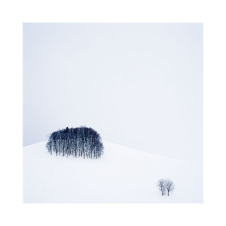
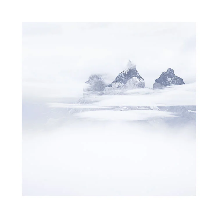
This photo was made by being perched up high. While at ground level, I could see that the collection of trees in the bottom of the frame were clashing / hitting the row of trees at the top of the frame. To get the separation between them in my photograph, I had to go this height:

image-asset-2.jpeg

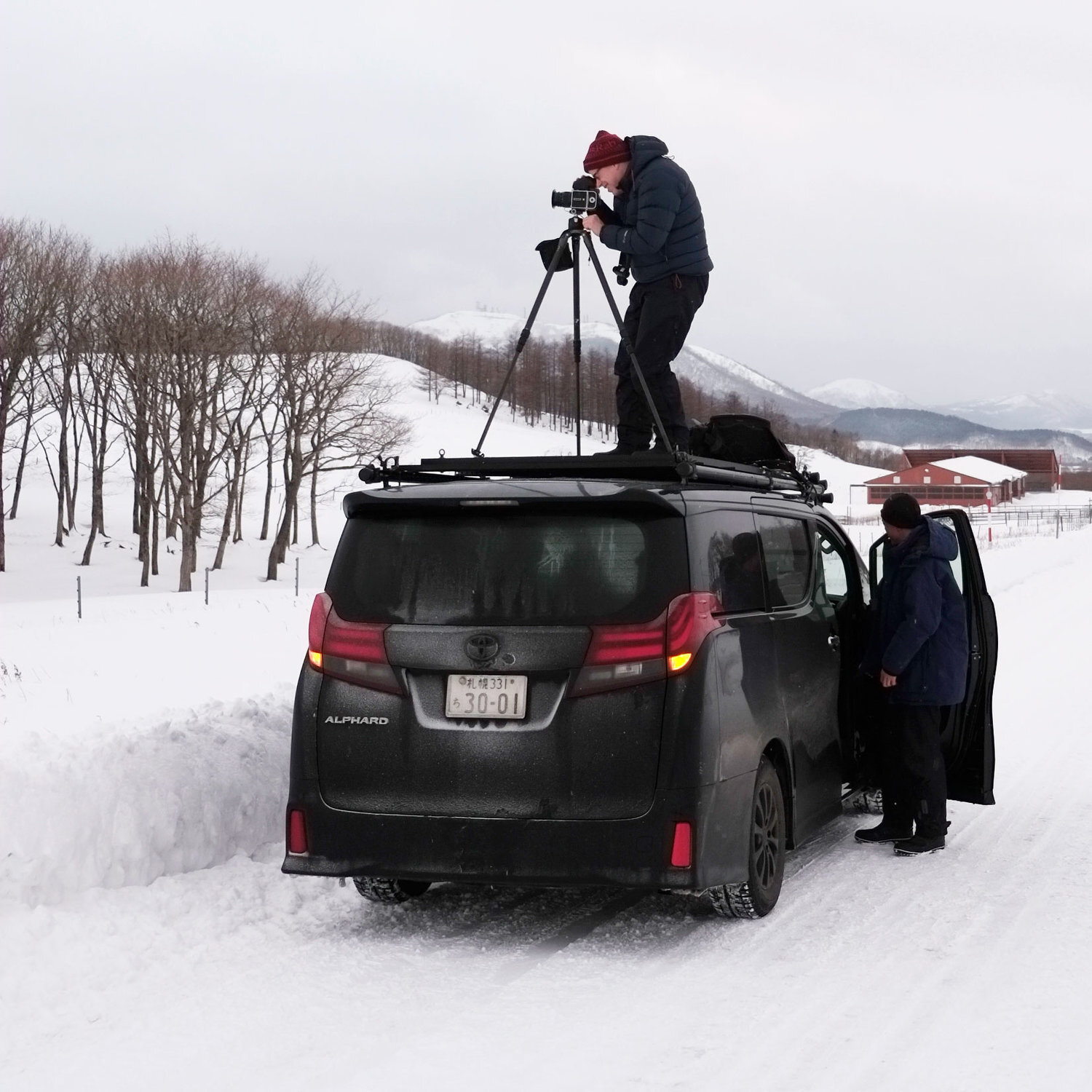
This is the actual photograph of me making the image you see in this post.

Camera height is often a critical part of composition. OK, my example to illustrate that is perhaps extreme, but I have had many times when I have wished to take photos from much higher than my tripod can reach to.

I have also had times when I have wished to take photos that are much lower than my tripod can compress down to. Going low allows me to compress the mid-ground, and it is also a useful device in removing any clutter or debris that is lying around on the ground. Going low also allows me to move objects that are on the ground closer to those objects higher in the frame. By bringing them together / closer, we can strengthen relationships between them.

Tripods don’t find compositions. They fine-tune them

I think camera height is an important consideration for composition. But I am always surprised to see many photographers doing this:

  1. Get out of the car

  2. Extend the tripod to eye-level

  3. Put the camera on the tripod

All of this, without really considering if the height of the tripod is correct for any possible composition they see.

For me, this is what should happen:

  1. Get out of the car

  2. Take the camera out of the bag

  3. Walk around with the camera looking for good compositions

  4. When you find a possible candidate for a good composition, try the composition from different heights: down low, mid-height, eye-level, and of course, from above my own eye-level.

  5. Once a nice composition has been found, set up the tripod to assist in keeping the camera in that ‘magic space’ that has just been found. You know - that ‘middle of the air’ place where the composition works.

So for me, having a very tall tripod is really invaluable. I have two tripods. One is over 7 feet tall, while the other is over 9 feet tall. I have used both fully extended many times, and I’ve been grateful to have the extended reach they have.

A word about centre columns

My tripods also have no centre column. For me, these get in the way and prevent me from putting the tripod so low that the camera is almost at ground level. So when I buy a tripod, I always buy one that is very tall, and also has no centre column.

There will also be occasions when you need the camera to be literally sitting on the ground. In these circumstances I take my camera off the tripod and actually sit it on the ground. I sometimes have to make a hollow in the earth to help support the camera to place it where I need to. But I also need to use a viewfinder that allows me to compose comfortably. For me, I have a 45º angle viewfinder on my camera. For you, you can either use your live-view, or buy a 90º angle finder for your camera (Nikon and Canon).

Tip: when working with cameras lower than you are : get low. That means having to lie on your tummy. You need your eye to be level with the view you’re seeing so you can balance it properly. Peering into a camera with your head sideways isn’t going to help.

Camera height is a critical part of composition. I have found many times that the same composition taken at different heights will have a ‘sweet spot’ where the height is just right for the composition to really gel.

The Benefits of seeing Upside Down

I’m in Turkey this week with my view camera - I own an Ebony SW23 medium-format film view camera. Whilst looking through my older entries in my blog (which I recommend you doing sometime, as there’s now quite a lot of information here as I’ve been writing it for over 10 years), I found this article. Which I felt I would like to re-post today.

—-

Originally posted on May 5th, 2014

A few months ago, I re-entered the world of the view camera. It was a decision based on a few things.

Firstly, I'd been finding that I needed perspective control over some of the landscapes I've started to shoot over the past year. Buildings, and tall features in nature were causing me issues where I felt that the subjects began to lean backwards or converge together. Using a camera (or lens) with perspective control would alleviate that issue.

Upside down, and right way up

Upside down, and right way up

However, one of the challenges of using a view camera is that of composing upside down. I've found that rather than it being a hindrance, it has been beneficial in teaching me to notice things in the frame that I wouldn't ordinarily see at the point of capture.

One aspect of the human visual system, is that once we learn what an object looks like, we tend to keep it for reference point later on. This happens with everything that we see in our daily encounters. For example, when learning to read, once we know what some particular words look like, we no longer actually 'read' them (in my mind, this is tantamount to not seeing them). We simply scan past them. Take this sentence for example. Try counting the number of 'F's in it (please count it once):

FINISHED FILES ARE THE RESULT OF YEARS OF SCIENTIFIC STUDY COMBINED WITH THE EXPERIENCE OF YEARS.

How many 'F's did you count? Most folks tend to count three. There are actually six. The reason why you probably got somewhere around three, is because your mind has learned to 'scan' words such as 'OF' - you don't actually read them. Instead, your brain passes over them because it learned many moons ago that it's really laborious to read words like this all the time.

Another example to consider is that of a room you know so well. Once the ornaments and furniture have been in place for a while, you tend to pass over them with your eye. But if someone comes in and re-arranges something, or changes something, you'll more than likely pick up on the change when you enter the room. Rather than having to 'see' everything, as if for the first time, each time you enter the room (which would be really exhausting on your visual system), your eye tends to pass over familiar objects.

Now, photography is really the art of being able to enjoy the subtleties and nuances of familiar objects. Like taking a still-life art class, where we are asked to look at a vase of flowers and draw it, the act of making pictures is really about noticing the details of things we take for granted.

In terms of photographic composition, when we see a objects we are familiar with, such as trees and mountains, we tend to pass over them quickly. This leads to issues where we don't notice compositional errors in our pictures until we are home staring at them on our screens.

But what if the image is turned upside down? Do you still pass over the tree in the frame below, or is your mind thrown into a state of trying to work out what the object is?

Upside Down & right way up (again)

Upside Down & right way up (again)

Turning an image upside down breaks our ability to pass over items within the frame easily. In an attempt to understand what we are seeing, we pay more attention to the shapes and tones of the items within the frame. Looking at the two examples on this page, I would like to suggest that when you see the upside down image, this is exactly what is happening in your brain. But when you look at the image the right-way-up, you're now back to scanning familiar objects such as trees, mountains, sky, etc.

So turning an image upside down allows us to abstract the composition down into form and tone.

I guess you may be asking - well how can I use this, if I don't have a view camera like Bruces? I'll let you into a secret - I don't just use this feature with my view-camera - I also use it when I'm editing images at home in Photoshop. It's hugely beneficial to rotate my images 180 degrees - because it allows me to notice flaws in the composition, or to see things that I wouldn't notice otherwise. The interesting thing about this is that once you correct the things you're not consciously aware of, the compositions tend to become much more relaxed and easier for your brain to take in.

So if your camera has the facility to turn your preview image upside down - it might be worth using it from time to time. Set up your composition and then flip the image 180 degrees to look at the frame and see if anything you didn't notice before pops out at you. Additionally, it's worth doing the same exercise with an image once back home and behind your computer screen.

Turning your images 180 degrees is a bit like having a workout for your visual-muscle. Perhaps it's something you might like to consider whilst out in the field, or at the very least, once back home and editing your work.

Cloud Inversion, Torres del Paine, April 2019

I love bad weather, snow storms, rain and fog. Temperature inversions are also pretty neat.

Most times that I am in Torres del Paine national park in Chile, we tend to see a temperature inversion from one particular viewpoint in the park. This year, we saw it happen on two consecutive days, but it is often so fleeting that on the second visit, I almost made the decision to keep driving as there seemed to be nothing special happening. But the clouds came in thick and fast and it wasn’t long before the entire valley below us was hemmed in with a thick cloud.

My guide Sabine and some of the group participants from this year’s Patagonia tour.

My guide Sabine and some of the group participants from this year’s Patagonia tour.

As you can see from the group photo above, the cloud was below us. It acted like a ‘sea’ in some respects. And it kept changing over the course of the hour or so that we were there.

I made a series of shots using a telephoto lens and a 2x converter for my Hasselblad film camera. I had the equivalent of a 250mm lens on, and sometimes I used a combination of 2x and 1.4 converters stacked together to get in close to the peaks of the Cuernos (horns) of the Paine massif.

Torres del Paine-2019 (5).jpg

Being highly selective on what you choose to put in the frame is of course one of the key points in composition. So too, is what we choose to leave out. It would have been so tempting for me to make vista wide shots of the valley with the entire range peaking out of the sea of cloud, but I chose instead to narrow right into what I consider the ‘signature’ shapes of the Torres range.

I was also attracted to the whispy, flowing s-curved shapes of the clouds as they moved horizontally across the frame. I felt these would add a degree of ‘elegance’ or ‘simplicity’, to add compositional flow to the shots.

Torres-del-Paine-2019-(3).jpg

There’s a tendency to dream up in one’s head what I’d like to see. In my mind’s eye, I was hoping for a shot like the one below, where perhaps the clouds would part at such a point and show me just the central part of the signature region of the Torres mountains. I did get the shot, but as you can see - it’s quite grainy. I love this grainy effect, but it’s really caused by me pushing the contrast extremely hard in the edit to try to bring out the mountains. They were very very faint in the original transparency.

Torres-del-Paine-2019-(2).jpg

Working in low visibility is advantageous. It’s also a guessing game and can lead to many many surprises.

I often feel that most of us are uncomfortable with images that are vague, unclear, or just lead too much to interpretation. Coupled with that, there is often a tendency to stress the point. If we feel something is nice, we tend to exaggerate it for fear that others don’t see what we saw.

Being able to edit images to still maintain a degree of subtlety is hard. But if you can pull it off, it probably signifies that you’re more confident, less likely to try to stress the point to your audience. You trust in knowing that the photograph is as strong as it needs to be, and that your viewer may not need to be hand-held through viewing it as much as you would have tried to do in the past.

Working with vague, undefined, hidden landscapes is wonderful for this. Besides, I’ve always enjoyed a story that gives me room for my own interpretation.

The making of.....

Everyone sees differently, and if I give you any thoughts today about how I created my images, please bear in mind that there are many ways an image can be constructed. I am not advocating that mine is the only way, or the right way.

You should try to find your own way, and I think the best way to do that, is by listening to what others say - particularly photographers that you like, and figure out what parts of their process resonate with you. If it makes sense : use it. If it doesn’t, then discard it. The key thing is to think for yourself and to decide what works for you.

Hokkaido-2019.jpg

Image prologue

I often find myself responding to the elements. If it looks good: shoot it. Don’t attempt the ‘I’ll come back for that one, as the reason you like it now, is because it’s working now. I’m not one to sit around for hours anticipating a good shot at a particular place. That’s a bit like trying to predict the stock market.

Interestingly, to contradict this, I don’t like chasing photographs either. Come on a workshop with me and you won’t find me chasing the weather forecast. You can often find something where you are right now. I prefer to stay where I am, and I seem to take a perverse delight in not knowing what the forecast is. My reason for this is - I don’t know what I’m going to want to shoot until I see it, and trying to put some kind of formula onto my shooting by watching or expecting certain weather patterns is just pointless in my view.

The adage remains true: if you don’t go, you don’t get. Or f8 and be there.

And I’ve had many workshops where the forecast didn’t look promising (for me - it’s usually a case of it being too sunny) only to find out that we found things to shoot and had a great time. You always find something.

The image

But this photo is a mixture of serendipity and of also waiting. I’ve been to this location many times and I’ve never seen it quite like this. It was snowing very heavily, and there wasn’t a breath of wind. So I knew that any small trees I used would be stationary for long enough. When I did find this composition - a small tree at the verge of the road that I’d never seen before, I knew that it would fit nicely with the background trees when the snow was blowing through. The sun was right in the centre of the frame and it kept popping through the snow clouds a bit too much causing a lot of extreme contrast. So once I settled upon the composition, I had to wait it out for about 10 minutes hoping the cloud front would thicken and obliterate the sun enough so I could record it on film without over exposure.

Learning to anticipate what the weather is going to do in the next few minutes is a good thing, but I often give myself a ‘time-out’ period and if I’ve been waiting far too long, I tend to abandon the shot and go find something that is working. I’m not in the fortune telling business. I’m here to work with what’s working now.

I used a telephoto for this lens. A 150mm lens on my Hasselblad, which relates to around 75mm on full 35mm format. The background trees were far away, so I had to pull them in and isolate them from the other noise outside the frame. But this left the foreground tree too large in the frame. So I had to walk back periodically into the middle of the road to get this shot.

Zooms shouldn’t be thought of as ‘how much you’re getting in, or how much you’re excluding’. They are really powerful at changing the emphasis between background and foreground. My trick is to do this:

  1. Set the focal length to make the background the size I want.

  2. Move forward or backwards to change the foreground to the size I want.

You see, once you set the focal length, no matter how many feet you walk forward or backwards, the background size remains unchanged. So once you set the focal length, your background is now fixed. Which then means you need to move forward or backwards to fit in your foreground. Moving a few feet either way can change the size of your foreground dramatically, while keeping the background the same size.

I’ve mentioned it many times, but for beginners, zooms are counterproductive. You tend to stay rooted in one spot and instead of walking around, tend to zoom in and out to get the foreground AND background to fit the frame. So you have two variables that change at the same time.

It’s much easier to work with one variable as a beginner, than two.

With a fixed focal length you have one variable to work with. Since you can’t change the size of the background, you only have the foreground to change. It makes for simpler composition if you only have one thing changing when you move. And besides, primes force us to move around the landscape - and that’s just great as they force us to discover things we wouldn’t have noticed by standing still.

Please don’t misinterpret what I’m saying. I am not saying that zooms are bad. Zooms are for the experienced shooter. Not the beginner. I just think that as beginners, working with fixed focal lengths is easier to master and as you become more experienced you can migrate up to zooms.

If you already own zooms, I’d suggest you try to prevent yourself from just standing still and zooming in/out to get a good shot. Instead, try to think of your zoom as a collection of fixed focal lengths. Try setting the zoom at 24mm, 50mm and 70mm and when you choose one of these, move around to see how the scene fits into the frame. Try to avoid micro-adjusting the focal length. In other words:

  1. Zoom to fit the background into the frame the size you want it to be.

  2. Move backwards and forwards to introduce / remove foreground elements until you get a good balance between background and foreground.

Back to the image

This image works well because I have the proportions between background trees and foreground tree about right. It also works well because I used the weather conditions to reduce the contrast of the sun to a manageable exposure.

It’s one of my favourites from this year’s Hokkaido trip. I’ve been to this place many times and yet this is the first time I saw this composition, which just goes to prove that nowhere is truly ever ‘done’ and going back and back again is always advantageous.

The idealised view

Photography isn’t about capturing what’s in front of us. It’s more about capturing what is within us. Often when I see workshop participants want to stop somewhere to make a photograph, it isn’t what’s in front of them that they are drawn to. Instead, they are drawn to an idealised view of what’s there.

I was laughing to myself when I saw this. It was simply too good to be true. Too symmetrical, too balanced, too orderly. Too close to an idealised view.

Image © 2019.

When we see a composition in our mind’s eye, what we do is take each element of the scene that is important to us, and discard the rest. Although the scene may be far from perfect, we focus on the parts that give us what we see in our mind, and discard the rest. This is often why many of us find our photographs never match what ‘we saw’ at the point of capture.

In other words: we have a tendency to idealise the view.

If we can find such an idealised view that requires little or no post-edit work, this is perhaps the goal we all seek. But it’s often not like that, and often most compositions out there are compromised in some way.

I think this is why I love Hokkaido so much. Although the landscape is heavily shaped by man, with a bit of work it is possible to find those rare moments when everything clicks into place and all the components before my camera lens fit into perfect symmetry. It satisfies my urge to make sense of the nonsensical, to make order of the disorderly, and to make pleasing compositions of random elements that come together for a brief moment in what seems like an intended way.

Square Variations

Today I feel like posting an old post. The post below was written in 2012. I feel it’s just as valid now as it was back then. Today I’ve been talking to a few people about aspect ratios. Since I wrote this piece, I’ve seen a few camera manufacturers offer more aspect ratios in their cameras, but it’s still not enough. Aspect ratios should be programmable on all contemporary cameras. It should also be implemented in a way that works without it being a bit of an afterthought (Canon, Nikon). Through the more recent introduction of mirrorless cameras, some have embraced aspect ratios (my favourite is the Fuji GFX50s which has just about every conceivable aspect ratio available, and it can be programmed as a dedicated button on the body).

Anyway, I hope you enjoy this article about me shooting images in Scotland.

Enjoy, Bruce.

April 2012

This past weekend, I was in Torridon conducting a weekend workshop. We had some very rainy weather, and one of the group - Steve - mentioned to me that he was glad the weather had been bad, as it gave him a chance to see he could actually make some good images despite the weather.

Top right

Top right

I often feel, that the reason why Scotland is so photogenic, is because of the changes in the weather. One minute it's misty, the next it's clear. And fog or low cloud levels can be a great way of making simpler images. Take the shot above for instance. This is Loch Maree. Normally, this group of trees have the massive Slioch mountain dominating the background. But with a bit of rain and poor visibility, Slioch was invisible. We were left with no horizon - nothing to give the shot context.

I loved the group of three or four trees clumped together. They were actually a subset of a larger group of trees, but I felt that we could easily 'remove' the rest and keep the entire shot very simple if we just had this small gathering of trees.

Variations

Variations

I made this shot on my little Lumix GF1. It's a great camera because it has interchangeable aspect ratios. I felt that square worked really well for this shot, as I could easily place the trees in three quadrants of the frame - top right, bottom right and middle right, as you can see in the above triptych. Question is, is one better than the other? And I like to consider that there is always more options than just one. So I guess the answer is 'it depends'. My personal favourite composition out of the three images is the first one. I feel the picture has a more 'uplifting' feeling than the rest, and it has more presence, because I'm really exaggerating the empty space in the frame more than the others. I also love the reflection of the trees.... I feel they have space below them to 'breathe'.

The middle composition, where the trees are placed in the bottom right, is perhaps less engaging for me, because the trees aren't so tight against the bottom of the frame. The picture feels less focussed for me, in terms of composition. I'd liked to have moved the trees even further down the frame, but I felt the reflections would not have enough space. I felt I had to keep moving the trees further up the frame. But it's a more relaxed composition than the first one - which I feel is more 'graphic' than being a photograph.

The far right composition is perhaps my less favourite. It is more of a 'standard' composition. I feel the horizon has been carelessly composed - for my taste. It's just a little below centre, and I think it might have benefited from being slightly above centre - giving that 'uplifting' feeling I was talking about in the first image, while at the same time, being more in-line with a 'standard' landscape image.

As much as I love square, maybe it might have suited more a 4x5 aspect ration as seen above?

4x5 crop

4x5 crop

Ultimately, when you have a simple subject such as this - trees and reflection, and nothing else, it's much easier to get down to the basic tasks of composition and placement in a frame. The less objects you have in the frame - the better, I feel.

I was immediately attracted to this scene when we were driving past, because there's little in there to distract. When was the last time you went out with your camera to shoot when the atmospheric pressure is so low, that almost nothing is visible?

Themes and variations upon themes

I believe that photographic work becomes stronger if there is a concept behind it. Concepts can be whatever you want them to be. There are no rules. There shouldn’t be.

I have a dear friend from Massachusetts who tells me ‘You know Bruce, you seem to be able to go anywhere in the world and take the same photograph’. He is of-course right. But I do hope it was intended as a compliment as I think it is. I think what Steve was telling me was ‘you have a style’.

But there is more to this than meets the eye. I do like to focus on certain concepts or themes, and it is not unusual for me to shoot the same scene in numerous variations. I even publish these variations in the same collection. Which leads me to another interesting comment I sometimes hear from viewers : ‘what is different between these two shots?’. The answer should be plainly obvious to us photographers: they are compositional variations. Rather than just picking one to publish, I sometimes can’t decide, as I feel each variation has something to say its partners do not.

Repeating themes in the work also makes the work thematically stronger. The work becomes greater than the sum of its parts.

But the trick I feel, or the talent in working with themes, is in finding them to begin with. It takes a rare eye to be able to see a theme in something that others may pass over as mundane, or in the case of some of my more recent Iceland images, landscapes that look quite close to being man-made quarries.

Themes can also go beyond a body of work, and leak into adjacent projects. You may find over time, that you have a propensity to steer towards certain subjects, or tonal responses. Again the trick, or ‘talent’, is in recognising this in yourself and your own work.

I feel that all too often photographers don’t ask themselves ‘why’, or ‘how did I create this?’, or ‘why did I create it?’. Too many of us are just busy making pictures without joining the dots, without recognising themes or variations in what we do.

We are missing clues that can help drive us forward in what we do.