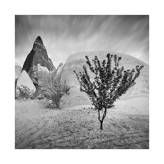
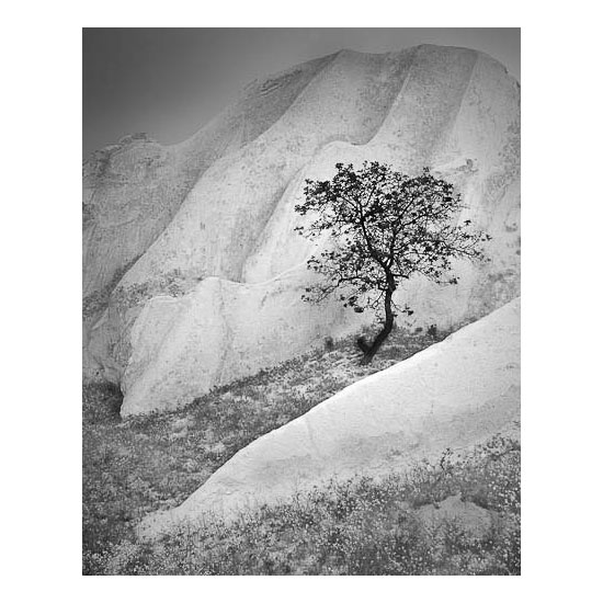
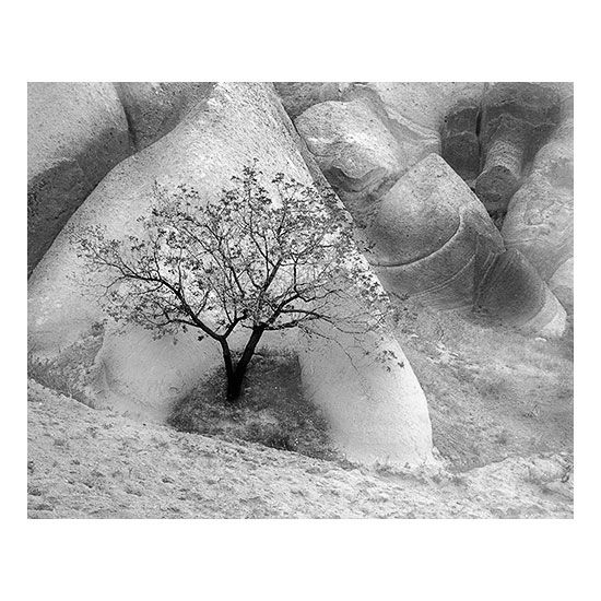
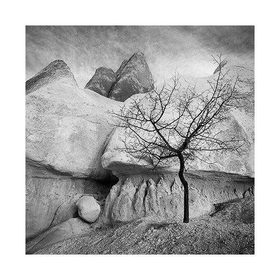
Over the past few days I've been editing work from a recent trip to Cappadocia, Turkey. The process has been a great learning one for me because I've found that working in Black & White has allowed me to focus solely on the tonal elements at play in the images.
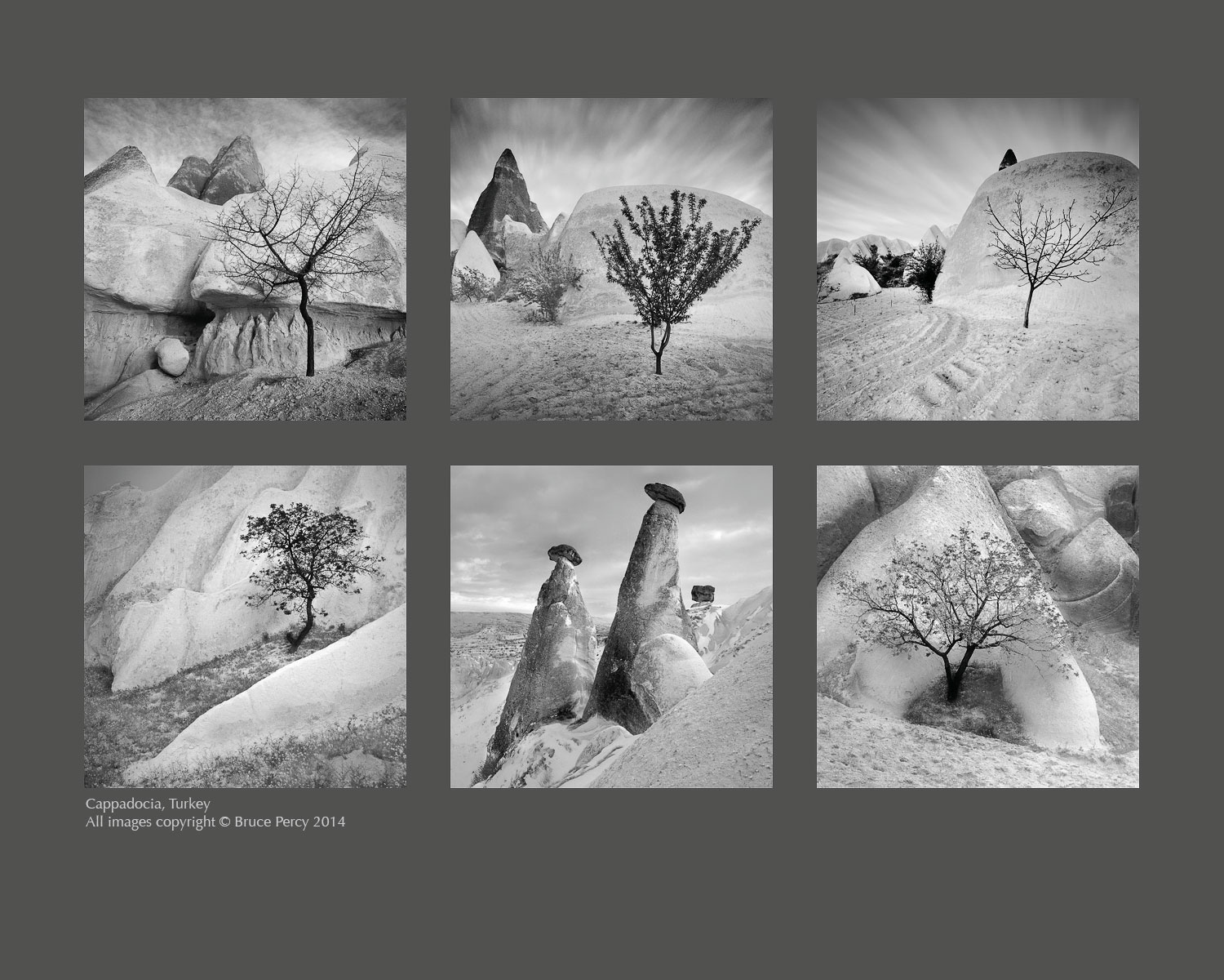
Specifically, I've had to spend a lot of time ensuring there is good tonal separation between foreground and background elements. For instance, the trees have been deliberately toned as dark as I could make them while the background tones have been lightened as far as I could, to ensure as much tonal separation as I can get away with.
Tones are one thing, but contrast is another. It's possible to convey a sense of depth to a scene by giving some objects less contrast than others. I chose to make the lighter rock formations as soft as I could - often reducing contrast in these areas. I increased contrast in select areas where I felt perhaps that a line or a curve or some other feature needed to be emphasised.
So often I feel that as beginners, most of us tend to add contrast globally but I feel that just pulls the eye in all-directions and leads to too many elements vying for the viewers attention. The image becomes fatiguing to look at for too long, because our eye is constantly being pulled everywhere.
Yes, Black & White is not just about adding lots of contrast, but also about smoothness of tone. Low contrast equals calmness while high contrast equals tension. Used sparingly, and in the right places, the eye is led around the frame in a pleasing manner.
On the subject of selection process, I shot a lot of images but I'm only left with the six you see here. I think when it came down to it, despite Cappadocia being a place of amazing rock formations, I fell in love with the solitary trees which I often found hidden away in the crevasse of a rock.
It's important for a collection of work to sit well together and this can either be achieved by collating images that have a similar colour palette, or by collecting images that have similar subject matter. I feel these Black & White images work well because they are similar in subject matter - the trees being the unifying theme here. But the compositions are similar in some ways too. But mostly I feel it's the use of tones across the collection that ties them together for me most strongly.
Editing is always a continuous case of reviewing where I'm at, how I feel about the work and it's that feeling that keeps me tuned into what needs to stay and what needs to be weeded out. Focussing on the tones in the images I shot, has led me to choose some images over others, simply because the tones were in keeping with the work I had amassed during my editing sessions.
Lastly, I've decided to present them here with a dark-grey background. Ansel Adams said that there was only one time in his career when he felt satisfied with an exhibition space, and that was because the walls had been painted olive-grey. I fully appreciate this - placing Black & White images on a white wall neutralises the white highlights of the print - which leads the viewer to perceive the print as much darker than it really is. Olive is akin to a mid-grey tone, thus allowing the brighter tones (in addition to the darker tones) a chance to stand out and sing.