Retrospective

I’m acutely aware that if one has an audience, that audience are always one step behind you. One of the best ways to illustrate that point is with my photographic books. Books are always based on the past. They can never be an illustration of where you are right now.

In my own case, the last three books I’ve published have been planned for about five years. We knew we were going to do Altiplano, Hálendi and then Sound of Snow. In that order.

This had always been the plan except the last two books came out rather quickly because I had the free time this past year to focus on the design of them. Had it not been for the pandemic, both Hálendi and The Sound of Snow would probably still be vapourware, and so when they would have finally become physical objects, the images within them would be even older than they are now.

This is just a ‘placeholder’ image. This is not the design or intended cover of any retrospective book I end up making.

This is just a ‘placeholder’ image. This is not the design or intended cover of any retrospective book I end up making.

So in this way, photographic books are always historical. They are a statement of past events.

I am now up to date: the cupboard is now empty of ‘completed projects’.

Which brings me on to thinking about a retrospective. A book that will cover the last decade or so since I ‘went professional’ for want of a better term.

I don’t just want to do a book that has a collection of images only. I’m more interested in telling a story.

So I think the book will try to convey the development and progress of my imagery over the past 10 years.

I’m very aware that certain landscapes have been teachers. And that in order to photograph one kind of landscape, I had to do my homework elsewhere first. I could not have known how to approach the black deserts of Iceland if I had not photographed the Altiplano of Bolivia first. Similarly, I could not have known how to develop my photographs in winter landscapes had it not been for working on luminosity / tonality in the black deserts of Iceland. My Japan imagery was built on top of my experiences of working in the vast black deserts of Iceland. And so on…..

So this is where I think I would like to take such a book. A chronology of epiphanies perhaps. As I often think that if one is developing, there are often times when we hit a new level of awareness, where things come together and begin to make sense.

Thinking this way, and realising that the whole thing is a path of progression, I can’t help but come to the realisation that every point that has come before, has been taking me to where I am right now.

Sound of Snow Deluxe Edition Still Available

Thanks to everyone who bought the book so far. It has meant a lot to me at this time, since I am unable to run workshops or tours right now, the book contributes greatly to my current income.

The standard edition of the Sound of Snow book is now sold out, but I still have copies of the deluxe edition available- which comes in a soft white cloth slipcase and a choice of one of three prints.

shadow.jpg
4.jpg
5.jpg

Biblioscapes Interview

Euan Ross has a very nice website and podcast about photographic books called Bibioscapes. If you are passionate about photographic books as I am, you should check it out.

Recently he interviewed my book-designer Darren Ciolli-Leach and myself about our decade-long partnership. I hope you enjoy it.

Reserve List?

My new book Hálendi sold out this summer upon announcement. I do have some spare copies I am keeping back - in case some orders go missing in the post, or get damaged. Once I know everyone has their copy, I will release the remaining stock of 20 books.

Should you wish to be on the waitlist, please email me.

2624d255-35e4-4947-8345-9fccc2af075f.jpg

Hálendi book review 6/13

Although I do feel I’m giving away a surprise element as to what’s inside my new book ‘Hálendi’, I do think the discussion I had with Sam Gregory was quite fruitful. For me, I was able to get clarity on some of my motivations. It’s often when talking to others that you realise ‘you know something that you didn’t know you knew’ :-)

Image Proofing.....

I’ve got the sequencing of the images completed for my next book, and the text is mostly written. We’re just working out the paper and cloth materials for the publication. Book projects always take longer than anyone would ever realise.

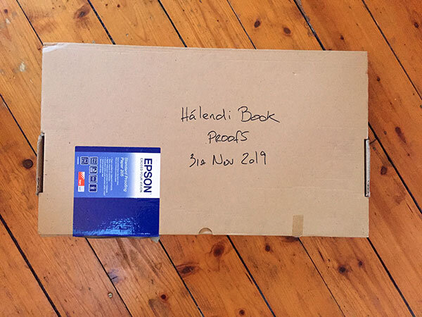
Here are some image proofs. I print everything to make sure it’s right before it goes for print. Often noticing things in the print that I didn’t see on screen, it’s a great sanity check. When I do notice something in the print, it’s often interesting to me to note that I can now see it on screen. But never the other way round.

Completed Image Proofs

It took about three weeks to complete the images for the Hálendi book.

You may be wondering what I had to do, other than just put them in a good order and print them? I rarely print all of my work, it would just be far too time intensive for me to do this and I realise when I publish them on the web, they are about 90% of the way there. Or they way I like to look at it - 100% there, but when I come to print them, I’ll notice things that need to be tightened up and the final image will now be 105%. That extra 5% is the ‘excellence’ in what we do - that extra bit of ‘going a little bit further with the work’.

Truth be told, if you care about your photography, it’s something we all do - we agonise over the smaller details.

proofs-1.jpg

Proofs are a way of verifying to me that the images are right. But there’s more to it than this. These proofs will be sent to the printer as a hard-copy - to tell them ‘look, this is what we expect to see in the final print’. Sending files on their own is not enough as each offset press has their own custom ‘colour management’ or maybe ‘no colour management’ in place. So the hard-copies are references for them.

But I find that going through the slow progress if printing 100 images is immersive and instructive. Although I had done an initial image selection and sequencing, I still found about 10 images were dropped from the final book and about 5 or 6 images were added in their place. Sequencing was tightened up as I felt there was a broken flow to the work as you walk from one page to another.

Seems I had to print them to find this out. Seems I needed to go through each image tightening up the tones and colour casts to ‘marry’ with each other to notice find it out also. Seems I had to live with the work over several weeks of printing and editing.

proofs-2.jpg

And rarely did I find an image just went straight to print. Every one of them needed work done to make them sit on the page. In some instances the image was too dark, too light, too soft, too hard, lacking contrast, requiring contrast reduction.

Printing always teaches me about my deficiencies. The way I interpret transmitted electronic light from a computer monitor is not the same way I look at light reflected off a piece of paper. I seem to ‘see differently’ and I know it is not a unique trait that I have, but one we all have.

So what’s next? Well we’re still about six months away at least from a printed book in my hands. The book artwork has to be finalised and the materials chosen for the book. We’ve had some price quotes through for soft-back and hard-back books. This is always a trade-off as I don’t have a large audience, so a smaller print run is important, and with smaller print runs the costs go up if you want to go hard-back. Quite a bit. So we will see.

Then when we send the final work to the printer, I would like this time to turn up for the actual printing to see it in progress.

I am going to go quiet now on the book. The rest of the process isn’t that interesting for most, so it’s time for me to talk about other things on this blog.

Page Sequencing & Balancing

A few days ago I began work on proofing the images for inclusion in my next book. As suspected, I’ve found loads of issues with the images once printed. Some of them it’s to do with the blacks and white points of the images, but also, clipping that is incurred by the reduced gamut of the paper I’m proofing onto. I am finding I am having to calm the higher tonal registers to allow the image to sit on the page without any flat-wall-clipping occurring.

I knew I would have a challenge ahead of me, in terms of sequencing the work. In the proof snapshot you see above, I spent a lot of time matching images to each other so that images on the left and right page compliment or sit well with each other. For me, this is about choosing the right images to begin with. Then once I have them sitting next to each other (I use View / 2-up vertical in Photoshop to view two images side by side, I can notice if there are luminosities that jar between the two side by side images, or colour casts - perhaps in the blacks that work against each other. For instance, one black desert may have more blue in it while the complimentary image that is to sit on the opposite page may have more of a reddish black. These things can sometimes be ‘tuned’ to sit better together and other times, I just find that the image doesn’t work when its colour balance is tuned away from its current colour temperature.

To me, this is ‘mastering’. I am trying to get the entire set of images to sit well together, and for that to happen, it’s never really about subject matter, or geographic location. It’s all about whether the tones and colours (or perhaps for some of you, monochromatic tones) that matters. Images have to sit on opposite pages in a way that they work together as a set. But the work also has to flow through the book as well.

I’m really enjoying this process. Images that I thought were nice, become something special when I print them out and notice further adjustments and enhancements. It’s like putting the icing on the cake.

Printing is indispensable in really getting the best out of your work. And it is giving me a lot of confidence in knowing the work is as good as it can be for publishing in my forthcoming book.

Proofing has begun for next book

Printing is the final stage in finishing your images. If you don’t print, you are trusting your monitor 100%. I’ve learnt that even if my monitor is very tightly profiled and calibrated correctly, I still can’t see certain discrepancies in the image until it is printed. And once I see it in print, I am now able to notice it on the monitor also.

Two images from the forthcoming book, printed on Epson Soft Proofing paper.

Two images from the forthcoming book, printed on Epson Soft Proofing paper.

So each time I come round to preparing images for a new book, I print every single one of them. I’ve done this now for the last two books and it has allowed me to get the best out of my work. I have often found just about every image needs some further work to tune it as best as it can be. For me, that extra 5% or 10% is crucial because I think printed images are more exposed, more vulnerable to inconsistencies than a computer monitor will show.

Screen grab from my computer monitor. I’ve got the proofing switched on to simulate the Epson Soft Proofing paper.

Screen grab from my computer monitor. I’ve got the proofing switched on to simulate the Epson Soft Proofing paper.

Through this process, I have also learned to ‘interpret’ what my monitor is showing me. I now understand that shadows and highlights and hues in those areas are more obvious in the print than on monitor (yes, I’ve profiled and adjusted the black point of my monitor). I have also learned that colour casts become more visible in print than on the monitor.

I think most importantly for me, is the luminosity or ‘dynamics’ of the print that I’ve noticed more in print. The eye is adaptable, and after staring at a monitor for too long, the eye adjusts and you start to believe things that aren’t true. We can convince ourselves that a duller luminance is brighter than it actually is. For instance, what you may interpret as white in the image may actually turn out to be around 50% L: a mid-grey tone. Printing out helps you recognise if the image is as vibrant as you think it is.

So a few weeks ago, I asked Neil Barstow from Colourmanagement.net to build me a custom profile for the Epson Soft Proofing 205 paper. This paper is a pretty good standard paper to convey what the images will be like when printed on an offset press.

I printed the Verification test image that I bought from him, and compared it with the proofing switched on in Photoshop.

I’m really pleased to have a ‘standard’ to print to. I can evaluate my images for offset printing.

One final thought: when you send your actual files to the printer for printing, I always send a printed copy of them. You can’t get more truthful than a hard-copy and I think it is always prudent to give this to your printer, as it means that you can avoid any possibility that their colour management is different from yours. They should be able to match the offset press to your hard copy prints.