Getting Acquainted with new work

Back in February, I made my first ever trip out to Japan. It was a very enjoyable trip, mostly because the people there are terrific. Politeness is something that seems to be at the core of the Japanese, and I will definitely be going back next year.

Maiko, Kyoto, Japan, © Bruce Percy

The past few weeks have been deeply satisfying for me on a creative level.

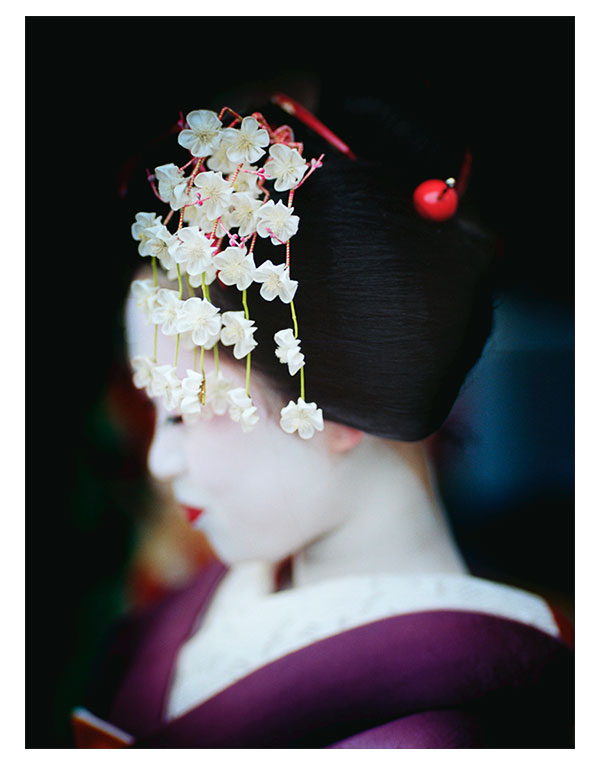
I had originally gone out to Japan for a special one day event in Kyoto. I had high hopes that I might make some beautiful images of Maiko and Geiko (Kyoto's Geisha). All I can say about that day is that by the end of it, I felt extremely happy, feeling that I'd maybe made a few nice portraits.

I'm a film shooter, which means I have to live with the memories of those moments where I felt I captured something good. I think that's one of the reasons why I love shooting film. There is no pressure to review immediately what I've shot, and I go with the philosophy that what's done is done. It allows me to live more in the present moment. No stopping to review, just making images. Which is great.

Once I click the shutter, the image is either imprinted on my mind or it's not. I have to listen to my gut a lot and the more memorable images tend to stay with me in my thoughts and feelings for days after the event. I find it highly enjoyable to let my mind settle and absorb what it was I experienced. I often feel it takes a lot of time, maybe weeks or moths to really be clear on what I experienced, and in this way, it's great to just leave the films until I get home and have space in my mind and schedule to work on the images.

So this posting is really about the experience of watching new work come to fruition. In my studio I have a light table where I place my transparencies, and I also have a daylight viewing booth where I can review the contact sheets for the negatives I've shot. The Geisha portraits I made were shot on Kodak Portra 160 colour negative film, so I always request a contact sheet to be made, so I can easily look over the entire collection of images on a roll in one easy go.

During the selection and editing, I've felt I've been getting re-acquainted with Kyoto and my the day I spent there making images of Maiko and Geiko. It's been such a really beautiful thing to get absorbed in the sights and memories of the trip and also to find that the certain images that really made a big impression on me at the time of shooting, have reliably met my expectations. But there is also the beautiful surprise in seeing other images I had not thought would make the grade come to life, and  to watch the final portfolio take shape.

Each portfolio should have it's own vibe. Sometimes that vibe is based on the subject matter, but more so for me now, the collection of images has to have a cohesive feel to them - usually brought about by the colours and tones present in the work. I often feel my own images tend to speak to me and dictate how they are going to turn out, and it's up to me to see relationships in colour ranges or subject matter to find a common theme or story while I'm editing them.

The past few weeks of sitting in my home studio absorbed in contact sheets and watching the portfolio's story appear before my eye's has been really wonderful.

One mustn't rush the editing. When you have just made a collection of images it's all so tempting to get back to your home and busily start work on them, but there's really something wonderful to be had in cherishing the moment because it is a way of recalling the experiences and feelings you had whilst making them.

My new collection of images can be viewed in the new work section of this website.

Focal lengths are for controlling background to foreground presence

I often feel that many of us are attracted to different focal length lenses simply because of the difference in angle of view they provide.

Wide angle lenses allow us to fit more into the frame, but at the same time, they make everything smaller. Conversely, zooming up the focal lengths, allows us to fit less into the frame, and what is included, tends to be more present.

So changing focal lengths affects two things in one go: angle of view, and subject presence. Only, most of us really only think about angle of view.

In this post, I'd like to discuss how using a fixed focal length and zooming with our feet, can radically change the compositional balance between foreground and background subjects.

In the above image, this is how I perceived the location in my mind's eye.

I had decided I loved the background mountains so much that I wanted them to have as much presence in the frame as the foreground bush.

However, as soon as I got close to where the bush was, I ended up with the shot below (note how the background mountain is smaller, and less present in the frame compared to the bush):

What happened was that as soon as I got close to the bush, I realised I needed my trusty wide angle lens (24mm) in order to fit in the bush and also the mountain. I put it on my camera, and all of a sudden everything in the frame got smaller - the mountain and also the bush.

My next step was to walk  closer to the bush to give it more presence. This certainly worked - the bush became pretty dominant in the frame, but the background did not change in presence at all. And this is a key point to think about here:

"When you put on a wide angle lens, everything gets smaller, and if you move closer to your foreground, it changes dramatically while your background remains the same."

My foreground became more dominant, while my background became less dominant.

Here is the same location, shot at 24mm again, but in this instance, I moved  about 3 feet back:

Notice how the background mountains have not changed in size, but that the foreground bush has become less dominant. The key point to this is:

"By keeping a fixed focal length (in this case 24mm), and moving closer to, or further away from the foreground subject, only the foreground subject changes in size and becomes more dominant, or less dominant respectively"

Ok, so you may be asking - well how did Bruce manage to get the first shot then? And the simple answer is that I used the same focal length as my eye - I used the equivalent of a 50mm lens, to ensure my background mountains were the same size as I had originally perceived them. I then walked back until I could fit in the bush. The key point about this is that:

"When you zoom in, everything gets bigger, but you can only influence your immediate foreground. By moving back 10 feet or so, you can radically change your foreground, while keeping the background the same size."

For this very reason, I prefer to set a fixed focal length, and zoom with my feet. It's also the reason why I prefer fixed focal length lenses to zooms (at least until you fully understand the properties of using different focal lengths).

The key points about doing this are:

  1. When moving around a landscape with the same focal length, the background does not change size - even if I move 20 feet back, or 30 feet back, the background remains the same. The foreground however, changes dramatically.
  2. I figure out how big I want my background to be and zoom the lens to fit the background it in the frame.
  3. I then zoom with my feet. By moving nearer towards / further away from my foreground, I am able to get the right amount of proportion of foreground to balance with the background.

Those of you who have attended workshops with me, will know that I spend a lot of time balancing objects within the frame. I often think of proportions and spacial distances between objects and how they relate to each other. For many of us, this is as natural as computing where to put our hand to catch a ball, while for the rest of us, it's something we have to work at very much.

By zooming with a zoom lens on location, you make composition harder - because you move two goal posts at the same time: angle of view, and presence of objects within the frame.

"I find it is rarely a good idea to stand at one spot and zoom, because although I may fit everything I want into the frame, I'm not giving the background and foreground the correct amount of proportion to each other."

By using a fixed focal length, I have decided how big my background is going to be, and I use my feet to change the foreground presence to balance against my background. In the examples above, I chose to make the background mountain a certain size in the frame, and I then moved back and forth with my feet to increase / decrease the size of the foreground bush in relation to the background.

In other words, I spent a bit of time balancing the dominance of foreground subject with background subject.

If you own a zoom lens, then try to avoid zooming in and out to fit a subject into the frame. Instead, determine what size you want your background to be, and then zoom to fit that. Then keep the focal length static and move with your feet to fit in the foreground.

"Focal lengths are really for controlling background to foreground presence."

The invalidity of spirit-levels

I've been in Norway for the past three weeks running two consecutive tours. While I've been here, I've had a few discussions with participants regarding the validity of using spirit-levels when composing.

In this post, I'd like to put forward a counter-argument for using spirit-levels when doing landscape photography. I'm sure some people will disagree with me or feel that spirit-levels have helped them a lot, but this is really just my point of view, so bear with me on this one.

Many of us use a spirit-level of some kind to help us get our horizons level. There are a couple of issues with this as I see it:

1) The first is that we are only levelling our camera with gravity. We are not balancing the objects within the frame when we use a spirit level, and this is where we get it wrong.

Many horizons are what I call 'false-horizons'. A false-horizon is one where the contours of the land are not in sympathy with gravity. In the image example below, the edge of the lake appears to be higher at the right-hand side of the image and lower at the left-hand side. The camera had been levelled with a spirit level, yet the false horizon is not level with the frame of the image.

False horizon is not level

What is happening here is that the contour of the lake rises as we move further towards infinity in the frame. Leveling with gravity makes no sense because the horizon is actually rising. If we are to level our horizon, there is only one thing we must level it with - and that is the edge of the frame. Here is an adjusted image to illustrate how the image was recomposed to ensure the false-horizon is in balance with the frame of the picture:

False horizon corrected

I now no longer use a spirit-level for a few reasons:

a) I need to level  objects within the frame - with the actual frame, and not with gravity.

b) balancing objects without the aid of a tool such as a spirit-level means I am more in control of the overall composition. I have to think more about where all the objects are and how they balance with each other. I believe using a spirit-level takes this level of awareness away from me, and thus the compositions I would come up with are less focussed as a result.

2) The second issue I have with using a spirit level is that they allow us to compose images while we are not able to interpret the composition correctly. The reason why many horizons can be so far off the mark for many photographers is to do with how we physically stand behind our camera. Many of us often cock our heads sideways to view either through the eye-piece, or at the live-view screen. Most of us are not aware we're doing it, but what we're attempting to do is balance a composition while our head is not level with the viewfinder. This may not seem like a problem, but it really is. It is extremely difficult to balance a composition when viewing sideways because we simply can't interpret the scenery so clearly when we do. Take this image for instance:

I've rotated this image by 40 degrees to simulate how you would see this composition if you were viewing it through an eye-piece or on a live-view screen with your head cocked to 40 degrees. In the process of doing so, we find the image a little harder to interpret and understand compositionally. But here is the point: it's not easy to tell if the horizon is level in relation to the picture's frame. It looks level within the context of the frame its in, but is it really?

In the image below, I've rotated the entire frame to 0 degrees, to simulate how you would see the above composition if you were viewing it through an eye-piece or live-view with your head level to the camera:

Looking straight on to the picture, we can now see that the horizon is actually off. That's because we're able to interpret things more easily when we are head-on with the camera. Not when we've got our head cocked sideways.

But let me ask you this... what exactly is the horizon in this image? We actually build up an 'imaginary horizon' based on the contents of the frame. In the instance of this image, it's a strange combination of vertical lines in the red house, and also the struts of the pier. But there's a degree of 'keystone' effect to this image because I actually had the camera pointed down toward the ground. If I show you the levelled image, you can still see distortion in the house:

Levelled

You could argue that the image is still not straight. I think the real answer is that the image is as straight as it can be, taking into consideration all the keystone distortions that are apparent in the composition. We've somehow balanced the left-had side of the house with the right-hand side, and decided there is some level of balance in there. We levelled the contents of the picture within the context of the frame. Not with gravity.

Ok, I know it's not easy sometimes to get your head level with the eye-piece of your camera, but I always make a concious effort to try to get my head as level as I can. If it means I need to lie down on the ground to keep my head level with the camera, then I do it. If it means I need to bend my legs to keep my head level, then I will do it. Because when I am level, I'm not only able to notice if my false-horizons are level, but also if all the objects within the frame balance with each other. In other words, having my head level with the camera enables me to improve my compositions.

A spirit-level only levels our camera with gravity, but it does nothing to help us understand and fine-tune our compositions, and it does nothing to help us balance false-horizons. We must learn to level our images based on what is within the frame, and the only way to achieve this, is to keep our eye level with our camera.

Let your eye, rather than a spirit-level decide what is good. It's really up to your own internal sense of balance and composition to get it right.

Behind The Mountains (Fjallaland)

Last year, Ragnar Axelsson released his 3rd photographic book. I was lucky enough to pick up one of the first copies while in Iceland running my yearly September trip there.

I'm a big fan of RAX's work (as he prefers to be called). To my eyes, he is more a photo-journalist than a traditional landscaper - someone who is more interested in the people and their mark on the places they inhabit. I love many types of photography - not just landscape, and RAX's work is interesting because of his reportage style, his use of black and white, and of course, his deep connection with the subjects he chooses to photograph.

This new book has been given two titles. In his native Icelandic it is simply known as Fjallaland, because it is about a very special region of Iceland - the Fjallaback nature reserve. The english title for this book is 'Behind the mountains', because I think it would have been hard to market a book about a relatively unknown, specific region of Iceland outside of the country. The title I might add, is very appropriate, because this book observes the farmers on their yearly roundups, gathering sheep, in one of the most difficult but also magnificent grazing terrains of the Icelandic wilderness.

I loved how this book begins. Instead of being immediately greeted with the signature style of RAX's black and white 'fly on the wall' reportage photography, we are instead prompted to look at the Fjallabak region from space. There are a number of very high quality, satellite images of the region, showing the complexity and composition of the land here. Fjallabak exhibits a range of colours from greens to reds to yellows. This is because the land is made up up Ryolite, Obsidian as well as volcanoes, rivers, sands and lakes.

As we continue to delve further into the book, the images change to ariel views of the Fjallaback region. More of a birds-eye impression that shows us how large these mountains and their valleys are. This slow zoom-in from space to the region where the farmers work is an effective introduction to the book. I liked this very much as I felt the stage was being set for RAX's photographs of the farmers working in this remote landscape.

So what of the subject matter of this book? Well, it's really an essay of images, garnered over a span of several decades about the yearly sheep rounding the farmers do up in the hills. For many of them, it is a special occasion and one not to be missed.

My own impressions of this book was that it is RAX's best to date. Whereas his other two titles were broad in their scope of subject matter - be it faces of the north, or looking at the problems faced by the Inuit of the arctic, this book is more tightly focussed on one region of Iceland. It's clear to me that this is a work of passion and love. RAX has a deep connection with his subjects and is on personal terms with many of them. He has been part of this yearly round up for quite some time, and the images convey this very strongly. I also felt that because the subject matter was more specific than his previous work, that so too were his images and his essays.

If you have an interest in reportage photography, or an interest in the life of people in Iceland, or even like me, if you just feel you have an affinity for the place, then this book should be on your bookshelf. RAX's text is often brief, but when he does speak to us, we learn a lot about Icelanders and how they view life, and how they think and feel about their own little back-yard.

If you wish to see more images from the book, they are on RAX's site here.

Behind the Mountain is available in the UK at most book stores, or online, but if you wish to own a signed copy, I believe Neil at Beyond Words book store has a limited number of copies available.

Turner-esque

Triplekite publishing has released a very beautiful soft bound book by David Baker. ‘Sea Fever’ is a photographic monograph about the power of the sea.

Like a Turner-esque painting, the cover image sets the stage well for what is to be found within its pages. I particularly like the cover image. With a break in the clouds situated right at the heart of the image, I felt drawn in - invited almost, to come and engage with this book.

Making a book is not an easy process. Having published two books myself, I fully appreciate that there are many design considerations, and plenty of discussions that happen along the way. And often the way a book ends up looking is the work of a very long and thoughtful  process.

This book is tall, and large - a decision I think to enable the power of the sea to be conveyed to the reader when viewed as two-page spreads. It is also a soft back book, and very light to hold. I enjoyed going through it as it was never a cumbersome book to handle. It felt like a very large, luxurious magazine that encouraged me to engage with it. This was possibly due to its flexibility, which worked well with the content it conveys, because it enabled me to twist and re-shape the contours of the sea to my own pleasing. Rather than the images being fixed and my viewing being forced to settle on the work from one static aspect only, I felt I could engage, and play with the book more. I liked this aspect very much.

I’m no fan of images spanning two pages and I often dislike images bleeding over the very edge of the paper, for me, I like to be able to take in the entire compositional aspects of an image in one go. Often a break in the middle of the image (due to spanning two pages) can be irritating or unpleasing at best. Many of the sea images in this book do exactly that, but I was surprised to find that it actually enhanced my viewing experience, rather than detract from it. In this instance, spanning big images of turbulent sea across two pages works like an IMAX cinematic experience - these images fill your entire field of view and the result is that we are told that the sea is powerful, the sea is overwhelming. The same can be said about the images bleeding to the very edge of the page. I think it was a very effective design choice to do this because it conveys the message that there is no end to the power of a raging sea.

page-spread

Also, because of the very abstract nature of many of the images contained within this book, there is less of a need to avoid page splitting. The images are less about order, and more about conveying power. We are not here to study graphic forms, but more to enjoy nature when things get dramatic - as the title of the book conveys. So I have to give a lot of praise to Dav Thomas whom I think was responsible for many of the design  considerations of this very beautiful and engaging book.

With regards to what this book has to offer, it is a monograph. It tells a story in visual form only. There is very little text, and that is fine by me. I often feel that many photographers wish to learn from the photographer, and they think that learning will come from reading text. I think you can learn a great deal about the photography and the photographer by simply studying their work - the answers are in the imagery. All we have to do, is be open and let the photographer take us on their journey. Submit rather than dictate. The photographer has a lot to tell us, so sit back and let him do that. And a good book will do exactly just that, and in this respect, this is a very good book.

I am looking forward to seeing what other subjects Triplekite will handle in future.

Sea Fever is available from Beyond Words book store for £25.

Beautiful Lo-Fi

I've been listening to a lot of Icelandic bands this past year and one thing that has struck me is how open many of them are to messing around with the sound quality of certain instruments in the production of their songs.

Some parts of the music are deliberately distorted, or are messed around with so much, that they have become almost shadow facsimile's of themselves. Instead of hearing the actual instrument, I feel I hear an imprint, some kind of aural residue. It's a really effective way to take the listener on a journey, one where you engage more with the music.

Here's one example, by an Icelandic duo (twin sisters), called Pascal Pinon. The song is very beautiful, but also, so too is the lo-fi quality of the piece.

https://www.youtube.com/watch?v=ds6miVqD9ZE&width=400

The song was produced and mixed by Alex Sommers (he is the partner of Jónsi (pronounced Yonsi for those who are not familiar with Icelandic) of incredibly famous band - Sigur Rós fame). Alex is a genius at production.

So this has got me thinking about image quality, and how we often strive for the best resolution we can. And I believe many of us think that by having utmost image quality, the image will be more enjoyable to view. That is certainly true some of the time. I think there is a valid place for utmost resolution in imaging, but so too, is there validity in all forms of image quality, be it soft, blurry, fuzzy, noisy, underexposed or overexposed.

Seeking perfection in image quality is not a symptom of the digital imaging age. It has always been a preoccupation for photographers through the ages, regardless of whatever medium they were using. In the instance of film users, there has always been a portion of the photographic community who strive for finer grained films, or larger negatives in the pursuit of high-fidelity imaging. This is of course a nobel quest and one I would not disparage. It's just that I think that going the other way - reducing  image quality, intentionally, is just as valid and nobel a pursuit as any.

With music, we can create depth to a piece by using different frequencies - we can also add a sense of 3D by mixing high-fidelity sounds with low fidelity ones, as well as bright and dull sounds. Complex interplays of varying audio quality lends a sense of space to the music.

Similarly, messing around with the tonal range of an image is just as valid. Not everything has to be 'punchy', or have high contrast. Mixing in low-contrast areas with high-contrast areas opens up an additional dimension to an image. But this does not stop with tonal range.

We can add additional ways to interpret an image. Most of us think about tones and contrast, but varying the level of detail within an image can bring an extra dimension to the work. It is just as valid to have areas of the frame where there is lack of detail as it is to have areas where there is a lot. Softness tends to make the eye pass over an area of the picture, whereas sharpness attracts the eye. So in my view, I believe that images where there is a deliberate degradation in resolution is welcome, and can be beautiful if the treatment is appropriate.

I think there's beauty in softness. Softness lends ambiguity to an image or a part of an image. There's something fascinating about the unknown, about wondering what something meant, when we only have a fragment, a clue to work with. When areas of the frame are soft, we have to fill in the gaps.

Similarly, any flaws can be beautiful. Flaws introduce a sense of randomness, which often lend a certain uniqueness or 'character' to the images we create.

Low-fi images have a way of engaging our emotions and dreams, in a different way than hi-fidelity images do, simply because there are things left unsaid, or half-revealed.

We should embrace low-fi quality as an additional tool to our imagery, and not attempt to banish it. After all - all images are wonderful if they capture the spirit of a mood or emotion or feeling, since seldom do we throw something out if it possesses such beauty, even if it is flawed in some way.

Osmosis

Osmosis - A gradual, often unconscious process of assimilation or absorption.

Some landscapes come to us when we are ready to receive them. Not the other way around.

Lumix GX1, 12-23 lens, Lee 0.9 hard grad. This image was taken quickly to illustrate compositional and tonal relationships during my weekend workshop.

Last weekend I was running my umpteenth workshop in Torridon - a very special mountainous place here in the Scottish highlands.

Although I've always had a love for the place, I've often found it extremely difficult to make images here, until recently. I think I've learned to understand this landscape more through the act of being a workshop teacher. Consider this statement by Brian Eno:

"You don't really understand your own ideas, until you try to articulate them to somebody else. Also, in the process of articulating, you find yourself saying things you didn't know you knew" - Brian Eno

This has often been a case for me whilst running my workshops. I discover that I knew something I didn't know I knew. And also, that through the process of having to explain something to someone else, my own understanding of a place, or a photographic concept becomes clearer.

I've found teaching workshops in Torridon immensely rewarding in this respect. The landscape is fractured and complex. It is not a simple landscape to make good images from, and it requires you to see that many of the stones, trees and bracken all have similar tonal relationships. When these tones are compressed down into a 2D image, they often merge, and become very confused and jumbled as a result. 'Separation' between objects within the frame becomes key. Through this awareness, my eye has become more finely-tuned.

The image you see at the top of this post was made last weekend while we were busy trying to work with competing elements. It has taken me around 13 years to get to a point where I can look at a scene and know how best to deconstruct it down to a few elements that will work as a photograph. Through this time, I have often asked myself questions about my work, and I've often had to explain it to others.


As creative people, we have to listen to ourselves and become more aware of our own thoughts. It is only through a sense of internal-dialogue, and a sense of inquisitiveness about how we choose to approach landscape photography, that we are able to progress as artists.

In the video above, you'll see Brian Eno and Ben Frost discuss the creative process. I found it fascinating to hear Ben mention that he finds his work seems to be a kind of diary. I think this is true of my own photography: my images are a sounding board that show where I was, creatively speaking. They are a record of my photographic development.

Ben is in-tune with his creativity - he understands where he has been and where he is now. This is perhaps a fundamental skill that all creative people should possess, or at the very least, be learning to tune into.

Photo Transit App

As some of you may know, I'm a big supporter of 'The Photographer's Ephemeris' application - which I will refer to as TPE from now on. It's a really useful application for planning a shoot. I use it all the time on my workshops for figuring out sunrise and sunset times as well as twilight times etc. It has quite a lot of useful features.

Stephen Trainor, the developer of TPE, has been working on a new application called 'Photo Transit' for the past six to nine months. Similarly to TPE, I've been a beta tester for the application, and have contributed feedback and feature requirements from the onset.

If you liked TPE, then you may like Photo Transit.

Whereas TPE is useful for calculating the angle of the sun / moon, and figuring out sunrise and sunset times, in an easy to use graphical manner, Photo Transit allows you to plan a shoot by figuring out the kinds of lenses you may need. You set up your 'camera kit' - the focal length's of lenses you have in your bag, and it shows you what each lens would see over a specified area of terrain.

[embed width="400" ]  https://vimeo.com/73595182 [/embed]