Film vs Digital

It’s an old debate, one that for most folks now is irrelevant. Besides, there are probably photographers around these days that were never around when film was prevalent.

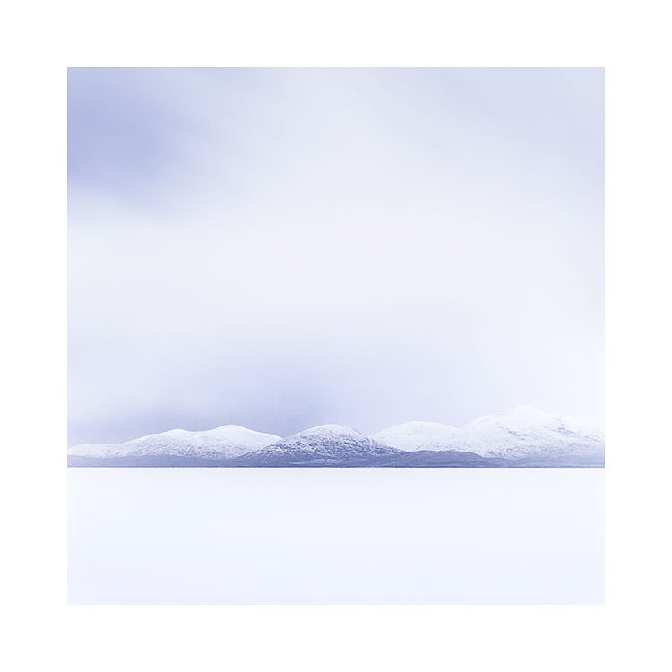
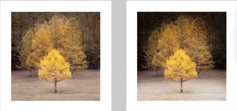
Fuji Velvia 50 vs Nikon D4s RAW

But for me, since I am still 100% a film shooter, I am often being tempted by the digital thing. You can do so much more, shoot in low light hand held for instance. My film cameras are rather bulky. So I’m often tempted.

But I’ve always found that the look of both mediums is different. Not better or worse, just different. And I like the look of my film images. And as the saying goes - “if it ain’t broke, don’t fix it”.

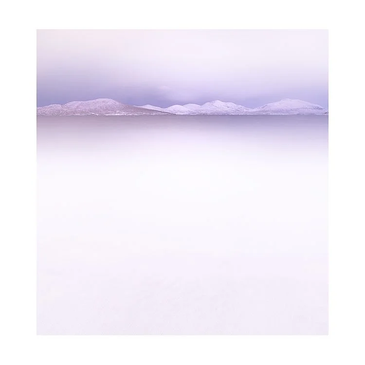
Fuji Velvia vs Nikon D4s processed to make it look as close as possible to the Fuji Velvia image.

For my Mongolia project, I chose to bring a Nikon D4s along with me so I could shoot in the dark interiors of the Yurts. But this got me thinking as to whether I could make the digital files look more like my film files.

I have been here before, and I failed last time.

The above samples may convince you that it’s possible to get digital files to look like their analog equivalents, but I disagree. You see, the only way I was able to get the Nikon D4s files to look like my Velvia files was by having a Velvia file to compare against, and to use as a ‘target’ for where to aim with the editing.

I have found that Velvia and all films react differently under different conditions. There is no ‘find one Curve adjustment to fit all’ scenario. For instance, the adjustments used in the above sample will not work with other subjects. So I would always require to shoot some film files for reference.

Also, perhaps not evident in the samples above, but there is a different tonal scale roll-off happening with the highlights in film that is hard to reproduce digitally. I have always struggled to make the highlight look softer in digital because I tend to have to manipulate the file so extensively to get it close to the film image to begin with.

With photography, it’s always a compromise. You can’t get to shoot everything you see. You’re always missing things, and so I long ago learned that I had to accept that with film, there are times when it’s not possible to shoot something that is possible in digital.

I think I will remain a film shooter for the time being. I think that if I am to use digital in the future, it will be for certain projects where I can’t use a film camera, and sometimes to supplement portfolios where I need to with captures that weren’t possible any other way.

I do feel that I should be exploring digital a bit more. But not as a replacement. Just perhaps as another tool, that can be used when it suits, and can be integrated into my film photography.

I’ve never really enjoyed the look of digital files. I’ve often felt I’ve lost something of my film work when I’ve tried to use digital, but this is where I’ve perhaps gone wrong: looking at one as a replacement for the other is perhaps folly for me. I should still be playing around with digital, and exploring what it offers. But I suppose I’m always worried that it may affect my film photography. It’s the reason why I stayed away. I like what I do with film and I don’t want to mess with it.

I think we should use the mediums we like or simply enjoy shooting. For me, it’s always about how the final result looks and I’m happy to put up with the constraints and limitations of the film medium (and believe that limitations and constraints can be a good thing). Perhaps for others, the final aesthetic is not such a priority. Perhaps for others it’s more about whether the medium is inspiring to use. It’s really up to you. There are no rules.

5-Year Eizo Monitor Death

I bought an Eizo monitor 5.5 years ago. I’ve only noticed this week that it is going pink around the edges, so I searched Google, only to find out that many others have had the same issue. Seems to be with the same model of monitor by Eizo.

Eizo’s support is fantastic. I got through straight away and they asked for the serial number, and knew I’d bought the monitor in June of 2020. They also told me I was out of warranty by six months. So no free repair for me.

The repair cost would be the same as buying a new monitor.

I suppose I’m writing this today to you, to advise that maybe you should check the edges of your monitor now and then, so you can utilise the warranty. Many monitors come with several-year warranties.

On Living with your work

It’s sometimes very hard to live with your own work. Over the years I’ve seen my photography morph and become more minimalistic in its approach, there have been obvious times when I have not been able to look back at earlier work and still like it, let alone relate to it.

I have often said that as we grow, I think it’s natural for us to dislike our earlier work, or perhaps feel a sense of shame and embarrassment about it. At the very least, even if we do like our earlier work, we tend to see immaturities in our approach, or ways we would tighten things up if we were having to redo it now. This is, in my view, a common, and natural response.

What is perhaps not talked about so much is the act of living with current work that one is not so sure about. Probably because if you tell your audience that you’re unsure about the work, the audience may mirror that uncertainty. It’s common for people to lose interest in what you’re doing if you tell them it’s substandard.

Last year, I felt I had optimal conditions on the Isle of Harris to make my dream portfolio of the place. We had a lot of fog during the first week, and a lot of snow in the second. I was sure I would come away with some really interesting images—enough to make a very good portfolio.

The problem was that I was never entirely happy with the portfolio I produced at the time, and I struggled with where to go with it. Some days I felt it was too light, and when I tried to put more depth into it, I felt it then suffered from being too stark, too hard.

The best approach I eventually settled on was to let it be and live with it for a while. This is really the point of this post.

Today, I’ve been reviewing the past year’s work. I feel I’ve now had sufficient distance to take the images as they are. I think I’ve managed to shake off any preconceived ideas or aspirations I had held. It was clear to me back then that the work didn’t meet what I had aspired to, and I now realise that this was getting in the way of seeing what the images actually offer.

Audiences tend to be one step behind the artist they’re following. When the artist is moving on, the audience often only recognises it after some time. You get rated on what you were, not what you are.

Sometimes an audience may resist new work because it isn’t “like the older, more familiar work.” I sometimes wonder if this is also true for the artist themselves. They, too, can be at odds with their own work. Perhaps the work is advancing, and they’re simply not up to speed with who they are now. I think this is possible.

We can be out of step with ourselves. Our perception of our ability or artistic voice doesn’t always match the reality of where we currently are.

Recognising that this can be the case is the first step in artistic mental health. Accepting it is the second. And perhaps being okay with the ebb and flow of your abilities is the final step.

Anyhow, I sometimes think we’re simply not ready to accept our current work. I’ve had work that I wasn’t sure about, only to find that it grows on me over time. Sometimes I’m pleasantly surprised by work I once thought was merely so-so. That’s just the nature of creating.

Learning to live with ourselves—our expectations of our work, and the reality of what it actually is—can be tough. You need to practise positive mental-health attitudes towards yourself and your art. Be kind to your creativity is something I’ve always believed in, and perhaps allowing your work—even when you’re uncertain of it—to have time to grow on you is part of that kindness.

1989

I’ve been reflective of late. I was thinking about an old friend today who was the receiver of my very first gift print.

Back in the late 80’s, when I was around 22, I made the shot below on my first camera.

In the late 80’s, we were film only. And 35mm mostly. Medium format was something for rich people to play with. I made the above shot on a Canon EOS 650 with some out of date Agfa slide film and a cheap Cokin filter.

It was one of the first times I’d used a grad filter, and the strength of the filter was clearly too much. It turned the blue sky black. But it did however, allow my slide film to record the detail in the clouds that afternoon.

This image was one of my ‘best’ for a long while. It was also the first image that I gifted to a friend. a friend that i lost touch with her many decades ago. I sometimes wonder where they are, and if they are happy.

New work up on the homepage

Just a short note tonight to say that I’ve uploaded all of my work from 2025 onto my home page. Should you be interested in seeing it.

It’s been a busy few weeks of processing a few hundred rolls of film, and going with whatever I found inspiring to work on.

A few observations from me are that I seem to be comfortable adding more colour back into my work, and some places are being represented in a more ‘literal’ way, rather than being pushed more towards extreme minimallism. I fully expect this to swing like a pendulum. Some portfolios in future will be very minimalistic with others less so. Similar with colour use - some will have reduced colour while others won’t. It all depends on how I feel I wish to go with it for each portfolio.

One thing for sure, is that I do enjoy looking at a year’s work and noticing the differences between years.

I hope you enjoy looking at the new portfolios.

Depth

Q. How do we convey a sense of 3D, or depth in our imagery when our photographs are 2D?

A. The answer lies in using tonal separation and varying degrees of luminosity throughout the frame.

In the example below, I chose to make the foreground subjects brighter, and the background subjects darker. Sometimes I reverse this and the foreground subjects can be darker than the background subjects. Irrespective of which way you choose to go with this, the perception of 3D is conveyed by there being a difference in luminosity between your foreground and background subjects.

Understanding this is easy. It may even seem ‘quite obvious’.

Yet in practice, I find myself sometimes unaware that this is what the edit requires. What may seem obvious in the final edit may have taken some time to arrive at, as was the case with this image.

Consider the two images below:

The left one is around 50% of the way towards the 3D look of the final image on the right. I sat with the left edit for a couple of days not quite knowing if it needed to be pushed further in the edit. All I knew was, that something wasn’t quite hitting the mark for me with it.

I have found that in order to reach the final edit, I sometimes have to sit with an intermediate edit (left) for some time. Perhaps a few days. I need to let my eye fully adapt to the intermediate edit, before I can then advance forward and push the image even further (right image).

In the final edit, the background is darker, and the foreground lighter. Making the background even darker took some confidence on my part. Once I had darkened the background, I think chose to lighten the foreground. I did this knowing that when I lighten areas of a frame, darker areas may be interpreted as being darker. It also enhances the perception of 3D.

Similar to learning to compose, editing is a skill that is not learnt overnight. It is a life long endeavour in learning to ‘see’.

I have met some who say ‘I rarely need to do anything to my images’. It is, in my view, often an admission of an untrained, or inexperienced eye. For there is always more that can be done. It’s just that we may not yet possess the visual skills to recognise it.

Happy new year

Wishing you a very happy new year with lots of nice new photographic opportunities.

Coming in 2026

The Curve tool is everything to me.

It is the one reason why I never considered Lightroom a serious replacement for Photoshop. Until a few years ago, Lightroom only had one global curve per image.

This has changed. Lightroom has - for me at least - come of age.

Lightroom now has localised curves. Each brush / mask now has its own curves control. This changes everything, and yet…. I think most seasoned Lightroom users don’t even use it.

In this upcoming e-book, I show you how Curves can become your one-stop-shop control for all tonal adjustment. Learn it well, and you won’t need anything else.

White Canvas, Notes & Exercises on Aspect Ratios

Today I published a new e-book about Aspect ratios. It’s a complete rewrite from my first edition which was published in 2010. I hope you enjoy reading this one. It contains a lot of information I tend to cover on my workshops.

White Canvas: Notes on Aspect Ratios explores how the aspect ratio of our camera fundamentally influences the way we see, compose, and judge photographs. Rather than treating the aspect ratio of your camera as a technical or secondary choice, the book argues that it actively shapes visual perception, eye movement, and compositional decision-making. Through observation, diagrams, and reflective analysis, Bruce demonstrates that different formats subtly encourage different habits—some making composition easier, others introducing hidden challenges.

A central theme of the book is visual awareness. It examines how the eye naturally gravitates toward the centre of the frame, how peripheral vision lacks detail, and how this leads photographers—especially beginners—to overlook edge distractions. The discussion extends into how wider aspect ratios exacerbate this problem by increasing reliance on peripheral vision, making errors harder to detect. The book also explores personal “blind spots” in viewing, showing that each photographer has habitual ways of moving through an image, which can vary depending on orientation and aspect ratio.

Practical exercises play a key role throughout. Readers are encouraged to rotate images, review unsuccessful photographs, and even edit upside down in order to abstract form, luminosity, and balance. These techniques are presented not as gimmicks, but as tools for re-educating the eye—forcing it into areas of the frame it might normally ignore. The book repeatedly frames image-making as a process of experimentation rather than success or failure.

Ultimately, White Canvas is not about prescribing a single “correct” aspect ratio. Instead, it advocates for informed choice. By understanding how different ratios influence spatial relationships, visual weight, and attention, photographers can choose formats that align with their intent and working style. The book encourages slower, more deliberate composition and a deeper awareness of how we truly see—both in the field and during image review.

Update on the new Aspect Ratios e-book

I’m almost finished formatting my new e-book on aspect ratios, which is coming in at around sixty pages.

I feel this is a huge upgrade from the first edition. And it should be, because the first edition was written sometime in 2010 I believe. That is 15 years ago :-)

In the new version I cover deficiencies in our visual system, and how this compounds issues when using certain aspect ratios. I’ve put a lot of exercises in the book which you can easily try out for yourself, along with many recommendations as to how to work with improving compositions.

I think it might be a few more weeks, as I’m now just checking the content for consistency and any errors I haven’t noticed. I expect it to be released soon after that.