Looking for cohesion

I thought it might be nice to do a little review of the new Hokkaido images I posted in my newsletter and that now adorn this website. Specifically with the the aim of discussing how to make a set of images that are so varied (well for me at least) gel together.

I think that individual images are fine, but that they are often more interesting when they belong as part of a set. I think sets of images are in effect mini-stories. They tell us a story about the location and give us a little more of a 3D view of the place, but they also tell us a bit more about the photographer and their style of work.

I think creating sets of images is not easy for most and I think that few photographers ever sit down to collate their work into sets or group their images into themes. This is a great mistake, as we can all learn something about our photography in the process, but also about the actual work itself. When collating or grouping images together I often find relationships where I had not noticed them during the capture. For instance, with this set of images I had not envisioned the dark set of nine images that are the final portfolio that is in my gallery section at the time of capture.

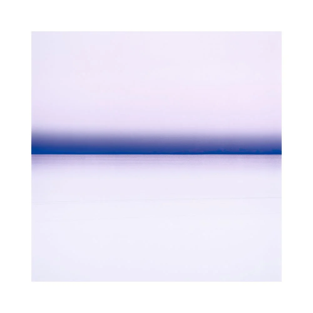
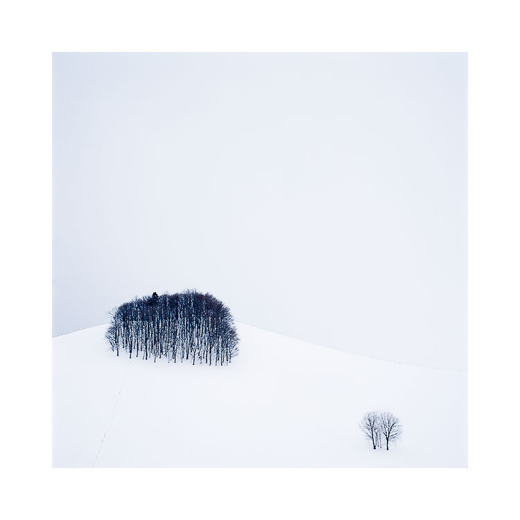
In fact, when it came to editing the work, it took me a while to get started. Or perhaps more accurately, to find the right groove to work in. I had experimented with a few of the images that really stood out to me to see how they felt after I had done some interpretation / digital darkroom work on them. I think it took me around three days before I realised there was a dark theme to the set, and to the 10 days I had been in Hokkaido. Once I realised using black as a background to give the images space, then I was on my way with moving towards the final selection you see here.

There are potential problems in creating groups of images, or looking to get such tight cohesion in one’s work. And that is when you try to make images fit together that simply aren’t meant to be part of the pack. The nine images above had a natural flow to how they wanted to be edited: I often think that images tell you what they want to be, and you just have to listen to them. They tell you in the core nature of what they are.

It can be a little restrictive if you try to force all the work you’ve created to look too similar. I often think in my own case that this is a thorn in my own creativity, as I sometimes fall foul to feeling that images have to conform too tightly that I sometimes worry that I will kill the essence of what they are in an attempt to make them belong to a set.

As a response and solution to this problem, I tend to sit on the images for days because I have learned that I am not always in tune with the spirit of an image immediately. If I’ve made a bad choice, it tends to become obvious over a few days or perhaps a few weeks. Anything that doesn’t sit right will become a noise that starts in the back of your mind and is amplified over the advancing days. Good ideas tend to be silent and do not jar. Bad ideas tend to get harder to live with over time.

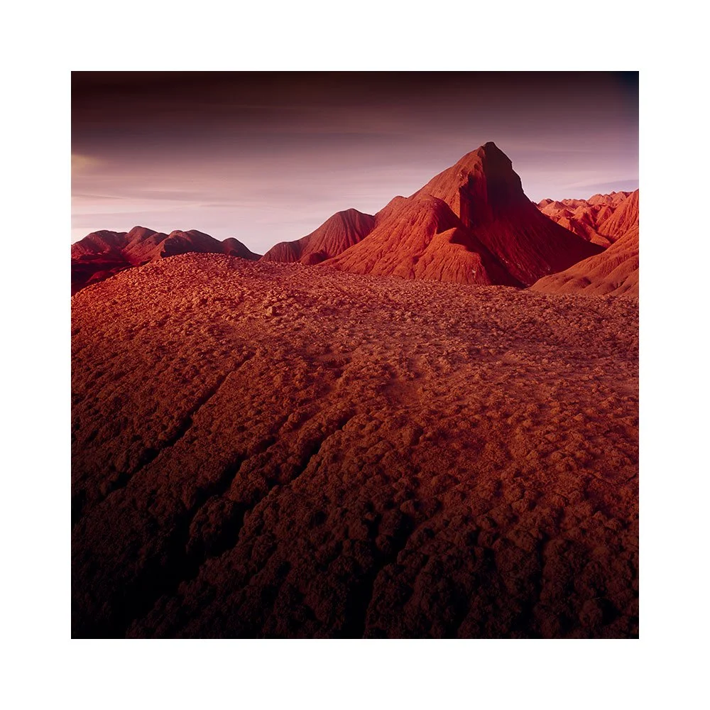
Then there are the sets of images that just do not belong to your thematic set you’ve created. This recent Hokkaido trip showed me that there was a clear set of dark images, but also some of the farmland in the centre of Hokkaido required a different approach and I did not see any way that the images below could co-exist with the set above, unless I deliberately decided to keep them as a separate sub-group of the work.

The other thing that surfaced for me over the week that I spent editing this work, was that working in sets of three images allowed me to find sub sets within the final set or portfolio. It helped me rationalise the edits and approach, and also by keeping the sub groups down to three images : the intention behind each image edit was clearer and often a lot simpler.

I do not think that editing is just a case of ‘moving sliders around until it looks nice’. I would end up with an unwieldy set of images that are more incoherent not just as a set, but incoherent as individual images. Editing with intention, and using the themes found in other images to help you bring forward the edits in new images (in other words previous edited images help influence and guide you in how to edit new images) cannot be overstated.

I prefer groups of six or nine images for a final portfolio set. Less is more. Six to nine images should be enough to convey a message, and not overcomplicate things. Working in small sets allows you to remain focussed and not to find yourself straying off into the long grass. But I cannot deny it: I came home with far too many images and most did not work as one large set. It all became much easier to understand and tackle once I realised there were sub plots inside the main plot of my Hokkaido story.

Rotating an image in the field

I’m using my field camera this week. It does not have a prism finder, so the image by default is inverted. What is up is down, and what is left is right. And I really like working this way.

By turning images upside down we abstract them. We also force our eye into areas of the picture that we do not normally visit: we all have a tendency to walk around a frame a particular way, so if the image is inverted or rotated we end up visiting parts of an image that we ordinarily wouldn’t.

My field camera has a lot of flexibility in composing and correcting perspectives. But what I like most about it is that it inverts the image on the ground glass. What is up is down, and what is left is right. It helps me abstract.

I wish all modern digital cameras had a feature to allow us to flip the image horizontally and vertically. It would help us spot issues in the compositions at most, and at least it would allow us to learn to see what is really going on in our pictures before we take them.

For example, the moment I rotate the image above, I notice that the foreground is quite dark. I also noice the background mountain in the centre of the frame more than I did when the image was the correct way up. This often allows me to take note of parts of the scene that I wasn’t so consciously aware of. Either just to understand the scene better, or perhaps to allow me to reconsider a composition and make some fine-tuning to remove distractions I had not noticed when rotated the correct way up.

If I were in charge of digital camera design, I would wish for a feature to allow me to flip the image 180º, and also just horizontally, and just vertically.

Our eyes are highly adaptive. Anything we look at, quickly becomes a normalised playing field. It is only by challenging our vision that we notice the things that our vision is innately suppressing. I am therefore often looking for tools that force my eye to look again, and by allowing me to flip the image whilst in the field, I can wake up my vision as it is forced to rebuild its understanding of the scene it is being presented with upside down.

As I say: I am often looking for tools that allow me to look again, and this feature is one I would love to have in a camera.

Selfoss, Iceland

This September I made a lot of new work using Kodak’s E100 film. I have not worked on any of the images from this September trip, except today I scanned the image below to test if my film processing is up to scratch.

I’m still having problems with Velvia 50 banding issues. I am leaning towards thinking that the manufacturing of Velvia is no longer that tight and that the issues I am seeing in the films are actually not the processing, but the actual films themselves. My reason for saying this is I have just reviewed all 50+ Kodak E100 rolls I shot, and they are perfect. No banding whatsoever.

I will be away for a week on a personal photo trip, so I am going to take Kodak E100 and Velvia and make duplicate shots on both films. I think this will settle for me if it is Velvia that is no longer being made up to standard or not.

Landscape as teacher

The landscape can either be a benefit or a hindrance to your development.

If you are seeking personal development in your photography then it’s best to work with the landscapes that seem to keep your creativity in positive flow. If a particular landscape keeps on showing you new things, or you find yourself enthused whilst there, then keep going back. You won’t be repeating yourself. Instead you’ll be honing what you do.

I’ve been very fortunate to find several landscapes that have been my teacher this past decade or so. Bolivia is one of them, and in this little 30 second video you can see how my photography has evolved over the time I have been visiting this landscape.

I think it might be easy to assume that this video just shows my own evolution as a photographer. Well, it does show that I have become more aware of luminance and removing distractions or fine messy detail in my work, and there is also a focus on reducing scenes down to an abstraction now. But this is not really the point I wish to make today.

Instead, I wish to make the point that my evolution as a photographer could not have happened on its own. I am aware that working in landscapes that resonated with my aesthetic, is one thing, but some landscapes just keep on giving and giving for each of us. We just need to find those which do and keep working with them.

Bolivia has been my teacher for over a decade now. I have so much to thank it for. I have had several epiphanies in my time there.

I like to keep going back again and again to the landscapes where I feel I have a connection or a relationship of some kind. There is more to do and more to uncover in my photography if I do.

By going back, they can become a yardstick with which to ‘notice’ changes in what we do. I do not use the word ‘measure’ or ‘evaluate’ because I think a certain judgement of whether our work is ‘better’ or ‘worse’ is to be avoided. For me, it’s more about just tuning in to where I feel I am, and how much I may have moved.

Going back again and again allows you to do this with your development in your own work. I appreciate that this may be an extravagance for me with regards to Bolivia, but you may have found a landscape that is in your own country that can afford you to go back repeatedly. If so, then I would advise you to continue going back.

Graduated Luminance conveys atmosphere

As a dyed in the wool Scot, I grew up in wet cloudy weather. It is part of who I am. I think it is also why I tend to gravitate to landscapes which offer similar weather to that of the Scottish highlands. I’m just most comfortable in overcast locations where rain is a predominant feature.

A few days ago I encouraged you to go out in bad weather. Because I have found over the years that working in inclement conditions offers soft light and atmosphere due to the constantly changing light.

But I have had to learn that there are many different kinds of ‘good light’. The first few times I went to the Bolivian altiplano I encountered a cloudless place that was full of colourful beautiful light.

It was a revelation at the time for me that a place that on the surface ‘had no atmosphere’, no diffused far away hills, no changing light scattering across the landscape, could be so enticing.

The landscape was dry, and the air was empty of any particles to cause diffusion and ambience in the scene. Well, at least that is how it appeared to me at the time because I was used to working in inclement conditions.

But I have found over the years of repeated visits to Bolivia and also the Puna de Atacama that these landscapes offer a blank template with which to draw my own atmospheres upon them during my editing. I have learned that graduating luminance across skies and lakes can impart a sense of 3D. When we use graduations - particularly subtle ones that most viewers won’t be consciously aware of, we can impart a sense of ‘glow’ into the work. We imply atmosphere when we go about using graduations carefully in our editing.

I now prefer to go to ‘blank’ places. Although I personally don’t like the phrase ‘negative space’, I like places that have lots of emptiness in them. They give me the space in which to impart a sense of 3D feel to the work in the edit.


Unskilled, and unaware of it?

The only thing I have learned for sure over my creative time as a photographer, is that there is always much more to learn.

The dunning-kruger effect describes how realistic we are about our abilities over our creative life.

dunning-kruger-effect.png

I show this to point out a few things:

  1. confidence in your abilities is not linear as your experience improves.

  2. You can be very confident but know little. In essence, you think you’re better than you really are. I believe this is a protection mechanism at the start of learning something new. Otherwise we would all quit.

  3. You can be low in confidence when your ability is high; although you are creating good work, you’re more critical of it.

  4. Few of us get to ‘expert level’. Despite us all wishing to get to this level, the real fun is in the journey of exploring where our creativity will take us.

In my view, I am always looking for balance in my creative life. I am always hoping to attain a level where I can objectively be right about what I’m doing. The truth is, I have brief moments when I feel I can accurately evaluate my output, and that is where we should all be. If we are growing, then we should have periods of being lost as we find ourselves in new territory.

As someone who is a ‘teacher’ (I prefer guidance instructor), as I often find myself just giving folks permission to try out what they didn’t know they already knew, I’m aware of the different levels in participants handle on their own abilities.

I’ve met folks who lack a lot of confidence and yet their work is really good,. Conversely. I’ve met folks who think they know more than they actually do. I think the later is very common, because in order to not give up, we have to think we’re doing better than we really are.

It can be a little frustrating dealing with someone who’s opinion of their abilities is out of step with where they truly are, but that is the nature of progress: we start off by thinking we know more than we actually do. It is only with experience that we realise how little we actually knew when we first started out.

With regards to my own personal development, if I’m honest, I am always discovering how little I know. Every year I look back at older work and realise ‘man, I thought I really knew this, but I still have a long way to go’.

This should be for all of us - our norm. We should always be looking back at our earlier work and thinking we have done better since.

Dunning-Kruger-Effect.jpg

Photographing Atmospheres

The conventional view is that we take photographs of subjects, and all we need to do is work on where to place them in the scene to get a good composition. Light is often considered an important part of the scene, but rarely considered the most essential element.

Coming to a place where there are no definite subjects ; no iconic mountains, no iconic trees, no iconic views to photograph, can lead those who fall back on using ‘subjects’ to feel lost, and be lost.

It takes a lot of time as a photographer to come round to thinking about light as the most essential ingredient in landscape photography. Yet that is what it is: it’s the most important element of our images.

The insecurities will lurk for some time that ‘I don’t have a key subject in the photograph’, as one works with landscapes that have no key compositional subjects. One will flounder around feeling unanchored and uncertain.

I would advise that this is something that needs gotten over. But I think will only come when you are accidentally caught in bad weather and manage to come home with a shot that has so much atmospheric content, you’ll wonder why you never went out in bad weather before. Often it is these unplanned moments that cause us to have an epiphany in our photographic development.

Scottish light is often changeable light as one weather front after another races over the Scottish landscape. This is its strength. Not its weakness. The Isle of Harris in Scotland has atmosphere because of this.

The island does not really have much in the way of ‘iconic’ subjects to use as an anchor in one’s photographs. It is a lesson in learning to let go of ‘looking for a rock for the foreground’ as one cannot find much in the way of subjects to place in the frame in the conventional sense. It is a lesson in learning to work with the elements, and dare I say, get used to getting wet as you pursue those fleeting, yet very emotive atmospheric scenes you encounter.

I love shooting in rainy weather. I have discovered over the years that I will find more interesting images when I shoot at the edge of storms, or in what many will consider a bad weather day.

The most important element in a picture is the quality of the light. Light is affected by the weather systems we encounter. Of the mix of rain and sunshine we encounter. Of windy days that tear up the sea in to many white horses we encounter. Of streaking clouds that blur across our camera’s frame.

We paint our imagery with atmospheres. Not subjects. Atmospheres.

When what is outside frame influences what is inside the frame

Preamble - this is a post that was originally published back in October 2020. I am finding much value in digging back through this blog.


This little area of Hokkaido is rather special to me. There are many rolling hills with bunches of copse together. When I am here, I am always striving to isolate groups of the copse with maybe a few single trees around them, but it’s so hard because there are often more complex, less attractive aspects of the landscape trying to creep into the shot.

‘To me, what you leave out of the frame is often just as important
or more important than what you choose to leave inside the frame’

As simple as this shot may appear, it took quite some effort to do, because I was constrained by a large forest just outside the bottom area of the frame. I found I had to go higher and higher up a hill to get enough clearance, and even then, in order to completely remove the unwanted forest, I had to settle on this composition:

Hokkaido-2018-(5).jpg

Due to the large forest (just outside the bottom part of the frame) being so close to the little trees, I couldn’t give the trees enough space below them. This forced me to push the two little trees towards the edge of the frame.

At the time of capture, I remember thinking ‘this is a little unusual’, as everything in the frame of interest is really bunched down at the bottom of the frame. Can I live with it?

‘I think all you can do is make the shot,
and leave the pondering for another time’
(we are best being editors when at home)

I think all you can do is make the shot, and leave the pondering for another time. And indeed, as I’ve lived with this image over the past two years I’ve grown to really enjoy it. To me, those little trees are so keen to be part of the copse. But they’re almost being pushed out of the scene.

So sometimes it’s ok to put subjects at the very edge of the frame. Sometimes it’s ok to create tension. I just think that it has to look like it was intentional. Otherwise most viewers will assume it’s a bad composition.

I would also like to add that by being restricted to composing this view because I was trying to avoid what is outside of the frame, I was forced to create a composition that is / was outside my normal habits or comfort zone.

Sometimes (if not all the time) restrictions and limitations are a good thing, and encourage an attitude towards innovation.

Grads and Feathering

Preamble: this was originally posted in February 2020. I'm reposting it here, as it's still relevant today.


When you place a grad right in front of the lens, it becomes softer, and more diffused. Consider what happens when you place a hard-grad in front of a 50mm lens:

50mm-grad.jpg

Let’s think about this some more. In the illustration below, I show where the barrel of the lens is in relation to the actual filter that you have placed in front of the lens:

lens-circle-50mm-hard-grad.jpg

Not only are you using a small portion of the actual filter, but consider that the filter has been placed up close to the front of the lens and that the lens is focussed much further out than where the filter is. So the filter will be quite diffused as illustrated in the diagram above.

Filter gradations become more soft as the focal length increases

When you zoom-in, the filter graduation becomes softer. Let’s look at how the hard-grad is now working with a 70mm lens:

70mm-grad.jpg

The hard-grad is becoming more diffused, and less effective as we ‘zoom in’. In essence, you are zooming into the graduation or ‘feathering’ of the grad.

As you go down the focal lengths, gradations become more defined

When we go down the focal lengths, we are essentially ‘zooming-out’ of the gradation of the filter. So it becomes more defined. However, there is still a degree of diffusion because the filter is in-front of the point of focus of the lens:

24mm-grad.jpg

So we’ve learned that:

  1. Hard-grads aren’t as hard as we think they are.

  2. Hard-grads are always diffused more than we think they are going to be.

  3. The diffusion or ‘gradation’ becomes softer as we go up the focal lengths (zoom in).

  4. The diffusion or ‘gradation’ becomes harder as we go down the focal lengths (zoom out).

Soft Grads are very soft

For years, I always thought soft grads would be more suitable because I wouldn’t see the sudden line of the gradation, but I often found myself pushing the soft-grad all the way down, in a futile attempt to affect the sky. In my view they're too soft for most applications.

I’ve come to realise that soft-grads are only useful for when I want very soft gradations over the entire scene and that they are of little use for when I want to grad the sky only.

Consider these illustrations:

50mm-soft-grad.jpg

At 50mm, soft grads just apply a very gradual change across the entire frame. I find them mostly useful for images of large expanses of water or other subjects where there is a gradual change from ground to sky of around 3-stops.

Let’s consider if it’s any better if we go down the focal lengths to 24mm:

24mm-soft-grad.jpg


It’s slightly more defined, but still very soft.

Feathering

What we have seen is that hard grads, as well as soft grads have a degree of ‘feathering’ to them. The transition is gradual even for hard-grads.

This means that placement isn't so critical.

If you are finding your placement is bad, is more likely that you are using a grad that is too strong, rather than your problem being bad placement.

It also means that the grad isn't going to bite into mountains on the horizon so obviously, as the effect is too gradual to be noticed.

For those that do find their mountains are darkening down too much, I would suggest that it’s not the use of grads that is often the problem, it’s usually down to one of two things:

  1. The wrong strength of grad is being applied (I’d say this is mostly the case)

  2. The subject matter has very dark mountains and the grad has been placed a little too far down in the frame. Our eye tends to adjust and ‘not see’ the effect after a while, so when re-composing, always ‘wiggle’ the grad to see where it’s placed. Often times, it’s much lower than you intend it.

Conclusion

Firstly, grads don’t work the way we thought they do.

  1. Hard grads are much softer than we think they are.

  2. Placement is less critical, so long as we choose the right strength

  3. Soft grads are very soft. I’d choose medium or hard grads over soft-grads for most of my work.

  4. As you zoom in, grads become more diffused

  5. As you zoom out, grads become more defined

With regards to point 4 and 5, I now own a set of Lee Filter medium grads alongside my Lee Filter hard grads (not all filter manufacturers make different degrees of gradation - hard, medium, soft). When I zoom in, I use the hard grads and when I zoom out, I use the medium grads. You may want to go one stage further and buy a set of very-hard grads. They will come into their own for focal lengths above 100mm.

6. Lastly, but most importantly, grads are more feathered than we assume. They don’t bite into the horizon as suddenly as we assume they do, and if you are finding so, then it’s most probably due to either the grad being too strong. Or it’s been placed too far down the frame. Wiggle it around to see where you’ve placed it. Often times our eyes adjust to the placement and we can’t see where the grad has been positioned. By wiggling it, we allow our eye to re-adjust to where the filter has been placed.

Finding out the right strength of filter

There are two ways to find the right strength of filter:

  1. By trial and error (not recommended)

  2. By learning to use your light meter and learning to read in f-stops

With point 2, I’ll reserve this for another blog posting.

Writers don't write, they mostly re-write

I was listening to an interview with a writer recently. He said that most of his time was spent re-writing what he had written, and was keen to emphasise that for the most part, writers don't actually write. What they mostly do is re-write.

In essence, I think what he was saying is that the first draft of whatever a writer writes, is never up to a publishable level of quality. A writer spends a lot of time honing the work, or expanding on it. I can see for most writers, that the choice of the right word is important because it brings nuance to the meaning. So there is a need to go back to rework things until it fits just right.

I would say: all creatives maybe spend about 20% of their time finding the initial concept, and 80% of their time honing that concept.

Song writers spend 20% of their creative time coming up with the initial song idea, and 80% of the time fine tuning it, doing micro adjustments and trying to remove all the loose ends in the work.

A movie in Hollywood can spend twenty years in script format before it is made into a film. Often going through several re-writes, several script writers, producers and actors until it is finally made.

I think this kind of 20/80 spit idea isn’t unusual. In fact, I think it’s perfectly normal and I think it proves one thing: that no matter what discipline, seldom do creators make things that are instantly up to publishable quality.

They will do as many drafts as is needed until it reaches a level where they think it is ready for publication.

Keeping things fluid is just as important as is chasing a final product that is up to publishable standards, and I think most creatives know they have to go through several drafts of their work to get to that point.

So again, I think that writers don’t really write. They mostly re-write. Photographers don’t really photograph. They mostly spend time recomposing, re-adjusting their compositions until they think they’ve got the right balance in camera. They spend a lot of time re-evaluating the numerous shots they got of a shoot and then further evaluating what kind of edit might suit them. They will re-edit the work and it may go through several drafts before it is considered ready for publication.

I know this, because this is how I work. I rarely publish my edited work once I think I’m done with it. I tend to leave it for days and weeks. I live with it. Sometimes I tire of it which is a great way of knowing that the initial idea wasn’t as strong as I had hoped. Sometimes something starts to annoy me about the work and I realise that I have maybe overdone the contrast, or something. I re-edit.

I keep re-editing until I get to a stage where it feels as though it is sitting comfortably for me. At that point, I know it’s as good as I can currently make it. It is then that I let it go.

And so I publish it and move on.