
I went to South Korea in December last year for an 8-day trip. I had been invited over by my friend Kidoo whom I met through my workshops. I hope to write more about my travels there in my coming newsletter this month. In the meantime a new gallery is up on the site for you to enjoy.


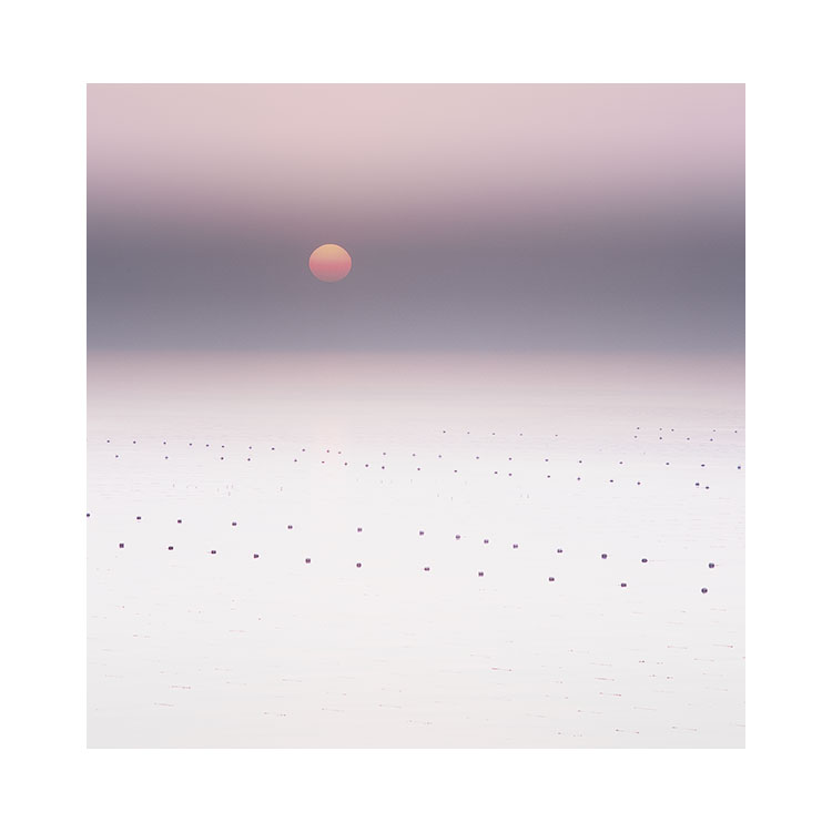


Ghostly Steel grey
This image has been sitting in my filing cabinet (I shoot transparency film) since February 2017. Volandstind is one of my favourite mountains in the Lofoten islands of Norway.

This image was taken on a particularly windy day in Lofoten with driving rain passing through every few minutes. Making images like this one doesn’t happen on a calm day, nor does it happen on a settled dry sunny day either. But you knew that, because that’s why you come to my blog. I shoot in inclement weather mostly, and if the weather is challenging, then it’s a good indicator that you might get something of interest in your photographs. If you can get over how rotten it feels to be outside on such a day.
I remember having to set the camera up and just wait as the squalls of rain passed through. Rather than just firing the shutter, I prefer to stop and watch the elements and look. Some times the visibility increases too much and that beautiful conical shape of Volandstind was lost to too much detail. Other times the visibility would decrease so much that the mountain was hardly visible at all. It was all a case of waiting for the right level of visibility and studying the weather.
You have to become an observer of weather patterns. Understanding what sort of day it is, and whether the rain squalls are passing through and what their frequency is, is important in anticipating what will happen next.
Most of my ‘strong’ images often leave a big impression upon me at the point of capture. Because I’m a film shooter I have no preview, so I have to trust what my memory tells me. With this photo, the residual memory of it stayed with me for so long that when I dug out the transparencies today I had it first and foremost in my mind to seek out and edit.
Steel blue
You can use colour to convey a feeling. And if you reduce the colours in your pictures to just a few, then the message gets stronger / simpler.
You can use tone to help lead the eye around the frame, but it is colour for me, that conveys emotion.

I’m not the same photographer I was 10 years ago. Where I once crammed lots of tone, texture and colour into the frame, I now do the opposite.
With early efforts, I think the high saturation, high colour, complex textures and busy compositions are similar to someone trying to convey all their points in one paragraph. As we learn to go on, we move each point to its own paragraph, to its own space where it has a chance to express itself.
I didn’t see the ‘steel blue’ when I was in Romania. It only happened during the editing and by creatively messing around.
I like to try to be as fluid as I can. ‘what happens if I turn the hue slider this way?’ and suddenly a steel blue colour leapt out of the frame. It was always present - you can’t bring something out that isn’t there, And once it was there: I knew it belonged.
Scars on land II
All landscapes have scars. It just depends if you choose to see it that way.
The word ‘scar’ may sound negative to you, conjuring up the idea that some kind of abuse has taken place. Not for me. A scar is simply the remnant of a moment, after all, even the most treasured loved objects we own, if we have them for long enough accumulate scars.

Scars are recorded history. Marks of moments in time.
Surely, all photographers are interested in capturing a moment? We are all fascinated by the idea of freezing time. Of pressing pause, of being able to focus on one tiny moment in time.
I think that’s why I like lines, features, geological elements to the landscape. I think it’s why we all do. They are scars. They are signs of moments in time.
We’re not just into photography for pretty-picture-making. I’m sure we’re into it for something more metaphorical in nature, of having a dialog with our surroundings. Photography is a way of connecting.

In the works
During last year’s printing workshop, I found that we got stuck in too much detail about the technology. Monitor calibration for instance, is a big topic that can consume you for days. Colour spaces were often confusing for most, and then there was the issue of rendering intent. Why do you have to choose the rendering intent in the print driver, even though it’s been set in the proofing set up? Some folks got confused between proofing settings and printing settings and couldn’t understand why they are different, and have different purposes.
Then there was the aspect of sharpening, and paper profiles. Yet another large topic that one can get lost in for days, if not years.
But it had to be covered. You need to know this stuff if you want to get good at printing.

I’ve got to prepare some notes for this years workshop. So participatns have something to refer to when they get lost. Rather than getting stuck going over the same material, I need to crystallise the information so I can keep the workshop on track, and those that find some parts confusing have notes to refer to.
So that’s what I’m doing. I’ve been working on the content of this workshop for the past few months and I’ve pretty much come to the conclusion that it would suit an e-book as well.
It’s a massive topic. And I felt a sense of dissatisfaction from some workshop participants - how do you learn about printing in a week? You can’t. It’s like trying to learn about composition in a week. You can’t. All you can do is point people in the right direction and try to cut out some of the crap. Cut down the chances of them going down the wrong avenues and getting lost down them for years.
So I think there is room for a stripped down information pack that cuts through a lot of the information out there, and tries to simplify it down to what you just need to know to get up and running. So that’s what I hope to do with this new e-book that is currently in development.
Stay tuned.
The lure of the road.....
I’m just home from Japan. I was there for a whole month. Sitting at home, enjoying being home, it is quickly wearing off…. there is just so much out there to go and see.
This little video is very inspiring. Surely all us photographers have wanderlust?
Art should be disposable
Being a serious photographer or serious artist is certainly something I would encourage. But you know, I think if you are passionate about photography or art, then you’re probably already there in that respect.

Being precious about what we do is hard. It’s hard to show others our efforts, particularly if they mean a lot to us, and somehow, when we care less about the work, or feel it’s ‘throw-away, disposable stuff’, it’s much easier to be less critical of ourselves.
Creating work takes confidence. Confidence to feel happy knowing it may not be as good as we hoped. Confidence to feel happy with whatever people think of it. Confidence to take it or leave it.
A split personality is often required: one that can take or leave our work and not get too precious about it, but also at the same time care very deeply about what we do. Let me explain.
To be truly free, to be able to explore, we need to free ourselves from any chains, or self-imposed limitations or rules. That’s a pretty hard thing to do if you are trying to be serious about what you do. We start to judge our efforts often before they are complete and as I’ve said on many previous posts - that can lead to writers-block - unable to produce anything because nothing seems good enough.
Creativity is all about letting go. You can’t let go if you are bound by rules and self-imposed restrictions. And to let go, you need to either develop a sense of ‘who cares if it’s rubbish’, or get confident in what you do.
Confidence does not mean you are good at what you do. Confidence has nothing to do with it. Confidence is all about being comfortable with whatever you create, no matter how good or bad it is.
I think one way to get around any self-imposed restrictions, is to look at your photography / art as disposable. Even create it with the mind that you will destroy it.
We’re all far too precious about it. We want to keep what we create for perpetuity, but that in itself is an illusion. We don’t last forever, and nothing does. So why should our photography? Why can’t our work be a product of the time it was created in? Why can’t it just live for the time it was made in, and be gone afterwards.
If you can get used to throwing your work away, of maybe printing it, and then throwing the negative or RAW file away, I think we would set ourselves free. Free to do whatever we want because we are no longer being tied down to judging ourselves on our past work, on thinking that the work we create represents us. It represents nothing but a moment.
I sometimes think that photography or art should be disposable. If you can create it with this in mind, then I am certain that things become more free. You lose your inhibitions, judgement, and an over-riding sense of value in something that should just be a passing moment anyway.
If you are having problems creating work, then I’d suggest you go out one day to create 10 images. Work on them quickly, print them, delete the raw files, and file them away if you feel you are too judgemental on them. Forget them. Come back to them a week or so later and think about the transient nature of what you did, and more importantly, how you were able to produce something so quickly.
Good artists create. They keep moving forward. They don’t build museums to their work. They don’t stagnate. I think the way they do this, is to understand that anything they create is just a passing moment, and something not to be taken too seriously. Free yourself from your older work and you can find the space to move forward.
What would you do, if you had no undo?
I’ve written posts in the past about the act of committing to your decisions. When we create art, we have to commit to our decisions along the way: where to place the tripod, when to click the shutter and when to say when something is finished / complete. There are many stages along the way where we have to make a choice knowing we can’t go back.

But there seems to always be a need to have an undo button with the software we use. We think that the undo button is pretty neat. Don’t like what we’ve done? We can undo it. It’s powerful. We now have more options in front of us, and that makes things more powerful, more creative, right?
Well, I don’t think so.
Having a way of being able to undo a decision is a cheap way of saying ‘I don’t have to worry about any decisions I make, and therefore, I can take them less seriously than if I knew that once they are made, I can’t go back.
What would you do if you had no undo feature with your software?
Would you be more careful with your edits? Would you think twice before you delete something? Would you find that every decision you made became quite difficult? Would you slow down? Would you find yourself torn, unsure of what to do?
Being a creative person is all about taking risks, of accepting that you may fail. Failure is good for us. Being able to be comfortable at failing when experimenting means that you open up your chances of doing something surprising. It also means you aren’t following the beaten path of the derivative.
Having no undo, means you have to stand by your decisions and learn to let go if things go wrong.
Having no undo means you are free. Because as soon as you are no longer scared to screw up, you are free to try anything you want, and to see where it goes.
Creativity cannot be controlled, perfected, done with no room for failure. Failure is part of the creative process, and having no undo button is actually a good thing. Having an undo button is actually stopping you from letting go, and from trusting yourself to give things a go because you believe in what you do.
Working your aspect ratio muscle
I’ve been saying for many years now, that certain aspect ratios are easier to work in than others. Choosing the right aspect ratio for your own aesthetic temperament will aid you in finding compositions, whereas working with a difficult aspect ratio will hamper you. The thing is, you need to find out which aspect ratios work for you.
I’m still surprised that so many buy a digital camera and don’t consider the aspect ratio it shoots in. I have always thought that 3:2 is a particularly difficult aspect ratio to work in and choosing a less panoramic format such as 4:3, 4:5 or 6:7 would be easier to help you compose in.
Anyway, the reason why I am writing this post today is to say that by choosing different aspect ratios to work in, you force your eye to move into regions of the frame that you don’t normally visit with your eye.
If we consider the 3:2 format below, I’ve marked the region where most of us tend to spend time with our eye in black. The white areas of the frame are where we spend less or no time looking in.


I like to think of the black areas of the frame as ‘concentrated areas of experience’ with the white areas being ‘areas of little or no experience’.
If you choose to shoot in another format for a while, the different shape of the chosen aspect ratio will force your eye into areas of the frame that you wouldn’t ordinarily visit.
I found with square, my eye was visiting more of the frame, as is illustrated below


Interestingly, I found my eye had less to travel to reach the far corners of the frame than in a 3:2 format. My ‘area of experience’ isn’t too far away from the corners of the frame.
As a result, I started to put objects at the far corners of the frame.
This isn’t something I was ever comfortable doing with 3:2 or 4:5.
After shooting square for a few years, I found that when I did return to 4:5 or 4:3, I found that all those exercises of putting things in the far corners of my square aspect ratio helped me use those corner and edge areas of the rectangle aspect ratio. As in this picture below:

Working with different aspect ratios is a good exercise to do. Move around between them too much and perhaps you won’t learn anything as I do believe you need to settled into one or two ratios for a few months if not years. But certainly it is true for me, that by moving to a different aspect ratio for a while, has changed my photography and how I compose when I have returned to an aspect ratio I used many years ago.
Your visualisation skill is like a muscle. If you don’t use it, you lose it. If you never force your eye into the corners of your frame then I think you lose the skill to visualise compositions that can produce very dynamic work.
Square Variations
Today I feel like posting an old post. The post below was written in 2012. I feel it’s just as valid now as it was back then. Today I’ve been talking to a few people about aspect ratios. Since I wrote this piece, I’ve seen a few camera manufacturers offer more aspect ratios in their cameras, but it’s still not enough. Aspect ratios should be programmable on all contemporary cameras. It should also be implemented in a way that works without it being a bit of an afterthought (Canon, Nikon). Through the more recent introduction of mirrorless cameras, some have embraced aspect ratios (my favourite is the Fuji GFX50s which has just about every conceivable aspect ratio available, and it can be programmed as a dedicated button on the body).
Anyway, I hope you enjoy this article about me shooting images in Scotland.
Enjoy, Bruce.
—
April 2012
This past weekend, I was in Torridon conducting a weekend workshop. We had some very rainy weather, and one of the group - Steve - mentioned to me that he was glad the weather had been bad, as it gave him a chance to see he could actually make some good images despite the weather.

Top right
I often feel, that the reason why Scotland is so photogenic, is because of the changes in the weather. One minute it's misty, the next it's clear. And fog or low cloud levels can be a great way of making simpler images. Take the shot above for instance. This is Loch Maree. Normally, this group of trees have the massive Slioch mountain dominating the background. But with a bit of rain and poor visibility, Slioch was invisible. We were left with no horizon - nothing to give the shot context.
I loved the group of three or four trees clumped together. They were actually a subset of a larger group of trees, but I felt that we could easily 'remove' the rest and keep the entire shot very simple if we just had this small gathering of trees.
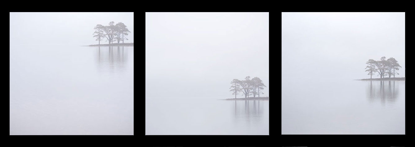
Variations
I made this shot on my little Lumix GF1. It's a great camera because it has interchangeable aspect ratios. I felt that square worked really well for this shot, as I could easily place the trees in three quadrants of the frame - top right, bottom right and middle right, as you can see in the above triptych. Question is, is one better than the other? And I like to consider that there is always more options than just one. So I guess the answer is 'it depends'. My personal favourite composition out of the three images is the first one. I feel the picture has a more 'uplifting' feeling than the rest, and it has more presence, because I'm really exaggerating the empty space in the frame more than the others. I also love the reflection of the trees.... I feel they have space below them to 'breathe'.
The middle composition, where the trees are placed in the bottom right, is perhaps less engaging for me, because the trees aren't so tight against the bottom of the frame. The picture feels less focussed for me, in terms of composition. I'd liked to have moved the trees even further down the frame, but I felt the reflections would not have enough space. I felt I had to keep moving the trees further up the frame. But it's a more relaxed composition than the first one - which I feel is more 'graphic' than being a photograph.
The far right composition is perhaps my less favourite. It is more of a 'standard' composition. I feel the horizon has been carelessly composed - for my taste. It's just a little below centre, and I think it might have benefited from being slightly above centre - giving that 'uplifting' feeling I was talking about in the first image, while at the same time, being more in-line with a 'standard' landscape image.
As much as I love square, maybe it might have suited more a 4x5 aspect ration as seen above?

4x5 crop
Ultimately, when you have a simple subject such as this - trees and reflection, and nothing else, it's much easier to get down to the basic tasks of composition and placement in a frame. The less objects you have in the frame - the better, I feel.
I was immediately attracted to this scene when we were driving past, because there's little in there to distract. When was the last time you went out with your camera to shoot when the atmospheric pressure is so low, that almost nothing is visible?