With the proliferation of the ‘same view’ on many social media sites, it would be so easy to say that certain places in the world have been ‘done’. But I find that such an off-hand, reactionary view and quite absurd.
No place is ever ‘done’. Instead, what is often ‘done’ is the derivative view.

Image made in 2017, on my second visit. The sky was less blue, and the contrasts of the cone and black desert stood out more. I also choose to tighten the crop a bit to focus more on the conical shape of the volcano.
Of course, there is nothing wrong with photographers going to iconic places to reproduce a shot they have seen before: we are all into photography for many different reasons and motivations. For many of us, simply being able to go to the location of a shot we love and make our own version of it is very enjoyable, and dare I say it - educational. I know that when I have encountered locations that have inspired me, I often learn a lot by walking in the footsteps of the photographers that have influenced and inspired me.
I think that when we hear the statement ‘it’s been done’, it’s a way of saying ‘most of us can’t think of an original way of looking at the same landscape’. And so, I am always enthusiastic when I see a really interesting / different / original view of a well known place. More so if the picture is beautiful.
Similarly, being able to say we’ve ‘done’ a place, is just as folly. I’ve been going to the same landscapes for more than a decade and I still find something new on each visit. We have to go back, because a first encounter only gives us a hint of what is there. To really get under the skin of the place, we need to return and spend time becoming acquainted with it, and allowing the relationship to deepen.
For example, I’ve visited the Cono de Arita in Argentina three times now. On each occasion, it has offered up a new view of itself. One that I never saw, let alone failed to capture the previous time. Plus, I think that each time I return to a location, I am often looking for something different. Perhaps I have grown / changed, or perhaps it is that I just see something new in the same landscape. I am aware that any feelings of a place ‘being done’ say more about my approach to it, than anything about the landscape itself.
Landscapes are fluid changing places. If we are seeing many shots of the same scene, then that has noting to do with the landscape, but more to do with us. Being original has never been easy, because if we could all do it, then it wouldn’t be worth doing :-)
Originality is hard, and good photography is hard work. To be exceptional at what you do requires something that is intangible to qualify, something more than just making nice photos.
Original shots of landscapes may require a lot of effort and a new way of looking at them, but they are possible. No landscape is ever ‘done’.

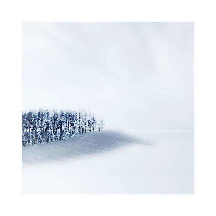
My original shot of the Cono de Arita, shot in 2015. In this view, I’m more interested in trying to give it context. I felt it vital that I show the far off distant volcanoes on the horizon and give the Cono de Arita more salt-flat space.