Do your images have good design?

As someone who makes photographs that are often cited as having some form of simplification about them, I've often found it hard to explain how I come about my compositions.

In this TED talk, I think that Roman goes a long way to helping me explain how I simplify my compositions. By discussing the design of Flags and why some flags are better designed than others, Roman explains what 'good design' is.

Once we understand what 'good design' is, it doesn't take much to realise that it can be applied to almost everything we see around us, which Includes photographs.

For example: a good flag will look effective when viewed as a tiny thumbnail image. Most flags are viewed from far away, so if the design doesn't work at such a small size, it's probably too complicated. I find parallels in this idea with my own imagery. Often the images I choose to edit or work on look good when viewed as thumbnails. I can often see the underlying structure or simplistic forms that make up the core of the image when viewed really small. Complex imagery doesn't tend to work when it's reduced to a very small thumbnail.

On a related note, I find that making well designed photos is not enough if you want to be a good photographer. How we choose to present out work - the design presentation - can influence how others perceive the work and ourselves as photographers. If the presentation is smart, clean and simple, then the work has a chance to live up to its full potential, but if the work is presented with little thought or care, it can be received less well.

Design goes right through everything we do as photographers - from our business cards, to website layout, to how we present our work in book form.

So often I've seen beautiful images badly conveyed because there was little or no thought in how to present the work. Good design is important.

It seems that flag design is more important than I realised. Watch the film - it's a fascinating insight into how design is everywhere and how it really matters.

Fine Art Posters

I've just published a limited edition set (100 copies) of fine art posters. Printed in my studio on my Epson 4880 Ultrachrome ink printer on Museo Silver Rag paper, they are archival prints made as 'poster' format. Each one comes numbered and signed.

They can be bought individually, or together (see very bottom of post) with one shipping ost applied if you buy both as a set.

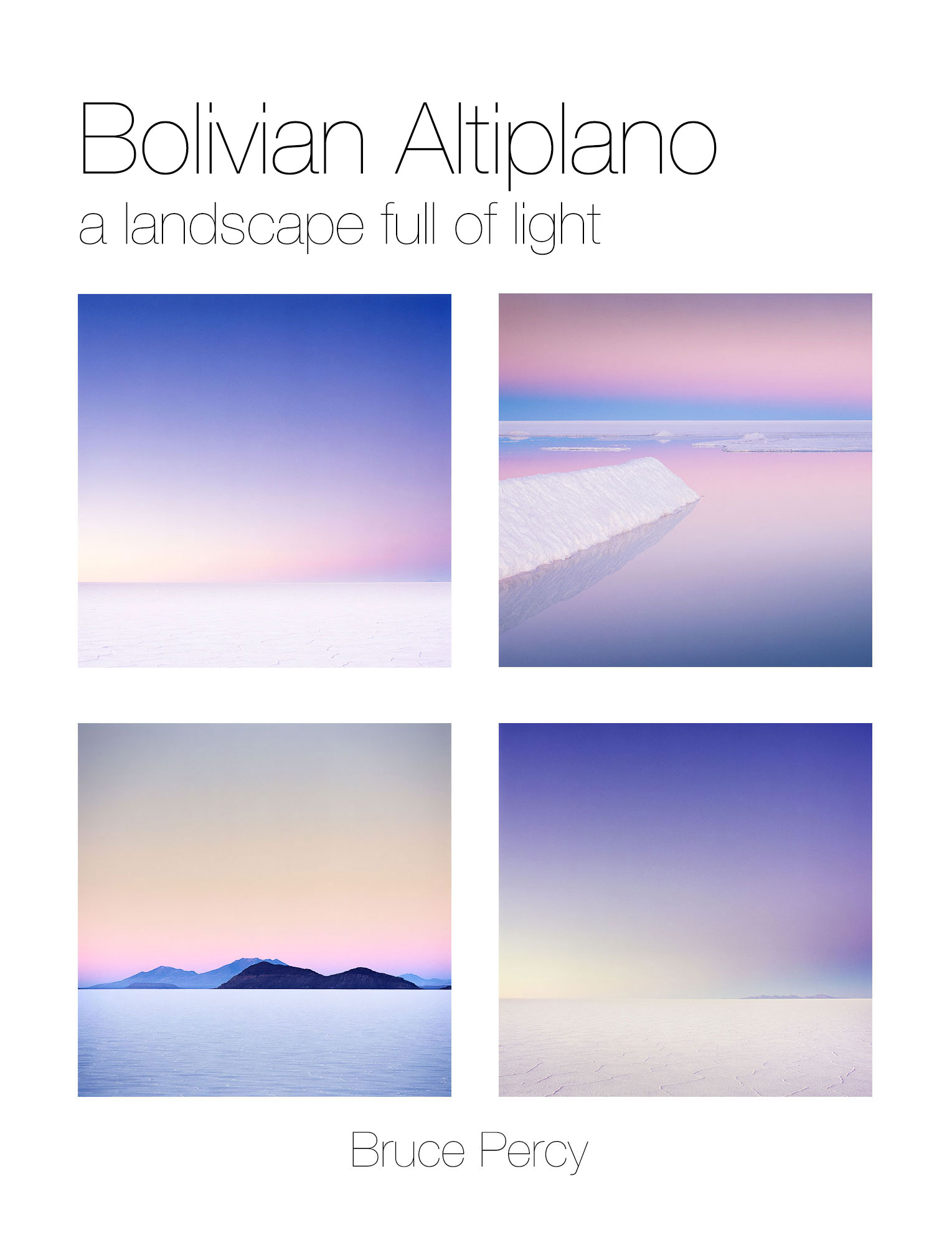
A landscape full of light

This week I've just completed working on new images from the Altiplano of Bolivia.

The Salar de Uyuni - the largest salt flat in the world, contains a world full of light at sunrise and sunset. These images were shot this June on Hasselblad 500 series cameras with Fujifilm Velvia 50 RVP film.Images © Bruce Percy, 2015

The Salar de Uyuni - the largest salt flat in the world, contains a world full of light at sunrise and sunset. These images were shot this June on Hasselblad 500 series cameras with Fujifilm Velvia 50 RVP film.

Images © Bruce Percy, 2015

Over the past few months, I've had some time away from my busy schedule each year. I've been at home for most of the time, sleeping in the same bed and finding a routine in the day to day experiences of city life. It's been a real luxury for me to do this.

Having this time and space at home, away from workshops and tours, has allowed me to entertain working on some of my own images that I've been stock piling up for some time. It's been hugely rewarding (and of great relief) to be able to unburden my conscience by completing work from the Isle of Harris, Patagonia and now the Bolivian Altiplano. Having a backlog of work that is incomplete feels unhealthy: it creates a blockage of sorts in my mind, and stops me from moving forward with what I do. I like to leave work for a while before I edit it, to allow objectivity into the picture, but leaving work for far too long starts to invite a sense of procrastination and other complex feelings about your work. It's not advised. Trust me :-)

I love my work: I'm so extremely lucky to be able to go to so many wonderfully exotic landscapes each year. Many of these places have become friends - as my favourite landscape photographer - Michael Kenna has often said in his interviews - the more you return to a place, the more you get to know it, to open up a deeper conversation with it. I couldn't agree more.

With this in mind, I present to you my most recent images from the Bolivian Altiplano.

About the Altiplano

At high altitudes between 3,600m and 4,800m, the air is thin here. There is no humidity so temperatures drop below freezing at night. There are no roads to speak of - just vast desert interspersed with Land Cruiser tracks spreading out in all directions. Professional help is needed and indeed, sensible. The guides and drivers I use here know their way around the landscape, and can also be found to navigate the largest salt flat - the Salar de Uyuni by fixing onto the far off distant silhouettes of volcanos. It is a challenging place, and coming here requires a lot of planning and discussions since many of the tour operators do not venture out for the special hours.

About the new Work

I should stress that there were some preconceived notions about what I hoped to achieve on my visit this June. When I say preconceived - I mean that I can't help having visual ideas or dreams about what I hope to accomplish. They are really motivators to get my inspiration working and I'm quite happy to depart from them once on location. They are dreams, and as such, they are often quite broad and not too specific.

It had been two years since I was last here, and I knew I'd missed certain key locations if I were hoping to complete a rounded representation of what is here. Now that I've completed the new work, I realise that although I did indeed visit some of these key locations and realise some of the images I'd hoped to make, the new body of work is different yet again from anything I had envisaged.

Things never quite turn out the way you want them to. In the process of aiming for what I was looking for, I've been fortunate to discover beautiful locations and imagery that I couldn't have dreamed of before setting off on this journey.

This, I feel, is the best thing about photography: you always aim for something, and more often than not, the final results and experiences are more surprising than you could have ever imagined.

Special thanks

I'd like to express my deepest of thanks to the following guides and drivers who assisted me over the three week period I was at high altitude:

Drivers

Abel Valdivia Lopez
Armando Mamani Flores
Demetrio Chavez Vergara

Guides

Alvaro Oropeza Carbera
Marisol Maydana

Film processing

AG Photographic, who should be commended for giving consistent and reliable results. In an age where I've had to switch lab because of poor or contaminated processing, AG can be trusted to give me the standard of film developing I need.

What is your message?

I was watching something recently, and there was a quote from Gandhi - 

When asked what his message was, Gandhi replied 'my life is my message'.

And it resonated with me. I felt that everything I do; how I conduct myself and the way I interact with the world, as well as  the art that I produce - is my message.

It's the same for all of us.

If you are a photographer, then I'd like to ask you -  have you figured out what your message is?

Tightrope walking, Jaisamler, India. Image © Bruce Percy 2009.

Tightrope walking, Jaisamler, India. Image © Bruce Percy 2009.

New Patagonia Images

I've just published a new collection of images from my Patagonia trip this May. They can be found under the recent work section of this website.

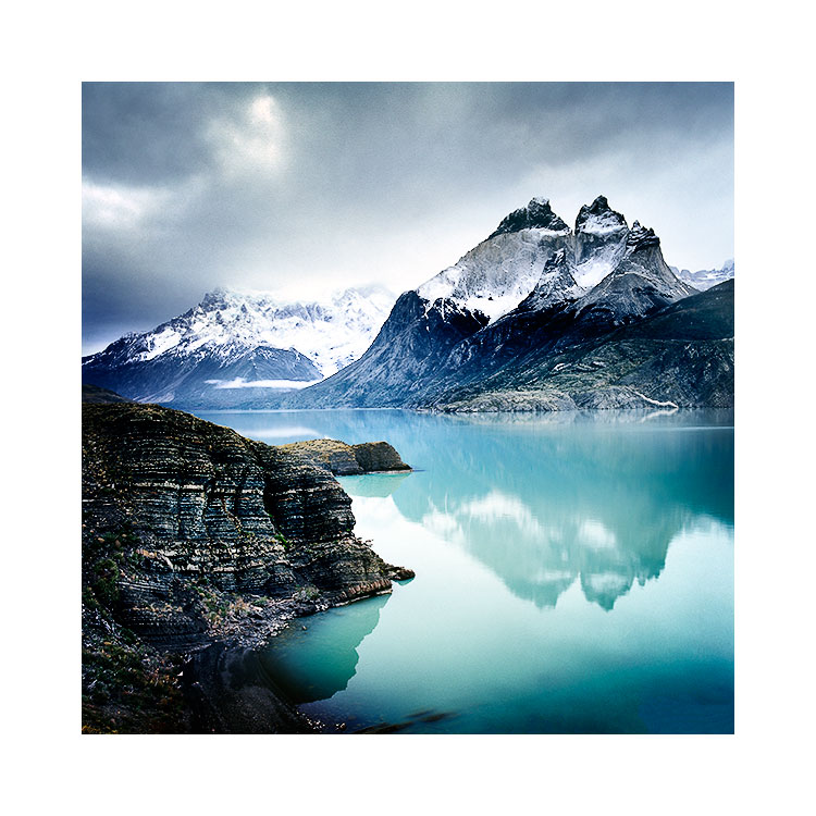
Lago Pehoe & Cuernos del Paine, Torres del Paine National Park.This was shot a few years ago that I never knew how it fitted in with anything that I'd done, up until now. So it is part of my new portfolio as it fits so well with the work from th…

Lago Pehoe & Cuernos del Paine, Torres del Paine National Park.This was shot a few years ago that I never knew how it fitted in with anything that I'd done, up until now. So it is part of my new portfolio as it fits so well with the work from this year. Image © Bruce Percy 2013

About the new images

I often get a feel for the work while I'm out there shooting. I remember saying to a friend once I was home, that I could see in my mind's eye a portfolio of black beaches contrasting against almost white skies. I could almost 'see' a two-tone collection.

If you like to focus on a theme in your work as I do, it's much easier to marry images together when you're dealing with a few tones or colours. Which I think is exactly what this portfolio does.

For me, I know that good images come about due to three things;

1) Good light
2) Right time
3) My ability to work with what i'm being given

The last point is the most important one. I've been saying for a while now, that I've been lucky to meet certain landscapes at the right time in my own photographic development. If I meet them too soon, then I run the risk of finding them hard to interpret because I haven't developed the sufficient skills in which to work with what I'm being given.

Lago Grey, Torres del Paine national ParkImage © Bruce Percy 2013

Lago Grey, Torres del Paine national Park
Image © Bruce Percy 2013

I've been coming to Patagonia since 2003, and despite loving the place, I've always found it hard to photograph and I believe it's because I haven't been ready until recently. I didn't have the skills with which to interpret a stark, monochromatic landscape. Looking back, I have often been going against the flow by trying to get Patagonia to give me what I wanted (saturated colours), rather than me being able to see the beauty and relationships in a landscape that excels at contrasts between light and dark. The black volcanic beaches are so far apart from the bright tones of overcast skies and snow covered mountains, that I see now, this was the key to me understanding this landscape.

I feel I'm always learning, always realising that each landscape has its own way that it wants to be conveyed. It's just a case of being receptive to it, and working with it, rather than against it.

Ice floes in Laguna Armaga, Torres del Paine national parkImage © Bruce Percy 2015

Ice floes in Laguna Armaga, Torres del Paine national park
Image © Bruce Percy 2015

seeing is a creative act of intelligence, we create the visual world we live in

As part of my workshops and teaching photography, I often find that many of my participants have difficulty resolving what they thought they saw, with what their camera saw.

I've felt for a long while, that seeing should not be believing. There are evolutionary aspects to how we construct our reality, and this can be a problem for us photographers, because we are often 'tricked' by our own nature. 

In this TED talk, Donald Hoffman puts forward that we 're-construct' our reality in our minds. In other words, we create the visual world we live in - inside our heads. Hoffman's talk goes a long way to making the point that all visual experiences are interpretive ones.

It might be useful in helping those of you who have difficulty resolving the differences between what you thought you saw and what your camera saw. Just simply knowing that there's a lot of psychology to it, might be enough to help you understand that you shouldn't trust what you see, but instead, try to look more closely.

Please do watch the video, but stay with it. It does get a little scientific for a few minutes and then ties up nicely at the end.

Epiphanies in the study of light

When I look back over the past twenty years of my photography, I can remember many moments when I had an epiphany - a sudden insight, to what kind of light really worked well in a photograph.

Lago Nordenskjöld, from a secret location Torres del Paine, Chilean Patagonia.Shot in mid-afternoon light on an overcast day.Image © Bruce Percy 2015

Lago Nordenskjöld, from a secret location Torres del Paine, Chilean Patagonia.
Shot in mid-afternoon light on an overcast day.
Image © Bruce Percy 2015

If I summarise it, it would be down to this; 

I started out shooting in bright blue sky sunny days because my eye liked it. But I found my camera didn't as the pictures wouldn't come out the way 'I saw them'. The first epiphany was that camera's don't see the way we see, and what is exciting to the human eye, is too high contrast and hard for a camera to record.

Then there came the second epiphany: If I shot at sunrise or sunset, the colour was often beautiful and it gave my images a sense of magic (or glow) that I couldn't quite get during the sunny days I had been shooting in until that point. I learned that the light is warm at sunrise and that often the atmosphere of a place is often calm too. Midday light is a rather cool light in comparison to the warm tones of sunrise.

For a long while, I would do nothing but shoot at sunrise and sunset. It's a great learning experience to continuously work in soft light at these times of the day, and although we all seek those golden colours, they don't always suit the environments we're photographing.

Shooting the isle of Rum from the Isle of Eigg one overcast, rainy miserable day, in 2007 taught me so much about overcast light, and how beautiful it can be in a photograph.

Shooting the isle of Rum from the Isle of Eigg one overcast, rainy miserable day, in 2007 taught me so much about overcast light, and how beautiful it can be in a photograph.

After many years of working in this light, I found myself on a very wet beach one afternoon in winter and had another epiphany. Midday light worked too, so long as the light was very overcast. I hadn't up until this point, imagined I could get any kind of 'mood' to my work except by working during the golden hours, and since this moment back in 2007, I started to employ working at other times of day, providing that the light is soft.

Over the course of 10 years, I'd gone from shooting only in sunny light, to only shooting during the golden hours, and then finally, coming back to shooting in midday light, so long as the light was soft. My understanding of the kinds of light I could shoot in had altered and I knew that soft light works best.

And then another epiphany happened. Although I would shoot any location if the light was soft, at sunrise, sunset and in the middle of the day, I found that some of the images didn't work because the light had to suit the subject. For instance, the stark black volcanic beaches of Iceland work well if the light is very cold / monochromatic. Composing a monochromatic black beach with warm light seemed at times to be at odds with each other. The landscape didn't really need the warm tones of sunrise, and if anything it was a distraction.

Small ice floes in Laguna Armaga, Torres del Paine, Chilean Patagonian winterImage © Bruce Percy 2015

Small ice floes in Laguna Armaga, Torres del Paine, Chilean Patagonian winter
Image © Bruce Percy 2015

These days I still prefer to work with soft light, but I try to work with landscapes based on their tones and colours. Some places are monochromatic in nature and therefore I feel they work best in a neutral colour temperature (midday). For example, Torres del Paine national park can be a monochromatic subject. The mountains are granite grey with dark sediment rock layered upon them and Its beaches are made up of black volcanic rock. The mountains have a very stark look to them, so rather than seeking to shoot them in the warm glow of sunrise and sunset only, I find that the cooler colour temperature of midday light can often work better.

I've come to realise over the years, that beauty is everywhere and it can be rendered under different colour temperatures - not just the golden rays of sunrise and sunset.

Live Interview Thursday 6th August, 8pm BST

I just thought I should let you know that I am being interviewed by Paul Griffiths for his 'Live and Uncut' Google+ Hangout tonight at 8pm BST (British Summer Time).

The interview is about 1 hour long and seems to be a general chat about how I got started, what cameras I use, etc, etc.

I believe you may need a google+ account to view this, as I'm not too up on g+, but here is the link to the hangout: https://plus.google.com/u/0/events/cu2uhd0t3b3frk0vh53dn1jfkl4.

Maybe see you there :-)

Editing is an art, not a process

I think there is power in the written word. In fact, the decision to use one word or term over another can have profound implications for the way we think. I mention this, because for a long while now, I've really grown to dislike the term 'post-processing'. I'll explain why, but before I do, let's consider what the editing stage of a photograph actually involves.

From left to right: Left: Original Image © Dave BowmanMiddle: Dave Bowman's interpretationRight: Bruce Percy's interpretation

From left to right: 
Left: Original Image © Dave Bowman
Middle: Dave Bowman's interpretation
Right: Bruce Percy's interpretation

Firstly, I consider the editing stage as interpretive. Just as you chose which composition to shoot and therefore give the viewer a particular angle or story, so to does editing your image give you another level of conveying your story. Often I find that by darkening and brightening areas of the frame, I choose how the reader's eye should be led through the frame.

Secondly, I think of the editing stage very much as an art. I've been editing work now for more than 15 years and I still learn new ways to approach editing my work every week I work at it. So to me, not only is it an art, but as art forms go, it is a life long journey of discovery in visual awareness skills, interpretation skills and above all, developing one's own style.

So let's get down to why I dislike the phrase 'post-process'.

Dave Bowman's edit (higher resolution). Image © Dave Bowman

Dave Bowman's edit (higher resolution). Image © Dave Bowman

Firstly, it does not encourage one to think of this stage of creativity as anything but a process, rather than an art. As an extreme example of this, I've met one or two photographers who apply the same template or 'processing' to every image they have.

Secondly and perhaps most important to me, the word 'post' encourages us to separate the editing stage of our work from the image capture, and I have a real problem with that. You see, I often think that it's easy to consider image capture and editing as two very different things, when in fact they are highly related and often use the same skills: for example, when you crop in your editing application, you are re-composing, and when you compose out in the field you are in effect cropping the landscape. Similarly, when we edit our work, we consider how the tones and shapes in the frame interact with each other (if you’re not doing this, then you should be). The same should apply to when we are out in the field. I now find myself thinking more about shapes and tones while out in the field than I did years ago and I know this is because of what I've learned during my image editing time.

So although the first stage is done behind a camera and the second is done behind a computer screen, they both utilise the same awareness skills. Only problem is, I think many of us don’t see it that way and tend to approach each stage as if they are completely separate. They’re not.

Fieldwork to Digital Darkroom Workshop

This year I conducted my first Digital Darkroom workshop here in the north west of Scotland. I had specifically set this up to work on awareness skills while out in the field and while behind the computer. I made a point of saying that the course' purpose was not to teach the participants software programs such as Photoshop or Lightroom (although some techniques and tools are learned as a matter of getting to a result during the week), but more to help participants consider what is actually in the frame of the image and how to interpret it during image capture and editing stages and hopefully see the relationships between the two.

It was a very informative week for me, as this was a new area to teach in my workshop schedule. I feel I learned a lot, specifically when it came down to ‘how far does one go with the edit’. I feel there is no answer to this, other than ‘it’s a matter of taste’. Some participants I felt were far too light on their approach while others may have suffered from overworking the work. I often feel this is a balancing act that can only be corrected by leaving the work for a few days and looking at it again later. Distance gives objectivity, but with a lack of experience, we can still end up with images that either haven't gone far enough, or have gone too far.

One of my participants during the week is a very proficient photographer in his own right. Dave Bowman has been making images for over 30 years and is represented by galleries in the US, Canada and the UK. I found his skills as a photographer to be already highly developed. So much so, that I found it particularly hard to contribute anything to Dave’s work because he has such a developed sense of awareness and skill. But during an e-mail after the workshop, Dave said he might have learned a lot more about my approach if had edited one of his images from scratch, rather than contribute to what he had edited. I thought this was a great idea.

At the top of this post are three images. The first is the original image straight out of Dave’s camera. You can see that his sense of composition is well developed. The second image is Dave’s edit and the third and last image is my edit - done this week without any consultation or referencing Dave’s own edit.

Bruce's edit (higher resolution). Image © Dave Bowman

Bruce's edit (higher resolution). Image © Dave Bowman

There is never a definitive edit

Firstly, and even though I will say this, I’m sure it will be overlooked: this is not a test of which is better. That I feel, will always be highly subjective. But I include both edits here to show that ultimately, two photographers editing the same image can convey a different aesthetic / mood and style. Both images are successful in different ways and ultimately, both are highly personal interpretations.

When I spoke to Dave about my edit, he felt i'd move it along further than he would be comfortable with. Likewise, I felt his edit was far too subtle and that he hadn’t gone far enough. All this proves really, is that both Dave and I have different tastes and we are looking for different things.

I find that I always learn new things in looking at a different interpretation of the same work. And I also feel that being a good editor of one’s work is mostly about objectivity. If I am too close to it, then I find my ideas about the image are often out of sync with what is really there.

I’ve also found that if I try to edit the same picture from scratch on a different day, I always go somewhere new with it. Like a band that plays the same song, each rendition is different in some way and presents a different flavour. Which is why I think image interpretation is an art form. It's a life long journey into personal interpretation and self expression.