Transposing Tones

I've been working on a new e-Book for some time now - 'Tonal Relationships'. 

Each time I begin work on a new project, it can really take a while to move off the landing pad. I found this to be particularly true when I wrote my Fast-Track to Photoshop e-Book, which actually took me about two years. Most of it was a sense of procrastination because each time I approached it, I felt I was tackling it from the wrong perspective.

A work in progress. It's better to release something when it's right. It may be some time yet :-)

A work in progress. It's better to release something when it's right. It may be some time yet :-)

I'm a great believer in sleeping on things if I don't know the answer. Backing off from something and giving my mind the time to collate and make sense of something works really well for me. I've found that adopting this approach to my photography, as well as writing e-books and also in life experiences, has been invaluable.

I found that just by leaving my 'Fast Track to Photoshop' e-book idea on the shelf for a long long while, I seemed to get clarity on how it should be formed, and when I did get round to writing it, it all came out very easily and I felt I wrote one of my most clear and concise efforts to date.

Well, I'm not there yet with my Tonal Relationships e-book, as I've been having difficulty trying to figure out how to proceed, but I've noticed that over the past few weeks I've started to formulate a structure for how the e-book should be laid out and things are getting clearer in my head.

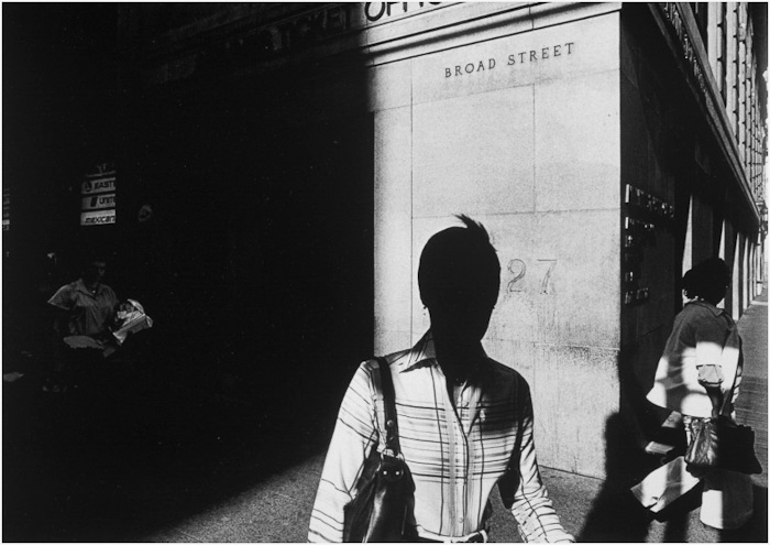
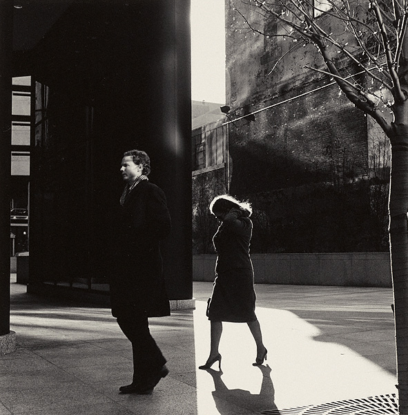
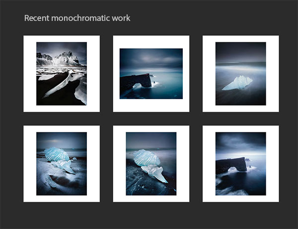
One aspect that has become clear to me over the past few years, is that tonal relationships do not just have to work within each single image, but in order to help with defining your own style, I think the tones should remain consistent through any body of work you produce. For instance, I've noticed that when I convert my colour work to monochrome, I'm able to see how consistent my work is - strip away the colours, and the images still appear to be very balanced.

It was only when I converted some of my existing colour work to mono, that I discovered how consistent I was with my tonal ranges in my work.

It was only when I converted some of my existing colour work to mono, that I discovered how consistent I was with my tonal ranges in my work.

Anyway, I digress a little. Here right now, is a rough idea of how I feel the e-Book may be laid out. I'm always open to things changing, and trying to not be too fixed on things, because creativity needs the space to go where it wants to go.

Main ideas of book:

  • Relationships throughout the frame - by strengthening one area of the frame, other tones are affected
  • If you make two areas of the frame the same tone - they become related.
  • If you make two areas of the frame different, they become unrelated.
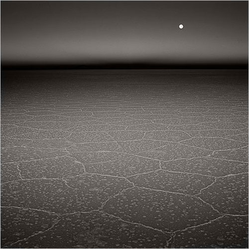
  • The odd tone out is the dominant one. If you keep one area of the picture different from the rest, it becomes the dominant tone. White stone on black background, or black stone on white background

Fieldwork Awareness Section

  • learn to think about tones while out making pictures: abstraction versus association
  • being aware of colour constancy / chromatic adaption while you work under different lighting conditions, and applying this to your choice of subject
  • Avoiding overly complex tonal compositions

Darkroom Workbook Section

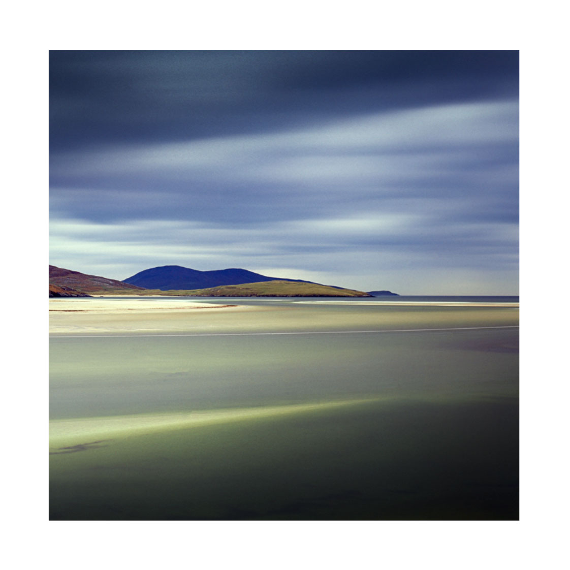
  • Transposing Tones - take one tone in the image, and shift it (harris hills in harris photos)
  • Look for images in your collection that have very few tones. Edit them so all the tones become more similar
  • Simple compositions aren’t necessarily of one or two objects. Sometimes they are simple because they contain one or two dominant tones. Busy images can have too much tonal information in them. 
  • Image selection: choose those with simple tonal relationships, because it will make the task of editing them easier.
  • image selection: when toning one image, refer to others in the collection for guidance. Often one image will dictate how the others should be edited, so they 'sit together' better.
  • Is your eye being pulled all over the place by too many tonal distractions? Apply localised contrasts, or reduce contrast in other areas to bring emphasis to other areas.

Moving between fixed and fluid creative states

I made this photo of Stac Pollaidh (pronounced Stack Polly) last October during an exceptionally windy day. I've known of this location at the end of the loch for some time, having first spotted it many years ago on a week long workshop with a group. I was drawn to the criss-crossed lines in the foreground rock, and knew that if I could be here when the conditions were right, then I might get what I envisaged in my mind's eye.

I've stuck with the same film type for years now because I love it, and because I know it well. You could say this is part of my structured approach to creativity.

I've stuck with the same film type for years now because I love it, and because I know it well. You could say this is part of my structured approach to creativity.

I've found over the years of repeatedly going back to places, I learn how the landscape works. I begin to understand where the light is coming from and where to be at sunrise and sunset, but I also get to know some of the more intimate details of the locations I visit - the criss-crossed features of the foreground rocks in the above picture is a perfect example of that.

Continuing from my previous post, I think it's important to keep things fluid. I love to go for a wander and to find things by chance, or to encounter something where there was no pre-visualisation involved. It's very freeing to work with what you're given. But there is also value in researching places and building up knowledge of locations too. I like both approaches and tend to move between fluid and fixed states all the time.

I think my personality has dual sides: in some ways I prefer to be structured while in others I prefer to be fluid. For example, i'm very structured with my technical process. I've used the same film stock for many years now, and I never deviate from it. I am also very wary of changing even the smallest of things in my workflow, because I believe it could have far reaching consequences that I'm unable to comprehend until much later. But I also like to be very fluid - I prefer not to pre-visualise a scene, often going for what feels right at the time. This is not just in what I choose to shoot while on location, but also in how I edit the work. I like to keep an open mind in this regard as I may find later when I come to review the photographs that I see something different or new in them. 

So I think to be creative, we need to be able to move between these two states of being fluid and fixed. Being fluid allows us to find new things and find inspiration, while being fixed allows us to shape them - to give our ideas structure and to see them through to completion.

The skill however, is in knowing which state to be in, and when :-)

I like to try out my shots in black and white sometimes. They may be better in monochrome, but even if they aren't, I maybe notice new things about the image when viewed with the colour removed. It allows me to free up what I'm doing and I think thi…

I like to try out my shots in black and white sometimes. They may be better in monochrome, but even if they aren't, I maybe notice new things about the image when viewed with the colour removed. It allows me to free up what I'm doing and I think this is perhaps a fluid aspect to my creativity.

Becoming Unstuck

I've been able to get outside a lot, and create new images. But what I've been having trouble with, is actually getting round to scanning the work and editing it. The problem is that since I'm so busy running a workshop business, when I do get some free time, I've not been feeling that I have any energy left to deal with the backlog of work that has been piling up in my studio.

Nisa Bost, Isle of Harris, November 2014. © Bruce Percy

Nisa Bost, Isle of Harris, November 2014. © Bruce Percy

When images start to pile up like this, it can have some negative side-effects to your own psyche. Firstly, if too much time passes, then it gets increasingly more difficult to look at the work. I can easily become so distanced from it, that I actually start to dread looking at it. Before long, any work that's left undone for too long starts to feel like a burden to look at. It begins to feel like a chore. And this simply isn't a good position to be in.

Then before long, a sense of perfectionism starts to creep in. You're so worried to look at the work in case it doesn't live up to what you hoped it might be that procrastination soon becomes the order of the day. And this is like a compound problem - a problem that is created on the top of a problem you started out with, and things just start to get far too complicated.

Creating art is all in the mind, and to be able to create work, we must have a healthy attitude towards what it is that we do. Once things like perfectionism and procrastination creep in, then things can quickly start to get out of hand and before long you can become lost.

Part of my problem has been that when I do create new images out in the field, I often find I have very little free time at home to work on them. So I decided this summer since I have some time off from my yearly schedule, that I would brace myself and get in and start to work on some of my blacklog.

I'd be lying if I said it wasn't easy to get started. So much time had passed, and I felt the weight of the work pressing upon me, but somehow I managed to get going, and I'm so glad I did.

Sea grass, Isle of Harris, Outer Hebrides, Scotland 2014. © Bruce Percy

Sea grass, Isle of Harris, Outer Hebrides, Scotland 2014. © Bruce Percy

I've now found that things have turned around for me and I'm feeling enthused about the new work, and it's slowly but surely gotten under my skin, so much so, that rather than dreading starting work on something new, I now find myself unable to keep away from it.

So I've learned something about myself as well as the creative process. I've learned that in order to keep a healthy attitude towards ones own art, I must keep on creating at all costs. Even if I feel the work isn't up to much, I should still work on it anyway - because in doing so - I gets cleared out of the way. I know from life experience, that new things can only come into my life provided I've made room for them.  So get it out of the way. 

One thing you must also consider, is that it's ok to create bad work, otherwise again, a sense of perfectionism will grow and you'll be stuck once again. We are not masters of our own creativity and therefore we can't control when we will create our best or worst work. There is just an ebb and flow that means our work will fluctuate. Either way, bad work has to be flushed out of the system - it still needs to be worked on and besides, we learn something from the bad work as well as the good.

White sand, Seilebost beach, Isle of Harris, November 2014. © Bruce Percy

White sand, Seilebost beach, Isle of Harris, November 2014. © Bruce Percy

So I've also had to recognise that I shouldn't be so precious. Art is about creativity, and for creativity to happen, things have to remain fluid. This means letting go.

When you start to control things too tightly, things stop flowing, and before you know it, you're back to being stuck again.

So keep working, keep creating and allow yourself to be open and fluid with what you do. Your output may vary, but the important thing is that you're going somewhere with it, and you're avoiding becoming stuck.

Success Rate

Ansel Adams said if he was able to make one good image a year that he liked,
he was doing well.

I'm very much in agreement with the sentiment behind Ansel's statement as I'd personally prefer to produce a very small quantity of high-quality work, than a lot of average images.

I've been thinking about how I dislike the terms 'hit-rate' and 'success-rate', as I feel that measuring one's own creativity is a destructive thing to do. Instead, I prefer to just be aware that my creativity has an ebb and a flow to it. For instance, I've found since I started this website way back in 2001, that I only manage to add a hand-full of images a year to it. But each time I do go to look at my archive work and recent work sections, I'm very aware that the work has taken a lot of time, patience and effort to create. 

I'm not that prolific and I as I see it, there are a few factors at play that determine my output.

This image wasn't planned, nor did I ever think I would make an image of Flamingos. But by returning again and again to a place, I can often find that things happen - wonderful things :-)

This image wasn't planned, nor did I ever think I would make an image of Flamingos. But by returning again and again to a place, I can often find that things happen - wonderful things :-)

Firstly, I have my own sense of what I feel is acceptable. I call it my 'in-built-quality-control', and it's what I use to determine whether an image is good or bad. Hopefully, I'm not too harsh on myself (by setting the bar unrealistically far too high), nor too easy on myself (by being happy to publish everything I do). Quality control is vital in understanding yourself, where you are artistically and for ensuring that others get a clear picture of how you see yourself.  I'd like to suggest you read this article of mine, which I wrote about the final selection process where I started out with around 400 images and filtered it down to around 30 or 40 I was happy to publish.

Secondly, I don't measure myself based on any success rate. I don't measure myself at all as I feel it's an unhealthy thing to do. Instead I accept that my creativity has its own natural flow which I can't control. None of us know when we are about to create our best work, nor our worst. A good photographer is open to new things coming in and to letting go of things that don't work, otherwise it's possible to become stuck.

I also understand the value of creating bad work. To get to the good work requires experimentation and an openness to try things out which may fail. Exploring the possibilities of one's own creativity requires us to be able to deal with failure because there will be many failures along the way. But rather than using the word 'failure' though, I would prefer to use the word 'experiment' or perhaps 'work in progress'. It's a much more constructive way to look at work that didn't meet your own standards. Our work is never finished anyway - we are always in a constant state of change.

The difficult to photograph Cerro Torre in the northern part of Los Glaciares national park, Argentina. This is perhaps the image I spent most energy on getting. I had visited this area several times over several years, often coming home with nothin…

The difficult to photograph Cerro Torre in the northern part of Los Glaciares national park, Argentina. This is perhaps the image I spent most energy on getting. I had visited this area several times over several years, often coming home with nothing - the place is so famous for its bad weather. I've had so many emails from readers who told me they saw nothing when they were here. Well, I camped here once for more than a couple of weeks and I saw nothing too.... but I kept returning and I got this shot for a brief 5 minute window.

Lastly, but perhaps most importantly, I understand that good work is the culmination of many things such as time, effort and patience. A good portfolio is not created overnight nor with little effort. Instead, good work is accumulated gradually over many years, with a lot of of experiments along the way and with a lot of perseverance. I also find that living with the work for many years allows me to have a sense of distance which brings a certain level of objectivity and awareness. I am always considering and reconsidering my older work. It allows me to notice changes within me.

So I think 'success rate' is a poor demonstrator for my art. I prefer not to think about this because everything I do, right from the experiments to the keepers - is all part of the creative process. Creative work should never be measured, instead it should just be allowed to flow in its own way and under its own pace.

Something in-between Sunlight & Shadow

For a long while now, I've been fascinated by the power of suggestion over a more literal interpretation. I was initially attracted to this aspect of photography through the work of Michael Kenna in the late 80's. His use of shadows and night often convey a sense of mystery or at the very least mood to his imagery.

Just recently, I found out about Ray Metzker, who passed away last year. His work conveys similar concepts to Kenna's. He was interested in suggestion rather than a literal translation. His use of sunlight and shadow to conceal his subjects often lent his work a sense of mystery.

 Solitary pedestrians and urban spaces transformed by sunlight and shadow. Image © Ray Metzker

 Solitary pedestrians and urban spaces transformed by sunlight and shadow. Image © Ray Metzker

Suggestion is a powerful tool to possess as a photographer - because being able to get your audience to stop and listen to what you are doing often happens through the art of suggestion.

 In Ray Metzker's images, he shows tremendous skill in using sunlight and shadow to convey mystery. What may have otherwise been an ordinary scene becomes more interesting and thought provoking when shade is used to conceal or reveal.

Ray would produce portfolios based on these tonal suggestions rather than by subject matter. This resonates with me because I feel I have been doing something similar; for a while now, I have been choosing images where they are related either by tonal response or by colour palette.

Ray Metzker's use of sunlight and shadow was masterful. Image © Ray Metzker

Ray Metzker's use of sunlight and shadow was masterful. Image © Ray Metzker

To explain further, I find Iceland to be a monochromatic place: black sand and white ice. Bolivia is about blues and reds: the lagoons of red sediments and the salt flats at twilight intertwine to offer up a particular colour palette. So I tend to go looking for subjects that fit together tonally or by colour - as a collection. These two places are responsible alone for me branching out into monochrome work. They have taught me that the portfolio - the whole is greater than the sum of its parts.

I see a similarity in Ray Meskier's work where he chooses subjects that are collected together by tonal similarities. People in the city often photographed as silhouettes, or with their identities concealed by use of shadow strengthen his portfolio as well as lend a very decisive look.

Images don't always have to utilise the full tonal range. Here Ray Metzker uses mostly shadow to mid-tones only. I find the deliberate concealment of the people's faces adds further mystery to the image. Image © Ray Metzker

Images don't always have to utilise the full tonal range. Here Ray Metzker uses mostly shadow to mid-tones only. I find the deliberate concealment of the people's faces adds further mystery to the image. Image © Ray Metzker

His work has a style - something that we are all trying to develop or bring forward in our own work. And this is perhaps the most important lesson from looking at this work: it's clear that Mezkier has thought about the aesthetic qualities of his final selection of images and also the subject matter in such a way that we are clear each photograph is by the same author.

I learn a lot by looking at work that I find inspiring. It doesn't have to be landscape related for me to 'get it'. I just have to find a connection in the work - to see something that I find intriguing, or that makes sense to me in some way that I hadn't thought of. With Ray Metzker's work, I do exactly that. I learn about image selection based on using tonal responses but I also learn that his choice to make people very anonymous or to conceal their identities through his use of shadow and sunlight can lend the work a thematic quality which goes a long way in conveying a photographic style.

And sometimes it's the sudden split between shadow and sunlight that throws a contrast; like two images spliced together, providing a sense of tension between the two subjects in the frame. Image © Ray Metzker

And sometimes it's the sudden split between shadow and sunlight that throws a contrast; like two images spliced together, providing a sense of tension between the two subjects in the frame. Image © Ray Metzker

And then there are his choices in composition. I've always thought that street photography has less to do with aesthetics and more to do with narrative. But in Ray's work the story is missing. He has deliberately chosen to conceal most of his subjects so we know very little about them. Instead we are presented with compositions constructed through form and tone only. They are like landscape studies about the people in a city.

A study of graphic qualities. Image © Ray Metzker

A study of graphic qualities. Image © Ray Metzker

Your own voice

 This week I was interviewed by the UK photographic magazine 'Black & White Photography'. It was interesting to find out that they were particularly interested in my isle of Harris photos below. 

During my chat with Mark Bentley, we got on to the subject of style and that of finding your own voice.

Isle of Harris images as requested by the Uk magazine 'Black & White Photography'. I'm always surprised by the choices others make when choosing which images of mine to use for publication.I've learned that I can't guess how some of my images wi…

Isle of Harris images as requested by the Uk magazine 'Black & White Photography'. I'm always surprised by the choices others make when choosing which images of mine to use for publication.

I've learned that I can't guess how some of my images will be received, and I never hear the same things about them. This has taught me that I just need to listen and trust my own intuition first and foremost. I can't anticipate what others will like or dislike about my work, and the only person I need to satisfy is myself.

I've worked with many participants through the years on my workshops here in Scotland. The subject of finding a style is never far away from our daily critique sessions, so it's only natural that I should have formed some views on this.

To my mind, a voice is a unique thing. to be recognised, you need to stand out from everyone else in some way. So I think the main characteristic of those who create very personal work is that they have a deep trust in themselves to be independent and do their own thing.

Anyone who does something unique does so,  because they do not to pander to trends or others opinions. Take it from me: I hear opinions about my work from others all the time and there is so much variety in what others tell me, that I've come to the conclusion that if I tried to follow it - I'd get lost pretty quickly. Instead, what I choose to do (note that I'm the one choosing what to do here) - is listen to the stuff that makes sense or enlightens me in some way.  The rest - the stuff that I feel doesn't make sense or can't see any value in, I just take as someone else's opinion. Interestingly, I find that most of the time, others opinions usually tell me more about them, than me.

No one else can live my life or make my creative decisions for me. The only person who knows where I want to go with my photography is ultimately me. I can glean some advice from others but in general, the impetus to do anything in my work has to come from within. 

So here are my thoughts on finding your own voice.

  • Your own voice, is something you find when you go it alone.
  • Your own voice, is something that only you can find.
  • Your own voice, is something that comes through a process of self enquiry.
  • Your own voice, is something that becomes apparent over time.
  • Your own voice, is something that comes to you when you listen and observe the changes within you.
  • Your own voice, can't be found by being part of the derivative. Follow others and you quickly get lost in a sea of ubiquity.
  • Your own voice, is something that happens when you are free of current trends.
  • Your own voice, is something that comes when you don't try to please others.
  • Your own voice, is something that comes when you are free of expectations.
  • Your own voice, is something that comes when you are free of ego.
  • Your own voice, is something that comes when you know yourself (i.e your capabilities and limitations).
  • Your own voice, comes when you stop copying your influences. Embrace your influences and use them as the basis for where you start, but don't get tied to them.
  • Your own voice, comes when you do your art for you and you alone.

In a nutshell, you need to have the courage to follow your own path, and above all, believe in yourself.

The Evolution of a Contact Sheet

When I'm busy editing my work, as I have been for the past few weeks, I like to collate all the edited work together and periodically do a review of it, to see how the portfolio is shaping up as I add newly scanned and edited work.

Some images from Fjallabak and also the north east of Iceland, taken this summer and autumn. Images © Bruce Percy. Mamiya 7 camera, Fuji Velvia RVP 50 film.

Some images from Fjallabak and also the north east of Iceland, taken this summer and autumn. Images © Bruce Percy. Mamiya 7 camera, Fuji Velvia RVP 50 film.

This has many benefits as I see it:

1) I'm able to see how new images added to the portfolio contribute by either enhancing or sometimes weakening the overall character of the collection.

2)  I can spot themes in the work which might suggest a direction that the work and future edits should take.

3) It helps me see when some images don't work because of colour problems and also tonal inconsistencies with the other images in the collection

4) The creation of a portfolio is an evolutionary process. As images are added to it, it grows and its character becomes richer. Sometimes a new story is unfolded in the process and what I thought the portfolio was going to look like, is radically changed.

It's also immensely satisfying to watch how the portfolio evolves. Like the act of making the images in the first place, there is a deep satisfaction in watching the work reach full completion.

Some portfolios come together very easily and quickly. Sometimes it's clear that there is a theme to the work before I start to edit, and other times, it's really not obvious to me at all.

I find the scanning and editing in the digital darkroom to be a fluid and iterative process. I may feel that certain images are finished, only to find several days later that they need to be re-tuned to fit with the colour palette or tonal response that the other images are dictating.

In order to let the portfolio evolve, I've got to keep an open mind, and be willing to go back and review an image I previously thought was done.

Images © Bruce Percy. Mamiya 7 camera, Fuji Velvia RVP 50 film.

Images © Bruce Percy. Mamiya 7 camera, Fuji Velvia RVP 50 film.

Some artists say their work is never done, and I tend to agree with this. Images that we work on this week are really more a statement of who we were or how we were feeling at that moment in time. Edit the work months or years later and we may find we come up with a different interpretation.

But still, I don't like to look back too often. Although there is value in revisiting one's work from time to time I'm wary of falling into a hole that I can't get back out of: revisit your work, but don't endlessly rework it. That way lies an unhealthy obsession with perfectionism.

There is a lot of freedom to be gained by accepting that your older work is a statement of who you were at that time. Being able to let go of the past is healthy as it makes room for the future and in a sense, invites new work into your creative life.

The black deserts and volcanos of the central highlands of Iceland. Images © Bruce Percy. Mamiya 7 camera, Fuji Velvia RVP 50 film.

The black deserts and volcanos of the central highlands of Iceland. Images © Bruce Percy. Mamiya 7 camera, Fuji Velvia RVP 50 film.

These images are my new work, and as such, it's too soon for me to be objective about them. I'm going to need some distance and that means some time away from them.

All I can tell you is that the images didn't come easily to me. The central highlands of Iceland is a difficult, wild place. I'm always looking for a graphic element to any place I visit and in this instance it was often not so easy to find.  I think this says more about me and my own approach (read that as criticism of my own limitations).

To add to the complexity of the place, the light was not easy to work with. The deserts are black and often times it felt as though the sun was bleeding out of the corner of my eye. Contrast is a massive issue here. 

Yet I feel that this is exactly what is so compelling about the central highlands of Iceland. Some landscapes are beautiful because of their awkwardness. They are complex and challenging and they are captivating because of these qualities. 

A landscape like the central highlands of Iceland is a defiant one. It will not submit to you. Rather, you have to submit to it. 

I feel I have only just scratched the surface of this intriguing place.

The Highlands of Iceland & North Iceland, 2014

Two nights ago, I published my monthly newsletter. In it, I described the beautiful complexity of the central highlands of Iceland.

I thought it would be nice to share a little contact sheet of some recent images from two trips this September (I still have a backlog of images shot during July as well as September to get through). So by no means is this the complete set of images.

Contact sheet of images shot in the central highlands and north east of Iceland this September. Images © Bruce Percy (Mamiya 7 Mk1 camera with 43, 50, 80, 150 and 210 lenses)

Contact sheet of images shot in the central highlands and north east of Iceland this September. Images © Bruce Percy (Mamiya 7 Mk1 camera with 43, 50, 80, 150 and 210 lenses)

It's been so long since I had the chance to edit any of my own work. I've literally forgotten how satisfying and absorbing working in the darkroom can be (read that as digital-darkroom if you like me, use photoshop or any other digital editor, or analog darkroom if you are a traditional film photographer working in a wet darkroom).

Going into a room, and shutting myself away from everyone for extended periods of time and letting myself be immersed in my experiences and thoughts about the places I am working on, is a bit like re-living the times I had whilst shooting, and it also allows me to reconnect with the work at hand. It's just so enjoyable to escape into my own world and disappear for a few hours.

And a few hours can often turn into a few days. I think I've been putting off editing any work this year due to a lack of free time.

I really prefer to be able to set aside a few days or maybe a week in my studio, so I can truly get into the work I'm editing. Anything else feels like I'm being interrupted, disturbed in some way. And I've really not had much free time in between workshops, and running a business.

I really think to get the best out of ones editing, I need to get some distance between the shoot and the editing. It's the only way I can be objective about what I was doing. But leaving the work for more than six months or more (as in the case of images I shot in Venice a year ago, and Lofoten this February), feels like I'm so far removed from them, it's a little hard to get reconnected.

Anyway, I feel as photographers, we need to look after our mojo. Mojo will only exist if we remain enthusiastic in what we do. Being able to shoot is one way of keeping your mojo healthy, but also being able to bring work to completion is another. Leave things for far too long, or never complete anything and very soon you may be feeling that your photography has no direction or focus.

I've been depriving myself of the joy in bringing my work to completion, and now that I've completed some new work, I'm feeling energised to continue.

You can see more of my new images from Iceland under my ''recent work' section of this site.


Beginnings

You might have noticed a formatting change to my blog. Well my entire site is now mobile and tablet friendly. I had been thinking for a while now that desktop computers are on the wane, and tablets and mobile devices are taking of. So I felt it was time that my entire website had a bit of a make-over for the new way we all tend to enjoy the web.

One of the things that has come out of reviewing my old website and putting together this new one, is deciding which images I should perhaps leave out, and which should be included. During that phase a few months ago, I came across this image of mine:

My very first 'ooh, that' looks interesting' image, 1989.

My very first 'ooh, that' looks interesting' image, 1989.

It is the very first image that I ever made with a camera where I felt I had stumbled upon something.

I was around 22 years old, and I had owned my first camera (an EOS 650 with 50mm lens) for about a year or so. The image is of nowhere specific - just a corn field in the new-town of Livingston in West Lothian Scotland. 

One of my friends (the same one who had introduced me to photography) showed me a filter he'd bought for his camera. At the time (late 80's), the idea of using filters was still pretty new.

I bought one of the same filters and tried it out. One of the images in the slides I picked up from my local photo shop really stood out. The sky was completely overdone to the point that the blue was now black but the image was more interesting than I had anticipated.

For years, I had a few ciba-chromes of this made up for friends, and one of them always referred to it as 'a film-maker's dream'. Highly complimentary, but also I feel, alluded to where I might go with my photography in the decades to come.

I think we all have a photograph in our collection that has a special place in our hearts because it was perhaps a pivotal change in our early development. That's certainly how I see this photograph.

Back in the 80's, Photography had a way of making things look like 'another reality'. There was often a great disconnect between what we saw with our eyes and what was returned from the lab. It's something I loved about photography at the time (and to this day I still do as I continue to shoot film). The difference for me nowadays is that where I once pressed the shutter and hoped for the best, these days I have a slightly clearer view of how things might turn out.

Reviewing the new website has given me another chance to review my earlier work and through this process, I've discovered at least one thing: what I loved about photography back in the late 80's is still relevant to my photography today.

New website - monochrome

For the past while I've been noticing that many of my more recent efforts have been leaning towards a muted colour palette or towards a monochromatic look.

I've often said on this blog, that it's possible to see where you're going by looking back at where you've been. There are often clues and signs in your previous work which suggest the direction you are headed.  For the past while I've noticed signs that monochrome might be an avenue for me to explore. I've encountered some locations that have dictated a more muted or monochromatic feel in my colour work. The black volcanic beaches of Iceland is one obvious example of this, as the following images may demonstrate.

The black volcanic sand beaches of Iceland is one area where I think I was given permission to accept that pink skies don't  always suit the subject matter. Rather than looking at a landscape and wishing for sunset tones, it's best to find beauty in what is actually there. Work with what there is and if the tones are muted, and the sky is overcast - then embrace it. It has its own kind of beauty.

This is something I find many workshop participants have to overcome. What appears to be boring light or disappointing as it does not match a pre-visualised ideal of a certain location can, and often is great light to work with, providing you can see that this kind of light and muted tones are actually quite beautiful.

I think I've been working in a monochromatic way even before I visited the black sand beaches of Iceland. If I look at this shot of the Salar de Uyuni in Bolivia taken in 2009, it's really monochrome-in-blue.

But black and white isn't easy. I think that's one of the reasons why I've steered clear of it for so long. The medium is unforgiving when it comes to noticing any errors in tonal relationships. I feel it's a medium that is actually harder to work in despite common sense telling me that it should be simpler. It's often the case that what looks simple is actually very difficult to pull off well.

I've always felt I needed to gain a good grounding in darkroom interpretation skills - knowing where to dodging and burn rather than how, has taught me a lot about how the tones in an image interact. So for me, working in colour, and reducing the components of the scene down to a much simpler set of tones and colours has been a good primer for working in monochrome.

With this in mind, I've decided that it would be great to start exploring the world of monochrome a little bit more, in addition to my colour work. I'm sure both will influence each other over the coming years. But at the moment it's just a hunch and I'm really keen to see where things may go.

I've set up a new website for my monochrome work here: www.monochrome.brucepercy.com

The site currently contains some re-interpretations of some of my better known colour images along side some new images.

Lastly, my reasons for setting up a dedicated website for my monochrome work was purely aesthetic. I feel mixing colour and monochrome work together under the same space is trying to do too many things in one go, and that kind of approach never works. One will dilute or weaken the message of the other. Plus, I feel that the viewer should be led into a body of work and whilst there, enjoy a sense of continuity rather than being flung from monochrome work to colour and back again. It's unsettling for the viewer and it breaks any spell they may be under (hopefully) from immersing themselves in the work.

For me, the importance of how ones work is presented, should never be underestimated.