
During my portfolio skills workshop this September, we spoke about the need to work on the presentation of our work. Portfolios may seem to be just about arranging the work, or selecting the work, but how the work is presented, is just as important.
For my Altiplano book announcement
Photography is a visual medium, so I think it should make sense that anything you do visually, should be as aesthetically pleasing as you can make it, at the very least. It should hopefully have some kind of unity or ‘brand’ that represents you and your work.

Lençois Maranhenses portfolio
As some examples of this, I showed some of the previous banners from this website to my workshop group. My aim was to point out that creating the photographs was one thing, but I deliberately spend a lot of time thinking about the presentation : how to lay them out.
Now, I’m not saying you have to have a banner on your website. You may be thinking this is what Im telling you. I’m not. I’m saying that how you choose to present your work, in whatever medium you choose to do it in : matters.
I chose to put a banner together on my site because I find it a great way to give visitors to my site an initial ‘hit’ of what’s in store.
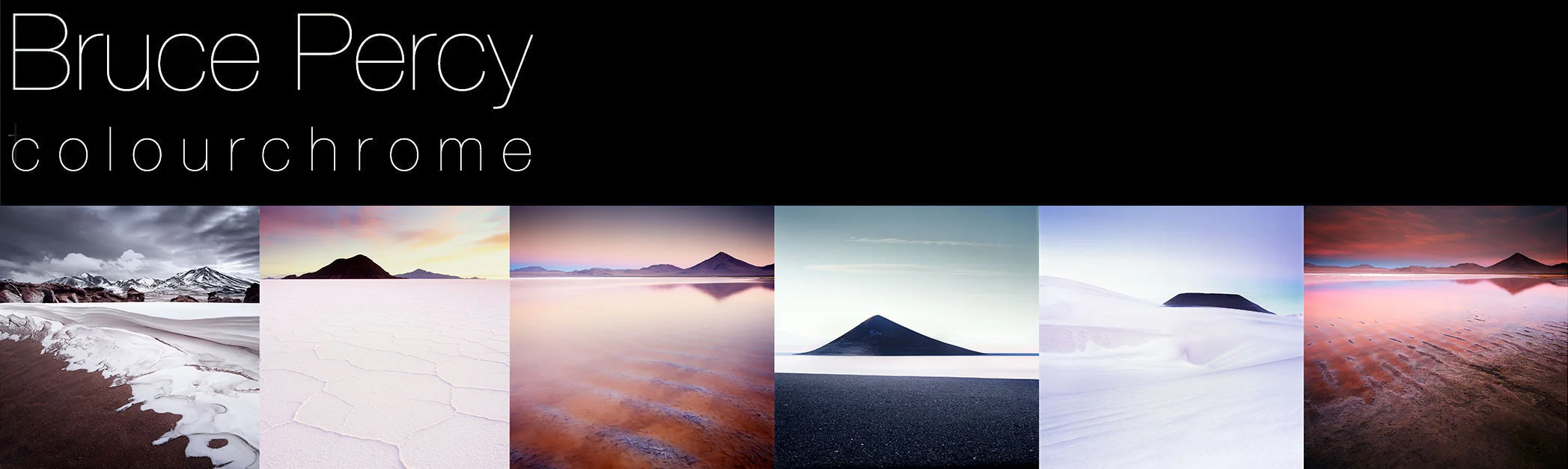
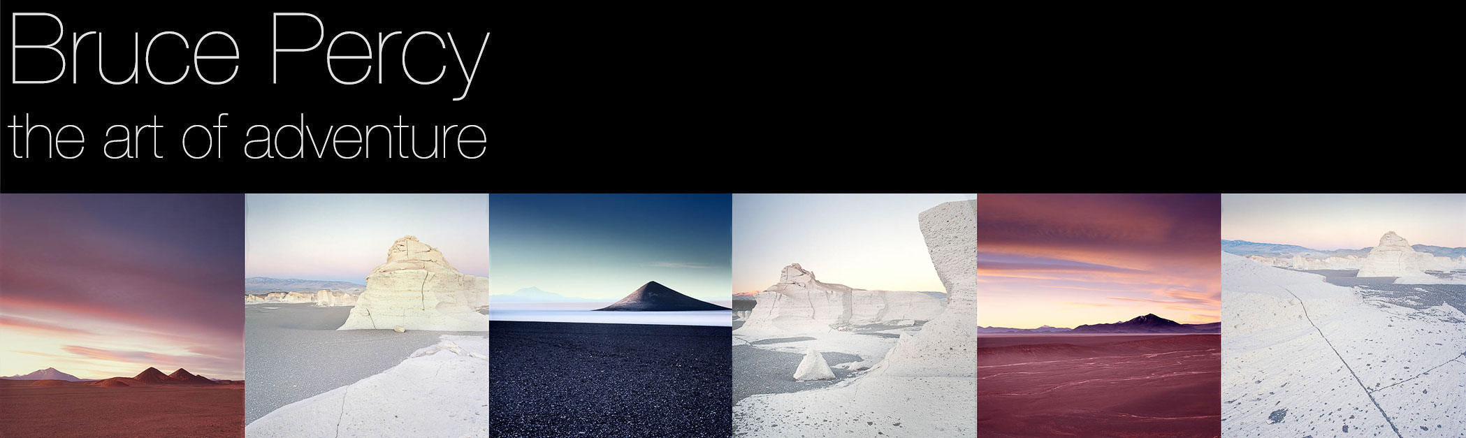
Back to the design of them: my banners often require a lot of thought and experimentation by me to get the look I want. I don’t just grab a selection of images and put them together for the banner - the order, the tonal responses between them all interact with each other and I move things around until it feels right.

Extreme Iceland winter trip
Everything you do needs to be presented well. Whether it’s your website, book, business cards, flickr account or facebook. Your work doesn’t end with creating and editing the photographs. It goes on and never ends. You are a visual-artist, so anything visually related to you has to have the same care and attention paid to it that you pay to your photography.

Fjallabak, central highlands of Iceland, 2018
With some of these banners, I have either used shapes - diagonals or curves to lead the eye into the banner (from left to right) and out of the banner (on the right). In others, I have maybe mixed light and dark images in a way that they alternate from dark to light and back to dark again. Some other banners it’s more about the space in the images: I will choose a collection of images that are all similarly ‘empty’ or similarly ‘busy’, so there is no imbalance.

Puna de Atacama, Argentina 2017
I’ve chosen to list most of the banners from this site back to 2014. I hope you enjoy them, but take a moment to study how I’ve chosen to sequence the images in each banner, and maybe also consider how my style has evolved / changed over the period also.

Easter Island
I find banner creation immensely satisfying. But again it doesn’t stop there, and I have to even think about the sequencing of the portfolios on the main web page also. Everything has been done with a great deal of thought behind it. I’m convinced that just this little bit of attention to detail makes all the difference. That extra 5% always seems to give the perception of being a whole lot more.

Bolivia

Senja, Norway

Hokkaido
Puna de Atacama, 2015

Patagonia, 2015

Isle of Harris, 2014