Subject Studies

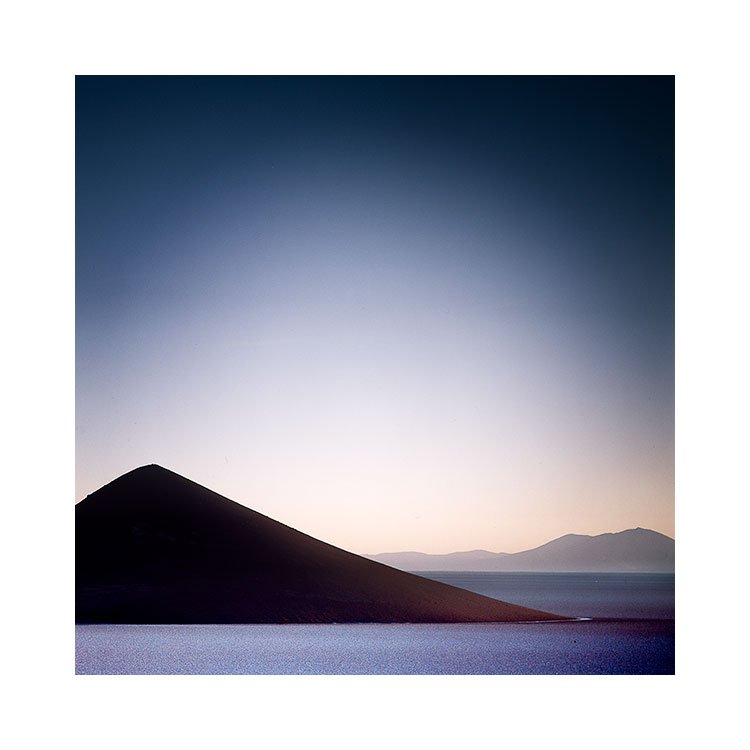
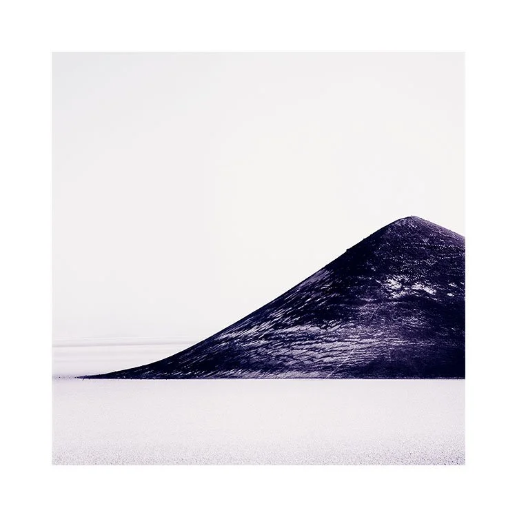
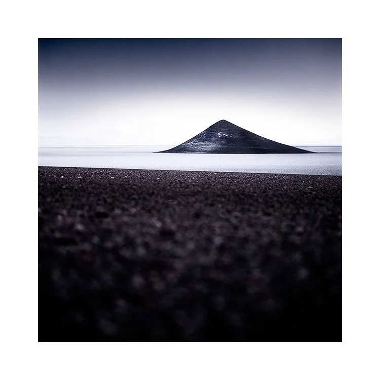
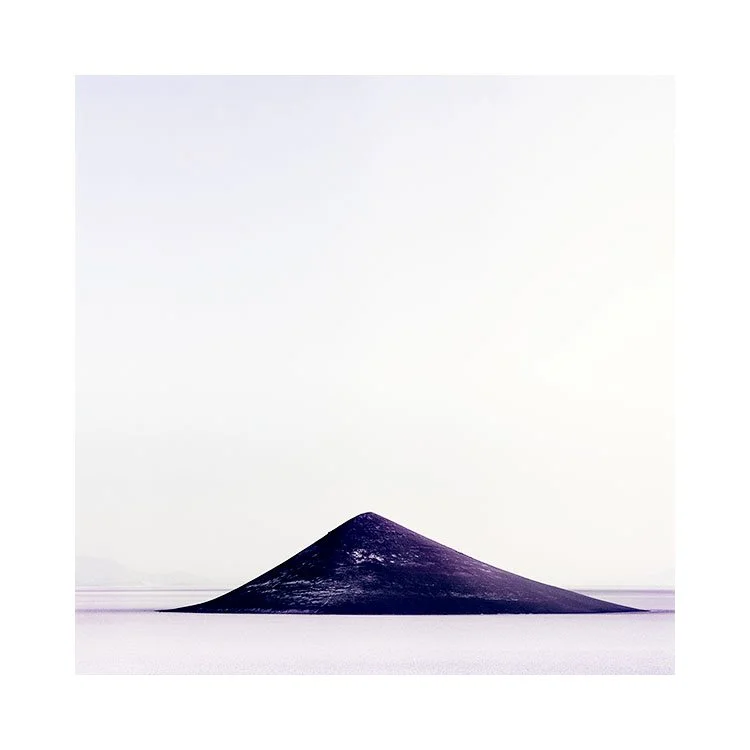
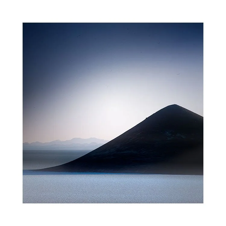
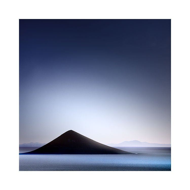
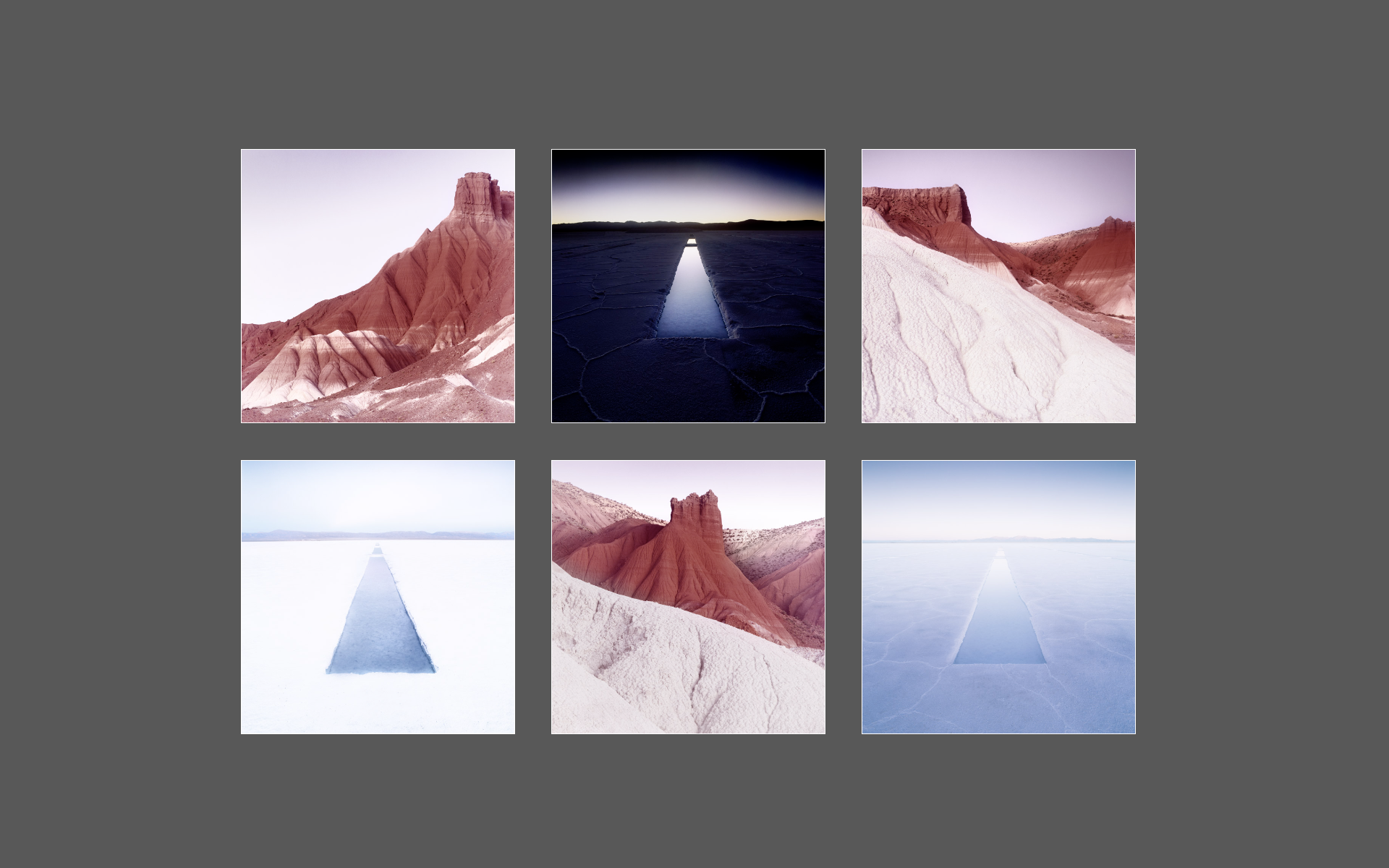
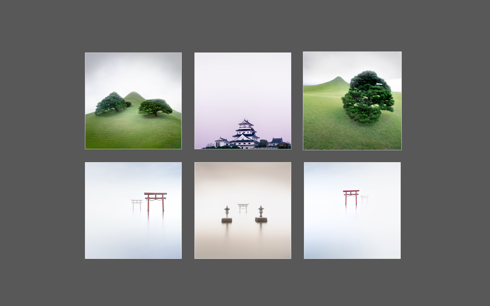
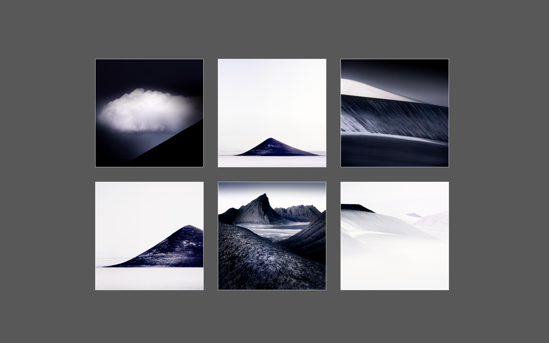
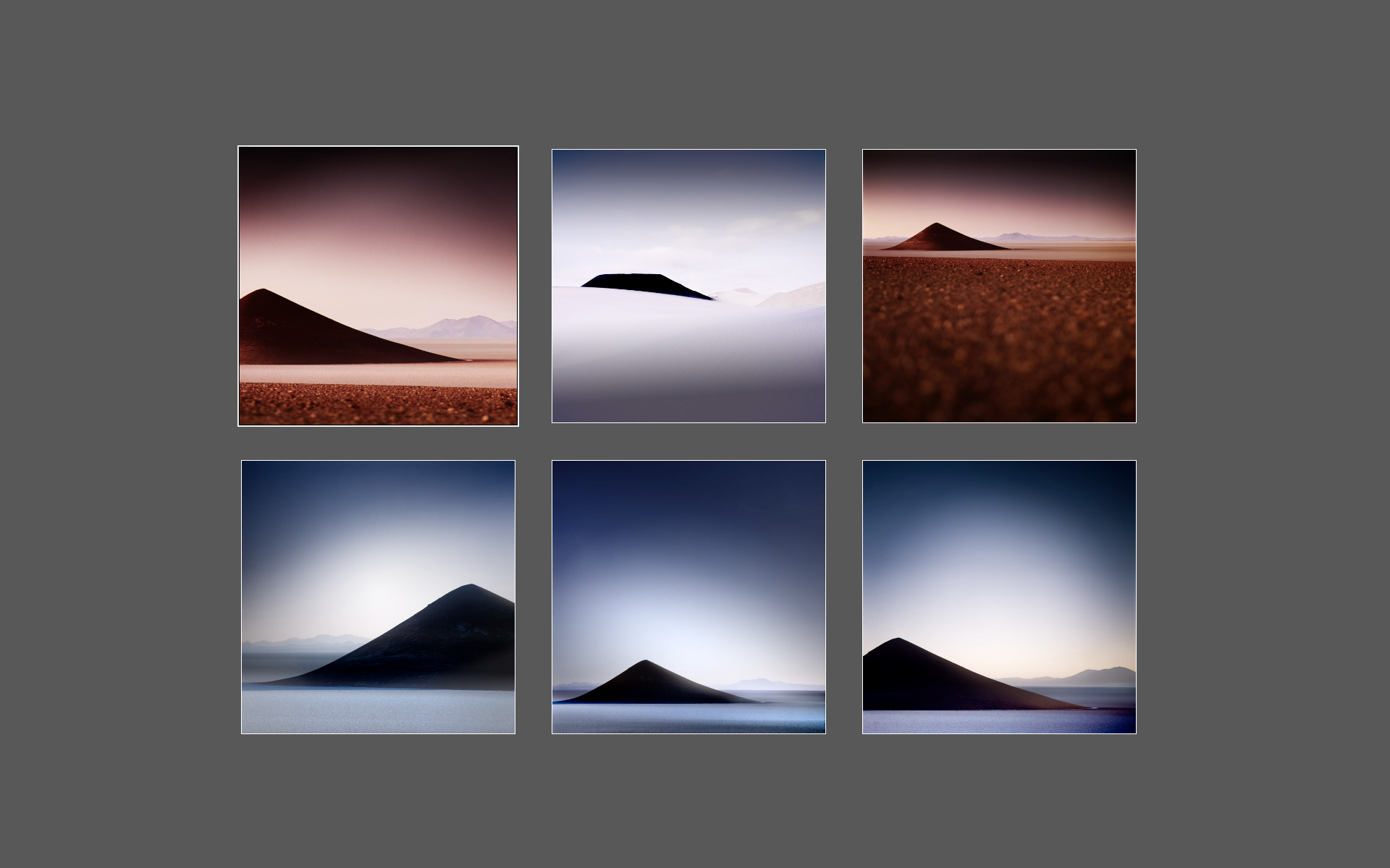
When I first found out about the Cono de Arita in Argentina, I knew I had to go there. The first image I saw of it was not remarkable - it had been made in the middle of the day and was front facing. It still looked unearthly, and was sufficiently different enough for me to know I had to visit the Puna de Atacama.
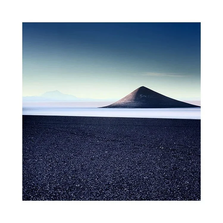
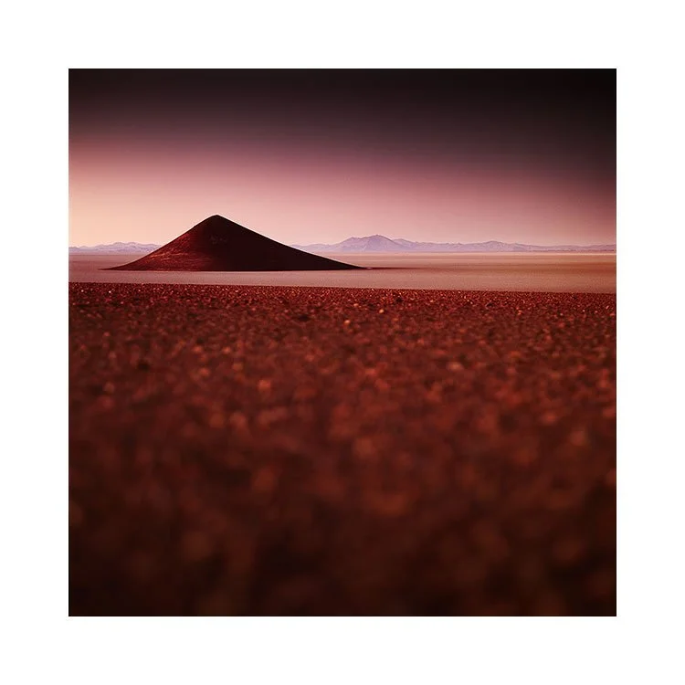
These images were made between 2015 and 2024. I don’t go back every year. The Puna trip is too niche to offer it every single year, so I have been back maybe around five times so far. Always enjoying visiting the region very much.

And often, coming home finding that out of all the subjects I photographed, the Cono de Arita always seems to dominate my editing and final portfolios.

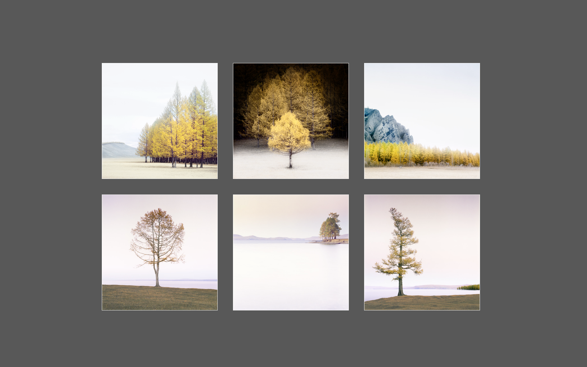
To me, it’s a gravitating subject. Especially when I discovered that it was much more interesting to shoot it backlit. What now may appear to be a rather obvious way to shoot it, wasn’t the case before I made my silhouette photo that you see top right.

As I’ve returned, I seem to have developed the idea more, often focussing in on the Cono de Aritas shape. It is less subject and more ‘line and contrast’. Graphic shape, rather than volcano.

I will be returning to the Puna next year, so I’m wondering if I will shoot it differently, how the light will interact with it, and whether the images to come, will be a continuation of this theme?

I think it’s fine to have subjects that you gravitate towards, and keep returning to make new images of. We of course all know that a photo of a subject isn’t enough (don’t we?). We all know that landscape photography has so many variables to it - from composition, placement in the frame and the kind of light that one is working in. We could not repeat the shot exactly, even if we tried. So even if one feels that they have ‘already done it’, the truth is that we haven’t. There’s always another way the same subject can be interpreted, and that is what photography is all about.

Abstraction or Subject related? Which is it?

I've been coming to Iceland for a very very long time now, first visiting in 2004.

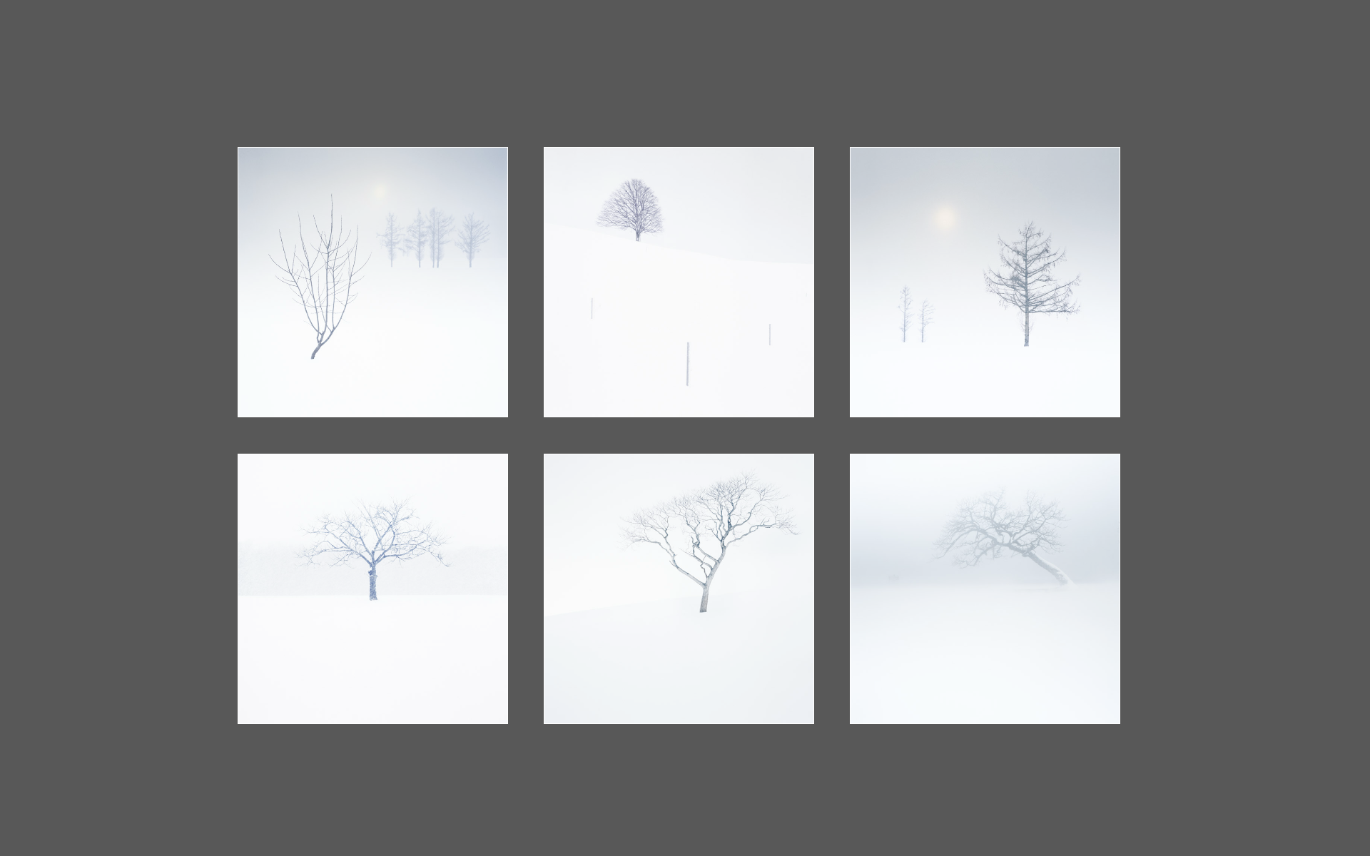
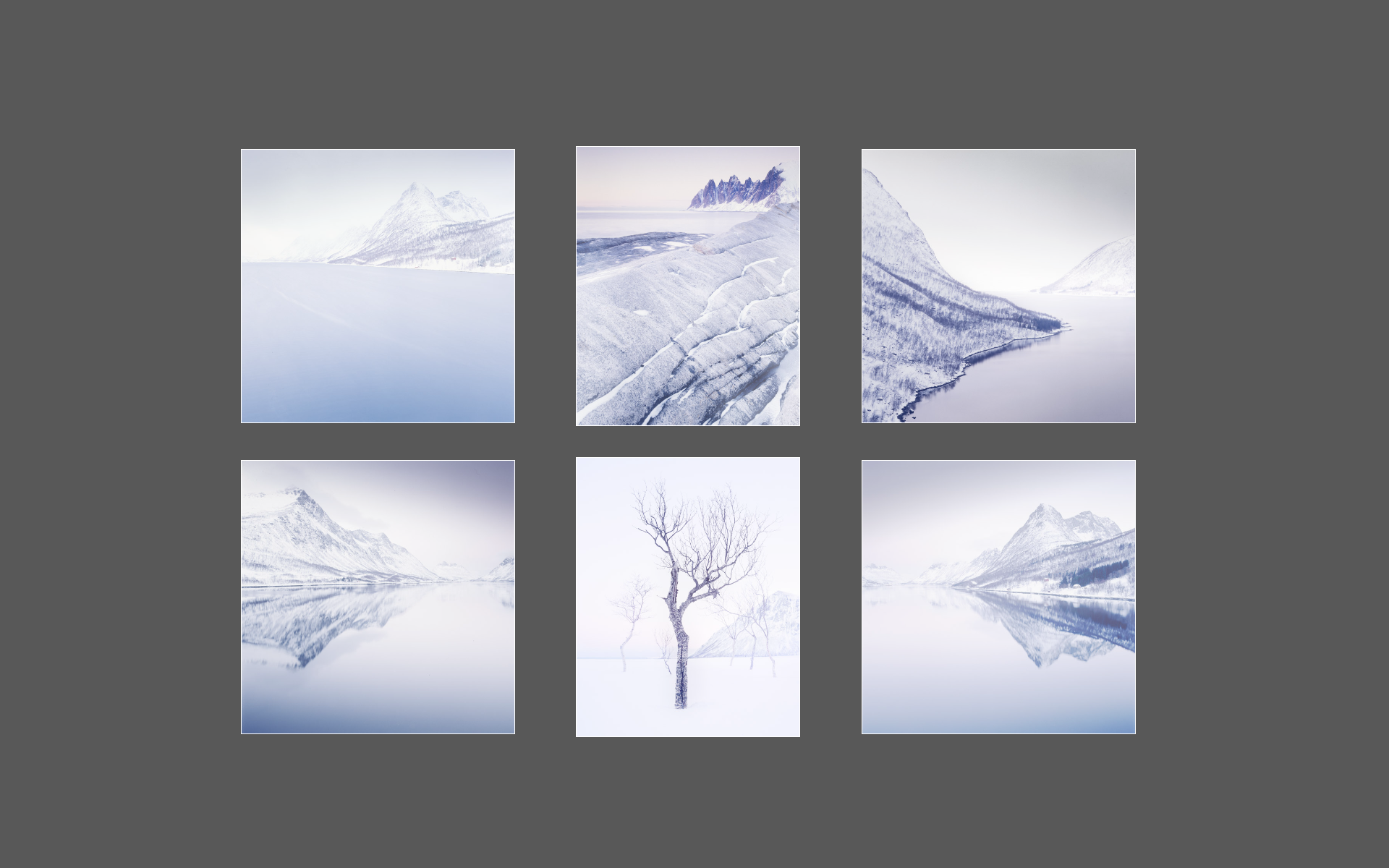
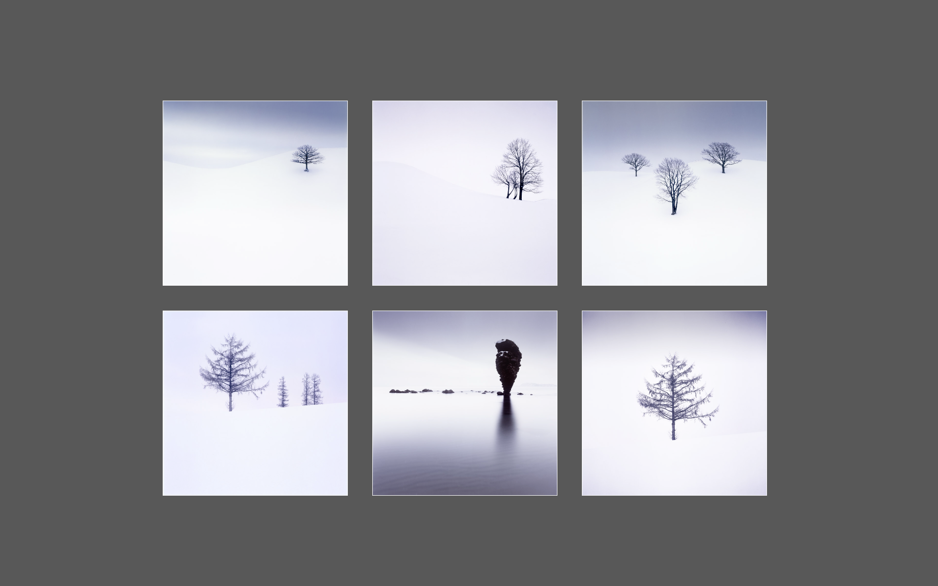
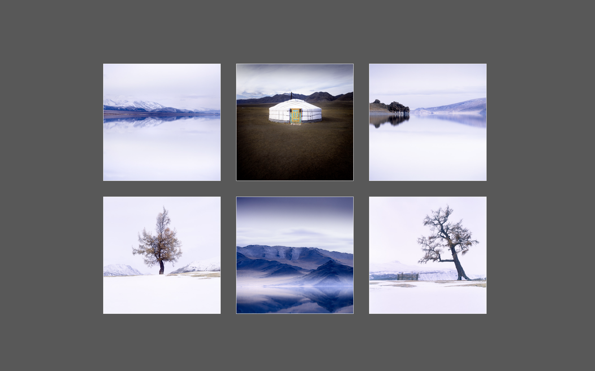
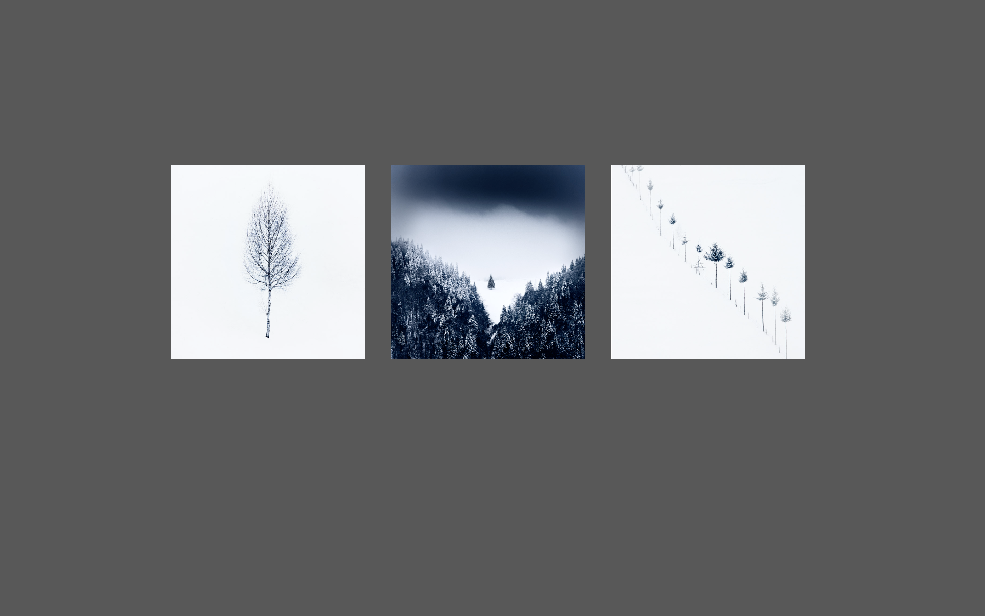
Around a decade ago I started to venture into the interior of the island with assistance from my guide and 4WD expert Haukur - @nature_explorer_iceland. He was the one who said to me  “Bruce, there is a part of the country that turns into black brush strokes on a white canvas”. As soon as he described it to me like that, I knew I had to go.

He was talking about the interior during the winter time. And we have ran adventure tours into the interior many times since 2016. Which is quite something because the roads can be two metres under the snow, and there is literally ‘nothing’ out there. No infrastructure, except for mountain cabins. Which we have stayed in. Very warm, cozy even, but no running water and you have to go out to collect snow in a pan to melt down.

When we have gone into the interior, it’s been really amazingly beautiful to see how minimal and empty it can get. The mountain cabins are also a nice environment for the group as we all ‘contribute’, help out, as no one wants to be ‘the guy who didn’t help out’ :-)

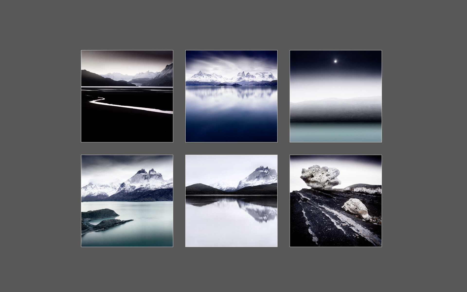
Anyway, these images were shot around 3 years ago now. There are several mountains in Iceland that I love, but perhaps none more than Þóristindur (Thoristindur).

I’m attracted to graphic elements more so in my imagery than actual ‘subjects’, but I guess this is maybe a graphic portfolio set, of a particular subject?

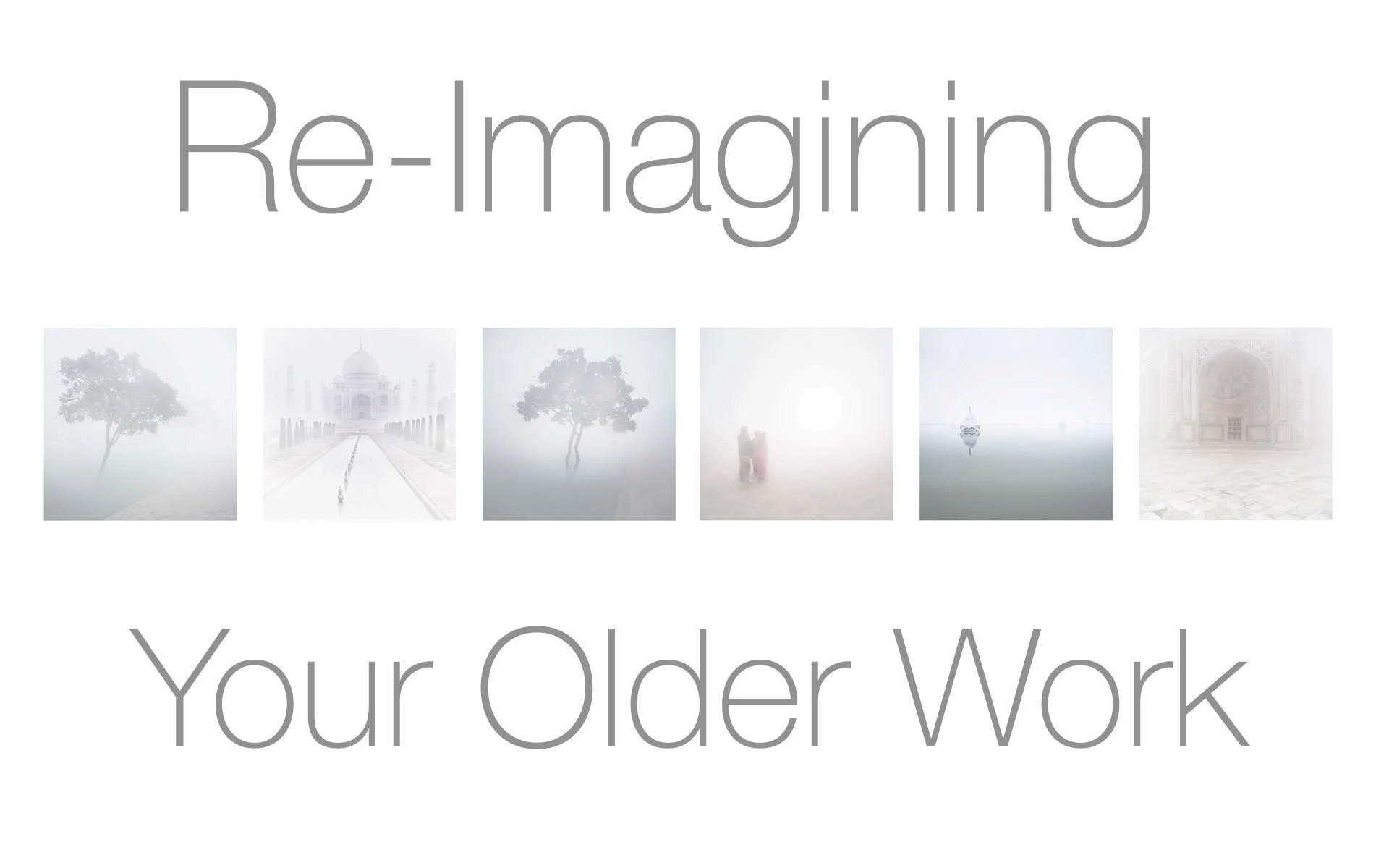
Re-Imaging your older work - noticing how far you've come

Sometimes the shoot goes well, but I struggle to edit the work to my satisfaction. In those moments, I often find myself asking the question: Is it simply that the work isn’t any good? Or it is more a case that I simply lack the skills at this present time to bring the images to a successful conclusion?

Knowing the difference between a bad idea, and a good one that has been poorly executed, is never easy to know at the time of the edit.  For if I lack the skill to execute it, then I may lack the ability to judge it correctly.

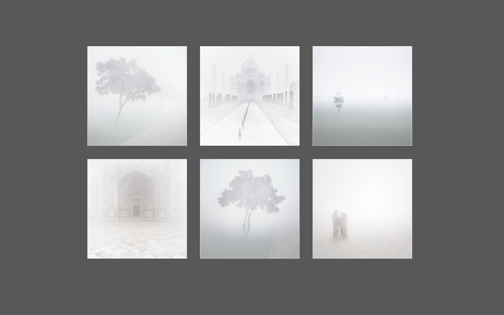
My original edits of these images of the Taj Mahal were just like that. Originally shot in 2009, the images lay dormant, filed away, because I had never been entirely happy with them. I couldn’t figure out at the time if the work was wanting, or whether I just lacked the skills to bring them to a successful outcome.

Looking back now, I could clearly see that the work held promise, but I had lacked the skills and experience to bring the images to a satisfactory conclusion. My use of contrasts and general tonality back in 2009 was rather rudimentary. To my inexperienced eye, I thought that by adding darker contrasts to the images, I would impart a sense of drama. Instead of drama, I got muddy images that lacked any focus.

I’ve learned over the intervening years that working in foggy conditions where definition is reduced, can be advantageous. Indeed, I often like to play with the edge of definition and deliberately lose it in my edits by pushing my images towards a more hi-key look. 

Foggy locations, seem to excel at being edited with this approach in mind.

As I reworked the images to give them the treatment I now felt was more appropriate, I found myself looking over my original edits as one might look over some historical documents.

I had a sense that I was being given an opportunity, to see who I was back in 2009, and to notice how far I have come in the intervening years. Where the original edits had been full of uncertainty, I was aware that my new edits were more immediate. They had a clarity of intention, that only confidence from working on similar imagery, over many years can bring.

It is my view that clarity of intention and good execution can only come through practice and experience. I had 17 years’ worth.

Yes, I was much happier with the new interpretations of the work. But what I got out of the exercise the most, was an understanding of just how far I had come in the intervening years.

Progress is often subtle, invisible even. We need the passage of time – often many years – to see that our progress has been more substantial than we first assumed.

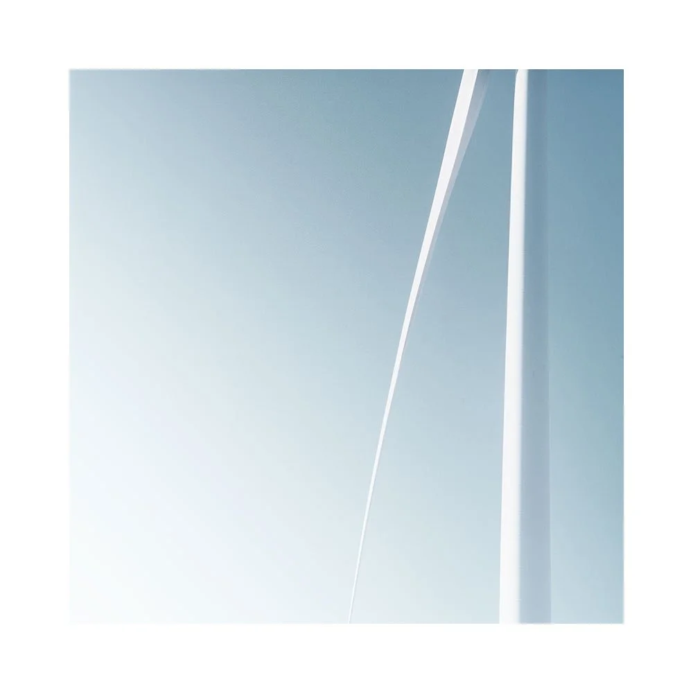
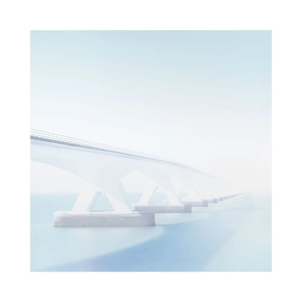
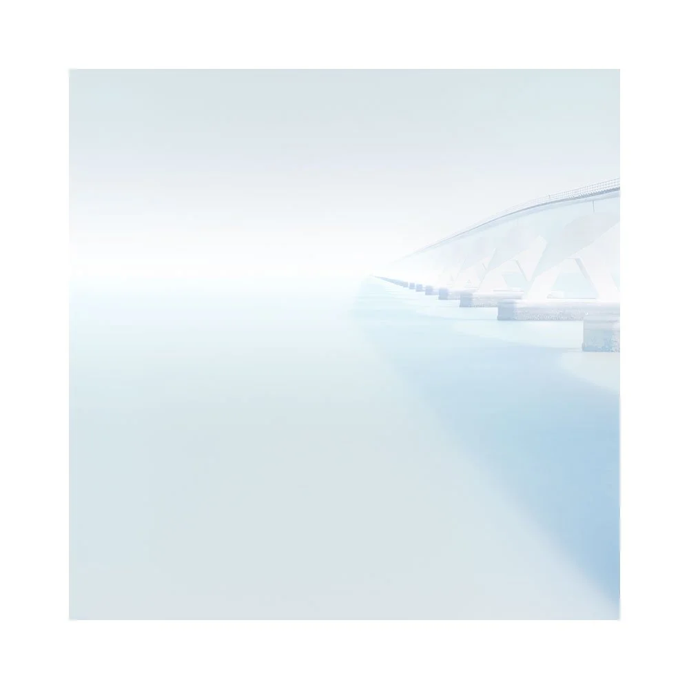
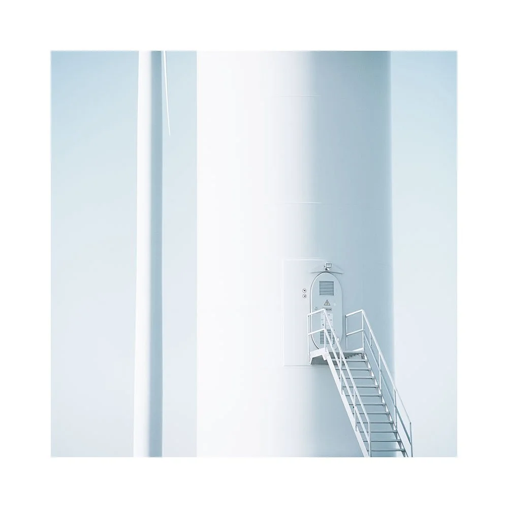
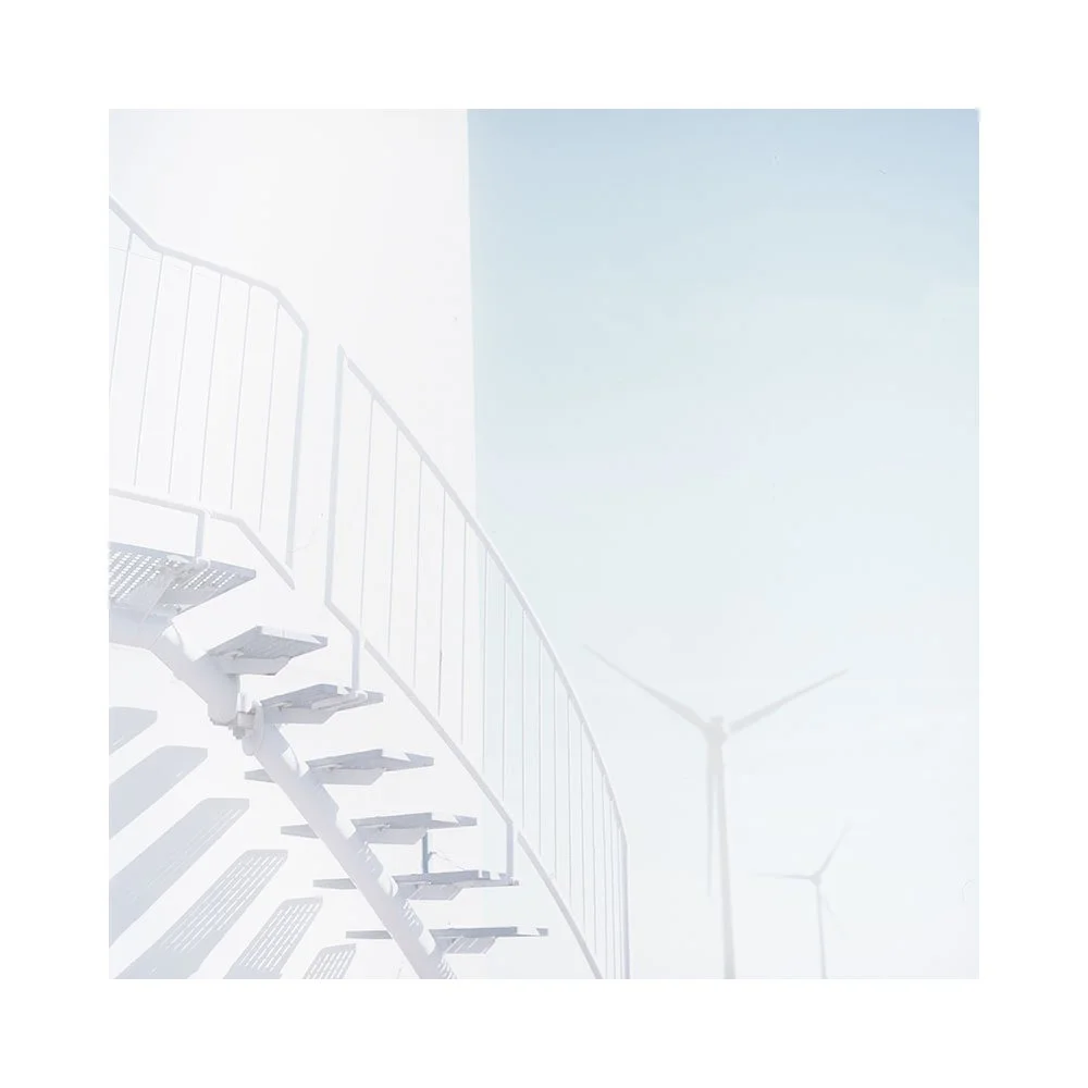
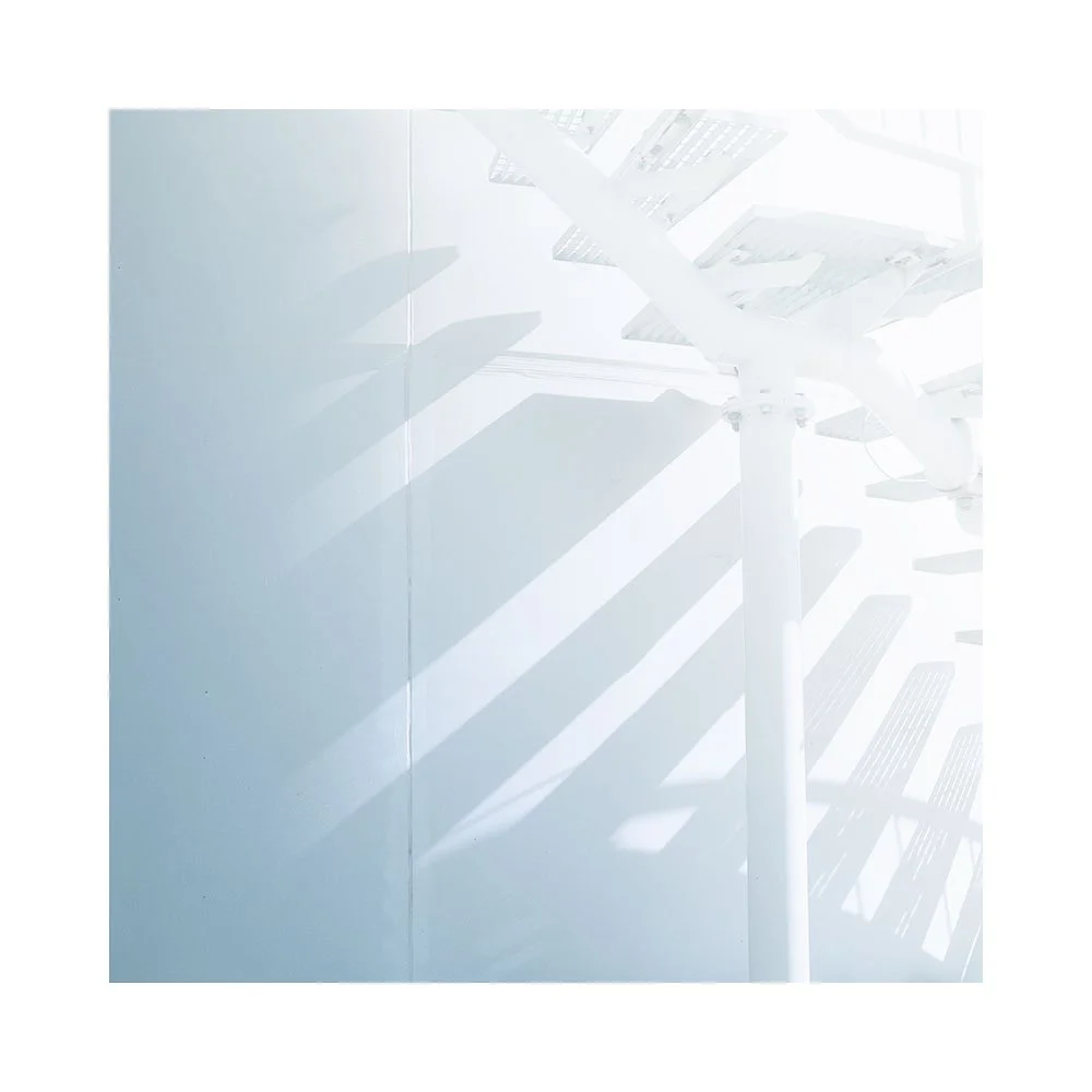
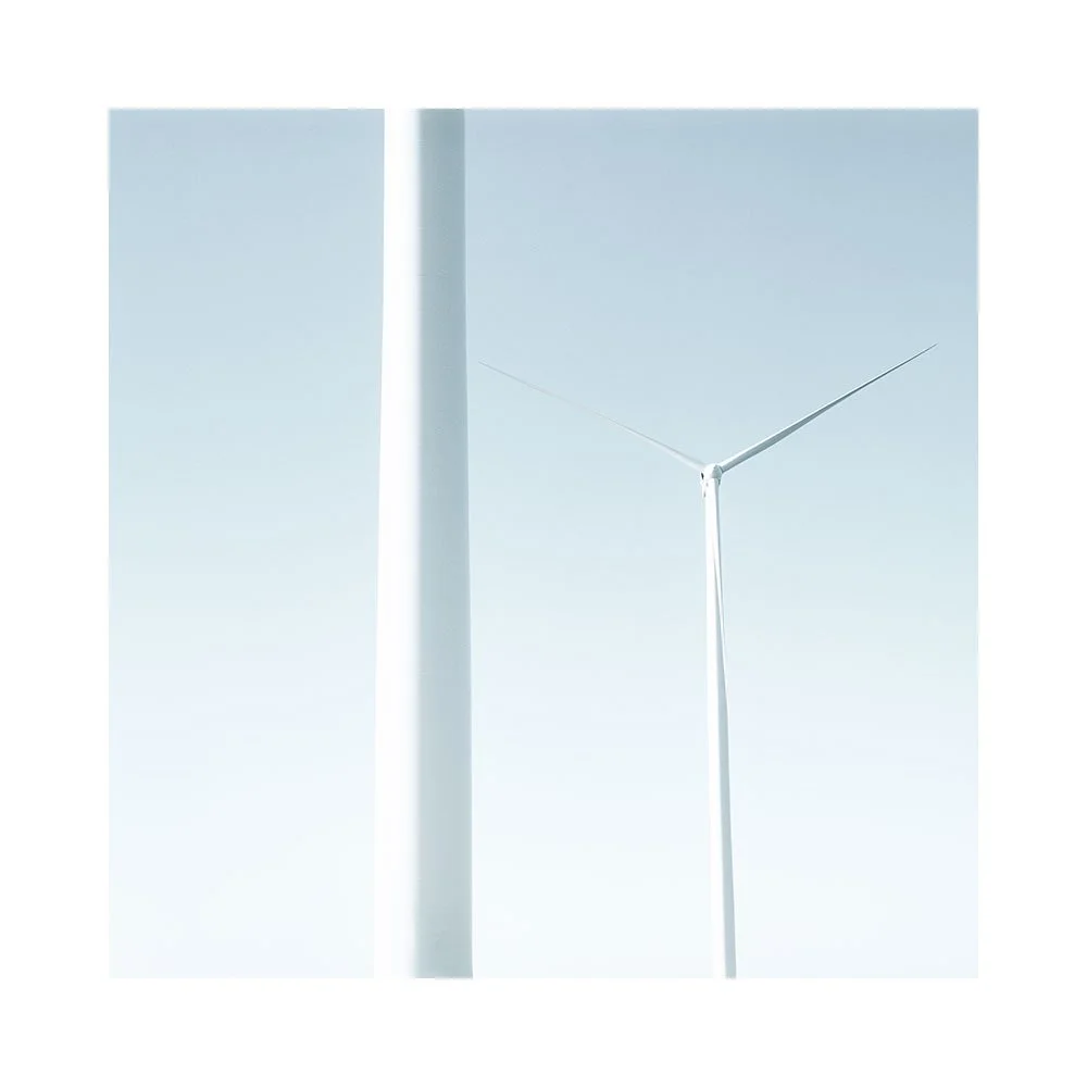
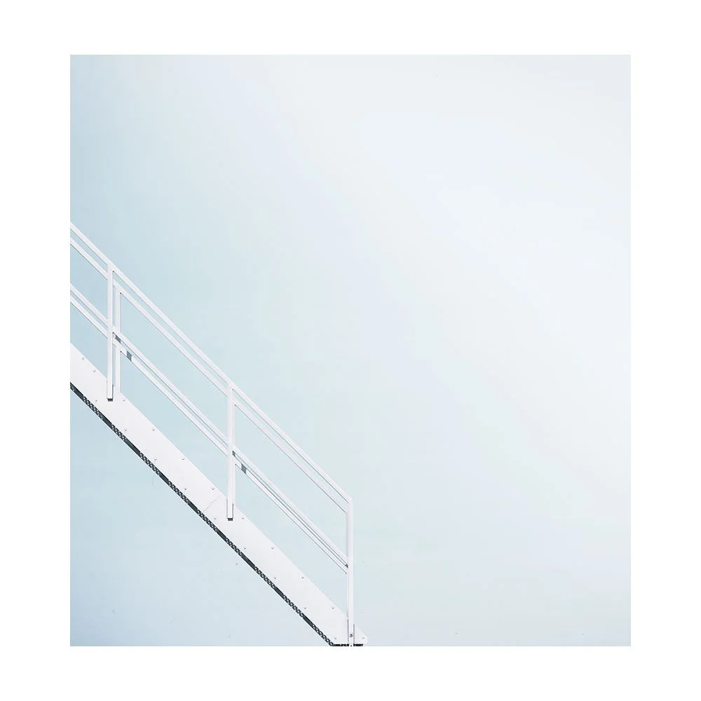
Concrete, Fibreglass & Steel

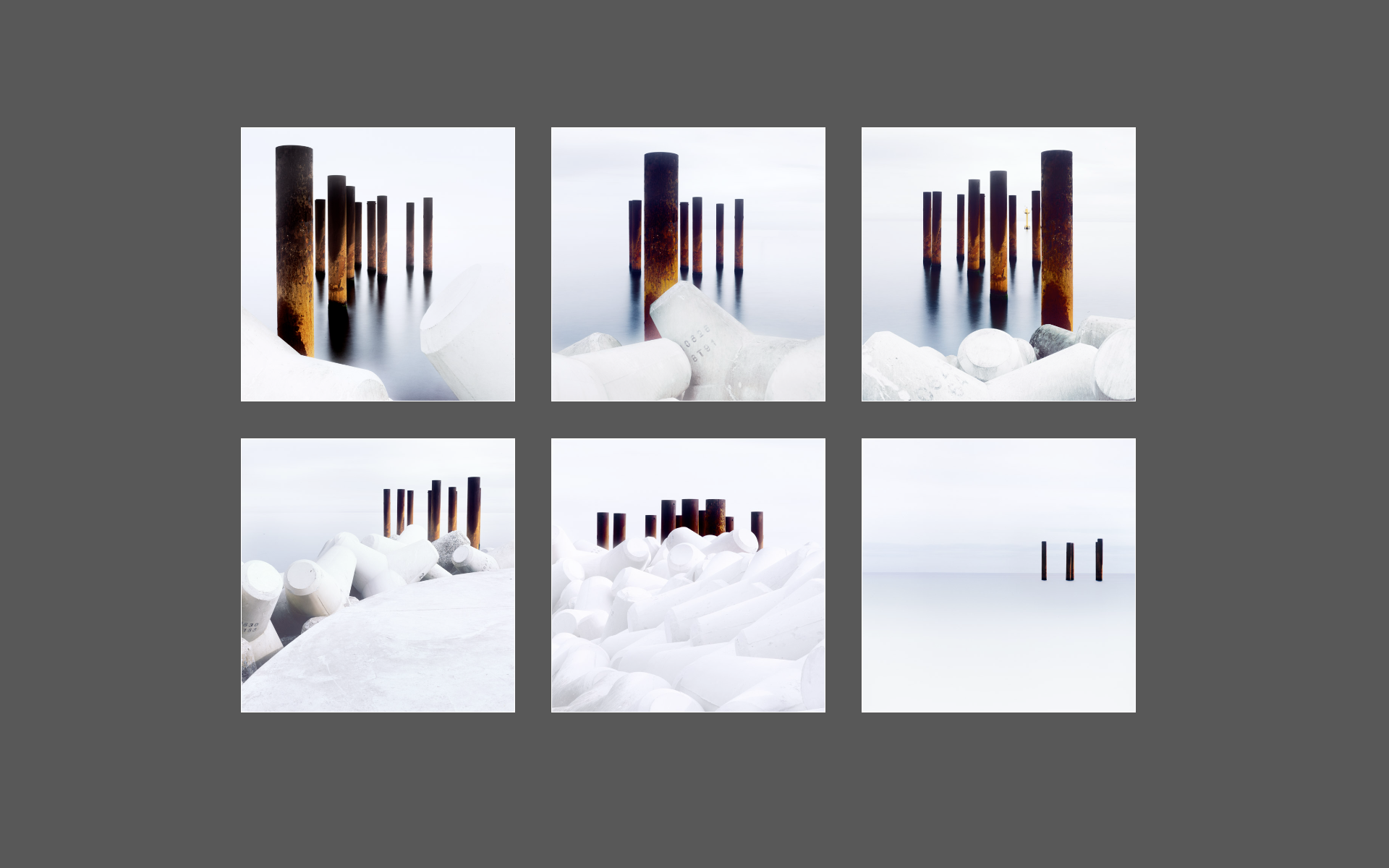
Can we find beauty in industrial places? Places we would ordinarily pass over, because we tend to relate to them as purely functional in purpose.

Often, I’ve thought, that there is no room in our minds, for beauty or art, with such places.

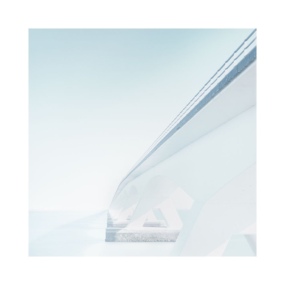
Zeeland, like many other parts of the Netherland’s coastal polders and dikes is reclaimed land. Over the centuries engineers have heavily fortified, straightened, and dammed sections of the Dutch coastline.

I doubt that beauty was ever in the hearts of the engineers that reclaimed this land. And yet, beauty is what I found here. In concrete, fibreglass and steel.

Who would have thought, this landscape to be worthy of a photographic portfolio? Especially from someone who has spent most of his time photographing natural landscapes.

I would not have guessed that I would enjoy so much photographing a world built for function and purpose. A place that no one frequents.

I was intrigued that our world can have vast areas of land, dedicated to the design and function, of engineering structures that no one goes to, or lives in. Where catering for human presence, if done, was done almost with a grievance. If done at all.

A landscape that is stark and austere of human ornamentation.

And yet, I still found much beauty. Beauty in the austerity of the technical design. Tower and blade. Abrasive concrete. Fibreglass and steel.

-

Many thanks to my friend Frank Hoogeboom
www.frankhoogeboom.com for showing me around.

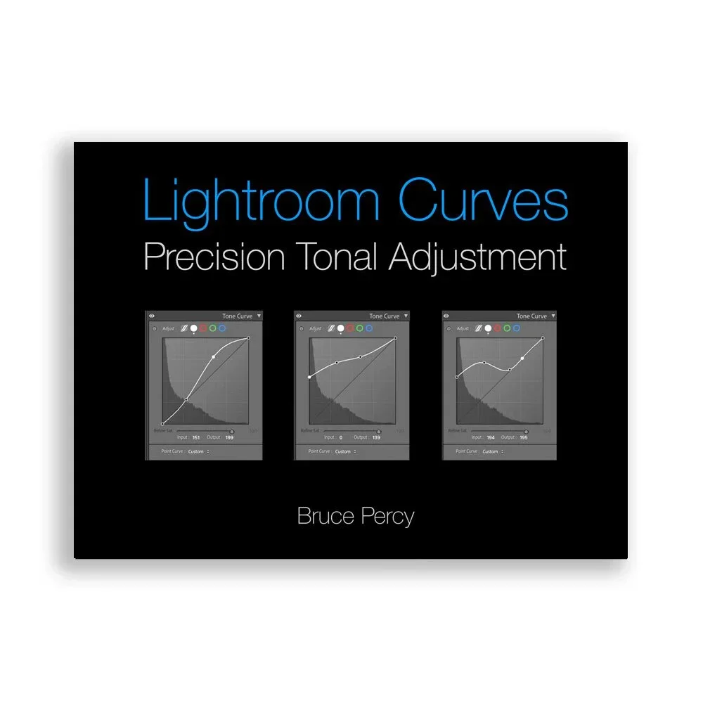
Lightroom Curves, Precision Tonal Adjustment

I’ve finally published my adaption of my Photoshop Curves e-Book for Lightroom users.

This book is a deep dive into Lightroom’s Curves tool. A hugely powerful tool for creative and surgical tonal control.

Please note that this is e-book is an adaption of my Photoshop Advanced Curves e-Book.

It teaches:

  • The theory behind curves (how tones are mapped and manipulated)

  • How to use curves for specific tonal regions (shadows, midtones, highlights)

  • Both simple adjustments (like contrast or brightness tweaks) and advanced techniques (like lifting shadows without affecting contrast)

  • Practical workflows using masking + curves together

  • Subtle but critical topics like:

    • Contrast vs saturation relationships

    • Avoiding highlight/shadow clipping

    • Precision control using the histogram and “adjust” tool

  • Real examples with before/after images + exact curve setups

  • Plus: included Lightroom catalog + video tutorials for hands-on learning

New Podcast Video

The summer time is my ‘time off’ from my intensive yearly workshop and tour schedule. To be able to recharge my batteries, it’s best I spend my time away from photography. But it is in my core. It is part of who I am.

I enjoy making these videos very much, as they allow me to crystallise my thoughts on what I do, and why I do it. But also, I am someone who creatively speaking, loves to work with sound as well as vision. My photographs are always concerned with creating atmospheres, and so too, are my little vignettes.

These are very time intensive to create. I have the utmost respect for folks who create high-quality documentary style video that is over 5 minutes. The level of detail and work required to do this is immense. I struggle to get a sentence out without falling over my own words….. So creating these short videos over the past while has been a humbling experience for me. Making high quality videos is a lot of effort. As the saying goes - ‘professionals make hard work look easy’.

One last thing: if you like these vignettes, I’d really appreciate it if you could let your friends know about them.

When you show everything, there's no room for wonder

“just because you can, doesn’t mean you should”

I can only listen to adverts in the TV or radio for a short while, before I have to either mute them, or turn them down. Deliberately processed to appear louder, and to grab our attention, they do in a way that is like being taken hostage. You cannot escape the distraction, and once caught, you get fatigued very quickly because sustained listening when it’s forced upon the listener has the limbic system working overtime.

There are images out there that could almost be tv/radio adverts. They are visually loud. Exaggerated foregrounds, stretched mountains, extreme contrast everywhere, and strong colour everywhere. And they assault our visual system in a heartbeat of us viewing them.

To the less experienced photographer, these are impressive images. To the more experienced, they are tiresome, perhaps bordering on clumsy work to look at, because everything is on show and there is no room left at all for wonder.

In a way, this is a rite of passage for all of us. I remember being impressed by high contrast. I also remember being swooned by high colour. And I also remember thinking if I managed to get both in one shot then I had a successful image.

I also remember reading Michael Reichman’s point of view that this is the territory of the inexperienced. Of someone who has not learned to ‘see’ yet and disagreeing with him to my very core. Reichman had also said in his article from over twenty years ago that as we get better at ‘seeing’ our appreciation of contrast and colour becomes more nuanced. At the time, I could not imagine what he was talking about because for me, colour and contrasts were everything.

In my own case, he was right. As time has marched on, I have found that using strong contrast globally is tiresome to my eye. I found I was now looking for more nuanced depth, and the way to do that, is to use high contrast selectively. My eye finds it much easier to stay with an image if it is less ‘globally’ attention seeking. If there are quieter passages and softer tones, my central nervous system isn’t forced into some kind of heightened state of awareness for the entirety of the viewing. Calm areas with intense areas mixed in allows my eye to have passages where it can relax. There is room for wonder.

Nuance takes time to learn. Because as photographers we have to learn to ‘see’.

No one escapes.

We have spent a lifetime trusting our visual coretex to help us navigate our world, and its job has been to look for the highest payoff for the least amount of effort. Paying attention to the small textural details of our world has never been a priority of our visual coretex. It’s goal is survival. Rather than paying attention to the things we need to learn to ‘see’ as photographers, it is more concerned with allowing us to navigate our world without danger. So for most of our waking life we have been filtering the less critical aspects of our world out.
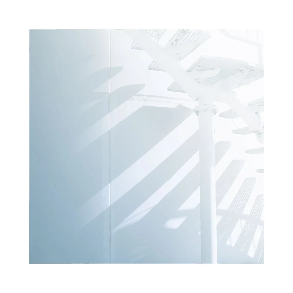
Being a photographer is all about un-filtering. Of seeing the things our visual system has chosen to ignore. Evolutionary pay-offs - that which is not critical to our survival and has been removed, now needs to be instated. Added back in.

These days when I am editing my images, I rarely go to any global solution at the beginning of the session. Global edits are done often at the end, once all the tonal relationships of the image are in place, but perhaps needing a global adjustment for calibration purposes. No, global adjustments are not my friend, and if using a RAW editor, I seldom try to get the image to look ‘punchy’ before I open it in Photoshop. To do that is like trying to reach the finishing line before one has started.

Leave the subtle and nuanced contrasts alone. Leave the image looking deliberately flat and unfinished. Localised edits are where to put in the depth, selectively, and with greater appreciation for giving the viewer some quiet passages within the image for some space to breathe.

Regardless of my advice, I think we all have to go through the ‘big wow’ image phase for a while. We have to learn what doesn’t work, what fatigues our eyes, before we move on to looking for nuance and subtlety.

Gradations on the Salar de Uyuni

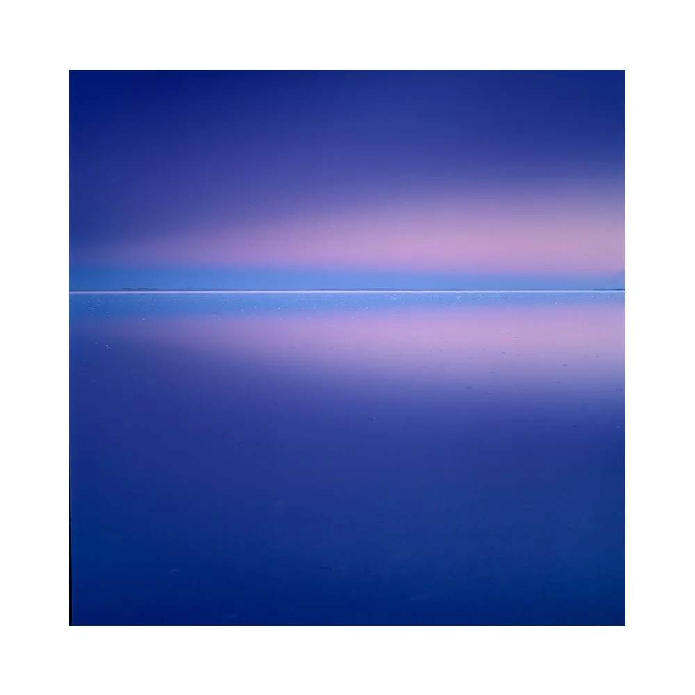
It was the first time I’ve seen water on the Salar de Uyuni.

Vera, Tommy, Pete and James on the Salar. Just a few inches of water, but more than enough to allow for perfect reflections in the evening light.
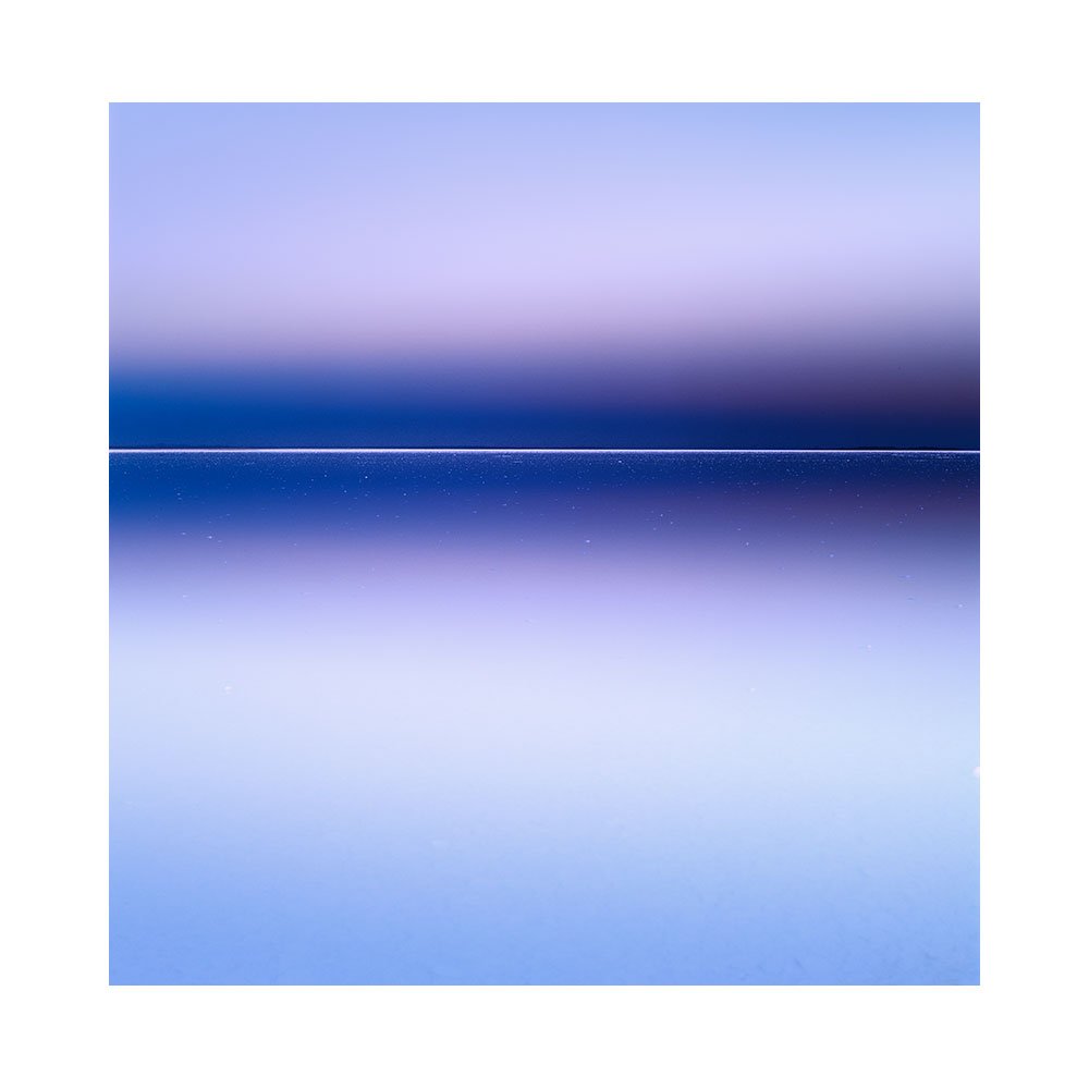
Always choosing to go in the dry season, there are never any guarantees that the season will be exact. In a way, I take delight when the weather is not predictable - whether it’s due to El Niño or something else, temperatures fluctuate, things change, nothing is ever quite the same.
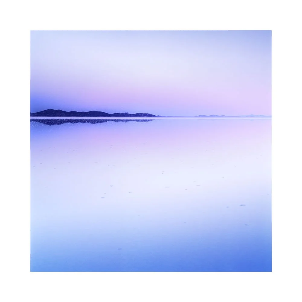
And so, this year, we found a small patch - maybe 5km square, on the Salar which still had water left over from the wet season. Around two to three inches deep. Just enough to allow for beautiful reflections, and not too much to cause waves that would disrupt the calm of infinity when one walked around the location.

I rather enjoyed feeling as though I was walking on water.

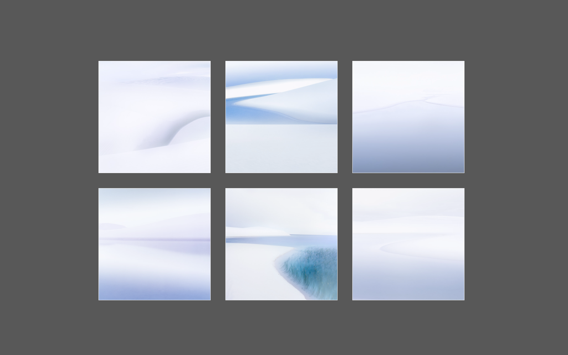
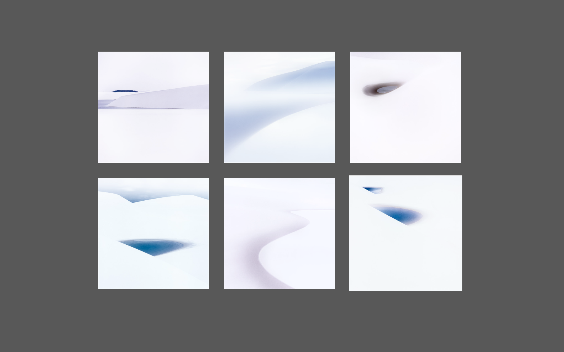
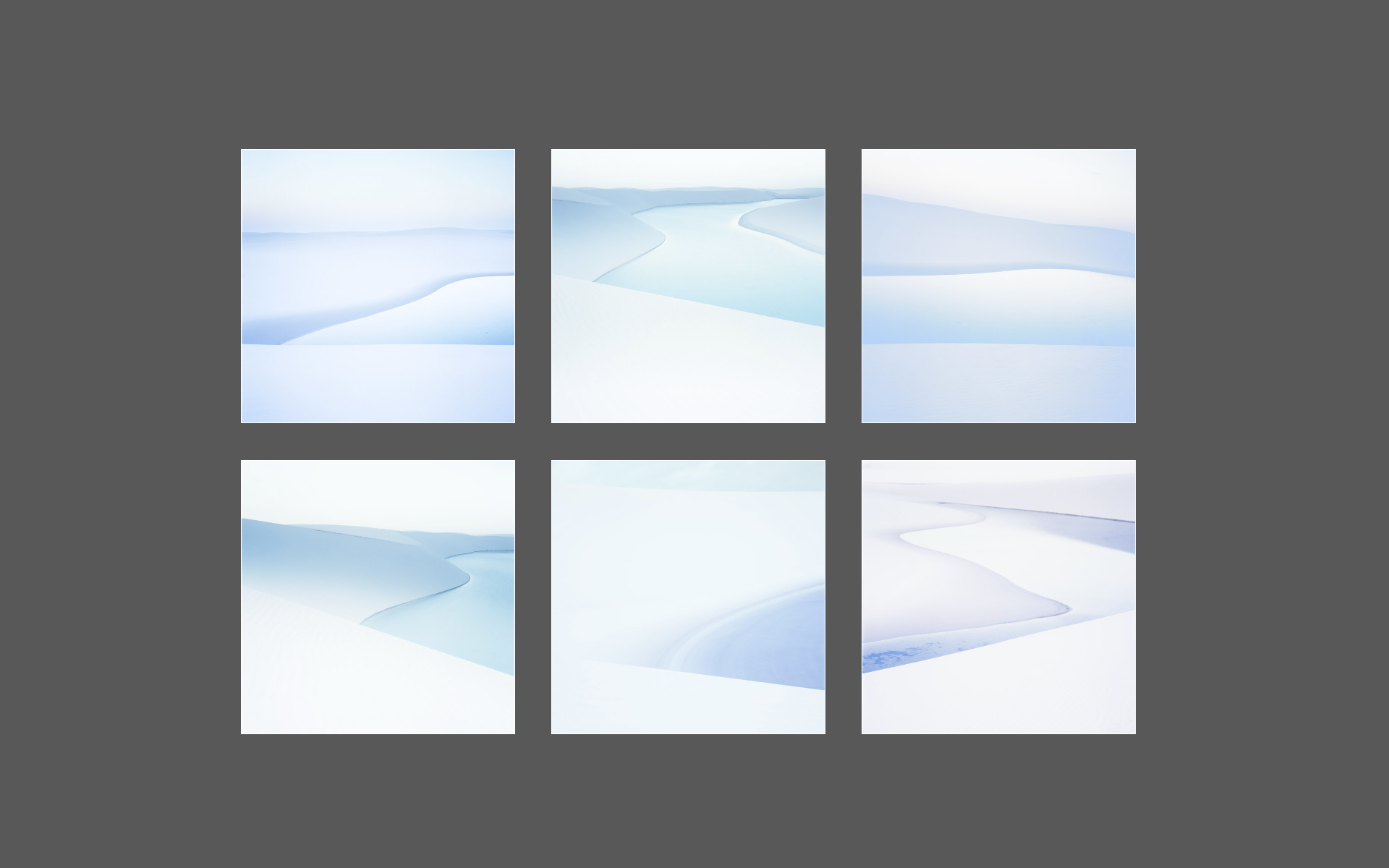
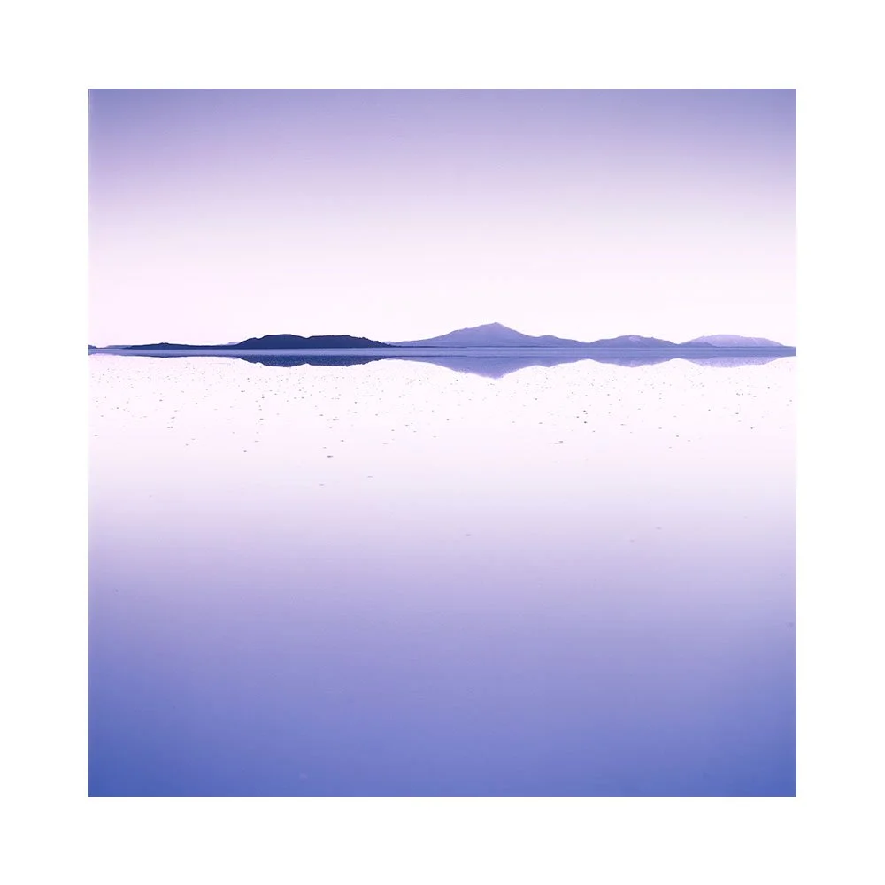
I also rather enjoyed studying the smooth gradations in the sky and water, and the enormity of space. So much so, that I found the set of images I edited this year, and indeed what I initially chose to shoot in Bolivia - were more towards my own preferences of ‘less structure, more space for tones to stretch out with gradual variance’.

I originally thought I did photography for the experiences it brings. But as much as I think that is true, it’s not entirely accurate. I think I’m drawn to colour, light and the gradation of time. Not so much the actual subjects of the photos, but the quality of light, and how the tones slowly morph and gradate from one luminosity to another.

When one strips the more conventional subjects out of the scene that we (mistakenly) assume to be the reason for our photographs, we find gradation of colour and luminosity is really at the heart of our picture making.

Mirage

I’d like to thank everyone who bought my new e-book. I’ve only just realised it’s been a couple of decades in the making - it was only possible to write it now, after all the experiences and thoughts I’ve had over the past few decades of editing and working on my art.

One thing leads to another. Stepping stones. Small steps. Gradual progress. Compound interest. Slowly but surely we develop. Patience and self awareness are key.

Got so much to do. But I’m breaking up the drudgery of three months worth of accounts with editing images from my recent travels. Like this shot….

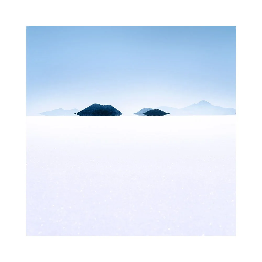
Mirage on the largest salt flat in the world. The heat and air bending light on islands that are 30km away.

I enjoyed Bolivia this year very much. It’s an old friend now. Seventeen years since I first started coming here. I know it very well and have spent a lot of time engaging with it.

What I love about repeating places is that they are seldom the same. Something happens you’ve not seen before. They can surprise you.

I enjoyed shooting the mirages on the Salar this time round. We also had the salt flat partially flooded...

New images from Bolivia to be published later in the year. They’re all edited now, but I have a backlog of work sitting in the queue to be published when the time is right.

Editing Masterclass - Creating 3D Perception

I’ve just released a new e-Book.

Creating 3D Perception teaches the ‘why’ rather than the ‘how’. It is not a technical book. It covers concepts you can use to impart a sense of 3D to your images without having to reach for global contrast.

With a few simple, easy-to-remember techniques, you can train your eye — and your editing — to give images a compelling sense of depth and dimension.

This concise e-book distills my editing experience into three core concepts:

  1. Using tonal gradations across a scene

  2. Separating foreground and background luminance

  3. Employing contrast differences to create the illusion of three-dimensional space

You'll learn why a soft gradient convinces the viewer's eye far more than a hard one, how brightening a background can make your subject appear to step forward, and how the luminance of surrounding areas can make the same subject look lighter or darker without touching it at all.

These ideas may seem obvious once you know them — but I can guarantee that they are not so obvious until you do. Few photographers edit with this kind of intention. This book gives you the 'why', so that every edit you make has a clear, considered purpose.

This e-book has been formatted and written in a deliberately concise way, with each lesson distilled down to a page to help with the learning.

immediately applicable to any landscape image.

Specifications: 33 pages.
Format : Electronic e-Book. Adobe Acrobat PDF format.