I remember Michael Kenna being asked why he specifically worked in black-and-white. I paraphrase here, but he said something like ‘because it’s quieter’.
I never really understood this when I heard the interview a decade or so ago, but I do understand it now.
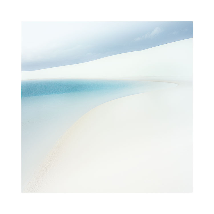
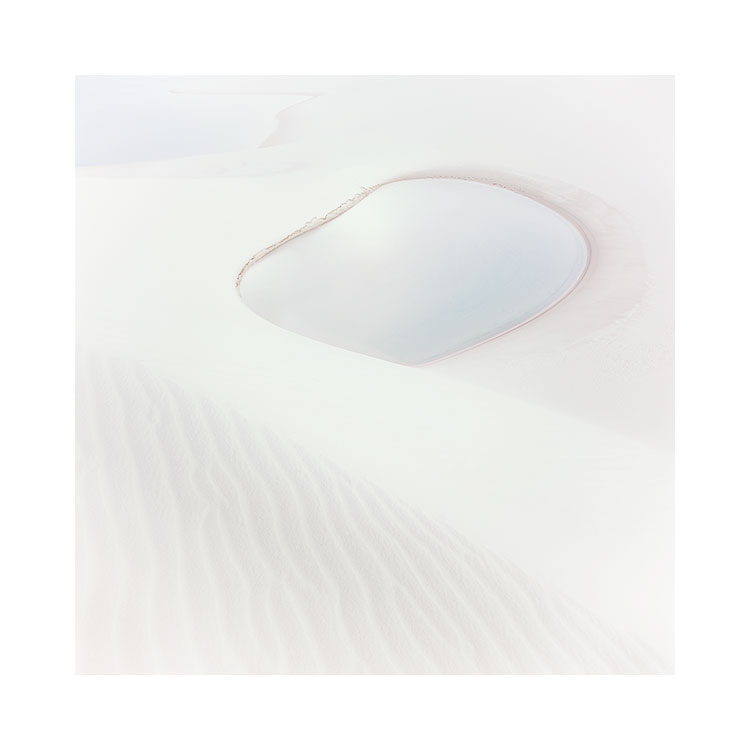
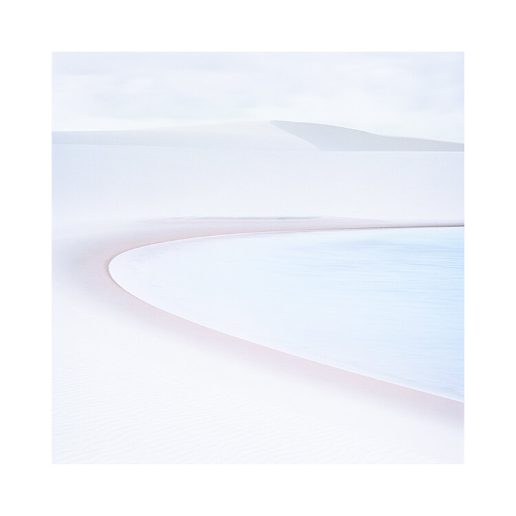
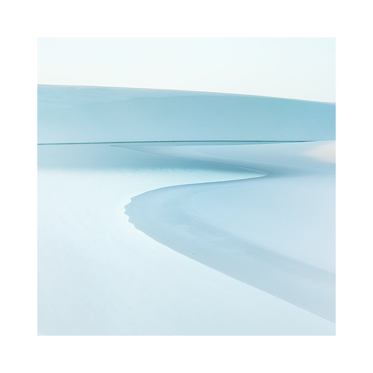
You see, I think I’ve been on a quest to make my images simpler. When I started out, things were cluttered, busy, with lots of issues and problems. First I found it was really about reducing down the composition to a few subjects, maybe three or so at most in the photo. Going to places like deserts, beaches, and working in places with very little going on has taught me so much about simplifying the content of a photo in terms of ‘objects’. But the next stage was to work with luminosity and tonal separation. I think that is perhaps the 2nd stage of composition that we all work on.
The third stage is perhaps colour. For most of us, I certainly believe that colour isn’t considered part of composition. It just ‘is’. But sometimes colour can be too dominant. First we start with trying to remove one or two colours from a composition to prevent our eye getting caught by them as it traverses across the image. But I think inevitably, as our awareness of colour develops, this too is reduced, and applied sparingly.
Perhaps I’ve just been on a path to reduction. But I don’t think so. I have often received the question ‘why don’t you go black-and-white’, which I think is a natural assumption if someone is desaturating their work. But for me, the work just becomes too one-dimensional when it has zero colour. I still need colour to exist.
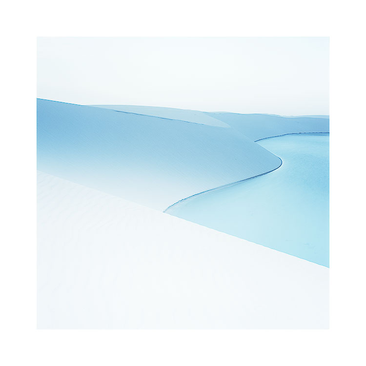
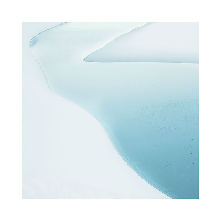
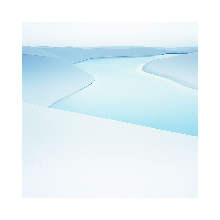
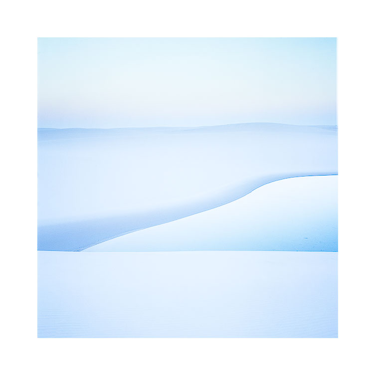
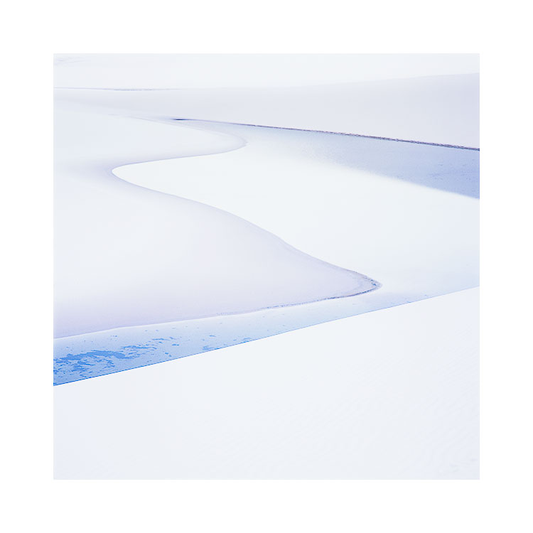
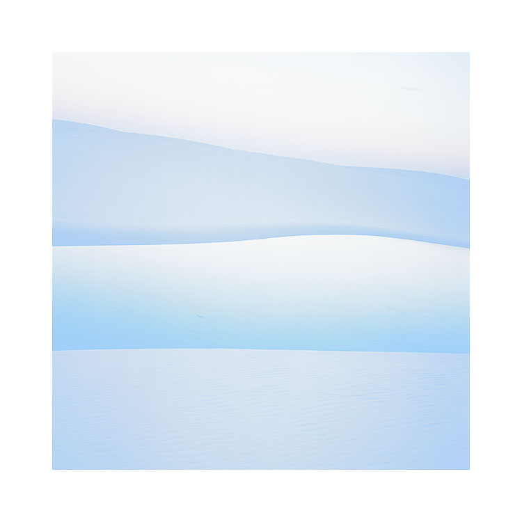
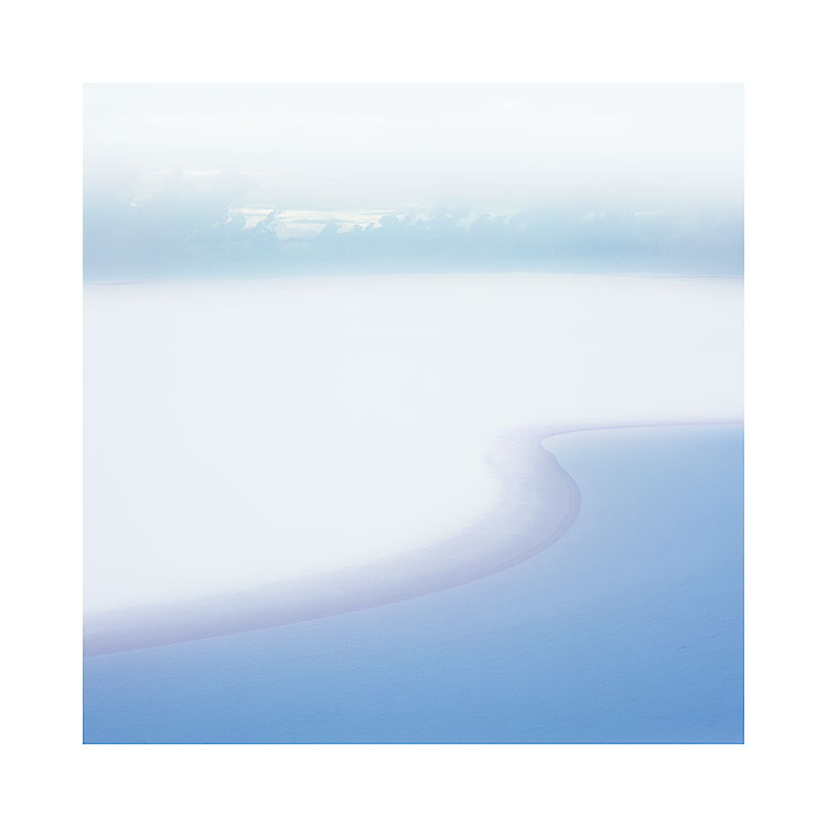
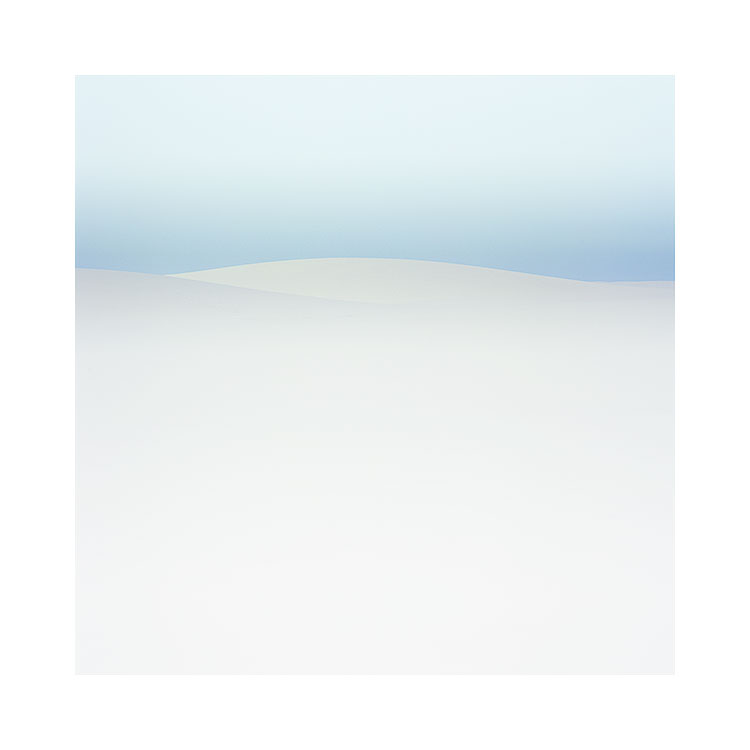
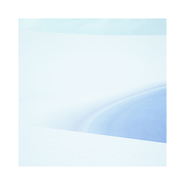
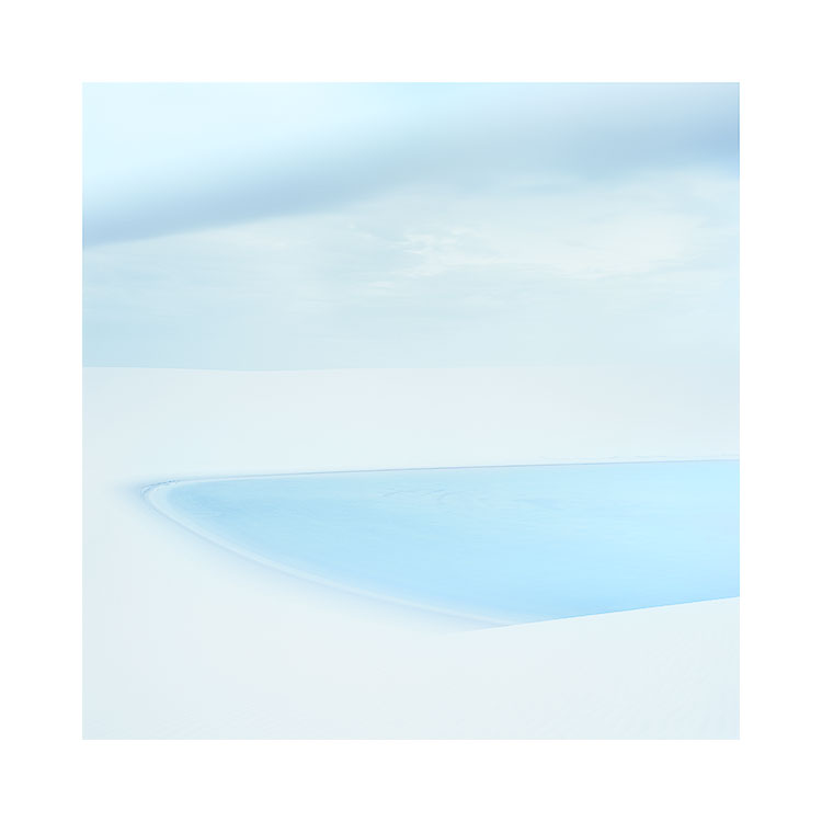
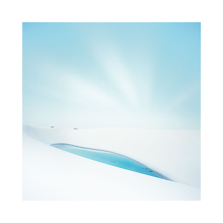
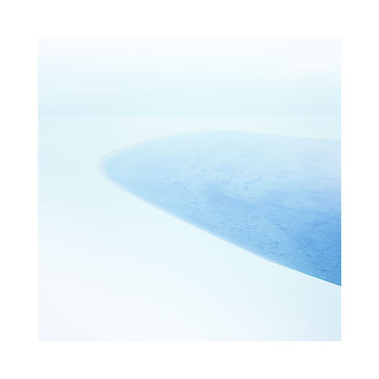
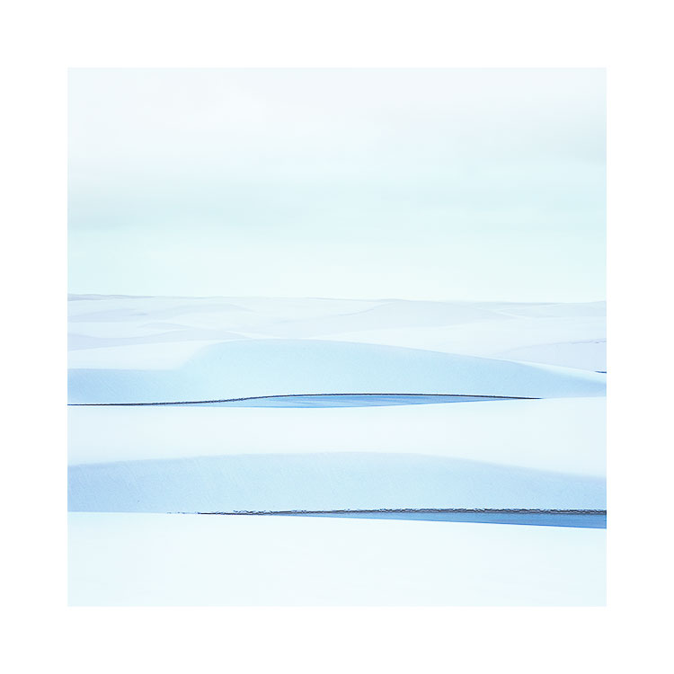
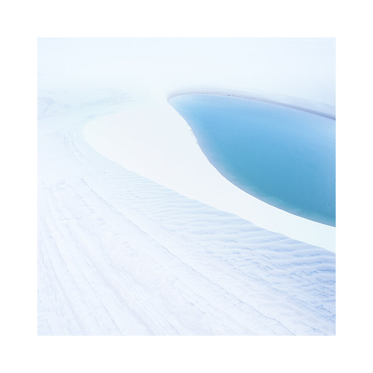
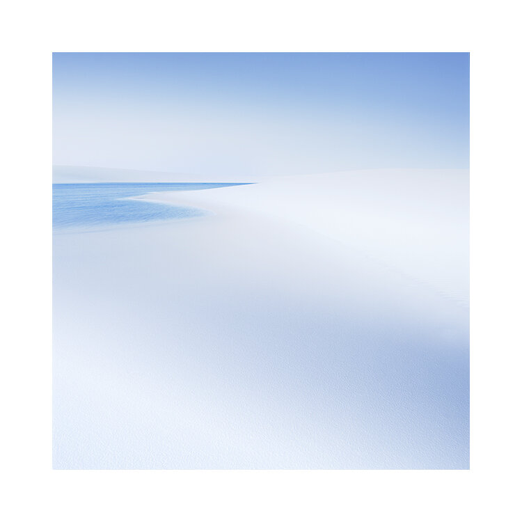
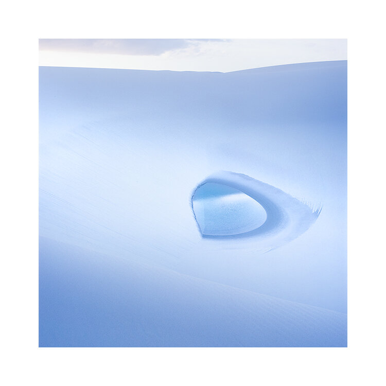
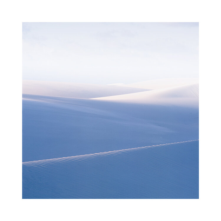
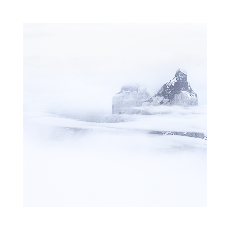
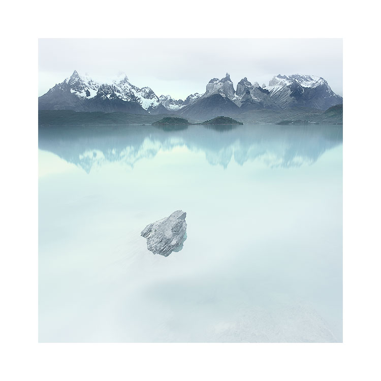
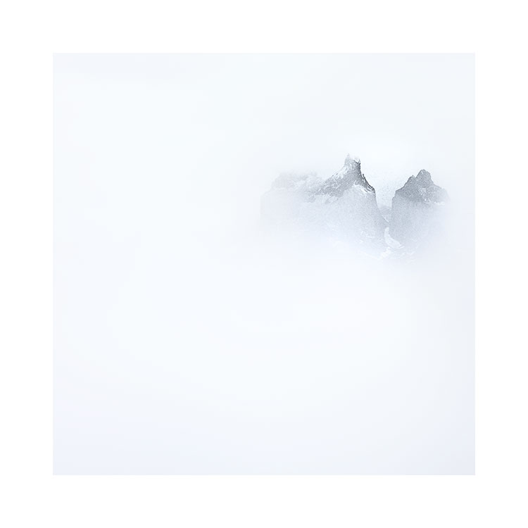
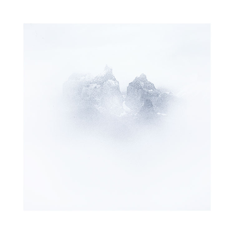
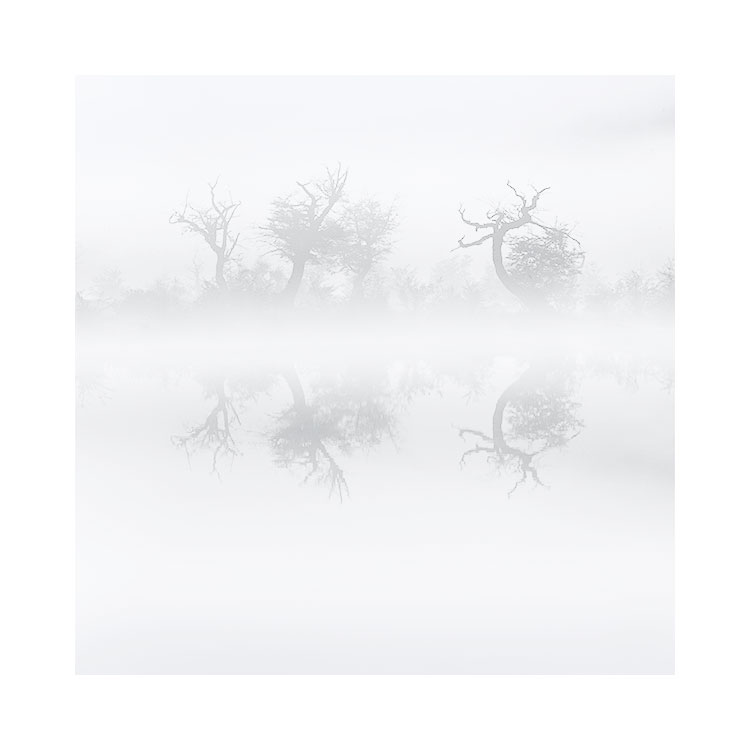
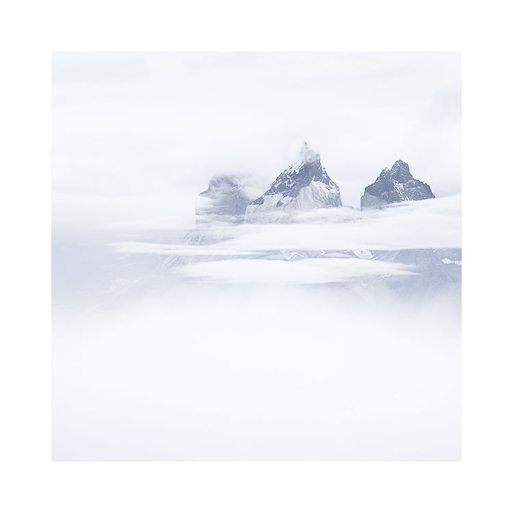
So if there is a message in today’s post, it is this: images can become more ‘quiet’ if colour is used sparingly.
Although I have stated this, it does not mean that you will immediately start to reduce colour, because I think we can’t control our own tastes of what we like / don’t like. It just has to happen over time. But I do think being aware of this, and perhaps reaching for that desaturation slider, rather than trying to soup up the image might take you somewhere you might really like.
I often feel as an editor of work, and of working with participants on my Digital Darkroom class, my aim is to push the participants outside of their comfort zone. If you are always working with mid-tones and never put any blacks or absolute whites in your work, how will you know if they might add something to what you do? Similarly, if you never desaturate your work, how will you ever know if desaturating may be just where you need to go?
Colour is a critical component of composition, and just like how much care we try to take on which objects to include in the frame (and similarly which to exclude), so too should we consider colour.
Colour can be deafening, or it can subdued. I much prefer the silence that muted colour brings to my work.