Waiting until the light has gone

Puna de Atacama, Argentina. Wednesday 28th of April 2022.

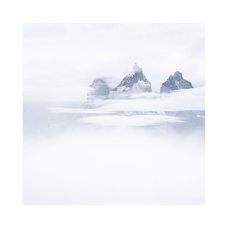
My guide Pancho took this photo of me in the Colorados region of the Puna de Atacama. Each time I have been here, I never quite know when to start shooting. While the light is on the actual mountains, their contours are more clearly defined. But I feel the images lack any particular atmosphere when they are made during daytime lighting, and so I often wait until they go into shadow.

My guide is always saying to me ‘the light has gone’, and I have seen many photographers in my travels pack up at this moment and go away. But this is often when the light may start to get better.

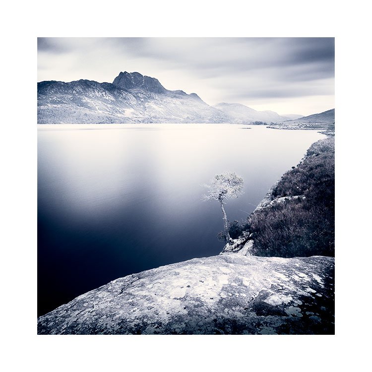
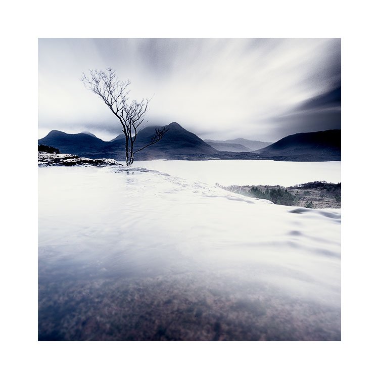
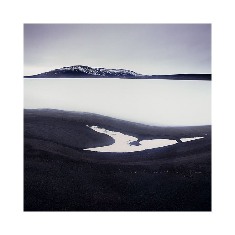
In this case, around 10 minutes after sunset, not only were the mountains in shadow, but the sky had darkened down also, and everything now appeared to be glowing. It is as if the light is coming from all around me during these times, but what has really happened is that my eye has adjusted to the shadowed landscape and the more muted sky.

After the sun has gone, everything starts to glow

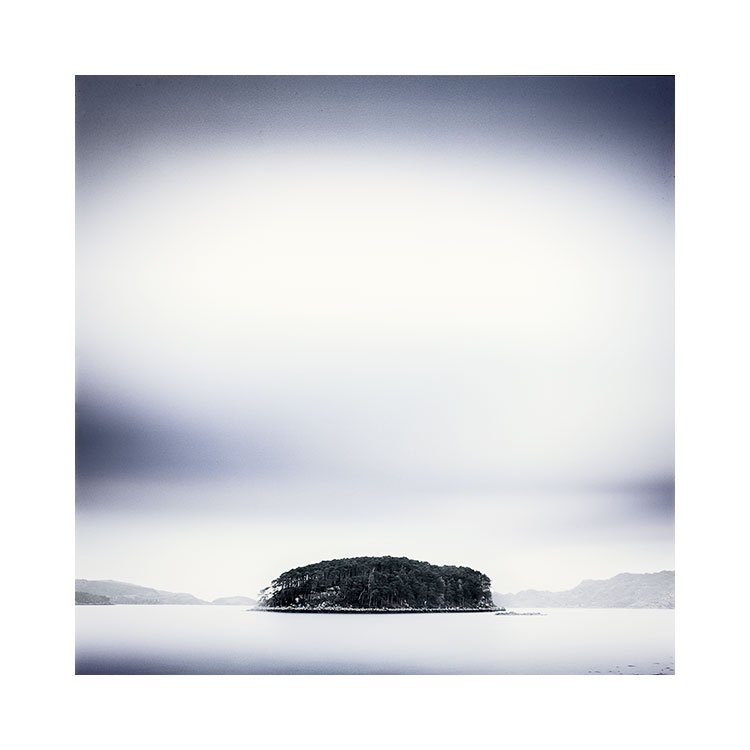
Think if you will, of an aperture being opened up. My brain is now interpreting this shadow light as ‘daylight’, and so even though the EV value is much lower, it now appears more balanced and easier to look at.

The main reason for shooting once the sun has gone, is that the shadows are greatly reduced. The tonalities are much softer. One danger about this is that by comparison to the ‘daylight’ shot, you may be tempted to believe that there is no definition in the contours of the landscape. Not so! The contours are still present, but they are softer. More easy to work with when editing / printing.

This is one of the more alluring times to make photographs. But I would suggest that you make photographs from just before the sun starts to go down, until well after into the twilight time. Review the images later on with the view to studying the tonalities, contrasts and also to note that the entire duration from pre-sundown right through to twilight can produce good images. Just don’t stop once the landscape has gone into shadow, because you may be missing out on the beautiful light you see in the above photograph.

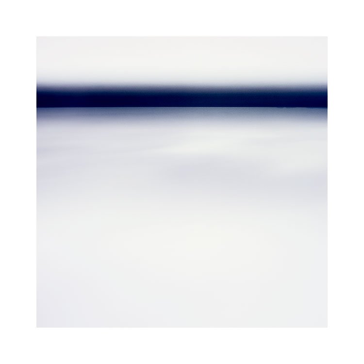
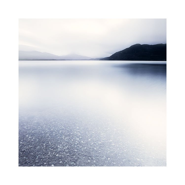
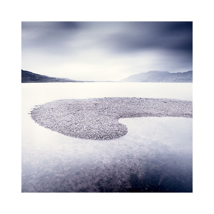
Ambient light is still falling on your subject after sundown

One last tip from me, is to shoot 180º to the sun. I always shoot with the sun behind me, or to the side. Rarely towards it (unless I am deliberately looking for silhouettes). The contrasts are extreme. Whereas shooting who the sun either behind or to the side of me, allows for light to fall onto the subject. It may appear as though this would not matter once the sun has gone down, but the truth is that there is still a lot of ambient light falling on your subject. There is always a flow of light particles still hitting your subject.

Even well after sundown, when everything is black, if the subject is facing where the sun was, your camera will still be able to record ambient light that is still falling onto your subject. Your camera will still see it, even if you aren’t able to.

Humahuaca's gorge

I’m in the Pumamarca region of Argentina right now. I went to visit the Humahuaca gorge last night. Mostly with a tourists view rather than to do any serious photography, as I had assumed that this region of coloured hills would only work with some intense light on them. We stayed until just shortly after sunset when we were ‘ejected’ from the location by a local guide. But the light was very beautiful, and the mountains started to ‘glow’ once the sun had completely gone.

I love how I look as though I’ve staged this shot: the background is a poster somewhere, and I’m standing in front with a fake camera. No? Well, that’s how it looks to me :-) ha ha ha :-)

I often feel many photographers make the mistake of leaving far too early. As soon as the light is no longer kissing the mountain peaks, and everything is in shadow, they depart. Yet I think this is just when things get going for me. My spot meter told me I had a 1 stop difference between the sky and earth. Perfect. I also know from doing this kind of shooting so many times now, that going home with super flat images like this allows me to play with the contrasts and bring out the areas of the image that are important.

We’re heading back tonight again to try again. We made an arrangement with the local community for a longer stay. I hope the light will be as special tonight as it was last night. What will be will be.

Los Colorados

I arrived back in Salta last night. It is very nice to be back here, for a number of reasons. The one that seems to be resonating with me loudly today is ‘because I was starting to think I would never be able to come back’.

My guide Pancho sent me a few photographs from my times with him. It appears that I have been going to the Puna since 2015. That is seven years!

It still feels very much to me like a recent discovery. My relationship with the Bolivian altiplano is much older, beginning in March 2009.

All I can say is that I’m so glad to be here. I’m so excited about being here, and I feel that the slumber I’ve been in, the depressive spell of uncertainty, and the general lack of interest that I’ve been suffering for two years (you too huh? If you are finding this resonates, you are not alone), is shaking off. It’s going.

If you’re worried about travelling, I understand. I had anxiety about it this past few weeks. I couldn’t help think that something would happen. Either I’d be omitted entry for some reason, or I’d get ill. Well I just feel that life is for living, and living means having to accept that there is risk in everything we do. Nothing ventured, then nothing is gained.

So tomorrow I will be back in Los Colorados. That is the red clay landscape you see in the photo above (my guide Pancho took this of me). I’m now hatching plans for other trips. I hope you are too.

A note about the photo above: This is an unusually difficult place to photograph. The red clay hills you see here are really much smaller than you might think. Maybe around 30 to 40 feet high. But they are quite difficult to walk up as the earth is a soft clay. You begin to slide as you try to get up the slopes. We found one ‘entry point’ where we were able to get up onto this ledge. The main issue for me with this landscape is that you need contrasts to show the contours, so shooting in soft light doesn’t work. It has to be hard light. Or sunset. And you can see that I’ve made this shot just as the landscape in the foreground has gone into shadow, and the sun is ‘kissing’ the background hills for a fleeting moment before they too, are cast into shadow. It’s fleeting, which means you can’t move around much. You have to choose a spot, and hope you got it right.

Returning to Argentina

A week today, I’ll be heading back out to northern Argentina. I am going a week early before my ‘photo tour’ begins, as I wish to spend some private time making some new photographs.

The last time I was here was in 2017. That is five years ago! The photographs you see above were made on my last visit to the Puna de Atacama.

There are several beautiful areas of the Puna, and all I can say is that the region is vast. The Altiplano of Bolivia is big, but the Puna is even larger, with longer travelling distances. I’ve decided to return a week early as I feel I haven’t really been able to make the kinds of photographs I would like to of the red clay area you see in the last three images above. The locals call this region ‘los Colorados’, and there is just a hint of the colour of these clay hills in the first image on the left: when the sun begins to set, the last rays seem to kiss the background hills causing contrasts and shadows of the foreground hills. It’s rather fleeting and what irked me most was that my guide made better images than I did on his iPhone, and a lot more of them as well !

My plan is to camp out near these red clay hills for a few days, so my guide and I have access to them for sunrise and sunset. It will be cold as the elevation is 3,600m.

I’m also looking forward to returning to the Cono de Arita with my photo group. It is a special small volcano which tends to offer up some very graphical contrasts during sunset.

I’ve got a few more projects lined up for this summer: some hiking to a special place in Iceland this summer. More on these projects later. In the meantime, I hope you are managing to shake off the Covid cloud of non-travel, and that you can venture forth, into the world. There is so much still to see and most of it hasn’t been photographed well yet. I wish you all the best,

The importance of silence in colour

I’ve had a difficult relationship with colour since I started making pictures. What may seem ‘about right’ when I’ve just edited an image, may feel ‘too strong’, or ‘too weak’ when I review the images after a short break, or maybe on a subsequent day after some rest. The more I have read about colour, the more I realise that we all perceive colour to varying degrees. What one person may feel is too strong a colour, may not be strong enough for others. Conversely, what may be just about right for some, may be too strong for others.

My tastes have changed a lot in the past decade and the colour component within my imagery has become more muted. It wasn’t a choice. It wasn’t a conscious decision. I just became aware of it when I dug through my portfolios from the past decade. There has been a slow, but sure progression in reduction in all aspects of composition for me.

Often I think that most of us assume composition is about where subjects are placed within the frame, but composition is about ALL aspects of the image: subject placement, luminosity relationships around the frame, and of course - colour.

For me, I’ve found my use of colour has become extremely selective. What may have looked ‘quite nice’ six years ago, now almost fills me with embarrassment. I think some of my earlier work is clumsy, and the colour component of the compositions is all over the place.

Indeed, being embarrassed by one’s work is healthy in my view, so long as you are not always so, and so long as it is only something you feel about work retrospectively. Because in my view, this signifies growth or change. Hopefully it indicates an improved sense of awareness.

All I know is, the more I learn, the more I realise how little I knew when I started out. That to me, in a nutshell is progress when I can look back at my earlier work and see room for improvement.

Anyway, back to colour as a component of composition. I’m aware that each of us perceives colour differently. For instance, some may find my work (see above) to have almost no colour. I know there is colour in the work, but it’s subtle, and for some who perceive the work has being black-and-white, the only way I can convince you that the work does have colour is to show you black-and-white versions below. If you compare back and forth, I think this might tell you a lot as to where the colour is, and also, what you originally perceived as ‘grey’ is actually blue. Particularly in the mountain tones:

I remember Michael Kenna being asked why he specifically worked in black-and-white. I paraphrase here, but he said something like ‘because it’s quieter’.

I never really understood this when I heard the interview a decade or so ago, but I do understand it now.

You see, I think I’ve been on a quest to make my images simpler. When I started out, things were cluttered, busy, with lots of issues and problems. First I found it was really about reducing down the composition to a few subjects, maybe three or so at most in the photo. Going to places like deserts, beaches, and working in places with very little going on has taught me so much about simplifying the content of a photo in terms of ‘objects’. But the next stage was to work with luminosity and tonal separation. I think that is perhaps the 2nd stage of composition that we all work on.

The third stage is perhaps colour. For most of us, I certainly believe that colour isn’t considered part of composition. It just ‘is’. But sometimes colour can be too dominant. First we start with trying to remove one or two colours from a composition to prevent our eye getting caught by them as it traverses across the image. But I think inevitably, as our awareness of colour develops, this too is reduced, and applied sparingly.

Perhaps I’ve just been on a path to reduction. But I don’t think so. I have often received the question ‘why don’t you go black-and-white’, which I think is a natural assumption if someone is desaturating their work. But for me, the work just becomes too one-dimensional when it has zero colour. I still need colour to exist.

So if there is a message in today’s post, it is this: images can become more ‘quiet’ if colour is used sparingly.

Although I have stated this, it does not mean that you will immediately start to reduce colour, because I think we can’t control our own tastes of what we like / don’t like. It just has to happen over time. But I do think being aware of this, and perhaps reaching for that desaturation slider, rather than trying to soup up the image might take you somewhere you might really like.

I often feel as an editor of work, and of working with participants on my Digital Darkroom class, my aim is to push the participants outside of their comfort zone. If you are always working with mid-tones and never put any blacks or absolute whites in your work, how will you know if they might add something to what you do? Similarly, if you never desaturate your work, how will you ever know if desaturating may be just where you need to go?

Colour is a critical component of composition, and just like how much care we try to take on which objects to include in the frame (and similarly which to exclude), so too should we consider colour.

Colour can be deafening, or it can subdued. I much prefer the silence that muted colour brings to my work.

Low contrast mood

Sometimes, the colours in nature, are a bit more unnatural than we are used to seeing. Cameras record light linearly, but we see a compressed dynamic range. We also ‘filter out’ colour casts.

But I think there’s a place for low-mood, low-contrast work. It’s so easy to think that everything needs to live in a full tonal register from deep blacks and absolute whites. As much as I love high-key images, they don’t suit all subjects, and I think with this edit, the deliberate lower tonal registers add to the atmosphere and mood.

This image is slightly damaged - I’m unclear if it’s a light leak on my film back, or the processing. But that hasn’t stopped me from liking it. The Sepia tone - actually desaturated from the original transparency (I shoot film - Velvia 50), still looks a little ‘otherworldly’, which is exactly what I am aiming to do with most of my work.

Torridon Six

New work from Torridon, Wester Ross, Scottish Highlands.

These images were made on two trips: my November workshop with a fantastic group of people, and on a private trip back in January to try to see if I could dig further below the surface.

I’ve had a long history with Torridon. Being one of three places I would visit as an amateur photographer back in the years 2000 to 2003, I had always felt there was something below the surface, something not so obvious, but it is there. This landscape does not offer up ‘postcard vistas’. It is a hard landscape to grasp, and I have often struggled here.

As my photography has developed over the years, I began to stray away from the Scottish Highlands. I had found simplicity elsewhere in Bolivia, Iceland and Hokkaido. It is with the current restrictions on our lives, that I have been forced to retract, and look locally.

The work is different from what I once captured here. I see traces of Hokkaido’s space and Iceland’s tonality. I don’t think it’s a progression of sorts at all: more like ‘This is what I do’. After so many years of what I felt was growth, I have an established style now perhaps.

I’m enjoying the return to my roots. I can’t say for sure that I feel I’m moving forward, as my instinct is to keep photographing far flung places. But as with all things in life : it is often in the unplanned, that great surprise awaits us, and it is often in the limit of options that we are forced into realms we thought we already knew, to find we did not know them at all.

If you haven’t figured this out yet, i’m enjoying this very much.

dreamstates in every day moments

I think that is what photographs are. They have, for me, never been about reality. But rather, an internal world.

To freeze reality, is to make it unreal. It is to take fluid time passing moments, and pause them, because for many of us, a particular moment when the lighting and subject matter come together, it is as though they have been conspiring, have been heading toward this one single definitive moment.

I have always thought that photography is the process of interpretation. I create images that mean something to me, but I have no control whatsoever on how others will view my work, and neither should I expect to. Because the simple fact that everyone will get something different out of what I create, just proves my point that photographs are interpretive, and therefore subjective.

With that in mind, when we put our work out there, we have to accept that it becomes public property. We no longer have any control over it. If you find an original composition or landscape, others may wish to emulate it. And to tell others what the work is about, is in my view rather pointless. That choice is in the viewer’s hands.

That is when I came to realise that photography is interpretive. What I feel of my work, and what I think of it is just my own interpretation. What others see and feel, is entirely up to them.

Photography is not reality, and for me, it is not about capturing exactly what was there. This is one of the reasons why I love film. With different film stocks you get different looks to the work. Either it is a colour difference, or a contrast difference or perhaps both. I use Fuji Velvia for most of my landscape work. Fuji Velvia does not record accurate colour. More or less, each time I get the films back, it is like I am staring at images made in a parallel universe to the one I was photographing. I also love film grain because it ensures that the images aren’t hopefully considered to be ‘real’ or ‘verbatim’. Film has a tendency to roll off the highlights so they don’t hit a sudden wall. And lastly, I like to use film because I understand there will be a big disconnect between what I am seeing and what I am recording.

One other disconnect that I like, is that I have no preview screen, I have no way to preview how the images will look, except to build up an internal view in my mind’s eye. I do that by metering the scene with a spot meter. I am able to figure out where each tone in the scene sits in relation to each other. This allows me to connect to an inner-world. A sort of dream state where the image resides.

Photography is purely interpretive, and because each person sees something different in my work, I have come to the conclusion that making photographs is a personal thing. I am doing it for myself.

I realised a long time ago, that it’s important for me to explore my inner world, because that is where I dream, and I like to think that all of my finished images are really a representation of those inner dreams.

Anonymity

I remember many many years ago, I was browsing Paul Wakefield’s stunning work on his website. None of the photographs had titles, or any explanations as to where they had been made, and although I was not consciously aware of it, this seemed to increase my attention to each image.

In Paul’s portfolio, he had a shot of an unrecognised lake in Patagonia. I was so sure it was Torres del Paine national park (a place I feel I know pretty well), but I could not figure it out. So I wrote to him to ask if I was right in assuming the photograph in question was in the actual park. I must stress that I was not looking for the same exact spot, or location. It had just stumped me that here was a photograph of a place I thought I knew well, and yet the lake looked completely alien to me.

Paul wrote back and he did what I think all artists should do: ask a question in reply to a question (I paraphrase here because it was so long ago, but his reply was more or less like this):

“Don’t you think that photographs become more enigmatic, and more interesting when you don’t know where they were taken from? Don’t you think that somehow, once you tell people where they are from, a spell of some kind is broken?”

I have to agree. In a way, putting any text near an image defeats the purpose. Surely a photograph should be all that is needed to convey the work? Yet we do it, and I think it is because for some reason, people need to know where the shot was made. They need answers. And yet I feel that with imagery, there doesn’t really have to be one.

I’ve said this before, but I enjoy movies better when I’m left to interpret the story. What exactly happened in the end? Did they get out alive? When those kinds of questions are left unanswered, the meaning of the movie become more a personal interpretation. We own it.

Conversely, in some films, they have to have a post-amble where they explain what you saw, and what happened, and sort of tie up everything into a neat conclusion so you can go home now and not have to think about anything ever again. There is no interpretation, because you are told that whatever you thought was going on, or your interpretation of subtle events in the film may have been false. You end up not owning the experience so much because someone has told you that what you thought was there, wasn’t.

And so, getting back to titling images, or even explaining why you made them in some way, is sort of pointless. But more than that, it can rob them of a personal interpretation that the viewer may own. I have had countless interactions with someone who has said ‘I always thought that photo was made in Torridon, but I was so surprised to find out it was made in another place entirely.

I think anonymity is good. I just don’t practice it so much, but I have been swinging that way more lately because I think it allows the work to remain more personal.

Distillation

It’s always worth going back over the work you edited recently and trying to whittle the selection down to a more distilled set.

I gave myself the task of looking at the last three edit sessions with the aim of making six images per set.

I believe that less is more. But we often get overwhelmed by the ‘love-is-blind’ drug that races through our veins the moment we’ve finished editing some new work. I often find I love the work while doing it, but I pay attention to the work that tires over a few weeks. That is what’s known as ‘objectivity’. The rose tinted spectacles have come off, and although I don’t discard the other images fully (they are probably still worthy and quite nice), they perhaps aren’t as strong as the ones I end up with.

Fjallabak, Iceland September 2021

Assynt & Inverpolly, Scotland, October 2021

Isle of Harris, Scotland, October 2020