Two views of a valley

It’s my view that trusting one’s initial emotional response to a scene can have two possible outcomes;

1) a strong idea

or

2) a derivative one

And I believe that at the point of capture, we often don’t know which one it is.

To put it another way, while making photos, it is impossible to be an editor. It is impossible be able to successfully judge what we are doing, while we are doing it. The judgement and review of what we are capturing should therefore come much later.

Senja-2017-(8).jpg
Senja-2017-(7).jpg

So my view is: just because I’ve found a composition that I like, I cannot trust my judgement that it is the best one available. Although I may believe it to be the strongest composition I’ve found, I have often found that there is usually something much stronger, if I keep looking.

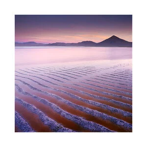
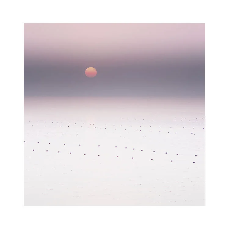
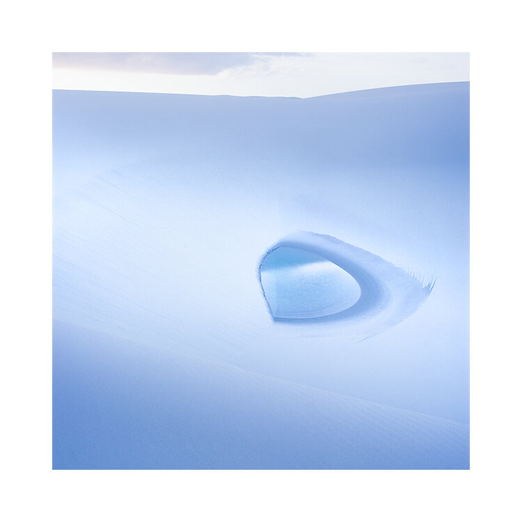
So these days, I tend to make variations of the same shot. Each with some kind of alteration. Whether it’s moving forward slightly, changing the proportions of sky to ground, using a different focal length, or just focussing on a different region of the same scene, as can be seen in the examples in this post today.

I therefore believe that we have one task at hand while we are shooting. We are content gatherers. We are there to collect material to work with later on.

This may sound rather heartless to you, and may suggest that we’re just there to collect raw stuff to make sense out of later on. I do not mean this at all. I simply mean we need to consider all options while we are on location because often the best shot isn’t the obvious one.

Each time I fire my shutter, I put 100% commitment behind it. I am thinking ‘this is perhaps the best frame yet’. But I am also thinking ‘there may be something better if I reconsider the scene a bit more’. I am therefore making insurance shots. I understand that I am in no position to judge what I’ve got, so I better keep on looking in case there is something better.

Judgement of what I’ve captured should come much later, when I am ready to edit the work.

And so if we go back to my initial statement:

It’s my view that trusting one’s initial emotional response to a scene can have two possible outcomes;

1) a strong idea

or

2) a derivative one

And I believe that at the point of capture, we often don’t know which one it is.

And so, it’s hard. Hard to judge whether what we are reacting to is a strong idea, or a derivative one. Once we get past this worry and decide that this is a question for much later, we open up ourselves to what is in front of us, and we become more immersed in the act of creating images.

Fjallabak-Sept-2019-(26).jpg
Fjallabak-Sept-2019-(25).jpg

Looking back, to look forward

In an attempt to find a wider audience, I’ve been experimenting with Instagram this past year (more on this further down).

So tonight I posted this ‘oldie’ on Instagram:

40.jpg

With the following text:

My first 'memorable' image for me, of the Salar de Uyuni, Bolivia. 2009.

Taken more than a decade ago (phew, am I really saying that?), on my first venture to Bolivia, I got a private tour with a Bolivian friend in a Landcruiser. We camped for a night on Pescado Island in the middle of the salt flat (amazing experience), and on a rare cloudy day I shot this.

Originally a 6x7 transparency, I now prefer it as a square. It was an epiphany of sorts for me. A moment where I thought I was onto something, and now, looking back, I see it was showing me the next 10 years of my photography.

Fuji Velvia RVP50 film on a Mamiya 7II camera. I still use Velvia exclusively for all my landscape work (because I know it so well), but the Mamiya 7II's have been replaced in the last 8 years by Hasselblad because I find the square aspect ratio more contemporary.

How do I feel about Instagram?

I am grateful for all the lovely comments people leave me. Thank you. For sure. It’s nice.

I also have to thank a lot of friends, and workshop participants that are there to encourage and support me. I know they’re doing it and I appreciate the kindness. It’s very touching. Thank you.

But on the negative side, I am finding that anyone who ‘finds’ me on Instagram, doesn’t investigate further. They don’t come to the website, and they don’t know much more about me. I just become a fleeting memory for most, as they scan past my images. Like Facebook (who own Instagram), they do not encourage visitors to go and explore other sites. For instance, I only have one tiny line at the top of my page to link back to my website and from what I have noticed - few click on this.

I have also been dismayed to find comments that more or less say this:

“I’m so glad you are on instagram, as it saves me from having to go to your website”.

So it’s been a bit of a mixed bag.

But I have not been a fan of social media for a long time. There is something wrong with a mechanism whereby they profit of you giving your data or imagery for free. If you’re not sure what I am talking about then I would recommend you look up Jaron Lanier and his book: Ten Arguments for deleting your social media account right now”.

More on this later.

But suffice to say: thank you to those who have supported me, and who have left encouraging and beautiful comments on my instagram account. I am very grateful. I just think this is the worst place ever to help an artist promote themselves.

Your data is a valuable commodity. Your data is valuable. Without your data, Facebook and Instagram could not function, could not profit. And as social networking platforms, they restrict you from reaching the people that matter to you. They are a brokerage firm, a middle-man who gets in the way of you and your audience. And I think many people are misguided in thinking that they have to be on these platforms to survive. You don’t.

Finding Simplicity in the Complexity

To me, I have always thought that portfolio making is like working on a puzzle, like a jigsaw. It is the skill in finding simplicity in the complexity.

Editing images individually is fine, and that is pretty much how I begin all my images. To a point. But once I start to collate the images into a body of work, I start to see relationships, themes emerge, that influence and instruct me in how to proceed with new edits, or to go back to existing edits to re-tune.

In a week’s time I will begin my portfolio development class. Over the space of four weekly sessions, you will see a condensed version of all the decisions I make whilst editing my work to sit together as a cohesive body.

I thought, how best to teach putting a portfolio together? And the answer came one day on a telephone call with a friend when she asked me ‘have you edited any of your work from that Bolivia trip we did in 2019?’. A light-bulb moment. I realised the best way to convey what I go through whilst editing, is to record myself as I put a portfolio together.

In the video series I’m about to publish, the work was unedited as I started out. I did not know how the work would end up, and this in my view was an ideal situation. Because I wanted the process to be as honest as possible. To show all the trials and tribulations, all the decisions I made, where I got stuck, and where I got set free again to continue.

I am hoping it will be very instructive to those who’ve signed up, as I spare no difficult decision. You see me thrive and also falter at times as I reach difficult decisions in how best to make the work sit together.

Portfolio Development video class 2021 (Bolivia)
£175.00
One time

Bryan Timmons

This is a message to one of my clients - Bryan from Australia.

Bryan, if you’re reading this….

Your email provider is saying your email does not exist. I get a bounce back each time I try to contact you. Please can you get in touch? Either by phone or another email address?

Bruce.

I see a dragon's eye

On my instagram account, someone commented “I see a dragon’s eye”.

Do you see it?

I have lived with this image for four years and until the viewer commented about it, I had never spotted it.

Easter-Island-2016-(21).jpg

Stories from South Korea

My good friend Kidoo is my only South Korean workshop participant. He found out about me through a mutual acquaintance while he was on an Iceland tour. Since around 2015, we have been good friends.

Back in 2018, Kidoo suggested I come out to South Korea, which is what I did around December. It was bitterly cold in Seoul, but there was no snow. My first impressions of South Korea was of how urbanised the entire country appears to be. We drove for many hours to reach the coast line and in that time, I hardly saw any nature.

South-Korea-2017-(11).jpg

We were together for around nine days, and over that time, I found it very very hard work to find anything that I wanted to shoot, and although Kidoo kept apologising, I kept telling him ‘there must be something there because I’ve shot around 18 rolls of film’. I never shoot unless I really think it’s of some kind of merit, and I’ve been on many trips where I shot zero. So I was definitely of the opinion that something was in the films.

I remember when I got home and looked at the completed edited work. I thought ‘these are really nice, better than anticipated’ and even Kidoo was surprised at how good they turned out. It has always been a reminder to me that work can sometimes progress in small, almost imperceptible amounts. You can be fooled into thinking you’re recording nothing, only to find out later that there is indeed a story that will surface, once you have time to curate and edit.

The funniest memory I have of my brief time in South Koreas, was when we reached some very remote landscape. A real boondocks place, very rural, no tourism, and Kidoo said to me ‘you may be the 2nd European photographer to ever visit here’. The first being Michael Kenna, as Michael has photographed South Korea quite extensively.

A few minutes later we spied an old lady in her 70’s with a Hasselblad medium format film camera. She was South Korean and a big film fan. Her first question to both of us was ‘Have you heard of Michael Kenna?’

Complimentary Cloud

Like it was placed ‘just so’, the cloud in this shot was timed.

Sky plays just as important a role in composition as the ground does. Indeed I think we must stop thinking of the landscape as split into symbolic areas such as ‘ground’ and ‘sky’, but instead as ‘shapes’ and ‘tones’. To my mind, sky should be indivisible from ground.

Bolivia-2019.jpg

The cloud is just hanging there in the ‘perfect’ space. It is a diagonally balancing object to the volcano Papillon in the lower-right side of the frame. In my mind’s-eye, I see nothing else in the picture apart from the cloud and the volcano. Two objects, both unified, and highly related to each other through placement.

This is why I think areas of the sky play just as important a role in composition as objects on the ground do. Sky is not just a space that has to always be in the frame, and nor does it have to occupy 50% of the frame as it seems to for many images. Sky is just space, like any other space in a composition, and if you use it well it can aid in the power of the composition.

The placement of that cloud (and therefore the timing of the shutter firing was critical), but so too was its shape and volume of area. Had it been much bigger than the volcano, then I think it would have dominated. Instead, it is pleasingly proportionally equal to the volcano, and I find my eye is comfortably bouncing back and forth between the two.

The could is also of a pleasing shape. Not all clouds are created equal, which although rather obvious to some of us, still needs to be pointed out.

A cloud is never just a cloud.

The deception of simplicity

Like watching a proficient ice skater, one could be forgiven for thinking that skating isn’t that hard at all. Indeed, I think that anyone who can make something that they do look effortless has two forms of outcome in terms of how their audience may rate them:

  1. For those in the know, who have experience of the skill they are witnessing, a sense of awe or admiration for making something that is really quite difficult look effortless.

  2. For the uninitiated, seeing something done so easily can lead to a sense of being underwhelmed. Because they have no experience to refer to, they are easily fooled into thinking that the skill being demonstrated is easily attainable.

Bolivia-2019-(4).jpg

It is perhaps a contentious point to bring up, but sometimes contention has to be part of the conversation. So I bring up black and white photography as a classic example of something that to the inexperienced may appear to be easier than colour. The reasoning may go something like this: ‘black and white photography should be simple because there is one less thing to worry about: colour. You only have to concentrate on tone’.

But my view is that black and white photography done well, is extremely hard to do for the very fact that all you have to rely on is tone. Because colour has been removed from the equation, it means the viewers attention is left to focus on tone alone, and so the tones in the picture had better work. Any tonal errors or bad judgement will be more evident. The colour component isn’t there to help distract the viewer from noticing the tonal errors in the picture.

On a side note to this, it is often a ‘last ditch attempt’ on a workshop to salvage an image that has some inherent problem. Often I am confronted with the suggestion that we should “see what the image will look like in black and white”. As if the mere turning of a bad colour image into a monochrome one will save it.

The other aspect of simplicity that is deceptive is the mere fact that the less we know, the more we tend to think we know. And the more we learn, the more we understand just how much we didn’t know when we started out. I’ve talked about this before and it is called the Dunning Kruger effect.

Making effective simple images is hard.

You have to go through a long process of making a lot of complicated images first, to find out why they don’t work. Even then, you have to apply a degree of aptitude to understand that something isn’t working, and you need to find a way to reduce the clutter and unnecessary complexity, while at the same time not lose the image to sterility. The work has to remain engaging.

It is one of the reasons why I dislike the term ‘minimalism’. As Mozart said in the 80’s Amadeus movie ‘why sire, I only used as many notes as I needed, nothing more, nothing less’. Minimalism suggests that the work could have been just as good with more stuff in it. It also suggests that there’s been a deliberate attempt to reduce the contents of the picture to a point below most people’s level of normalcy. When in truth, the skill is in knowing, and being able to successfully apply the correct degree of just what was needed. Nothing more, nothing less.

I therefore believe that simplicity is itself deceptively difficult.

Perseverance in regaining momentum

I persevered yesterday. Despite feeling that there were no more images in the set of films I had which showed any promise, turns out I was (gratefully) wrong.

A lesson to myself, that I know all too well:

“There is always more than I saw. There is what I cannot see as yet.”

Which is a repeating story for all of us.

I have come to notice there are repeating patterns to my own progress. Particularly so with portfolios. This is what I think the typical workflow and thought process is for me:

LOW MOMENTUM

  1. A feeling of being overwhelmed by so much work to go through.

  2. Procrastination. Worried that if I start on the wrong foot, the work will be derailed.

  3. Sitting on the work for a while, letting it simmer in the back of my mind.

  4. When I start work, I tend to go looking for the really magnetic, powerful images. There are usually if I’m lucky about two or three images out of the entire set that I feel are the best.

    MEDIUM MOMENTUM

  5. Once I’ve edited this core set of images, I get a feel for how the entire set should look. This drives me forward in what I choose next to add to the set. I find I am theme driven rather than picking secondary images that just look good on their own.

  6. I edit the complimentary images to suit the core images.

    HIGH MOMENTUM

  7. As I add new images to the ‘core set’ I start to gain a sense of confidence in the set.

  8. I edit the complimentary images to fit the core set. But I also now re-tune the core set of images to fit the complimentary images.

  9. There is now a high degree of symbiosis between the original core images and the newly added images. They are working together and they influence each other in terms of further tuning and editing.

  10. I find other images to edit which will compliment well the existing set. As the existing set is starting to take shape, I am able to see more clearly which unedited images will compliment the set.

    LOW MOMENTUM

  11. I start to run out of unedited images to fit the set.

  12. I try a few and some work, and some don’t. I start to feel a loss of interest for some of the unedited work, and although there are still some very interesting images, I just don’t feel they warrant further exploration or even any attempt to edit them.

  13. I finish the portfolio, but I still feel there is work left undone that if I tried very hard, I might get some further good images to compliment the set. But by this point, I’m feeling that I’ve gone as far as I can go, and my interest levels are really depleted.

    ZERO MOMENTUM

  14. The portfolio feels complete. I have a full story. It’s rounded, feels balanced, and it’s so set in stone now that I can’t see anything else I want to do with it. I park it. It’s done.

By point 14, I’m well aware that points 12 and 13 could have shown me more work that may have been of value had I persevered. But I do also recognise that my heart by this point, just isn’t interested now. I’m probably tired of working on the set, and I feel I have enough images to make a decent portfolio.

I have learned, as we saw above at the very start of this post, that there are often hidden gems left in the unedited material. It may be worth going back to them a few weeks / months later to see what is there. With some distance and a fresh perspective you may be able to pick out images that will compliment the set. But there are two things we should consider when doing this:

1) The original edited set was a performance. It has a look and a style to it that is partly due to how you were on the days you edited them.

2) resuming work on a completed set of images that have a strong style and approach later on, can be difficult. You aren’t the same person, and you’ve also lost sight of what it was that drove you to edit the work in a particular way in the first instance. You cannot regain it easily, and if you do, it will most probably be through trying several attempts, in which you gain some insight into what it was you were doing originally to make the images look the way they do.