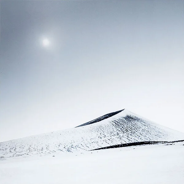
Hálendi Book Advanced Orders now available

I’m pleased to announce that I am now taking advanced orders for my new book.
This time we have changed to an Italian printer, and the book is a hard-back. It comes in 3 variants.

If you would like to order one, the edition run is very limited to just 300 copies. Just click on the button below to go to the order page.

Black edition cloth cover

Black edition slipcase cloth cover

My thoughts on on-line teaching

Back in April when I chose to offer on-line teaching, I was skeptical that it would be as effective as being in the same room as my student.

Images by Fee Chin, used by kind permission. Fee is one of my on-line students.

Over the past month or so of working with around six people on a weekly basis, I’ve found that the teaching in many ways has out performed what’s possible in a classroom environment. Most of my students have excelled by the third lesson to a point beyond where most of my students get to on a 5-day course. I have a few explanations for this:

  1. The first one is that I get one solid hour of uninterrupted time with a student. I do not get that amount of time, even though there are 7 hours per day in a 5-day workshop. Because my time is split between 6 people. Each at different levels, each with different problems.

  2. The second reason is that they get a week'-gap to go away and think about what we’ve gone over, and review their work, and take time on editing it. This is not possible on a 5-day class - things are compressed - and I am trying to get people up to speed in 5 days as opposed to 1 hour per week for six weeks. The six week gestation period really makes a big difference.

  3. I get to review everyone’s work before we meet. I usually spend a few hours going over everyone’s material and making notes so that when we meet, I have some clear direction and instruction for them.

  4. fourth, working online has not been such a communication barrier that I had anticipated. The delays are usually minimal and the lines are often fast.

  5. There’s more chance of things sticking and you retaining the knowledge, if the learning is reinforced over six weeks as opposed to 5-days.

The most important part of all of this is perhaps point 2. Stretching out a teaching experience over six weeks as opposed to condensing it into 5-days is much better.

Conversely, these are the benefits I see from the 5-day class:

  1. We have shooting time together, and things we learned in the classroom can be worked on in the field in the evenings. We don’t have that option on the on-line class.

  2. There is more time together for ‘random discussions’ and other things come up that maybe wouldn’t during a 1-hour one-on-one session.

There are a few things that come up as problems in the 5-day course, that don’t happen in the on-line class:

  1. People get fatigued from trying to work and edit images for more than a few hours a day. Regular breaks are advised.

  2. You need time away from the work to reflect. Each time I edit my own work, I like to shelve it for a few days because when I do look at it again, I am often surprised by themes, errors, potential opportunities that I had not seen the last time I looked at it.

  3. Condensing so much into 5-days doesn’t give any space to reflect and let things sink in.

So there are pros/cons to both formats, but I am finding that on-line teaching is definitely as valuable as a traditional 5-day class.

I’m sure I will continue to offer the Digital Darkroom class in future (if / when things get back to normal). I’ve had participants tell me how useful it is, but I am definitely sure that I would like to continue with the on-line option as well. I enjoy it so much as I get to know each student’s drive and work better.

Indeed, many students have told me that the Digital Darkroom class is something they wish to repeat each year as a ‘top-up’ and I think that doing both can be a good combination. I suppose I’m just trying to convince any doubters that on-line teaching is a useful endeavour as well as the standard workshops. It’s just different.

Abstraction vs Classical

When I work on a composition of a subject, I tend to make around 3 major images of the same subject. In other words, I like to work the scene and for one subject I will maybe come away with three images that are hopefully quite different.

My view is that: there is no one single composition to be found. There are often many.

Fjallaback-Sept-2018-(15).jpg

The image above is more graphic, more abstract than the scene below, which I consider to be more ‘classical’ in composition. By ‘classical’ I mean ‘expected’, ‘traditional’ or perhaps just a bit more conventional.

I would like to explain that when I made these two photographs, they were maybe a few minutes apart. On one of them I chose to include the sun in the clouds whereas the top image I chose to leave it out. I think that it takes courage as a photographer to remove a vital component of a scene in order to maybe focus or strengthen what you are doing. My own personal view is that the image above is stronger than the image below. It is more ‘quantised’, or ‘reduced’. I’ve reduced it down to a few black lines. The bottom image although containing those black lines isn’t as powerful because our attention is taken elsewhere (the sun). But more over, the bottom scene is clearly a photograph of a volcano in a landscape. It has a great deal of content. Whereas the image above does not have the same clues to give us context. It is less a photo and more like a calligraphic drawing with two black ink strokes.

Fjallaback-Sept-2018-(14).jpg

Often when we talk about composition, it’s about the placement of objects in the scene, whereas i tend to think that tone and colour are just as important as the subjects. But I think to create more surprising work, we need to step away from classical thoughts. Again, to explain what I mean by ‘classical’, I mean ‘conventional’. And I don’t mean it in a positive way. For a while now I’ve had a real problem with conventions such as ‘rule of thirds’, etc. These are just conventions to get us going, but they are also a trap in taking us into a cul-de-sac of the mediocrity. Making compositions that people expect is just going to make your work predictable and boring. But you do have to start there - learn the basics, so you can ‘unlearn them’ later.

It’s simply not enough now to create a ‘nice composition’. I think my first image has the edge on the second because it’s slightly less conventional, perhaps a little more graphical. More abstract. It requires a bit more time to work out than the bottom image.

When you are composing, try to work the scene. Don’t just assume you’ve found your composition. Yes, it’s a nice composition but there are many more. Try to work the scene by moving around, and by removing some of the elements of the scene that you initially thought were vital. I think it takes a sense of conviction to remove that sun from the 2nd image and focus on the volcano. But I have often said that composition is more about what you leave out, than what you leave in.

Composing the sky

If you were to ask me what the most common composition errors I see in workshop participants images, I would say these are the main points that spring to mind:

  1. The sky takes up too much area of the picture, for no good reason, except that it’s the sky.

  2. The majority of the subjects that make up the composition live in the bottom half of the picture. So the viewer spends most of the time in the bottom region of the image. And as a result, the composition feels as though it is sinking through the bottom of the frame.

  3. Some of the main subjects of the composition are bunched up too tightly towards the bottom edge of the frame, and in some cases are also falling through the bottom of the frame.

  4. There is too much sky for no good reason. Except that it’s the sky.

Did I repeat point 1 as point 4?

Let me digress for a little bit.

Each time I have come round to publishing a new photographic book, it’s a long drawn out process of piecing it together. The text is usually what slows the publication date down a lot because it has to get checked. I now use a professional editor to verify the text because I have noticed a few things that repeatedly happen when I ask people to proof read the text:

  1. The titles are never checked.

  2. The words ‘of’ and ‘the’ are not checked. It seems that the eye scans the text rather than reads it and we tend to insert missing words into the text when we don’t find them. There is a little experiment you may have seen where someone asks you to count the number of ‘f’s and ‘t’s in a sentence and you get it wrong. Because we don’t parse the words ‘the’ and ‘of’.

Two subjects, not one. The tree is not the only subject. The sun is just as important as the tree is, and they balance diagonally opposite each other. Yet I believe that most viewers consider the tree the subject of the photo. The sun is just the su…

Two subjects, not one. The tree is not the only subject. The sun is just as important as the tree is, and they balance diagonally opposite each other. Yet I believe that most viewers consider the tree the subject of the photo. The sun is just the sun. That’s not true - the sun is just as important a subject as the tree is.

But mainly, no matter whom I’ve asked to help proof read the text, seldom checks the titles. I almost went to press after 10 individual proof readings with a title that said ‘Bolovino’ rather than ‘Bolivian’ in the title of the text.

My reasons for mentioning this is that vision is a funny old thing. There is a lot of psychology to it that most of us lay people do not understand but scientists have begun to realise.

Perhaps some day I will write a book about the most common errors that I see in composition, as I feel there is some relationship of these errors to how the brain interprets. We look, but we do not see.

My point is, that the sky is just as important as the ground is where composition is concerned. But for some reason it is treated as something that just seems to fill up around half of the area of the rectangle for no other reason than ‘it’s the sky, and I just fill up half of the frame with it’.

When I am working with skies, they can often break of make a composition. I have found that they can contain motifs or repeating shapes that mirror shapes in the landscape and when that happens, they become a core component to the composition. Other times the sky may break the composition. Here are some examples:

  1. There is cloud cover over one half of the region of the frame, while the other side is blank. This causes light reduction on one half of the frame while the other half of the frame is around 2 stops lighter. When this happens, the picture looks as though the grad was left on sideways.

  2. Uneven skies can cause distractions - particularly if they are brighter towards the very edge of the frame.

Sometimes sky is just a space for objects to float in. Rather than thinking of an image as having ‘sky’ and ‘ground’, think of it as ‘canvas’.

Sometimes sky is just a space for objects to float in. Rather than thinking of an image as having ‘sky’ and ‘ground’, think of it as ‘canvas’.

In my own style of photography, I often avoid complex skies. I’m talking about skies with lots of clouds and tones in them, because they can be overly distracting to the main compositional features I’ve found in the ground. This is one of the reasons why I work in overcast light (apart from the light being very soft - a huge advantage), overcast skies tend to have little in the way of distractions to cause tonal inconsistencies or ‘bald’ regions of the sky later on.

Simplifying Composition - on-line lessons
£175.00

Learn in your own time,
ask questions during a live Q&A event

Four 1 hour pre-recorded lessons
Live Q&A event for each lesson

Download, watch, re-watch each lesson as many times as you like.
Attend a live Q&A event for each lesson.

Price £175

Indeed, I hear photographers tell me that Namibia is best around April because there are lots of clouds in the sky. If I were going to Namibia, I would be going when the skies are completely empty of clouds, because it enables simpler compositions.

Skies are important integral parts of the composition. They need just as much thought and consideration as the main subjects of the composition, and in some cases, can break the composition if there are overly demanding tones or shapes in there. Skies are also extremely difficult to work with because we have zero control over what they do. Whereas we do at least have some control over the main subjects by moving forward, moving backwards, or removing them from the compositions, but for me, skies are often problematic when they have a lot going on.

Give your skies a lot more thought if you can. Consider if they are brighter at one side of the photo, and whether they have some of the ore dominant brighter elements of your composition (sometimes white clouds may end up being the most dominant feature of your composition). So try to think of your skies as just the same as your ground elements: they also contain tones and shapes and they are just as important as the rest of the scene.

Notsuke

Sorry I’ve been quiet for a while.

But quietness is to be enjoyed. It just seems so rare these days. Everyone feels they have a voice now. But I think it’s just as important to know when not to use your voice. I have little to say, and so I thought I would just post a picture from Hokkaido this January. I’ve just completed work on my images from my Hokkaido tours. I’m very happy with them, and I think I will choose to hold off publishing them all at the moment. I wish to enjoy getting to know them first. On my own. And on my own terms.

Hokkaido-2020-(18).jpg

A new mini workshop for you?

I’m running a 2nd online mini workshop this August. Perhaps this may be of interest to you?

Simplifying Composition - on-line lessons
£175.00

Learn in your own time,
ask questions during a live Q&A event

Four 1 hour pre-recorded lessons
Live Q&A event for each lesson

Download, watch, re-watch each lesson as many times as you like.
Attend a live Q&A event for each lesson.

Price £175

The aim of the classes

My aim is to give you a teaching format where you can review the material over the course of a week, and then submit questions in advance for a Q&A webinar. My intention is to collect questions before the Q&A webinar, so that I can prepare some good illustrations and answers for you.

The format of the classes

The format of how the lessons and Q&A sessions will be run may give you a better understanding of the teaching process:

  • Each week (Sunday), a 1-hour video lesson will be available for download. This video is yours to keep so you can refer back to it as many times as you like.

  • You have up until and including Thursday to review the video, and submit questions.

  • Submitted questions will be answered on the live Q&A session on Saturday. 

  • The following day a recording of the Q&A will be sent to you to keep.

Drawing or constructing Gradients?

I got asked recently whether there was a way to use the gradient tool in Photoshop in the same way the gradient tool works in Lightroom. The observation was that with Light room, you are able to reposition the start and end points of the gradient by dragging them, whereas with Photoshop you cannot do this - instead you have to redraw the gradient until you finally get it right. Each time you redraw the gradient, you overwrite the last effort.

grad.jpg

It was a question I had not been asked before, but it led me to think about the pros and cons of using a gradient tool that allows precision re-adjustment (Lightroom) or one where you are forced to redraw it if the positioning isn’t right (Photoshop).

My preference is for the Photoshop way. I admit that since Photoshop’s way of drawing grads was the first way I learned, I may be biased because I’m simply used to working that way. But I think there is an important difference between the two methods.

Are you an Artist?

Painters in general don’t use precision tools to reposition their paint on the canvas. Indeed, I think that part of the artistic effort of painting is that you respond to how the brush strokes surface on the canvas as you brush. Painting is very much an emotional response between the hand and the eye. And indeed, I would suggest that sometimes painting a brush stroke a way that was not intended can be highly surprising and creative, leading you in directions you had not envisaged.

To me, that’s what the Photoshop gradient tool is like. You draw with it and wait to see what result it gives you. If you’re not happy, you re-draw until you get the right emotional response.

In my view, it’s about going with an emotional feeling and just applying the tool until it feels right. It’s more ‘creative flow’ than ‘analytical’.

Are you an architect?

Architects on the other hand, want to create work that is exacting. They need things to line up and the precision part of it is less ‘creative flow’ and more ‘analytical’.

That’s how Lightroom’s gradient tool is for me. It displays scaffolding around its start and end points so you can be precise and reposition the grad exactly where you want it to go.

But I feel that by staring at the scaffolding - the start and end points, you’re no longer looking at the photo. An analogy I’d put forward is that you’re so busy driving the car that you’re not seeing the scenery.

So for me, I’d much rather work with the Photoshop gradient tool. Because each time I draw with it, I don’t really know exactly what I’ll get with it, and that can lead me in directions and results that I had not imagined. I also think that the act of drawing is much akin to painting, and less about being an architect. It’s about emotional engagement more than precision engineering.

If I had a choice

I would have both modes of operation available:

  • Grads that you just draw with your hand

  • Grads that you can reposition.

The first is artistic and emotional. The second is analytical and maybe the process is that we start with the first, and then perfect with the 2nd.

I love mistakes in my work. I love not knowing where things are going exactly. That to me, is the definition of what art is. It is not about control, nor is it about perfection. It is about feeling and emotion, and each time I draw or paint with brushes and gradients I get an emotional response immediately. So I’d personally prefer to work with Photoshop’s Gradient tool, than a tool I have to set the start and end points. There’s too much ‘context switching’ from ‘creative flow’ to ‘analysis’ with the later whereas the former just keeps you in the ‘creative flow’ mode.

Michael Kenna's response

Yesterday, in my blog post titled ‘Nocturnes‘, I explained that I had recently been inverting some of my images. I explained that I think the catalyst for me doing this may be down to the photo ‘Beach Path, Hastings 1984’ by Michael Kenna:

Beach Path, Hastings 2984. Image © Michael Kenna

Beach Path, Hastings 2984. Image © Michael Kenna

I’ve been very lucky over the years to have a very nice correspondence with Michael. Indeed, I consider him a good friend now. I have been very privileged to spend time with Michael here in Scotland showing him around, and I’ve also been out in Tokyo on a Karaoke night with him (another story perhaps for another time). He is a very nice person and I’m really grateful that our paths have crossed over the past decade. It’s been such a nice thing for me to find out that someone who I greatly admire is also an extremely fun and nice person to become friends with.

So I felt that I could ask him about the photograph above, to find out how he made it.

Below is his reply, but also, he was generous to submit three other photos to expand upon my initial question which was:

‘Is your photo of Hastings Beach an inverted photo?, or was it created by artificial light?’.

Here is his reply:

“Hi Bruce,

“A beautiful morning moon set is happening before me as I sit and type this : )

IMG_2792.jpeg

“The image you refer to “Beach Path” (see first image to this post) was photographed at night without any additional lighting on my part. I just used the nearby street lights.

Title Poles. Image © Michael Kenna

Title Poles. Image © Michael Kenna

“The image titled “Tilted Poles” above is another example of this lighting.

So that cleared up any illusion that I was under that Michael’s Hastings photo was an inverted print. But he continued to expand on this:

“I suspect that reversing images is almost a rite of passage on many photographers journeys. I did a lot of color reversal experiments when I was studying photography. Later, I played around with black and white. I remember being in Yosemite Valley in the seventies following in the footsteps of Ansel Adams and realizing that to be creative in a place like that needed a radical shift of vision. I came up with a reversal of trees reflecting in a hotel pond. I printed from a color transparency:

Trees, Yosemite, California, USA. 1978

Trees, Yosemite, California, USA. 1978

Michael’s conversation turned onto another subject. That of playing around with 3D elements in a 2D space. I think this is very much related, as I will explain further below:

“I have long been intrigued by images that play with three dimensional movement on and in the two dimensional print. “Conical Hedges” and “Avonmouth Dock, Study 7”, both below, have this aspect for me.

Conical Hedges. Image © Michael Kenna

Conical Hedges. Image © Michael Kenna

“In Conical Hedges (above) the dark shapes seem to float forwards out of the paper toward the viewer. In Avonmouth Docks (below) the 3d buildings become a 2d flat form.

Avonmouth Dock, Study 7.  Image © Michael Kenna

Avonmouth Dock, Study 7.
Image © Michael Kenna

Michael’s thoughts on turning 3D elements into 2D flat forms wasn’t something I had anticipated that he would discuss. I had not expected my initial question would turn into an explanation that for Michael, everything can be abstracted.

His last two photos illustrate how he plays with real objects to create 2D flat shapes or patterns. In the case of the conical hedgerows, they aren’t conical hedgerows anymore, but instead black serrated shapes that float off the page. In the case of the Avonmouth dock buildings, they are no longer buildings, but pleasing symmetrical graphical shapes. Indeed, the lack of 3D quality to the dock buildings helps reduce them from buildings to effective compositional form.

It is something that I like to play with myself a lot. For me, a picture isn’t about what is there. It’s not about trees, snow, sky, mountains, rivers, etc, etc. Instead, photos are about graphical forms and tone. They are pictures instead of photos. It’s a subtle difference but a difference nonetheless. I like to abstract scenes down to their fundamental framework if I can. To do that, I like to reduce real objects down to the graphical forms they are made from. Perhaps for a few reasons:

  1. graphical forms are easier to compose

  2. graphical forms make for stronger compositions

  3. graphical forms aid in abstracting a scene from ‘reality’ to an interpretation (and hopefully a highly personal one).

I’d like to thank Michael for his generosity and time to reply. I know he is super busy. So I greatly appreciate it.

Nocturnes

You may have noticed that I’ve been playing around with inverting some of my old photos of late. I’ve just come to the conclusion that they should be called ‘nocturnes’, which the dictionary defines as ‘a picture of a night scene’. This is simply because once I put that label on them, they sit more comfortably in my mind. I find I’m able to accept them more readily as possible night scenes, than positives that have been inverted in Photoshop.

So here’s how the ‘Nocturne’ series look on this very website:

I really like them, because they fit what I’m trying to do with my photography: create another reality. But it’s struck me today that I think I’ve always been aiming for this. I tried night photography many years ago but I failed at it. I couldn’t get the results I was looking for, and this method of shooting minimalist scenes and inverting them gives me the control I was looking for.

It also struck me that this has all come from one photo: Michael Kenna’s intriguing photo of Hastings beach, England. I came across this image way back in the late 80’s. Indeed, it was my introduction to Michael’s work.

Hastings, Image © Michael Kenna

Hastings, Image © Michael Kenna

Curiously for me, even though I was no photographer at the time : I got really interested in this photo. Even more curiously: I bought the magazine that this photo was on the cover of, because I was so intrigued by it.

Looking back, perhaps this image has been a subliminal plant in my mind for a long while? Most probably :-)

Which brings me to two points:

  1. All I know for sure these days is that: my subconscious often knows what I like, before I do :-)

  2. Influences can stretch way back. Michael’s work has had a lasting, long standing impact on me.

Elliot Erwitt

I’ve been a Magnum photo agency fan for many years, stretching back to the early 90’s. Contrary to what you may think I like to look at, I’m more attracted to reportage images than landscapes, and I seem to have a particular liking for photographers from the 40’s, 50’s and 60’s. Eugene Smith for instance is another photographer that I love the work from.

Image © Elliot Erwitt Magnum Photo Agency

Image © Elliot Erwitt
Magnum Photo Agency

This has to be one of my favourite Elliot Erwitt shots. Elliot is now 91 and I’ve read many times that he likes to look over his back catalog of negatives (yes, the good old film days) each year to see if there’s a shot he’s missed before. He says he often finds something that he’s passed by many times before, and I think that just proves that what you like or see today may change each time you revisit your work.

With this photo, it’s just beautiful. I think photography is all about telling the viewer ‘your’ story. What ‘you’ saw. What ‘you’ felt.

Photography is not a contest. Photography is just about creating a point of view.

Well, to me at least, photography is about a point of view. I personally abhor competitions (that does not mean I am suggesting you or others should not enter them - do as you like). I just think the merit of a photograph is not in any awards or gravitas it is given. The merit of a photograph is in how well it tells its own story visually. And that is a highly personal thing which will differ greatly from viewer to viewer.

Photographs shouldn’t have to be explained. The seeing and enjoying of the work should be all that’s required.