You've gotta hand-craft it

Many years ago, before my current occupation as a photographer, I used to be a budding musician with lots of nice synths at home to play with. This was the 90's and an era where most synths turned up with lots of nice sexy factory presets to play with. Indeed one of the issues with 90's synths was that they only usually had one slider on the front of the panel and thus were a nightmare to edit the sounds, so most people would tend to use the factory presets with almost no changes to them at all.

This past month I have returned to music and I'm presently busy building a little home studio of some nice synths to own. I've deliberately chosen to look for machines that have lots of knobs and sliders on the front panel so that they will encourage me to shape the sound to my liking, rather than hope or rely on some preset to work in the music I'm making.

You may wonder what this has to do with photography. Well quite a lot.

I don't believe that plug-in's that offer presets to work with are a good way to start, or to continue with for the long-run. I can sympathise and appreciate that they may feel like a really great way of kick-starting your editing, or that they perhaps influence or inspire you, but the chances of them actually being exactly what your images need is pretty slim.

I've reached the conclusion that the best approach to image editing is to hand-craft it. Here's my reasons why I think it's good to go the slow manual way:

  1. You are given the opportunity (through having to figure out what you want to do to an image) to learn what components of tone, colour and form your image is made up from.
  2. You learn a lot about what works and what doesn't when you have to go in there and deconstruct  your image. Presets don't encourage this.
  3. Presets will rarely, if ever, give you exactly what you need and they will not encourage you to look or study deeply into what is going on in your work.
  4. Hand-crafting your work means that you build up skills to interpret what you've created, and also to think about what you might want to look for in future when you do return to shooting outside.
  5. It should go without saying, but each image you create does not conform to a preset. It has its own character and therefore needs to be treated on an individual basis.
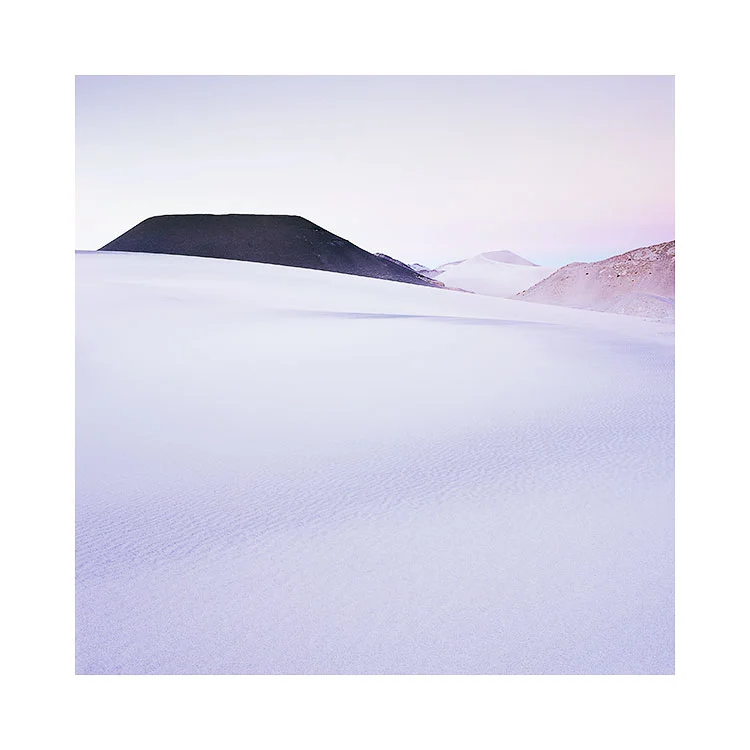
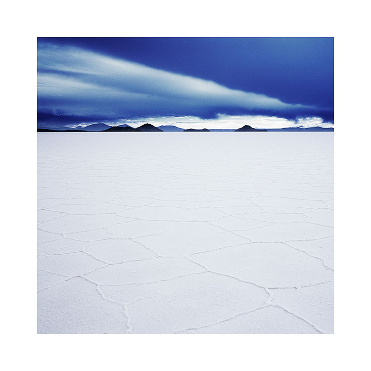
  6. Photography is about being creative, and convenience should not be part of the creative vocabulary. Making good or great images isn't easy, and we have to put the work in to learn.
  7. Perhaps the most important point - you get to tune the image exactly the way you want.

Perhaps you think that presets are a great starting point, and that you still tune and edit manually anyway. My thoughts on this are that when we apply presets to our work, we only see or understand a little of what has been changed. if you wish to iron out some of the effect it's a little bit like going 10 steps forward to have to retreat 8 steps to get to where you want to be. I'd much rather walk each step at a time and build up a good understanding of what it is i'm doing with the edit at each stage.

I used to rely on presets for synth sounds in my music and often found it hard to get certain sounds to mix in well with others. Now that I have a collection of synths at home with tweak able parameters I can shape the sounds to fit in more. It brings me confidence when I hear certain sounds just shift into focus as they are tuned to fit into the music. Rather than flipping through thousands of presets hoping for the 'right sound' I am creating it myself.

By taking the reigns of your editing and pulling the decisions and control back into your own lap, you are giving yourself the opportunity to learn about your yourself, your work and to improve your own visual awareness. As tempting as certain presets may be, I'd suggest going the manual way for a while and see how it goes.

First draft of New e-Book is complete

Part 2 of my Tonal Adjustment Series

It's been slow progress, but I'm really delighted to discover to day that I've finished writing my new e-Book about Photoshop's curves adjustment tool. I've been trying to write this e-Book since last year - I remember doing some work on it in December, and then it got shelved while I was so busy running tours and workshops.

tr.jpg

It is my 'holiday' time at the moment. I'm at home for the next few months, and the only work I have to do is finish this e-Book and also one other special project. 

All I can say is that I had no idea I could write 50 pages about the curves adjustment tool. One of the best things about writing this e-book is that it's helped me clarify in my own mind just what is actually going on when I do any curve adjustments.

The new e-Book now needs to go into review mode, where I will check for errors and discrepancies. It comes with around eight Photoshop files to illustrate some of the more difficult to understand features of curve adjustments. And I'm hoping to put some QuickTime movies together to show you some screen sessions.

But it's all come together well so far. I'm very pleased with the results and I think it's going to be a very nice e-Book if you're interested in developing your knowledge of curves. The curves adjustment tool really is the most powerful way to modify and transpose tones.

Flow or Force? Which is it to be?

I feel I've hit a creative slump right now. But I know that this is perfectly natural. No one can be 100% creative all of the time, and as with everything, there is aways an ebb and a flow.

Which makes me think about how I deal with my basic happiness in my creative pursuits. Many years ago, any creative slump would have been very unwelcome. I feared it. But I have come to accept and indeed embrace these moments because I now realise that are needed pauses in the creative process. Sometimes these 'slumps' are really periods of growth in their own way; although no work is generated, I'm sure there are things going on in my subconscious. I often feel that there are pauses before something new is to come through.

I have come to know that with creativity, it is best to not ask too much of it. To have expectations is to suppress an energy that has its own path. You can try to steer the river in a different direction but it is wasted energy that will only cause you frustration and delay the inevitable natural course that it is on.

Finding flow in the landscapeLençóis Maranhenses, Brazil, 2018Image © Bruce Percy 2018

Finding flow in the landscape
Lençóis Maranhenses, Brazil, 2018
Image © Bruce Percy 2018

One of the biggest problems I see in our modern lives is the need to have immediate resolution. There is a need to fix our problems immediately, a need to know how they will pan out.

I would say ‘not knowing the answer’ is a great place to be. Rather than feeling the unease of not knowing what the outcome will be, I am now aware that when I am at this point: anything is possible, and it's very inspiring to know that there are lots of possibilities.

For me, I have come to realise that ‘trying to know the answer’, is just to force things when they're not ready to be concluded. Creativity as in life, has a way of flowing where it wants to go, and our task is to trust it and become comfortable with uncertainty. Everything has a way of following towards a natural conclusion - in it's own time. To rush it, is to force it and to wreck with natural advancement.

We have to trust. Control is an illusion and it just gets in the way. To trust, we have to surrender and let creativity take us where it feels it must. Indeed, I have found that when I go where life is guiding me, then things tend to go from strength to strength. If it feels good then you can't go wrong with that. If it's moving and flowing, then you're on the right path. If you are constantly hitting barriers or obstacles, then you are most probably forcing it and you should re-evaluate what it is that you're doing. Either it's not right, or the timing is off and you need to wait. I often find that waiting allows things to come forward and show me the way forward *when the time is right*.

Creative anxiety - the feeling you're not getting what you want, or that things aren't happening the way you want them to - is another way of *forcing it*. It is another example of you trying to control things. You have to surrender and let your creativity show you where it wants to go.

Similarly, trying to outdo yourself is not the way forward either. Your creativity naturally fluctuates. Some days we will create bad work, other days we will create good work. This means nothing except that your creativity has an ebb and a flow. So measuring yourself against your last great work is folly.

The key is to listen - when something good comes, we tend to know it, and this is when we run with it. When it’s not working, rather than being dejected or downbeat about it, just know that this period of what feels like 'going nowhere' is more like reconnaissance. You are just surveying, experimenting, testing things out. All good ideas often come when you least expect them, from things that start off as small ideas that lead to big ones. Just don't assume that your less successful work has no point to it: all of your work - either good or bad matters - it all contributes to where you are going, so long as you are willing to let it flow where it wants.

You need to print to Verify your edits

I'm just home from my first printing workshop. We had a great time and as much as workshops are there to teach my participants, I always learn a lot too. No one's learning is ever complete.

At the start of the week I explained to my group that although having a tightly calibrated / profiled monitor that matches what we see in print is something we strive for: it is not ideal. The truth is, that the only way to verify what we have in our files is to print. I am not alone in knowing that even with a highly profiled monitor I can be mislead. It is only the print that is honest: it shows me what is right and also what is wrong. Errors that I did not see on the monitor become evident in the print, and once I return to the monitor to check if they were there also, I see they were there all along.

The great American photographer Charlie Cramer has often said that 'computer monitors have their own reality distortion field. The more you look at them, the more your eye adapts. The only way to see what is really in your file is to print'.  I'd sure love to attend one of Charlie's workshops sometime. He is someone I have heard consistently great things about: he sounds like a great teacher.

The thing about profiling computer monitors is that you can't trust the software. It is always 'aiming for the target you set, but often finding out that it can't reach it'. So when your calibration software says 'your monitor is calibrated', what it is often saying is this; 'I did my best'. There are a few reasons for this: firstly, depending on the monitor hardware, it may have a difficult time trying to reach the white-point and luminance levels you are asking for. I know my old Eizo lost shadow detail when I tried to calibrate it down to 100 candles. It was too low for the monitor.

I use BasICColour's Display 5 software. Below it shows you how 'close' it got to what I was aiming for (known as the delta). You can see that my colorimeter and software got very very close indeed. But this still only means that the software got close to what I aimed for. But you may be aiming for the wrong result......

BasICColour Display Calibration & Profiling software shows you just how much of a delta there was between what you aimed for, and what you got when you calibrated / profiled. You can see I chose a luminance of 100cdm, and the black point of the …

BasICColour Display Calibration & Profiling software shows you just how much of a delta there was between what you aimed for, and what you got when you calibrated / profiled. You can see I chose a luminance of 100cdm, and the black point of the monitor can't reach absolute zero, so I've set it to what it's physically capable of reaching (0.26cdm). Even with this report showing me the delta, I still need a verification test proof to compare with my monitor: the only way to confirm your profiling is visually.

You need to have something to verify against. Just because your software says 'I did it!', means nothing. If you are finding that your prints look warmer than your monitor, then you are probably using the wrong white-point setting. To find out what that should be, requires you compare your calibration with a day-light viewing booth. On the image below I have a daylight viewing booth (colour temperature is D50 - 5000K) and to match that, my computer monitor is around 5,800K. Each monitor will vary. Some may be higher in colour temperature while others may be lower. Just because I asked my calibration software to reach D65 (6,500K) means it is only a target it is aiming for. In truth, D65 on a monitor is far to cool.

You can't trust the numbers, only the visual inspection. That means iterating around the profiling / calibration software looking for a white-point that matches a viewing target. Once you find that colour temperature for your monitor, you now have a place to evaluate your prints.

Even though my monitor is tightly profiled and calibrated to match my GTI viewing booth, I still see errors in the final print that were actually present in the monitor representation. I now feel I still have to learn to 'interpret' what my monitor …

Even though my monitor is tightly profiled and calibrated to match my GTI viewing booth, I still see errors in the final print that were actually present in the monitor representation. I now feel I still have to learn to 'interpret' what my monitor is telling me, and not to trust it too much.

Once I have my monitor showing a close representation of what is under my viewing booth may I evaluate my prints. And this is where the fun begins: this is when you will find tonal distractions, colour casts and other distractions in the final print that you 'thought' weren't on your monitor. Looking back at your monitor to review, you will find they were there all along. 

The human eye is highly adaptable. One thing I have learned is that my visual system is constantly trying to lie to me. Monitors only get me so far. I have to print to verify what I think is in the file. Even if the calibration and profiling of my monitor closely represents what is on print.

I'd go one step further by adding in what Charlie Cramer has to say about the printing process:

"Poor images can look great on a monitor but will always look bad in print. Whereas great prints always look great on a computer monitor"

Your images aren't complete until you've printed them, and then further optimised them.

You have to print.

Thoughts on 'negative space', the Empty Landscape

Empty landscapes aren’t truly empty. They are governed by the same physical laws that any landscape is bound by. Light affects the surface as it would any landscape, except that subtle tonal variances are more apparent to the human eye. 

Campo-de-Piedra-Pomez.jpg

Empty landscapes also remove the temptation to get hung up on the ‘what’ and focus more on the ‘why’. Subject matter is almost secondary, and if present, is there only to support the emotional response brought on by the tonal and luminous qualities of the light. Indeed, subtle tonal variances seem to be the basis for any image-making in empty landscapes. This is what the Altiplano excels at. It offers a fascinating array of minimal landscapes under some of the most beautiful high-altitude light I’ve witnessed. 

However, it does take time to begin to see the subtle tonal variations on offer and to utilise them in one’s own photography. For example, I can forgive anyone who visits the Salar de Uyuni for the first time for assuming that it is just a vast plain of white. To the uninitiated, that is all there is. However, to the experienced photographer who has photographed this place many times, the salt flat provides endless variances of tonal response across its flat surface. So much so, I don’t feel I have truly been able to capture the essence of it because part of its beauty is in the transient nature of the light that plays upon it. 

Salar de Uyuni, Bolivia, Image © 2009, Bruce Percy

Salar de Uyuni, Bolivia, Image © 2009, Bruce Percy

Making images here is difficult because the human visual system is not capable of seeing true dynamic range. We are essentially blind to gradual tonal variances and often confuse two different areas of a subject as having the same luminance or colour when in fact they differ greatly (have you ever cloned one part of the sky over another area thinking they both exhibit the same tone, only to find they vary greatly?). This begs the question: If our eyes deceive us while reading tones in the landscape then what else are we oblivious to? Quite a lot, I believe. 

But, we can and do learn from empty landscapes. Whereas, busy scenes hide distractions and tonal imperfections because our eye is far too busy absorbing what’s there, empty landscapes are uncompromising in showing us subtle problems once we begin to ‘see’.

Campo-de-Piedra-Pomez-2.jpg

Just like any small problem when magnified, what may be acceptable under other circumstances soon becomes quite glaring and annoying.

As a result of working in empty places, I have become more selective to the kinds of tones I wish to record, and this I believe has pushed my photography and my visual awareness forward. 

If I were to sum up what I think photography is for me, I would say it has been a life-long study of tone and form and of improving my own visual awareness. I started off blind, not really seeing or understanding what was truly before my eyes, often over-complicating my compositions. As a result of this, it has taken me a long time to learn to 'see what is really there', and to reduce my compositions down to their essential elements. 

I believe I understand now that less is often more and, even then, less may be still too much.  Ultimately, I have begun to see, that empty landscapes aren’t really empty at all. 

All my work, is homework

Every image I create, whether I think it's good or bad, contributes to my photographic education. For this very reason I never think that any of my work is a failure: it all contributes in some way.

No matter how good someone thinks they are - the truth is that we are all in photography-school. We will always be learning. Even those we consider masters of the art of photography know this. Indeed, they welcome it. Because they understand that if they are no longer learning then they are no longer growing. And no growth means their art is dead.

The good artist knows that he is always learning, and will always have much to learn. He also knows that creating art isn't about success, it's about the creative journey. There is no room for words like failure or success, it is just a process that they have to do.

I feel a lot of contemporary photographers look for solutions in their tools when they really need to work on themselves more. I'd rather find something that works from the outset, than something that sort-of-works but needs to be worked on later. It's much easier to play with something if it's a great idea than to try to make something out of a poor idea. Looking for solutions in software or technical forums isn't going to help you improve. You need to do the work.

Hokkaido-2018-(29).jpg

Weak ideas will never work, no matter how much technology or software is applied to them. If an image has a strong idea behind it, it will be carried along by that. It needs no one's help.

You have to fail in order to learn. You have to get used to accepting that the majority of what you create isn't any good. Look upon it as 'prototypes'. Until we get to where we wanted to go with a piece of work, everything we create on the road to getting it right is a prototype. Not a failure. 

You have to understand that creating bad work is part of the process. And also to understand that even very gifted artists have to create a lot of rubbish in order to find the good stuff. If it was easy to create good work, everyone would be doing it.

Put the work in.Accept that the road will be a long one, but it will be a growing time while you're on it.

I'm very aware that all of my work to date has taken me to the point where I am now. I couldn't have got here without putting all the work in that has led me here. Everything I've done, every bad photo I've made and every successful one has taught me something, and has contributed to me being who I am now. This work has shown me that it's never the tools I need to improve, or the software I need to change. It is my application of them, my skill and experience that needs to grow.

So with that in mind, I'm very aware that all of my work, is homework. Everything I do educates me, and every apparent failure is a valuable lesson, so long as I choose to listen to what it's trying to tell me.

Our work is never finished. Every image we create, whether we think it's good or bad, contributes to our photographic education and our artistic growth, and I think we should revel in the discoveries and surprises of our chosen art form.

slow growth

A few days ago I wrote a very short post about the neuroscientist Susan Rogers. She was the sound engineer for Prince in the 80's and early 90's. In her interview she finishes up by saying:

'slow growth is real growth.
You have to be patient, and you have to go the distance'

Getting to know a tree, Hokkaido 2018

Getting to know a tree, Hokkaido 2018

Nothing worth pursuing comes easily, and if it does, I would be suspicious of it. You don't create great work by talent alone - there has to be a lot of effort put into it. Likewise, you don't create great work from putting the hours in - you still need talent.

If I were to say what's required, it's dedication, commitment and a sense of drive to pursue what you love. Great work doesn't come from following formulas or templates, nor does it come from using software-plug'ins or reading cheap e-Books that promise to get you there in 10 easy steps. It simply doesn't work that way.

Slow Growth through intimacy

I've learned so much from the places I am so fortunate to visit. I mean, who else has the fortune to go to Iceland twice a year? or Patagonia every year? And yet doing so has taught me so much. I know it's a great privilege to do this, but it has taught me that improving one's own photography comes from developing an intimate knowledge of the places I photograph. This is why I often suggest to students on my workshops to go back to places, if they feel they have a connection with them. That connection is telling them something: namely, that there is potential here, there is work to be done.

Again and again and again

It would be understandable to think that each time you return somewhere, you get to see things in a new way. But as much as I think this is a valid part of learning, it's only one part of the story. For me, what I do learn a lot from, is seeing places in exactly the same way. If I go back to a location each year around the same time or same season, I often find that there is commonality in what I'm seeing. It confirms that places have seasons, that a tree will look a certain way, but rather than it allowing me to think 'If I don't capture it this year, I can always do it next year', it makes me realise that with the same lighting, the same weather conditions, and the same subject, I am forced to find something new there, that doesn't rely on different weather, different light, or the subject being different. Being confronted with the same thing each year, makes me think 'what else can I do here that I haven't done before?'. That is where the real learning comes from.

Going the distance

Working on my photography is like investing money in a fund. You have to be patient. You have to take delight in the subtle changes as the fund slowly grows over time. Photography is not about instant hits. It's not about instant gratification. It's about the long haul. It's about standing where you are in 10 years time and noticing that things have changed. You are now seeing things with a more mature eye. You're more aware of what's before you. And you know, that this couldn't come any other way, than going the distance.


Sometimes too much colour, is simply too much

When photographers talk about minimalist images, we often think of compositions where there is lots of space with very simple subjects in the frame. There is a predisposition to thinking more about objects in the frame and one aspect that is often overlooked is that of colour.

Lencois-Maranhenses-2018-(6).jpg

Images can be simpler (or quieter) by being very selective about the colour that is used. As a beginner I would often welcome as much colour as I could to my images. When I started out on this road to producing more simplified images, I think I got a handle on the compositional elements within the frame pretty quickly, but one aspect of my compositions that let me down was my use of colour: I knew that something was wrong or missing, and it took me years to realise that sometimes there was simply too much colour.

Lencois-Maranhenses-2018-(7).jpg

So if you're looking to simplify your photographs, it's not just about visiting minimalist places, or shooting one or two subjects within the frame. It's also about reducing colour, or being more selective on the amount of colour you use in your work.

I do believe that we all have to go through certain learning stages. The first being to reduce the number of subjects within a frame down to a more coherent assemblage that can support a strong composition. This is really the first stage for many of us. The 2nd stage is to work on the tones contained within the photograph : we are now juggling two balls: object placement and tonal relationships between the objects. And the third stage that comes along at some point is our evaluation of colour. As time goes on, we begin to realise that images can become simpler when we reduce or remove certain subjects with certain colours as they overcomplicate the scene. We also understand that sometimes we don't need a lot of colour for the image to work. In my own case, I sometimes feel I create monochrome images in colour. Some are often reduced down to simple colour palettes of one colour using many shades.

But this can only happy when we are ready. And by being ready, I mean that we are now 'able to see'. I think the reason why I have become more comfortable with reducing the colour palette of my photographs is because my awareness of colour has become more acute over time. Where I would once need to have a colour explosion of saturated hues thrown in my face, I now find it too overwhelming. If I'd tried to reduce the colour palette of my work 10 years ago, I wouldn't have been satisfied because I was still very much in love with the deeply saturated image.

You can't force things. You can only be aware of how your tastes and perception of your visual world is changing, and adjust your work accordingly. That's all you can ask for, and by being sensitive to your own aesthetic changes, and applying them to your work - you move forward.

Lencois-Maranhenses-2018-(12).jpg

Tonal Relationships e-Book Part 2 Update

Just a very short post today to update you. I'm around 2/3rds of the way through writing my new ebook, but it's taking some time. I just haven't had much free time over the past year. I am coming up to a quiet spell this June where I will have a few months at home. I'm hoping to have most of the work done on the remainder of the eBook by then. But I just don't want to rush it. If it takes longer, then so be it.

7d1a2b47-432a-4a56-971e-0f151fdff5be.jpg

Curves is, in my view (this is what a blog is about - someone's point of view), the most powerful editing tool available for adjusting tones in a photograph. Your mileage may vary from mine. 

On the surface the Curves tool seems relatively straight forward, but I've learned that many of my workshop participants have a rudimentary understanding of it. The curves-tool is the tool I've been using for 18 years and I'm still learning about it each time I edit. It is a tool that you do not master overnight.

I'm aware that my views may be contentious to many: a lot of people like Lightroom and love it. For me, there is still a wide gap between what Lightroom offers and what Photoshop offers. I do believe that the gap is narrowing with every release of Lightroom, but it still isn't there. Lightroom's tonal adjustment tools are broad, and they don't give you the degree of control I feel is required for very fine editing. Although Photoshop is not an intuitive program, and neither is the curves tool, with some dedication and time applied to it, it is worth the investment for finer tonal editing.

I hope to have the e-Book finished this summer. But it is kind of growing as a project. I'm now thinking I need to have some accompanying videos to go with it, but I will see.

Slow growth is real growth

If you're a regular reader of my blog, then you'll know that I see so many parallels between music and photography and that I'm fascinated by what creativity is. If you're interested in creativity, and how to get better at what you do, then I'd suggest watching Susan Rogers (used to engineer records for Prince) talk about it. She is a neural scientist these days. There is so much wisdom in this interview. A must see.