I feel I've hit a creative slump right now. But I know that this is perfectly natural. No one can be 100% creative all of the time, and as with everything, there is aways an ebb and a flow.
Which makes me think about how I deal with my basic happiness in my creative pursuits. Many years ago, any creative slump would have been very unwelcome. I feared it. But I have come to accept and indeed embrace these moments because I now realise that are needed pauses in the creative process. Sometimes these 'slumps' are really periods of growth in their own way; although no work is generated, I'm sure there are things going on in my subconscious. I often feel that there are pauses before something new is to come through.
I have come to know that with creativity, it is best to not ask too much of it. To have expectations is to suppress an energy that has its own path. You can try to steer the river in a different direction but it is wasted energy that will only cause you frustration and delay the inevitable natural course that it is on.

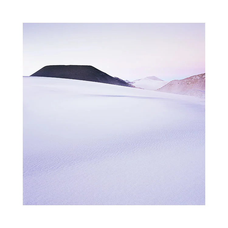
Finding flow in the landscape
Lençóis Maranhenses, Brazil, 2018
Image © Bruce Percy 2018
One of the biggest problems I see in our modern lives is the need to have immediate resolution. There is a need to fix our problems immediately, a need to know how they will pan out.
I would say ‘not knowing the answer’ is a great place to be. Rather than feeling the unease of not knowing what the outcome will be, I am now aware that when I am at this point: anything is possible, and it's very inspiring to know that there are lots of possibilities.
For me, I have come to realise that ‘trying to know the answer’, is just to force things when they're not ready to be concluded. Creativity as in life, has a way of flowing where it wants to go, and our task is to trust it and become comfortable with uncertainty. Everything has a way of following towards a natural conclusion - in it's own time. To rush it, is to force it and to wreck with natural advancement.
We have to trust. Control is an illusion and it just gets in the way. To trust, we have to surrender and let creativity take us where it feels it must. Indeed, I have found that when I go where life is guiding me, then things tend to go from strength to strength. If it feels good then you can't go wrong with that. If it's moving and flowing, then you're on the right path. If you are constantly hitting barriers or obstacles, then you are most probably forcing it and you should re-evaluate what it is that you're doing. Either it's not right, or the timing is off and you need to wait. I often find that waiting allows things to come forward and show me the way forward *when the time is right*.
Creative anxiety - the feeling you're not getting what you want, or that things aren't happening the way you want them to - is another way of *forcing it*. It is another example of you trying to control things. You have to surrender and let your creativity show you where it wants to go.
Similarly, trying to outdo yourself is not the way forward either. Your creativity naturally fluctuates. Some days we will create bad work, other days we will create good work. This means nothing except that your creativity has an ebb and a flow. So measuring yourself against your last great work is folly.
The key is to listen - when something good comes, we tend to know it, and this is when we run with it. When it’s not working, rather than being dejected or downbeat about it, just know that this period of what feels like 'going nowhere' is more like reconnaissance. You are just surveying, experimenting, testing things out. All good ideas often come when you least expect them, from things that start off as small ideas that lead to big ones. Just don't assume that your less successful work has no point to it: all of your work - either good or bad matters - it all contributes to where you are going, so long as you are willing to let it flow where it wants.