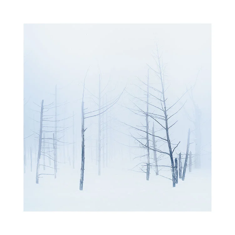
Empty landscapes aren’t truly empty. They are governed by the same physical laws that any landscape is bound by. Light affects the surface as it would any landscape, except that subtle tonal variances are more apparent to the human eye.
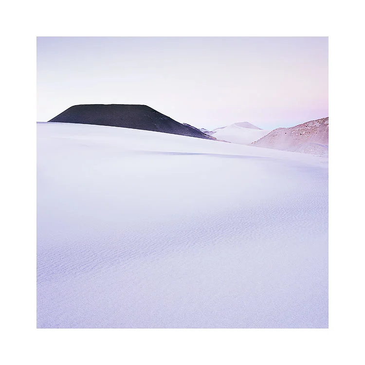
Empty landscapes also remove the temptation to get hung up on the ‘what’ and focus more on the ‘why’. Subject matter is almost secondary, and if present, is there only to support the emotional response brought on by the tonal and luminous qualities of the light. Indeed, subtle tonal variances seem to be the basis for any image-making in empty landscapes. This is what the Altiplano excels at. It offers a fascinating array of minimal landscapes under some of the most beautiful high-altitude light I’ve witnessed.
However, it does take time to begin to see the subtle tonal variations on offer and to utilise them in one’s own photography. For example, I can forgive anyone who visits the Salar de Uyuni for the first time for assuming that it is just a vast plain of white. To the uninitiated, that is all there is. However, to the experienced photographer who has photographed this place many times, the salt flat provides endless variances of tonal response across its flat surface. So much so, I don’t feel I have truly been able to capture the essence of it because part of its beauty is in the transient nature of the light that plays upon it.
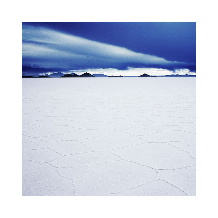
Salar de Uyuni, Bolivia, Image © 2009, Bruce Percy
Making images here is difficult because the human visual system is not capable of seeing true dynamic range. We are essentially blind to gradual tonal variances and often confuse two different areas of a subject as having the same luminance or colour when in fact they differ greatly (have you ever cloned one part of the sky over another area thinking they both exhibit the same tone, only to find they vary greatly?). This begs the question: If our eyes deceive us while reading tones in the landscape then what else are we oblivious to? Quite a lot, I believe.
But, we can and do learn from empty landscapes. Whereas, busy scenes hide distractions and tonal imperfections because our eye is far too busy absorbing what’s there, empty landscapes are uncompromising in showing us subtle problems once we begin to ‘see’.

Just like any small problem when magnified, what may be acceptable under other circumstances soon becomes quite glaring and annoying.
As a result of working in empty places, I have become more selective to the kinds of tones I wish to record, and this I believe has pushed my photography and my visual awareness forward.
If I were to sum up what I think photography is for me, I would say it has been a life-long study of tone and form and of improving my own visual awareness. I started off blind, not really seeing or understanding what was truly before my eyes, often over-complicating my compositions. As a result of this, it has taken me a long time to learn to 'see what is really there', and to reduce my compositions down to their essential elements.
I believe I understand now that less is often more and, even then, less may be still too much. Ultimately, I have begun to see, that empty landscapes aren’t really empty at all.