Exhibition 2019 Mockups

I'm holding another exhibition later next year (Summer 2019), t

The last few weeks I've been working on the image selection for the forthcoming book, and we have now completed this, along with the text that is going along side the book. Currently I am awaiting Spanish translations as I feel that since this is a book about a region of South America, it should honour the landscape by also having a Spanish translation.

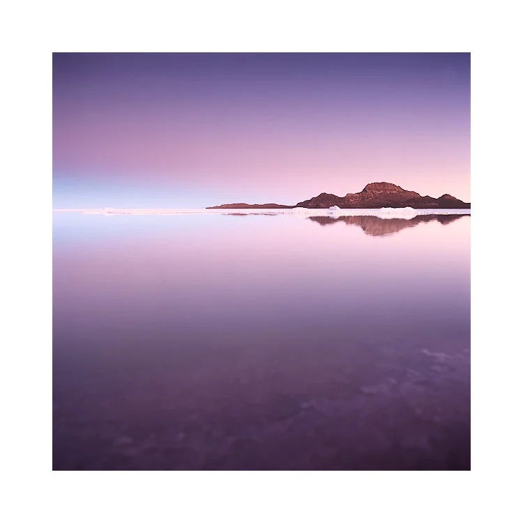
What I found last year about preparing my book, was that I really needed to print each image out to ensure they were optimal. When I did print them out, I noticed that some of them didn't have the 'sparkle' that they seemed to have on my monitor (even though my monitor is tightly calibrated). Some things needed to be pushed so that I was using the tonal range of the paper. It was a fascinating thing to do, as you can so often think the image is finished on the monitor, only to notice discrepancies in the tonal range once printed.

Once I had completed the printing of all the images that were to be contained within the book, I then replaced the original files with the optimal ones. So in essence, the images that were contained within my 'Colourchrome' book were the result of fine-tuning by print-review. Most important and I would urge you to do the same for any image you work on: print it out and evaluate it. Sit with it for a while and see how your impressions of it changes over days if not weeks. You'll be able to notice problems in the image that you weren't aware of on the monitor.

And so it comes to which images to prepare for an exhibition?

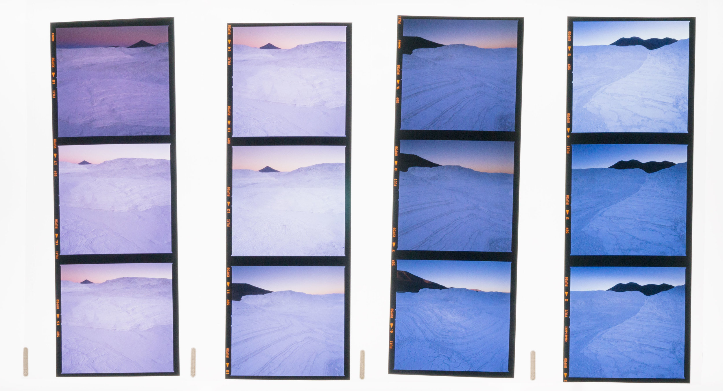
If you are considering doing an exhibition (I highly recommend it : everyone of all abilities should exhibit their work: it is the final stage in photography in my opinion), it's a good idea to go into the exhibition space and take measurements. My dear friend Alan Inglis suggested this to me when I was in the initial stages of looking for a location to exhibit. He came in with me and took measurements of the walls and also made some iPhone photos of the walls too (the images you see here).

Once we'd done that, I could set up mockups of the actual frames, all to scale of course, so I could experiment with a layout.

This is what you are seeing on this post today. I have chosen a selection of images and laid them out whilst trying to give them sufficient space, while at the same time maximising the number of images I can display (the more you show - the more value and interest to the viewer).

Last year's exhibition was terrific. I really enjoyed the experience: I got to meet so many people from past workshops and tours who came in to say hello. I also got to meet people that have had me on their radar for sometime, yet I was not aware of them. And the exchange in discussing your work is not to be underestimated.

Once I'd finished the exhibition, I was sitting around thinking 'now what?'. What do I do next? So I asked my favourite Photographer - Michael Kenna that, and he said:

"Hey Bruce,

You should have a show every year - include a few classics and show new work.
It will keep you on your toes. Sales may not increase - that remains to be seen.
But, it’s a good way to measure your own progress. Specific goals and deadlines always make us work a little harder."

Well, you heard the man. He knows a thing or two about exhibitions. So I chose to listen to what he has to say and decided I would do another one this year.

About the mockup's : that is exactly what they are. They have given me the opportunity to see what the final exhibition may look like, and I have been able to move and swap things around till I get the 'flow' right. What is most inspiring of all though, is that by visualising the final exhibition this way, it all just begins to take on a more 'real' aspect. You feel you are one step closer to your goal! I always try to use visual pictures to help me see where it is that I am wanting to go, whether it is mockups of exhibition spaces, mockups of books I want to produce, or even mockups of future workshops I hope to hold.

Bruce-Percy_WhiteSpace-wall-5.jpg

Moving beyond the accessible

I think all great artists at some point lose their audience. Through pursuing what they feel is all about the art, they move beyond what their audience find accessible.

Because accessible often translates to 'conservative' or perhaps 'already understood and accepted'. Accessible means that the audience know where they are, because they've been there before. There is you see, great comfort in knowing what you're dealing with.

Fjallabak-(6).jpg

When something comes along that we have never experienced before, some are able to see it as the great wonder that it may be while others find it hard to take the new step on board.

Now let's mirror this in what we do as creative people. If you are always creating work that you can accept, then I would like to suggest to you that you are only treading water. You know where you are because you've either been here before many times, or someone else has.

Conversely, if you venture into an area that is new to you, or something you've never encountered before elsewhere, I would suggest that you are growing.

it can feel like you might have gone too far. You may be scared, or uncertain because you are now in unfamiliar terrain. If you feel this way, then that's great, because when you're riding the crest of a wave, you should feel scared (and dare I suggest - alive). Being somewhere you've never been before is good for you.

When you get there, you may feel that what you have created is too weird, or strange. Maybe you don't feel you get it yourself. This is normal. Like trying out a new style of clothing, something that you had never thought would suit you, you may find after a while that it was a natural progression. 

If you manage to get to this point, you should congratulate yourself, because I don't think this happens very often. In general, most of us stay within our comfort zones and create the derivative - we see what else is around us and we replicate it. Without thinking about what we're doing, we may be fitting in, but we're not standing out. We've lost our individuality. We conform.

Great work comes from going it alone. To make a mark, you have to be different, and to do that, you cannot follow others. You have to find your own path. One way to do that is to not give a damn about what others are doing and to give your creativity the freedom it deserves. This can only come from some kind of confidence or self-belief, and that only comes if you give yourself the permission to experiment. You need to give your creativity the freedom to be what it needs to be. You know this is the right approach. Control it too much and you'll be right back to producing something bland and derivative. Sure, everyone will get it, but they only get it, because everyone else is doing it too.

If we only keep within the realms of what others think is cool, then we are in danger of becoming lost. We won't be pushing the boundaries of the medium, and most importantly, we won't be finding out who we are, or what we are capable of.

Instead,  we will simply be losing ourselves to someone else's story, to someone else's idea that has already  been tried and tested so many times before by so many others, that it can't possibly be yours.

So what is it to be? Do you want to reach the levels of the work created by others you admire, or would you much rather find out who you are?

The choice is yours.

Printing is a vital part of image Editing

I've just completed the image selection and sequencing for my Altiplano book, which is due out later this year. 

As part of checking the images are ready for publication, I've printed them all out. There are a number of reasons why I've printed the images but it's mostly because no matter how calibrated my computer monitor is: no one should trust what they see on their computer screen. The only way to validate and prove that your images are as good as you think they are, is to print them out. 

You should invest in a daylight viewing booth to verify your monitor is calibrated (by comparing a print target). And also to evaluate your prints.

There are a number of reasons why you should print out your images:

1. The human eye is highly adaptive. Stare at a computer screen for too long, and your eye adjusts to discrepancies in the white balance and also in the tonal range. 

2. I've often noticed things in the print that I never noticed on the monitor. Yet, when I go back to check if the problem exists on-screen, I now see it. See point 1.

3. Loss of highlights or blocked shadows become more obvious once printed. It takes a lot of time and skill to be able to 'read' a computer monitor and know what it's telling you. See point 1.

Mostly it's all about point 1.

I'm a big fan of Charlie Cramer, the American landscape photographer and once protege of Ansel Adams. I was fortunate to meet Charlie a year or so ago and listen to him talking about the value of printing and in particular how the human visual system works (and deceives us!).

The most memorable point that Charlie made is this (which I am paraphrasing):

"An image can look good on screen, but not good in print. But if you get it to look good in print, it will also look good on-screen"

I agree entirely. Printing *should* be part of your editing process. When you are dodging and burning areas of your picture in Lightroom or Photoshop, you should be printing it out to verify your edits. Editing and printing are therefore highly iterative. You should be circling around between them as you continue to edit your work.

Here is Charlie's talk from the On-Landscape conference I attended. There is a lot of wisdom in what he has to say so I would stay with the video to the very end:

If you want to create great images, then you need to optimise them. The only way to do that is to print them out and evaluate them with a daylight viewing booth. If you're not printing your images, you're not really finishing your work, and it most probably still has a long way to go to being complete.

The art of overlooking something

Sometimes I overlook images. I don't see them, don't recognise them for their beauty. It's a talent I have, one that I think most of us have to not truly see what is before us :-)

Pabellon.jpg

As part of reviewing work for my upcoming Altiplano book this year, I've been finding work that I can't quite understand why I passed it by. The images are very beautiful and yet I failed to embrace them at the time I was editing.

We all do it. Sometimes we don't see our work for what it truly is (this goes both ways - sometimes I think it's better than it actually is, other times I don't appreciate the beauty because I am so hung up on how I wanted the image to turn out, and don't accept it for what it offers.

There's a remedy to this: every once in a while, I go back to my older images and review them ( in my case - I look at the unscanned Velvia transparencies). I then focus on the work I didn't use and try to see if there's something there that I missed first time round.

I can guarantee I will find something for sure. Either because I was too focussed on other things to notice it, or I was simply too close.

One of photography's much needed skills, is the ability to review oneself. To do that, you have to be open to what you've done, accept the failures as much as the successes, and to be as objective as you can be.

Progress

Sometimes you just want to go back and rewrite history. Your older work feels immature and lacking.

If you feel like that, it's a good sign that there's been progress in what you do, because you are probably seeing issues in the work that you didn't see at the time you made them.

Salar-Reflection.jpg

I've just had the uncomfortable task of going back over my older Bolivia work choosing images for inclusion in my forthcoming book 'Altiplano'. I think it's encouraging to note that I am uncomfortable with the older work, as I do believe there has been an improvement in my visual awareness, and hopefully editing skills.

There are maybe a hand-full of the 63 images that I intend to include in the book, that really need to be tuned a lot for one basic reason: way back when I started out, I didn't really know how to utilise the complete dynamic range of the print.

I think that review is healthy. But going over your older work endlessly trying to make it perfect isn't. Still, there are times when dusting off older work does give you the chance to reconsider.... but I often feel if the image is well known and much loved, it's best to leave it alone.

Let's see where my book preparation takes me......

Hit Rate doesn't matter

A good friend of mine recently asked me how many good images I shoot on a roll of film.

I can fully appreciate that it's just very interesting to know how often a photographer reaches success with his images - it might give an indication to the skill of the photographer, but it might not.

In my own case, I shoot a lot. And I'm very selective about what gets published. 

Borax field, Bolivian Altiplano, © Bruce Percy 2017

Borax field, Bolivian Altiplano, © Bruce Percy 2017

I don't think we should focus too much on how successful we are. Simply because I believe that experimentation is an important ingredient in the creative process and by definition, experimentation means being open to trying different things without fear of failure.

Let's consider that experimentation actually means. If you are experimenting, it means you don't quite know what the outcome will be like. This means that it could be somewhere between two extreme possibilities: a success or a failure. There's too much emphasis on failure being a bad thing. I think failure is a positive thing because you have to find out what you don't want to figure out where you need to go.

Indeed, I find that when I look back at my rolls of films, each roll is a chronological record of me working a scene. Take the transparencies shown below. There are four strips from one roll all laid out from start to finish from left to right. You can see that as the shoot proceeded I went from sunset to twilight.

If we analyse what I was doing, I think the roll of film breaks down to two major compositions. The first composition is using the peak of a volcano as a black triangle on the ridge of a borax field (it's not snow - this was shot in Bolivia). You can see I try the volcano peak on the right side of the frame at different focal lengths (it's bigger in the first shot and smaller in the next two). I then settle for the volcano peak on the left side of the frame. 

The 2nd composition is really about the black hillside in the distance. Again you can see I place the black hill in the background on different sides of the frame.

There is a theme going on with both compositions: I'm using a stark black object to frame against the white borax - these images are exploiting the tonal difference between black volcanos and hills against white borax.

A roll of processed 120 Velvia film, showing you the chronological sequence that the images were shot in.

A roll of processed 120 Velvia film, showing you the chronological sequence that the images were shot in.

The other thing to notice is that I am doing small shifts in the image sequence - changing the foreground slightly or using a different focal length to make the small volcano bigger in the frame.

I like to explore a scene, and take different compositions with different focal lengths. On the surface it may seem as if I'm making the same photo again and again, but I'm really looking for a perfect scene and this is the most important point: I have given myself permission to experiment.

When it comes down to the final edit, I think there are perhaps two images in this roll of film that I will compete and be happy with. I don't view the others as wastage of film, or failures: everything I've shot contributes to the final result. Consider them prototypes, or whatever, they all contribute to where I finally end up.

So with that in mind, I think 'hit-rate' is rather unimportant.

Shoot when you feel you need to shoot, consider if you are changing anything in the composition each time you click the shutter rather than just endlessly repeating the same shot, think about what might make the image stronger or weaker if you change something.

Borax field, Bolivian Altiplano, © Bruce Percy 2017

Borax field, Bolivian Altiplano, © Bruce Percy 2017

I think I am always shooting variations on a theme. Once I find my main composition, I will take around four or even an entire roll of film working the scene, experimenting, because I can't be a good judge of what I've shot until I get home, I'd therefore like to try out as many possibilities as I can. And that means discarding the thought of how many successful images I've made. It's really quite irrelevant.

Keep on experimenting and being open to trying new things. By it's very definition, experimentation means you don't really know the outcome of what you're doing. To truly experiment you have to be open to failure, because if you aren't open to failure, then you aren't experimenting. If you aren't experimenting, then you aren't growing.

Gitzo Tripod Break

I have discovered that using a tripod in deep snow should be done with care. I broke my tripod in Hokkaido as a result.

I've learned that rather than spreading the legs as wide as they can go before lowering the tripod into the snow, I should leave some room for the legs to spread further apart once the tripod begins to sink downwards. This is because the legs slide down at an angle - and therefore move further apart as they go deeper into the snow. So they need some room to spread out.

If the legs are already spread as wide as they can go before lowering the tripod into the snow,  the snow will try to spread them even further apart and this will put a lot of stress on the joint at the top of the leg (in my case - it fractured as you can see in the photo below):

IMG_0704.jpg

My guide had some duct tape, which I forgot to bring this time with me (I normally travel with it - worth bringing - you can use it for many things) and it did the job well for the remainder of my time in Hokkaido.

IMG_0702.jpg

I wouldn't blame Gitzo for this: there's only so much stress a tripod can take, and I abused it by forcing the legs to try to spread out further than they could go.

My tripod is now back to 100% functionality. Thanks to the modularity of the Gitzo system, I was able to buy a replacement column from  www.gitzospares.com  (around £100), and replaced it in a matter of minutes. Much better than having to go out there and buy a new tripod at over £650. So I'm very pleased. 

I might invest in a complete leg as a spare, for the checked-in luggage ;-) I seem to need spares of everything. Perhaps the next replacement part I'll be needing is a replacement-me !  :-)

Forthcoming Book

This year will see the publication of the second instalment of my Colourchrome book that was published last year. The new book will be of similar format: same dimension, but this time it will be a detailed monograph of my Altiplano images, interlaced with stories from my time at high elevation. The book will also contain some context towards the geographical and cultural region: Bolivia is a high altitude landscape and the land here is the way it is due to the environmental conditions and local farming.

Forthcoming book cover (prototype).

Forthcoming book cover (prototype).

I've been photographing the Altiplano regions of Argentina, Bolivia & Chile for the past nine years.

I had hoped to publish a book on the Atacama regions of Chile, Bolivia and Argentina  several years ago, but the project just kept extending as I found each year that I went back to complete the work I would find more locations worthy of exploring.

A handful of images

A handful of images

The whole region would take a lifetime to photograph, so I came to the conclusion recently that it is a task that has no end in sight, and I should really draw a line where I feel there is some kind of personal natural conclusion.

Expect an announcement later in the year.

Cono de Arita, Puna de Atacama, Argentina. Image © Bruce Percy 2017.

Cono de Arita, Puna de Atacama, Argentina. 
Image © Bruce Percy 2017.

No sitting on the fence

I've made some headway with my new e-book and I hope to have it published in a month or two from now.

This is really part 2 of of my tonal adjustment series.

Part one ' Tonal Relationships' was 'software agnostic'; I deliberately left out any 'how to' in the text and focussed more on the 'why' because image editing is an interpretive process where understanding tones and relationships is more important than figuring out which slider to adjust. Indeed the technical is something anyone can master, but the artistic interpretive side is a life-long artistic endeavour tied in with improving one's own visual awareness. Being able to 'see' what is in the image is paramount in achieving the most from your edits.

But there does need to be some kind of technical instruction if one wants to push things as far as they can. In my forthcoming new e-Book 'Photoshop Curves', I now take a look at the technical: in particular, I take you through the most powerful tonal editing tool available: Photoshop Curves.

Forthcoming e-book about Photoshop's Curves tool. The Curves tool is, in my view, the most powerful tool for tonal adjustment available.

Forthcoming e-book about Photoshop's Curves tool. The Curves tool is, in my view, the most powerful tool for tonal adjustment available.

I know this will be highly contentious to many: but it is my view that Lightroom does not offer the fine degree of tonal adjustment / control required (at the time of writing) that Photoshop's Curve tool offers.

Lightroom is a good editing tool. It is intuitive and offers most of what we need. At present though, the tonal adjustment side of it isn't as powerful as it could be. I know many love Lightroom and feel it is all they need for photo editing, but to me, it's a bit like saying 'I'm happy with what I know, even though there may something out there that can offer a whole lot more'. If you're serious about improving your photographic editing, and thus upping your photographic style, you need to get to grips with Photoshop and in particular its curves tool. That is where all your future growth as an editor lies. Believe me.

But I realise that Photoshop isn't an easy program to learn. It isn't intuitive and this may be a reason why you will choose not to learn Photoshop. However, this point shouldn't stop you if you are faced with the knowledge of what it can provide you with in terms of tonal adjustment. There is nothing better out there.

Over the past few years that I've been running my Digital Darkroom workshop, many participants who start the course as Lightroom users often end the course wishing to defect from Lightroom to Photoshop once they have seen what I can do with the curves tool. Even with seasoned Photoshop users I still find room for improvement in their knowledge of curves and how to utilise it to really tune individual tones.

So with this in mind, I have decided to write specifically about curves. It really is the most powerful tool available to image editors.

I appreciate and anticipate that my point of view will be highly contentious to many, but since my blog is all about my point of view, that's what I'm giving you, after all, you didn't come here to hear me sit on the fence, now did you?   ;-)

Progress Isn't linear

I have to confess I've been having difficulty writing something on this blog for the past few months. After almost a decade of writing a frequent blog, things become harder to cover as the risk of repeating oneself becomes higher. I don't like to write on my blog unless I really have something to say. 

Each year I have been very lucky to surprise myself. I never envisaged this shot before the trip to the central highlands: it just landed in my lap.

Each year I have been very lucky to surprise myself. I never envisaged this shot before the trip to the central highlands: it just landed in my lap.

Right now, I feel I am at a cross roads with my photography. There has been so much progress and development for me over the past decade. I've been fortunate to find certain landscapes that resonated for me and have been instrumental in helping me grow (or perhaps grow up) as a photographer: the Bolivian altiplano was the beginning of my style development, and has over the years taught me so much about simplification. I know know that when I thought there was nothing there but just negative space, gradual shifts in tone were still present. I learned to look again and to work with the less obvious, subtle shifts in light.

Over the years that I've been continuing to develop as a photographer, my choice of colour palette has become more muted (when appropriate). This too, was an instructive lesson, given to me by the stark landscapes of Iceland and Patagonia. I've learned that not everything works in soft warm colours and that I can also celebrate the more stark aspects of the landscape.

In essence:  the landscapes that  I have been drawn to have had another purpose beyond just being an aesthetic choice: they have been my teachers and I am now a very different person from the one who started this blog almost 10 years ago.

But progress isn't linear.

I have had to learn to work-through lean times. I've had periods of stagnation, where I felt I had perhaps reached the end of the tracks in how far I could go with my own development, only to find a few years later that my photography was taking a turn for the better. Either it was progress - a strengthening of already learned ideas and techniques, or it was a shift - a change in direction, or a change in tastes. Perhaps I found I had grown tired of the old ways and was now interested in a new way of seeing.

I have learned that I can't force progress. Forcing anything never works for anyone. All I know is that I just have to be open and wait for the cues for taking that further step forward.

We are the products of our experiences and memories. We are all defined by what we've learned and what we've seen and our experiences become part of us.

This is no different from our photography: our photographs are the culmination of our experiences that we amass over time, so in that way, our own progress is bound to slow: we start to haul around a lot of history with us.

My journey has taken me to this point. Last year I created perhaps one of my most minimalist images to date.

My journey has taken me to this point. Last year I created perhaps one of my most minimalist images to date.

A photographic life should be full of wonder. We need to keep surprising ourselves, of shedding old skin and evolving. I know so far that I've been lucky for this to happen for me at different times over the years.

I'm aware also, that in recent years my photographs have become less focussed on the iconic landscape, less saturated, and to me at least, there is more of a thematic side to them brought about by tonal responses. I know I still have a long way to go, but just sometimes I'm not sure what the path up ahead is taking me, and I need to be patient and let it come when it's ready.