A crisis of abundance

When I started out making pictures a few decades ago, there was little thought on my part about how I would live with the work as time went on. I think that for many of us, the pursuit of the image is what consumes most of our time when we first start out.

It is only now several decades later, that I am aware of the mass of work I have created over many years. Not all of it is consistent and I've come to realise that although there are images which have stayed strong for me, some of it I am now embarrassed by. It seems that the passing of time invites objectivity.

There is clearly a skill to be mastered as one learns to live with their older work.

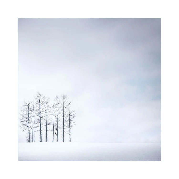
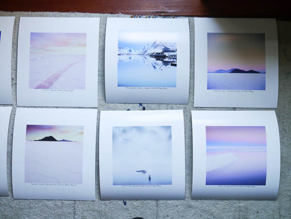
As part of my preparation for an exhibition I am doing this summer, I've been revisiting some of my older work and also reconsidering many of my more resent images. I've been thinking about how I should approach looking back at what I've done while also remaining in the present moment. I've also been asking myself the question 'how should I look towards the future without being tied down by what has gone before?' Because I do think that any body of work that has been amassed over time can become a weight, a burden to shoulder.

Learning to let go of who we were, of what we were trying to do, and what the work represented, is I feel,  the best way to go about moving forward. If I am able to also accept that the work itself is more a document of a moment, and does not strictly represent who I may be right now, then that allows me the freedom to grow.

It also allows me to view the work as open to re-interpretation. Why should work be cast in stone, to be one way just because that is how I felt at the time I first created it?

The nub of living a creative life, as I see it, is to recognise that the only thing that is constant in our lives is impermanence. The way we see the world now, and the way the world is, is always changing and just because we said or felt or believed something one day, does not imply that it is still true another day. We are entitled to change and in fact we are always changing.

By accepting that things come and they go, gives me great comfort to understand that what I do, is just a transient expression of who I was at a moment in time. Sometimes these expressions (images) become part of me - works that I am immensely proud of, and sometimes they are works that lose appeal over time. I do not judge myself harshly for what I have done, because that would lead to trying to obtain unreachable goals. By accepting that I am changing and that my work may vary in quality and quantity over time, allows me freedom to continue. The way I see it, it's the only way to prevent my older work (my history) from having more prominence than it should.

Back in Hokkaido

I just arrived back in Hokkaido last night. It's great to be here, despite the 9-hour time difference and feeling slightly woozy from the jet lag.

Last year when I first visited this Island, the weather was not what I had been expecting. Too mild and with very little snow, I had to pick my compositions very carefully and also had to pass up on so many great locations as well. This year I am assured is back to -17ºC temperatures and almost waist-level snow in places. So much so, that I may not be able to get to some of the locations I fell in love with last year.

Photography as well all know, is a great leveller. It teaches you to accept what will be, because we have no control over the elements. And to come back to a place with expectations that have been formed by previous visits is also folly. It's best to clear the mind as much as I can and try to keep an open mind, because it is with this acceptance of adventure that new ideas and new images are born. I can't wait :-)

I'm also looking forward to sharing a glass or two of Saké with my guide :-)

Greetings from Hokkaido, Japan

Left to right: my guide, myself & my friend Sonja

First time for everything. I've never been on the roof of a car before. Getting down was worse than getting up.

Kodachrome Rumour

I'm always interested in just how viable it is to bring back older products. Last year we saw the Moog Minimoog synthesiser resurrected. It's something i never thought would happen, and it seems that some of the film companies are now starting to realise there is still value in their older discontinued product lines.

It's being rumoured on a few websites lately that the CEO of Kodak was quoted as saying:

"We get asked all the time by filmmakers and photographers alike, ‘are you gonna bring back some of these iconic film stocks like Kodachrome [and] Ektachrome,'” says Overman. “I will say, we are investigating Kodachrome, looking at what it would take to bring that back […] Ektachrome is a lot easier and faster to bring back to market […] but people love Kodak’s heritage products and I feel, personally, that we have a responsibility to deliver on that love."

It's a big 'if' right now, so don't read this as 'they will bring it back'. For me, it's simply inspiring to know that the film companies are looking back at their older products and realising they still have a lot to offer if resurrected.

Kodak Brings Back a Classic with EKTACHROME Film

Film is not dead. I've known this for a while because I looked into it a while back. Today is nice news to hear that Kodak is re-introducing Ektachrome film and is manufacturing it in their Rochester plant.

Since 2009, film sales have been on the rise. Indeed, it is not unusual for me to find maybe 1 or 2 people per workshop who is what I would call a 'hybrid' photographer or 'flexitographer'. Someone who now plays with analog mediums as well as digital.

This is a massive turn around from the usual question I got asked about 10 years ago of 'have you gone digital yet'. The way I see it is that we have certain behavioural patterns to embracing new things and I'd like to draw comparisons to music listening mediums.

Each time something new comes out, there used to be a terrific rush to adopt it. Bring in the new and throw out the old. Back in the 80's we had this notion that one format had to replace all others. Cassette tape and vinyl records were promptly abandoned by many for CD. Roll forward to the present time, and we are now living in a multi-format society where it's more a case of lifestyle choice whether you listen to your music digitally or via vinyl. In fact, we live in an interesting time where CD is now mostly obsolete and yet vinyl is alive and well (albeit selling in very very small quantities compared to other digital mediums).

So with regards to music listening, we've gone past the honeymoon period of embracing digital and abandoning analog listening mediums and now enjoy both.

The same can be said for photography. We have gone past the question of 'have you gone digital yet?' to perhaps asking questions such as - what else is out there that I can play with? And the answer is that many photographers are now enjoying working with other mediums such as traditional black and white printing, black and white film, colodian wet plate process, palladium printing, and of course digital capture.

It's an interesting time to be a photographer, because we have all these mediums at our disposal and it's heartening to know that many of us are experimenting and playing with them.

In Kodak's case with Ektachrome, I feel this rebirth of the film is more to do with the requirements and needs of the motion movie industry to have film for a few reasons: firstly, there is the need to archive. Digital is not the most safest way to do this and the more secure way is to have hard-copy. Always. So there is a desperate need from the motion picture houses to have film stock available so they can archive and keep their films for posterity. Secondly there is still a demand from certain film directors to shoot on film. There has been an active campaign for film to stay around.

From my own perspective, I think film is here to stay. But there is a problem with keeping it here. Currently with vinyl album production, most of it is being done on old pressing plant machines. The infrastructure to keep vinyl albums alive is based on dedicated people maintaining these older presses. Similarly, I think the biggest challenge to keep film production going is to maintain the lines and processing plants that make them. Re-tooling when things break down is problematic for large-scale existing plants, but surprisingly, it is not a problem for some of the newer films that are coming from cottage industry businesses.

Anyway, the upshot is that any 'scaremongering' about film being end of line product is simply that now. Film still has a future now that things have settled down a lot and we as creative people have more options at our disposal. It's a good time to be a photographer.

Interview

I was interviewed by Sam Gregory from @thetogcast and it's now available on iTunes and also their website. Some nice questions too :-) You can hear an excerpt (I believe it's just a small section) of it below:

And you can hear the full interview and subscribe to TheTogcast on iTunes below:

Printing is the only way to truly evaluate your work

It is only when we print, that we can truly see what we have. Until we print, we are dealing with a half-realised, half-baked image.

My calibrated & profiled monitor and daylight viewing booth. The daylight viewing booth is essential in print evaluation and also in calibrating my monitor.

My calibrated & profiled monitor and daylight viewing booth. The daylight viewing booth is essential in print evaluation and also in calibrating my monitor.

Even though my computer monitor is calibrated and profiled to a tight tolerance, I still find discrepancies in my photographs once printed.

One of the most obvious errors is to discover that the brightest tones in the image, aren't really bright at all. The weird thing about this, is that once I notice that the tones aren't as bright in the actual print, I can now see the same problem when I view the image on the computer monitor. Even though when I looked at the image originally on the monitor, I thought it looked fine.

Our vision is often tricked and what we think we're seeing, isn't the case at all. Let's look at how our computer monitor may fool us. Take for instance this image below. It's a snow scene and I've chosen to work on it with a black background. The image looks pretty bright to me, almost white.

But if I change the background of my monitor to a light-grey tone, the snow scene doesn't look so bright any more.

And this problem just gets worse if I change the background to white as you can see below. The snow scene isn't looking so white any more, but instead, it looks quite muddy. Those bright tones are really mid tones.

Interestingly, if my monitor is calibrated correctly, the white background should simulate what the image will look like if printed on a white piece of paper, and in the example below, I may find that the image will be too dark once printed.

In the final image below, I've brightened it up a bit more to convey what I was looking for originally. This has only been possible because first I viewed the final edit on a white background on my monitor, but more importantly, once I printed it, I noticed it really wasn't as bright as I'd hoped. Now that I've corrected it and printed it, I'm happy, but surprisingly, it also stands up on my monitor also.

My monitor can only take me so far in evaluating my work. I really need to print it to get a better feel for how far I've taken the work, and how much further I still need to take it.

There is certainly some form of perception 'error' at play here and I'm sure it's to do with the fact that when looking at a file on a monitor, the light is transmitted, while looking at a print the light is reflected.

Either way, what I do find to be true, is that prints show up any discrepancies in my images more easily than any computer monitor can. This has nothing to do with the quality or correctness of my monitor, but more to do with the simple fact that there is some perceptual errors introduced by looking at something that is electronically transmitted. 

So printing can be used as a kind of reference, to find discrepancies in the work so you can go back and work on ironing them out. The thing that is most surprising about this, is that if you are able to work on your images until they look great in print, they will also look great on the monitor also. But the same is not true the other way round.

If you really want to push your image editing forward and get the best out of your work. You really have to start printing it.

Just make sure that you have your monitor calibrated and profiled as best as you can get it (use a decent colorimeter for your monitor - X-rite i1 display pro for example), but even once you have calibrated and profiled your monitor, there is only one way to confirm that it is correct: that is to use proof print that is guaranteed to be close to the file it was printed from. I use Neil Barstow's ICC verification target. Once I have calibrated my monitor, I check it's accuracy by comparing the ICC verification target against the file it was created against. The target is placed under a daylight viewing booth such as my GTI viewer below, and I open up the file in Photoshop. I also ensure that the right ICC profile is selected and proofing is switched on. If there is a difference in the colours between my target and file on my monitor - then I need to redo the calibration. I often find that it is more about the colour temperature of my monitor. In the image below, you can see that my monitor is perhaps a little colder than the target is under the viewing booth. So I will turn the white point down of my monitor a little and reiterate the process until my monitor is very close to what I see on the target.

My GTI viewing booth on the left, and my  Eizo 27" monitor on the right. I have the target file opened in Photoshop and proofing switched on. This is the only way to confirm that my monitor calibration is right.

My GTI viewing booth on the left, and my  Eizo 27" monitor on the right. I have the target file opened in Photoshop and proofing switched on. This is the only way to confirm that my monitor calibration is right.

When you do print, let your gut tell you what's wrong with your work once you print it. If you notice that the tones aren't as punchy as you thought they were, then look again at the file on your monitor and I'll bet you that you will now notice that they indeed lack punch there also. Your monitor isn't the best reference for telling you how far you need to go with your edits: your prints are.

Printing for my exhibition

I'm holding an exhibition of my photography in July 2017 here in Edinburgh. 

I know it seems like a long way off, but my calendar is pretty busy for most of the year with only a few weeks now and then at home. So over the past few weeks while I am here at home for the festive break I've been preparing the mats, frames and prints that will form part of the exhibition.

Prints and frames, December 2016 for upcoming exhibition.

Prints and frames, December 2016 for upcoming exhibition.

If you have never exhibited your work before, then I would urge you to consider doing so. It can be an enormously rewarding thing to do - just the preparation, selection of images and working out how best to display them can be hugely satisfying.

One thing that I have noticed over the past few weeks of printing, is that I have had to shake up the collection a little. It was so tempting to print all of my personal favourites, but I found after a few days that there was perhaps too much repetition of themes or perhaps colour palettes. My images from some areas of the world can be muted or almost monochromatic, while other areas such as Bolivia are very colourful. Mixing up the collection of prints to be displayed has become vital in ensuring that the viewer's experience doesn't become too one-dimensional.

Then there has been the issue of discovering that some images are lacking the presence I thought they had. Computer monitors can be extremely deceiving in letting you think the work is as optimised as it can be and even though my system is tightly calibrated and I have a very real sense of how the final print will look, viewing an image on a reflected surface (paper) compared to one that is transmitted (computer monitor), the experience may fall down. So I've found that there is an iteration of printing, evaluating the print or living with it for a few days and then finding I wish to perhaps push to upper tones a bit lighter to maximise the dynamic range of the paper I'm using.

Some printed contenders for the exhibition.

Some printed contenders for the exhibition.

I certainly feel that preparing the work well ahead of the event is crucial as it give me time to let the prints settle in, to notice errors or possible improvements. Plus, I think it's just sensible to be prepared in advance, so there is nothing that you've overlooked - such as frames not arriving in time, running out of ink and paper, or just finding out that the set of images you've chosen hasn't been as wise as you thought it might be.

Either way, it's a real delight to print your own work and to see a true hard copy. There is simply too much reliance these days on the images living in the electronic world of pixels. Photography should be printed and in my view, is never really complete until at least one image has been printed per image that you have finished.

Edward Burtynsky - Watermark

I've just finished watching Edward Burtynsky's movie 'Watermark' which came out in 2013. So it's not a new release by any stretch of the imagination, but it's new to me :-)

For those of you who have never heard of Burtynsky, he is a photographic documenter of the large-scale environmental impact that us humans are having on our world. His images are startling documents of environmental scale and very much worth checking out by buying some of his beautifully printed monographs.

I'm keen on many avenues of photography, not just 'landscape', but also reportage and documentary style work. Edward Burtynsky has the uncanny knack of creating amazing landscape work which is art in its own right, but is very much geared towards the environment and letting us into a few secrets of just how large scale we are modifying our world. Scale is the word that keeps coming to mind.

This documentary is beautifully filmed and it left me with a new appreciation of water. Just how vital it is to our survival but also just how much it is being manipulated and redirected. Creating dams in California has had disastrous consequences for the areas where the water was diverted from. Looking at modern china, we are able to see the massive scale of dam creation and how much this is changing our landscape. 

His documentary is really a lament to the natural world. This documentary really shows just how much we are shaping and re-creating our world. It is only the beginning, and indicator of the things to come. Nature has it's own processes and its own way of working. Each time we influence it, we may benefit in some ways but we lose in others through a lack of deeper understanding of just how much it is going to cost in the future. But most of all, this documentary shows that we have no handle, no overseeing jurisdiction on how much our world should be reshaped. We just go about our business each day hoping that someone else is looking after our world for us, but through the scale of Edward's photographs, I no longer feel comfortable with the mass adaption of our land.

Epson Ink expiry dates

This week I've been doing some printing for my exhibition next year. But I've been having difficulty getting the prints to look as they do on my computer monitor. I've re-calibrated my system a few times and yet there was a colour shift in the prints I saw coming out of my Epson 4880 printer.

A 'before and after' simulation of what I was seeing in my prints with expired inks (1 year out of date)

A 'before and after' simulation of what I was seeing in my prints with expired inks (1 year out of date)

The expiry dates of my inks are now out of date by 1 year. I don't print that often so I seldom go through a 220ml ink cartridge in the time the inks are still valid. But I couldn't imagine how the expiry date would suggest a colour shift so prominent in such a short period of time so I checked around the web, only to find that there is a lot of misinformation and many assumptions by owners as to what happens when the inks expire.

In fact, Jeff Shewe simply stated that the coagulation of the inks would start to break up and maybe not lie on the paper correctly, but there was no mention in any internet search I did, that a colour shift may happen, despite this being what I saw.

So I took the plunge and ordered a brand new set of inks for my Epson 4880 and have just installed them. First I should point out that to do this requires a lot of inks. The old inks have to be flushed out of the system and in order to put enough ink into the print head, also requires the lines to the head to be refilled too. So for the half-size cartridges I've just installed (110ml) I've used around 1/3rd of them up just in the install.

The colours are now back to what my monitor shows me and the prints I'm making are very tightly aligned with what I see on my monitor. So I put out a question to a colour management expert I know, asking if the inks drift past their expiry date. This is what he had to say:

"Yes they do change after expiry, it's especially noticeable in proofing environments where a test wedge is checked."

Which I can confirm by my findings, since I've replaced the inks and I've compared the prints against my calibrated and profiled monitor.

So that's the upshot for you. If you have expired inks in your Epson printer, you're more than likely not getting the full gamut of colours you may be expecting. For me, I noticed that the blacks weren't as deep as they should be, and magentas were much weaker. Some of the blues were not as deep as they should be, and yellow tended to be absent on prints. In general, I felt my prints were a little lacklustre and not as vibrant or deep as I expected. In some cases, this was marginal when comparing before and after prints, but in other cases, it was very obvious.

So my suggestion would be that if you are serious about your prints, you buy the cartridge size that allows you to use most of the ink in the allotted expiry date time, and also check when you buy the inks that the expiry date has a long time to come. Some of the inks I bought are due to expire next September and that is still too short a time for me, while others have around 18 months or more.