Josef Albers - Interaction of Color

I've been saying for a while now, that digital-darkroom skills take a lifetime to master. It is a continuous journey of self improvement. Simply buying a copy of Lightroom or Photoshop and learning the applications may give us the tools, but it does not make us great craftsmen. We need to delve deeper than simply adding contrast or saturation to our images to truly understand how to get the best out of our editing and to move our photographic art forward.

Josef Albers fascinating 'Interaction of Colour'. It's quite an old publication now, but it's great for getting a better grasp of colour theory.

Josef Albers fascinating 'Interaction of Colour'. It's quite an old publication now, but it's great for getting a better grasp of colour theory.

Lately, I've been taking more of an interest in tonal relationships and more specifically, the theories behind how we interpret colour. It's something that has grown out of my own awareness of how my digital-darkroom interpretation skills are developing.

Simply put, I believe we all have varying levels of visual awareness. Some of us may be more attuned to colour casts than others for example. While others may have more of an intuitive understanding of tonal relationships. 

Ultimately, if we're not aware of tonal and colour relationships within the images we choose to edit, then we will never be able to edit them particularly well. I think this is perhaps a case of why we see so many badly edited (read that as over-processed) images on the web. Many are too attached to what they think is present in the image, and there's a lack of objectivity about what really is there. 

So for the past few weeks I've been reading some really interesting books on the visual system. In Bruce Frazer's 'Real World Colour Management' book for instance, I've learned that our eye does not respond to quantity of light in a linear fashion.

An overly-simplified illustration. It demonstrates that the human eye is not able to perceive differences in real-world tonal values. Our eye tends to compress brighter tones, which is why we need to use grads on digital cameras, because their respo…

An overly-simplified illustration. It demonstrates that the human eye is not able to perceive differences in real-world tonal values. Our eye tends to compress brighter tones, which is why we need to use grads on digital cameras, because their response is linear, while our response is non-linear.

We tend to compress the brighter tones and perceive them as the same luminosity as darker ones. A classic case would be that we can see textural detail in ground and also in sky, while our camera cannot. Cameras have a linear response to the brightness values of the real world, while we have a non-linear response.

Similarly, when we put two similar (but not identical) tones together, we can discern the difference between them:

Two different tones. Easy to notice the tonal differences when they are side by side.

Two different tones. Easy to notice the tonal differences when they are side by side.

But when we place them far apart - we cannot so easily notice the tonal differences:

Two different tones, far apart. Their tonal difference to each other is less obvious.

Two different tones, far apart. Their tonal difference to each other is less obvious.

Our eye is easily deceived, and I'm sure that having some knowledge of why this is the case, can only help me in my pursuit to become more aware of how I interpret what I see, whether it is in the real world, or on a computer monitor.

Josef Albers fascinating book 'Interaction of Colour' was written back in the 1950's. I like it very much because it:

"is a record of an experimental way of studying colour and of teaching colour".

His introduction to the book sums up for me what I find most intriguing about how we see -

"In visual perception a colour is almost never seen as it really is - as it physically is. This fact makes colour the most relative medium in art".

Indeed. How a viewer of your work may interpret what your image says may be totally subjective, but there are certain key physical as well as psychological reasons for why others are relating to your work the way they do. But most importantly, if we don't 'see it' ourselves, then we are losing out during the creative digital darkroom stage of our editing.

"The aim of such a study is to develop - through experience - by trial and error - an eye for colour. this means, specifically, seeing colour actions as well as feeling colour relatedness"

And this is the heart of the matter for me. I know when I edit work, that sometimes I need to leave it for a few days and return later - to see it with a fresh eye. Part of this is that I am too close to the work and need some distance from it, so I can be more objective about what I've done.

But I also know that I don't see colour or tonal relationships so easily. I need to work at them. I am fully aware that I still have a long way to go (a life long journey in fact) to improve my eye. And surely this is the true quest of all photographers - to improve one's eye?

The memory of a colour

While I was in the Fjallabak region of the central highlands of Iceland this September, I encountered a number of vast black deserts. I've been in vast landscapes of nothingness before, such as the Salar de Uyuni salt flats of the Bolivian altiplano, and also the pampas of Patagonia.

These places are captivating endless nothingnesses that make the eye hunt and hunt for something to latch onto. At least, that's what I think happens when humans encounter something so vast and featureless.

One of the many black deserts of the central highlands of Iceland. Black can come in many shades and hues, as I discovered.

One of the many black deserts of the central highlands of Iceland. Black can come in many shades and hues, as I discovered.

This was nothing new for me. But what was new for me, was that I discovered that black isn't really just black. There are many different types of black desert to be found in Iceland. One of them - near the volcano Hekla, is so jet-black (it feels as if nothing can escape it's pull) that you realise every other black desert you've witnessed has to a large degree - some kind of colour to it.

There's a lot of psychology at play when it comes to interpreting colour.

Bruce Frazer's excellent book on colour management. Every photographer should read this.

Bruce Frazer's excellent book on colour management. Every photographer should read this.

For instance, I've been reading Bruce Frazer's fantastic book 'Real World Colour Management', and in it he describes the psychological factors involved in how we interpret colour. Colour is as he describes it 'an event'. It is light being reflected off a subject and viewed by an observer.

We have what he describes 'memory colour'. For instance, we know what skin tone looks like, and we all know the kind of blue a blue sky should be. We know 'from memory' how these colours should be. There are psychological expectations that certain colours should be certain colours. 

I think this applies to how I perceived the black deserts of Iceland. If i say a desert is black, we think of it as jet-black, even though it might be a deep, muddy brown-black, or a deep muddy purple-black.

I think most of the time, many of us simply go around looking at colour but not 'seeing it'. We use memory colours all the time with little thought to what the real colour of an object might be.

For example, last year during a workshop, my group and I were all working in very pink light during sunrise. Knowing that the entire landscape was bathed in a pink light, and that many of us don't notice the colour cast so obviously, I asked my group individually what colour the clouds were. Half of the group correctly said that the clouds were pink, while the other half incorrectly said that they were white. My feeling on this matter is that those who said the clouds were white - were attaching a memory of what they think clouds should look like. They were, in other words, not really noticing the colour of the object at all, but just attaching a common belief that clouds are white. This is a good example of memory colour.

But let's go one stage further. This might actually not be colour-memory at play though. It could simply be our internal auto-white-balance working. It's known that the human visual system is very good at adapting to different hues of white light. If we are in twilight, we may not see the blue colour temperature of the light on the landscape (but we sure would notice it's twilight if we take a photo on a digital camera and look at the histogram - there will predominantly be a lot of information in the blue channel, and very little in the red and green channels). Likewise, if we are sitting in tungsten light at home, our visual system adapts and tunes out the 3000k warm hue that we're being bathed in.

I think I was applying 'colour memory' to the black deserts of Iceland - I wasn't aware of the subtle differences in hues between one black desert and the other, because I had just attached a memory of what I know black should be (all blacks are black right?).

Being aware of the subtle differences in colour is hard work, because our visual system has evolved to adapt to whatever context we exist in. If we are sitting in pink sunrise light, we tune it out. If we do detect any pink at all,  it's in the more obvious region of the sky where the sun is. That's why most amateur photographers point their cameras towards the sun at sunrise (I tend to point 180º the other way, because I know the pink light is everywhere, and the tones are softer and much easier to record).

If I see clouds, I assume they are white because my visual system has its own auto-white balance. If I see skin tones, I use colour-memory to assume all skin tones to be the same, regardless of what kind of light the person is being bathed in. For example, if someone is standing underneath a green tree, there will be a degree of green-ness to their skin tone which I won't see, because of colour memory.

We lie to ourselves all the time, but our camera doesnt. It tell's it like it is, and I think this is the nub of todays post: being a good photographer is about being as colour-aware as we can be.

This is not an easy thing to do, because we are hijacked by our own evolution: our visual system tunes out colour casts all the time, and we also apply colour memory to familiar objects. We expect certain things to have certain colours, and as a result, we tend to ignore the subtle difference that the colour temperature of the light we're working in can have.

As I keep saying to myself as I work on my new images from Iceland "Not all black deserts are black".

The Highlands of Iceland & North Iceland, 2014

Two nights ago, I published my monthly newsletter. In it, I described the beautiful complexity of the central highlands of Iceland.

I thought it would be nice to share a little contact sheet of some recent images from two trips this September (I still have a backlog of images shot during July as well as September to get through). So by no means is this the complete set of images.

Contact sheet of images shot in the central highlands and north east of Iceland this September. Images © Bruce Percy (Mamiya 7 Mk1 camera with 43, 50, 80, 150 and 210 lenses)

Contact sheet of images shot in the central highlands and north east of Iceland this September. Images © Bruce Percy (Mamiya 7 Mk1 camera with 43, 50, 80, 150 and 210 lenses)

It's been so long since I had the chance to edit any of my own work. I've literally forgotten how satisfying and absorbing working in the darkroom can be (read that as digital-darkroom if you like me, use photoshop or any other digital editor, or analog darkroom if you are a traditional film photographer working in a wet darkroom).

Going into a room, and shutting myself away from everyone for extended periods of time and letting myself be immersed in my experiences and thoughts about the places I am working on, is a bit like re-living the times I had whilst shooting, and it also allows me to reconnect with the work at hand. It's just so enjoyable to escape into my own world and disappear for a few hours.

And a few hours can often turn into a few days. I think I've been putting off editing any work this year due to a lack of free time.

I really prefer to be able to set aside a few days or maybe a week in my studio, so I can truly get into the work I'm editing. Anything else feels like I'm being interrupted, disturbed in some way. And I've really not had much free time in between workshops, and running a business.

I really think to get the best out of ones editing, I need to get some distance between the shoot and the editing. It's the only way I can be objective about what I was doing. But leaving the work for more than six months or more (as in the case of images I shot in Venice a year ago, and Lofoten this February), feels like I'm so far removed from them, it's a little hard to get reconnected.

Anyway, I feel as photographers, we need to look after our mojo. Mojo will only exist if we remain enthusiastic in what we do. Being able to shoot is one way of keeping your mojo healthy, but also being able to bring work to completion is another. Leave things for far too long, or never complete anything and very soon you may be feeling that your photography has no direction or focus.

I've been depriving myself of the joy in bringing my work to completion, and now that I've completed some new work, I'm feeling energised to continue.

You can see more of my new images from Iceland under my ''recent work' section of this site.


Fjallabak, Iceland

I'm editing some new work from Iceland tonight. It's been a tough road this time, because I wasn't sure how to approach such a difficult landscape, but I feel I'm on a roll now.

Image made this September 2014, © Bruce Percy. Shot on a Mamiya 7 Mk1 rangefinder with 150mm lens.  Right in the heart of the Fjallabak region of Iceland. Perhaps my most favourite place in Iceland to date.

Image made this September 2014, © Bruce Percy. Shot on a Mamiya 7 Mk1 rangefinder with 150mm lens.  Right in the heart of the Fjallabak region of Iceland. Perhaps my most favourite place in Iceland to date.

It's a strange landscape, and it's a compelling one. Seldom photographed compared to the more accessible areas of Iceland, I feel it has a lot to offer, and I know I will be returning here a lot more in future.

More on my monthly newsletter (hopefully tomorrow). 

Places choose you

.... not the other way round.

Have you ever thought that some of your best images came from places that you didn't particularly feel an affinity with to start with? And some places just don't work when you finally get there? Some places, for some reason just seem to work when you had no expectation of finding something there to begin with?

Looking back, I never intended to go to Bolivia, and I never even considered it would have much to offer. But I went anyway, and I found that the landscape spoke to me.

Siloli Desert, Bolivian Altiplano, June 2013.

Siloli Desert, Bolivian Altiplano, June 2013.

It would be easy for me to think that the reason I've felt at home in this landscape, is because it suits my photographic style. But maybe it's the other way around, maybe it's responsible for it.

I think some landscapes dictate a photographic style - one that resonates with you. They tell you how they should be photographed and as a result, direct your photographic style.

I think some landscapes are like that; they offer us clues, suggestions, hints at what we may become and it's up to us to run with what we're given.

I think Bolivia chose me, rather than I chose it.

It has been a six year love affair. A place where I know I have learned so much about working with negative space. It has also offered up different colour palettes that I've integrated into my style of what I am seeking in a landscape.

Just recently, while I was in my dentists office, I read an article in a Travel magazine about another part of the Altiplano, that I'd never heard of. I turned a page and the images spoke to me. It also felt oddly familiar and I knew I had to find out where it was. I had no idea at the time that I was reading about a related landscape to the Bolivian altiplano, that is situated in Argentina, just across the border from where I've been spending my time.

I now have plans scheduled for next July to go.

I didn't go looking for this new landscape, it just seemed to find me and I feel I've been invited.

Is there a landscape you feel has chosen you?

The Art of Being Quiet

I've been wanting to say for a while now, that I'm sure some of you may have noticed that my blogging activity isn't as frequent as it used to be. Through working a lot on my tours and workshops, things have gotten very busy for me. I find that I need  to get time away from my business, as well as time alone each year to find my own inspiration. There is only so much that you can give before you start feeling that you need to keep something back for yourself.

Space in a photograph conveys silence and silence can often be beautiful.

Space in a photograph conveys silence and silence can often be beautiful.

So I'd much rather write on this blog when I feel I have something of merit to say, and when I feel recharged enough to say it.

If I think about some of my most favourite pieces of music, they often contain moments of silence. Silence is a creative way of conveying calmness, or pause for thought. In photography, space in an image conveys a sense of calmness or silence and I find silence in photographs very moving. 

I'm aware that there is a trend to blog and facebook/tweet your every waking thought, but I find very little beauty in doing that. I don't wish to bombard you with noise, because sometimes that's all I may have to offer you.

Besides isn't there an ugliness in this kind of constant intrusion? And a beauty in silence?

Fujifilm XT-1

One of the perks of being a workshop leader, is that through meeting new participants each year, I get to see an array of assorted camera equipment, from the budget to the seriously expensive.

Image © Bruce Percy. Shot on a Fujifilm XT-1 camera with 10-24 lens. I think this camera has some of the most pleasing tones in any present digital system right now.

Image © Bruce Percy. Shot on a Fujifilm XT-1 camera with 10-24 lens. I think this camera has some of the most pleasing tones in any present digital system right now.

And once in a while, somebody turns up with a camera that I think has a very beautiful look to its images. During my Scottish workshops, I do a daily critique of participants images, so I get to see first hand the differences in colours and tones between different models. For a while, the digital camera that I thought had the most beautiful tones and colours was the Nikon D3X. 

I won't pretend to know much about the tech side of any digital camera. I rarely go to websites to look at equipment specs for digital systems as I'm pretty much focussed on my art with the medium I've been using for the past twenty odd years (I'm a film-shooter). But it is interesting to see how digital cameras are improving and advancing each year while running my workshops.

This year I've found that if the colours and clarity in a participant's work stands out, it's a fujifilm camera that's behind it. From what I'm seeing, I think the Fujifilm cameras have an 'almost' film-like quality to them - a more 'organic' look than what we've seen so far in digital imaging.

This week I'm up in the far north-west corner of Scotland with some friends, and one of them has let me play with his XT-1 camera. If I were in the market for a digital camera right now, I think this would be the one for me. The only downside about it, is that it doesn't offer some of the aspect-ratios I think are important if you are wishing to improve your composition skills. The Fuji line of cameras seem to offer 3:2, 1:1 and 6:19 only. It's an odd omission to leave out something like 4:3, 4:5 or 6:7 - any one of those would have given me a more pleasing proportioned rectangle to use rather than 3:2, which I feel is more towards a panoramic format than a rectangle, and often the culprit in making composition harder for newbies to master.

If you're in the market for a small system now, and are thinking of getting rid of the bulk and weight of a traditional SLR, I think the mirror-less cameras such as the Micro-Four-Thirds Olympus / Panasonic models as well as Fujifilm's X range of cameras would be worth investigating. Image quality is a moot point now. We've got far much more than most of us need now, and the quality that smaller systems have to offer is no poor contender to full-frame systems. 

If it were me right now, I'd be going for a Fujifilm XT-1 camera with 10-24 lens, despite it not having a 4:3 / 4:5 or 6:7 aspect ratio to play with. I love square and so I'd be happy to use it as a digital 'hasselblad' if you like. But I do hope that the omission of a decent rectangle aspect ratio will be addressed in a future firmware update at some point. 

In the middle of this nowhere

I arrived in Bodø (pronounced Boda) around 11pm one February. It was dark and very very cold outside the airport. It was also the first time I had chosen not to attempt to sleep in the airport (my connecting flight to the Lofoten Islands was always at 5am the next morning).

Getting to the Lofoten Islands is not easy. First you need to arrive in Oslo, and once there, you need to take an internal flight up to the very top of Norway to the town of Bodø. From there the Lofoten islands are a short 20 minute plane hop, or a four hour ferry journey. Only in winter, like here in Scotland, you’d be lucky if the ferry is running at all.

So I’d opted to stay at the local youth hostel in town. The taxi took me there in about 10 minutes from the airport and cost me around £20 one way. I checked in. The place seemed to be occupied by young guys coming and going at all hours, when there is nothing to go anywhere for, unless you like snow and darkness.

I ventured outside to see if I could get something to eat. At 11pm in northern Norway in February, very little is open. Norwegian towns are very quiet, law-abiding, deserted places and I felt particularly lonely on this first of many journeys to Bodø. I kept walking and found the only place open in town - a Pizza shop. 

They asked me about Scotland and I asked them about Norwegian life. They were about 20 years old, while I was at least double their age. But we had a lot in common, being the only people in town not ensconced at home at 11pm.

I wanted a coffee, or a tea, but they only had Coca Cola, so I bought the smallest bottle they had, a 2 litre plastic container of sugary water. I went back to my hostel and after eating my pizza, I looked out of the window of my room onto the train station below. I thought about how this wasn't exactly the warmest fun place to be, and at that moment I realised how much my life sucks at times. Running a business that involves travelling when I sometimes don't feel like it, can be hard at times.

As exotic as it seems to some (and I do have moments when it feels wonderfully exotic), there are often times when I have to stare at the harsh reality of what my life has become. The space between leaving home and arriving at my destination can feel like a displaced, friendless-ness space in which to be stuck in for anywhere up to a whole day and one empty evening.

It can feel like I'm in the middle of nowhere.

But it's always temporary, and good things always come out of my ventures.

In the morning I was on the local plane hop over to Lofoten. The plane was tiny with around 20 seats in it, and everyone clambered on board with their shopping and luggage in their hands. We rose abruptly into the sky, got tossed around in the winter storm, and just as quickly as we had ascended, we abruptly hit the ground on the other side. 

My air hostess had conducted the safety briefing in English - just for me. I was the only non-native on the local flight, a flight that is more akin to a bus service than anything else. She said before we departed ‘ if we can’t land due to strong winds, we’ll turn round and come back’. I liked her plan very much.

Since my first trip to Lofoten, I’ve become friends with a handful of the locals in the town of Reine, and many others that I know well enough to say hello to. I'm the outsider, the one with the Scottish accent that comes once a year for about two to three weeks every February.

Mostly my friends there are expats: I have friends who are Dutch, Swedish, Australian and one of them - Sandro - is half Norwegian and half Italian. Lofoten seems to attract outsiders to come and live there.

Beauty is one thing, and beautiful Lofoten is. But it’s not for everyone. With long winters, and a small community, some of us (and I think I’m one of them) would go a little crazy with all that space and silence. 

As my Dutch friend Lilian who lives there once said to me ‘if you have any personal issues, a place like this can amplify them. It’s not a place to run away to if you have emotional things you need to run away from’. Being in the middle of nowhere, whether it's a hostel in a northern town in Norway, or whether it's sitting on a plane,  often gives me a glimpse of what Lilian describes. My thoughts and feelings often get amplified whilst in the middle of nowhere.

My First Black & White Print

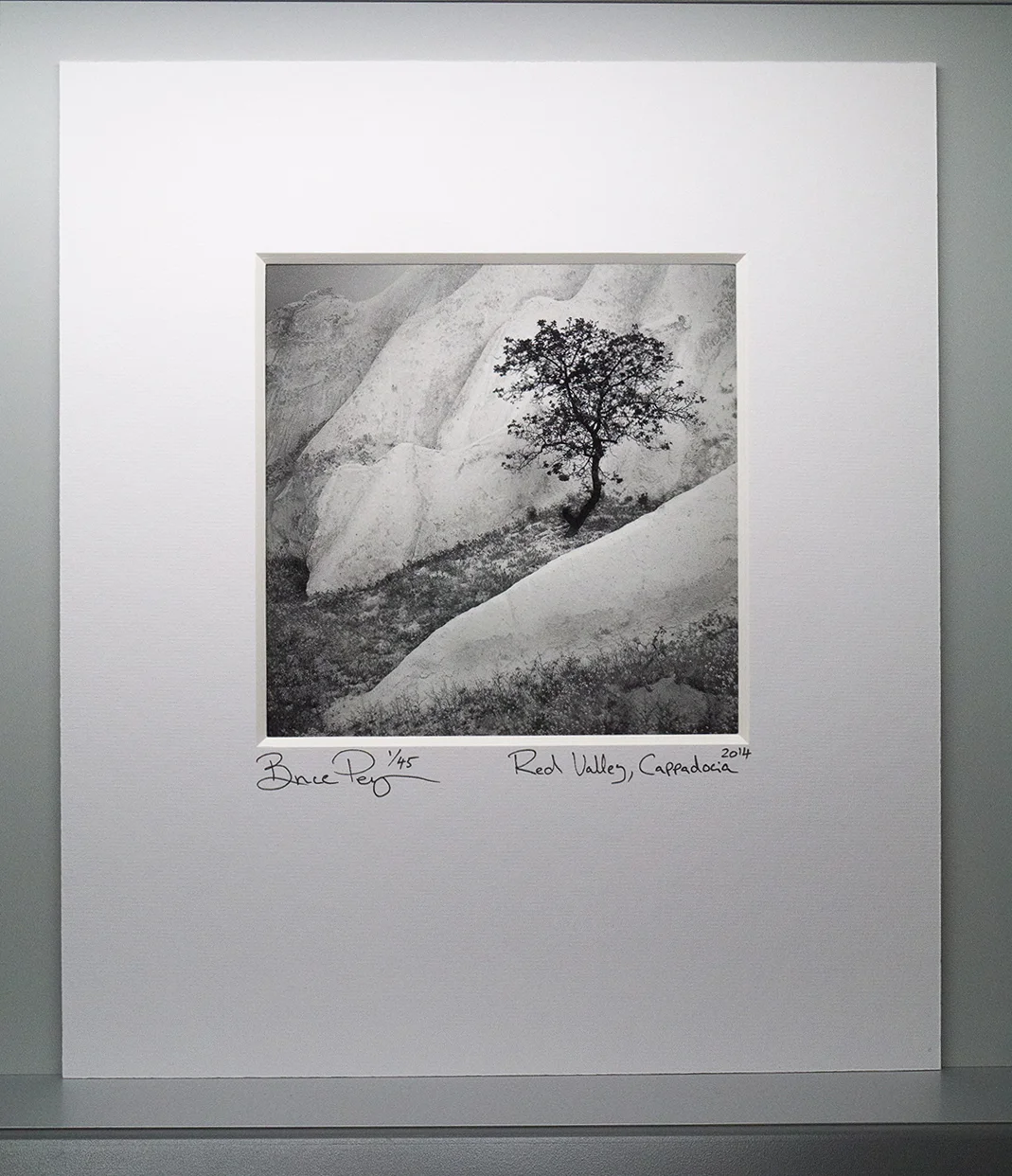
I've spent a bit of time over the past few months researching black & white printing. Until this year, I had deliberately stayed away from monochrome work as I feel that it is a very different space in which to work. It is also an extremely difficult medium to master because any tonal errors or tonal distractions are more evident in the work. With colour, tonal errors are less critical because we have the added distraction of colour.

Printed on Museo Silver Rag paper, using Colourburst's RIP Print driver and Pixelgenius capture and output sharpeners

Printed on Museo Silver Rag paper, using Colourburst's RIP Print driver and Pixelgenius capture and output sharpeners

So I'd looked into using the John Cone system of loading up a dedicated Epson printer with monochrome ink sets. I really liked the sample prints I got from John, but I went ahead and used my own standard colour printer inks to do the monochrome print you see above. My feeling is that if you have a really well calibrated / profiled system, I think monochrome inks via the colour ink cartridges is really nice. I'm certainly happy with it and I would suggest if you are thinking of doing monochrome work with a colour printer, to use really good profiles, or as in my case - a dedicated RIP print driver.

When I looked into printing a few years back, I was amazed to discover that it is almost a religion for some and many people have different ways of tackling it. My system is very simple - I use BasICColour's Display 5 software to calibrate my monitor, and by using a RIP driver with good paper profiles installed, and suitable sharpening algorithms for the final print (I use Pixelgenuis' Sharpener toolkit), you can't go wrong. Oh, and of course you need a really good day-light viewing booth with which to evaluate the final prints.

The print you see above is my first monochrome print, and it's for my client and friend Stacey Williams, who is from Trinidad. Stacey will be on my Torridon workshop next weekend so I'll be delighted to hand her the print in person.

Printing is a very personal thing. The paper choices, how the work is presented are all personal decisions. But what sets a print apart from a computer screen is the fact that it's tangible, physical thing.

And with all tangible physical things, t's an extremely rewarding feeling to be able to actually give the work to whoever it was intended for :-)

The Multi-Medium Photographer

It's probably not news to you that I am a film shooter. I am 100% film and although I have a digital camera, I tend to use it for illustrating compositions while running workshops, only.

What some of you may not know is that I am a Hybrid-Photographer. I shoot film but I scan my images and then edit them in the Digital-Darkroom. So you could say that I'm half analog and half digital. My reasons for this workflow are purely personal as I love the look and feel of film and what it produces, and I also enjoy the creative freedom that the Digital domain gives me to further edit my work.

The look and feel of my images is partly due to the film stock I like to work with (Fuji Velvia 50) and my aesthetic choices in the Digital Darkroom

The look and feel of my images is partly due to the film stock I like to work with (Fuji Velvia 50) and my aesthetic choices in the Digital Darkroom

A few days ago, I was sent an email about a new kickstarter project to bring a new kind of film to the market. Apart from being very pleased to hear that a new film may be coming out, it gave me a chance to reconsider the future of film and more broadly, the future of photography.

When I looked into what the current state of play with the film market is, I was surprised to discover that many film manufacturers have noted a rise in film sales each year for the past five years and although the market is very small compared to what it once was, film manufacturers believe the decline in film sales has stabilised.

Looking into this a little more, the answer to why this has happened is complex, but at the same time, encouraging.

Firstly, Digital capture is no longer new, it is an established and mature market now. We perhaps live in a 'post-digital-capture' age where Digital is just one of many mediums that we can play with. This is very exciting as I don't think we've ever had so many different mediums with which to do photography with.

Secondly, because the initial rush for Digital is now over, I think many photographers can't help but experiment; there's nothing better to invite inspiration than to give something different a go. I think that's why sites like Lomography and iPhoneography have risen in interest. 

From my own personal experiences of running workshops, I have certainly seen a very small rise in the interest in film and other mediums, and I've had some participants tell me they now have their own analog darkroom at home, or that they have been experimenting with collodion wet plate processes. All this alongside being digital-shooters.

So rather than this being a case of a resurgence in film only, I think there has been a mind-shift for many photographers. We're far too interested to be stuck with one way of creating imagery, and that is just such a fantastic thing to witness, because about a decade ago, it felt that the mind-set was very much about whether you were digital or film, and in some cases sometimes I was asked 'when' rather than 'if' I was going to move to digital photography.

CineStill 800T Tungsten film is a new Kickstarter project to bring a Tungsten balanced Cinematic style film stock to the Still's market. The film can be exposed between ISO 200 and 1250

CineStill 800T Tungsten film is a new Kickstarter project to bring a Tungsten balanced Cinematic style film stock to the Still's market. The film can be exposed between ISO 200 and 1250

Photography has always been the act of self-expression. So if a photographer wishes to use a Collodion wet plate process to convey their work, or print in an analog darkroom, or use digital-sensors, the choice of medium is often a personal one. For some it's all about how the process feels and for others it's about how the final images look and sometimes it's a matter of both.

We are now in the age of the Multi-Medium Photographer.

As part of my current thoughts about how we're all changing as photographers, I decided to look into the viability of film remaining with us in the future. It seems that my ideas about film becoming end-of-life were unwarranted. Despite a small resurgence in it, I had believed until now that film manufacture could not continue to be a profitable exercise as time goes on. It seems I am partly right and also partly wrong about this.

Many existing film manufacturing sites are optimised for large-scale production. Apparently retooling them to produce smaller production runs is not a viable option for some of the large film manufacturers, and from what I understand, because of the chemical processes involved, would also require a redesign in the films so they could be optimised for smaller scale production runs. I don't see how some of the big film manufacturers are going to be interested in investing the time and money in developing and retooling. It's just not a viable thing for them to do.

But there has been an increase in new films coming out from small companies. From reading into this, it appears that it's much easier to optimise a small-scale production facility from scratch rather than trying to down-scale, so in this respect, I think if film is to continue to be around for the future, it is going to be in the form of small scale production and that means new films released by new start up businesses rather than the films we know and love now.

This is perhaps no bad thing, because film technology still has a lot of potential for further development and it may mean we see more exciting films coming out. Companies such as CineStill have just announced a new film stock that can be exposed anywhere between ISO 200 and 1250. That alone gives an indication of how film technology is developing.

I think the world of photography has never been more exciting and interesting than it is now. Rather than throwing one medium out for another (switching), some of us have begun a process of incorporating multiple mediums and many formats into our photography. The general mindset or attitude towards film & digital has changed over the past few years and this is proving to be liberating.

The future is a multi-medium, multi-format one where photographers work in analog or digital and sometimes (as in my case), both.