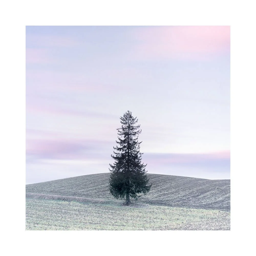
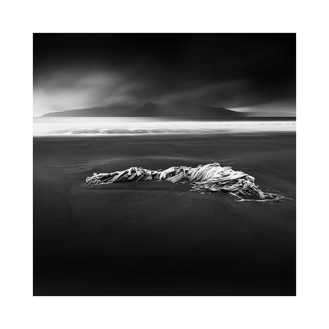
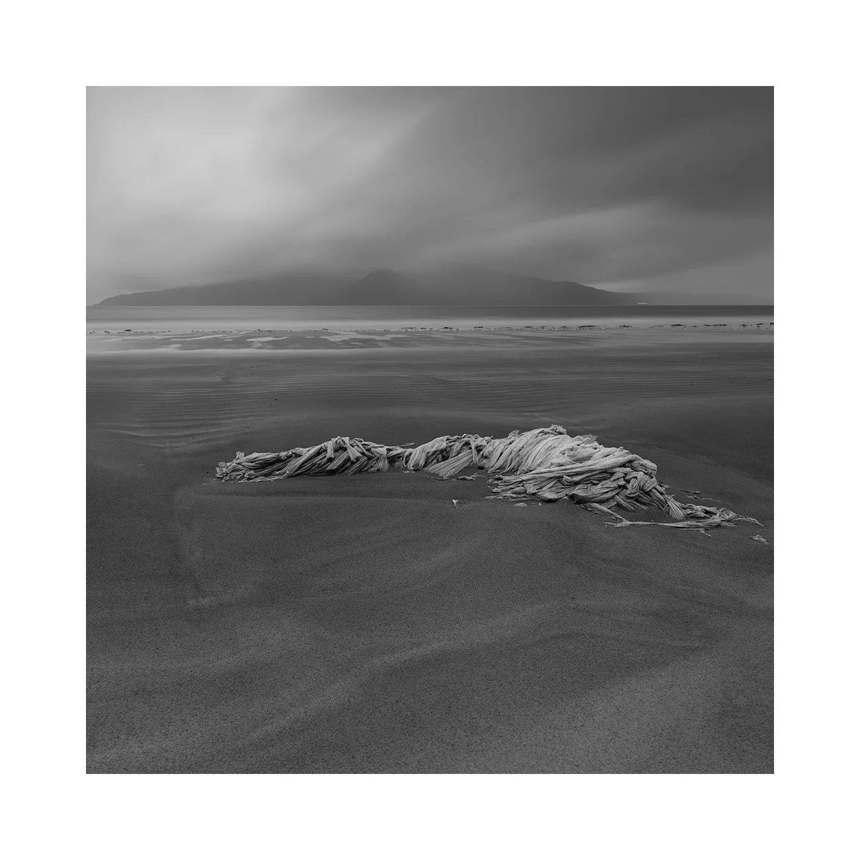
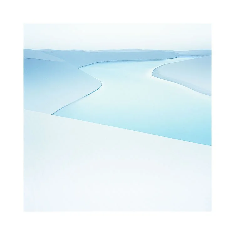
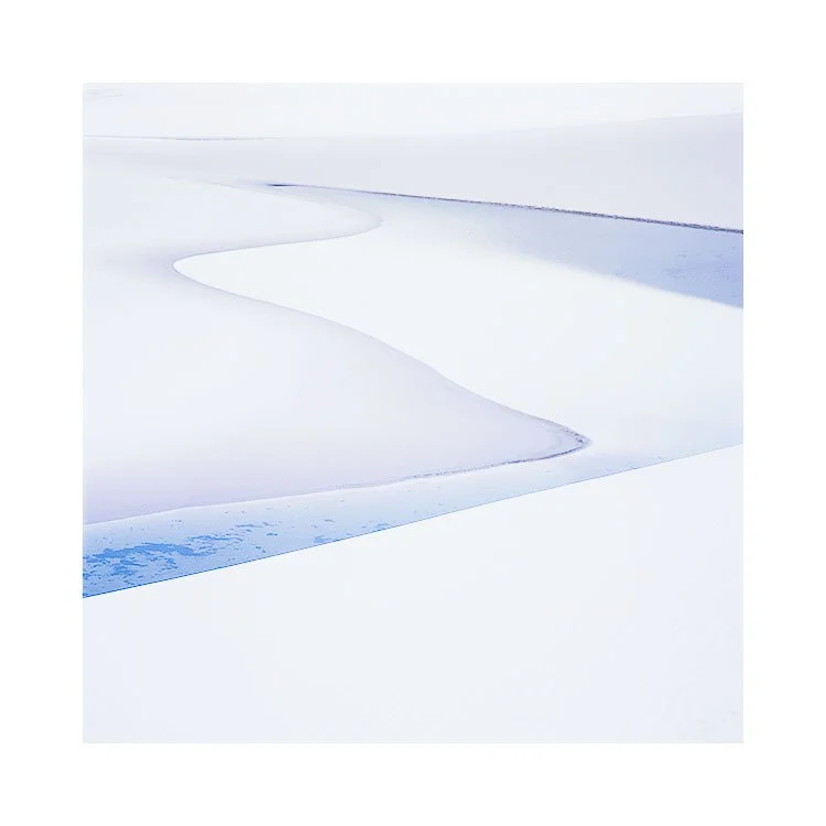
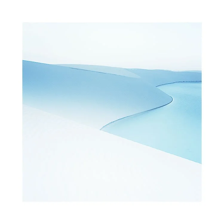
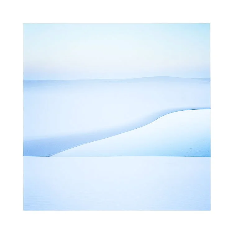
Black lacquerware, Japan

I’ve been looking back a little this week at my work over the last few years. I enjoyed very much coming back to this set of images that I made on my first trip to Hokkaido in the Autumn time. Perhaps they are the most thematically strong of all the images I’ve shot so far in Hokkaido during the Autumn time?

This portfolio uses black backgrounds to help unify all the images together (as you can see in the final portfolio set).

It was not my intention for this to happen, and I did not visualise this at the time I was here. But it became apparent during the selection and editing of the images that certain ones worked very well if I used the dark forest backgrounds as a canvas of sorts.

As you may know, I like to work ‘thematically’.

On a personal note, there is a lot of dark lacquerware bowls and furniture in Japan, and I think this was perhaps at the back of my mind when I worked on this set.

Industrial Beauty?

Can we find beauty in industrial places? Places we would ordinarily pass over, because we tend to relate to them as purely functional in purpose.

Often, I’ve thought, that there is no room in our minds, for beauty or art, with such places.

Zeeland, like many other parts of the Netherland’s coastal polders and dikes is reclaimed land. Over the centuries engineers have heavily fortified, straightened, and dammed sections of the Dutch coastline.

I doubt that beauty was ever in the hearts of the engineers that reclaimed this land. And yet, beauty is what I found here. In concrete, fibreglass and steel.

Who would have thought this landscape to be worthy of a photographic portfolio? Especially from someone who has spent most of his time photographing natural landscapes.

I would not have guessed that I would enjoy so much photographing a world built for function and purpose. A place that no one frequents. But I was intrigued that our world can have vast areas of land, dedicated to the design and function, of engineering structures that no one goes to, or lives in.

A landscape that is stark and austere of human ornamentation.

And yet, I still found much beauty. Beauty in the austerity of its technical design. In its Towers and blade, abrasive concrete, fibreglass and steel.

If you enjoy these videos, it would be great if you could help me not get killed by the YT algorithm, by ‘liking and subscribing’. Otherwise, YT buries my content and others don’t get to find out about it.

Hidden skills of a workshop / tour leader

Preamble - this has been written to offer an insight into what it takes to set up and run a tour or workshop smoothly. I suppose my aim with this, is to help assist anyone who is considering booking a tour or workshop with a photo leader. There are certain things worth thinking about, that should help you make a decision.

As a workshop leader, I often think my participants are oblivious to many aspects of a trip when they book or choose one.

To me, I would only be going with someone who has demonstrated that they have been there many times and know it well. It takes a lot of time to get to know a location, and to work out the logistics so things work very smoothly. For if the tour runs smoothly, then it can give the illusion that it was easy to set up.

That is one downside. If the tour or workshop leader does his job well, it can seem as if he’s doing nothing very much at all. Yet the truth is, throughout the day, all photo tour leaders are constantly re-calculating how the day will pan out as time spent in certain locations is shorter or longer than anticipated. This can only be done well if they know the place well, and have time and experience of being there with groups.

So I personally would prefer to go on a tour with someone who has been going to a place for many years. They most likely have built up a good knowledge of the landscape, and have the skill to offer something when plan A fails and plan B has failed as well.

In addition, the photographs they show you, should be an indication of what you’re going to shoot. If you like minimalism, then the workshop leaders work should show this. Choosing a photographer because you like their work and think it’s representative of what you will see and photograph is key.

So in essence : the workshop / tour leader should have an intimate knowledge of the place - experience of shooting there, and of knowing the logistics. If he doesn’t, then he should at least have a guide that knows the place well to help him run the tour. And of course, his images should give you an indication of what you’re going to see and shot. That includes style of photography and locations.

In terms of actually running a trip, I’ve learned that it takes a while to figure out how best to run a trip. The obvious one is knowing the landscape well, and knowing what places to take people. But the less obvious points are the logistics. Not every place is easily accessible. Hotels aren’t often in remote areas and the sunrise and sunset do not wait for anyone. Working out a daily schedule to make sure you are on location on time, get decent locations throughout each day, with sufficient time (there is never enough time, but I think around 1 to 2 hours per location is a good yardstick), while also getting sufficient rest, and fed can be a juggling act. It takes experience of the location to make a tour or workshop work very smoothly, and as I say, to work around problems or issues when they come up.

It is also one of the reasons I work with 3rd party tour operators in foreign countries. I essentially have a local with me on the trip, and they often know how to fix a problem when one is encountered, or who to contact if they don’t.

Building up relationships with the hotels, with the guides I use is also paramount. Learning to understand how they work, and respecting their experience and knowledge is key. This is why I like to keep working with the same guides and drivers when I can.

Too much of a good thing?

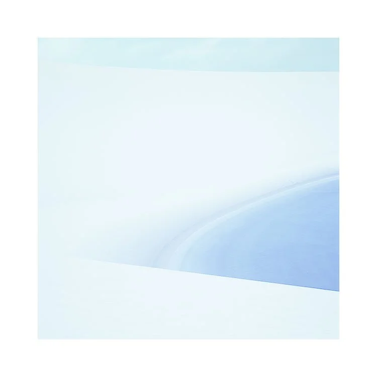
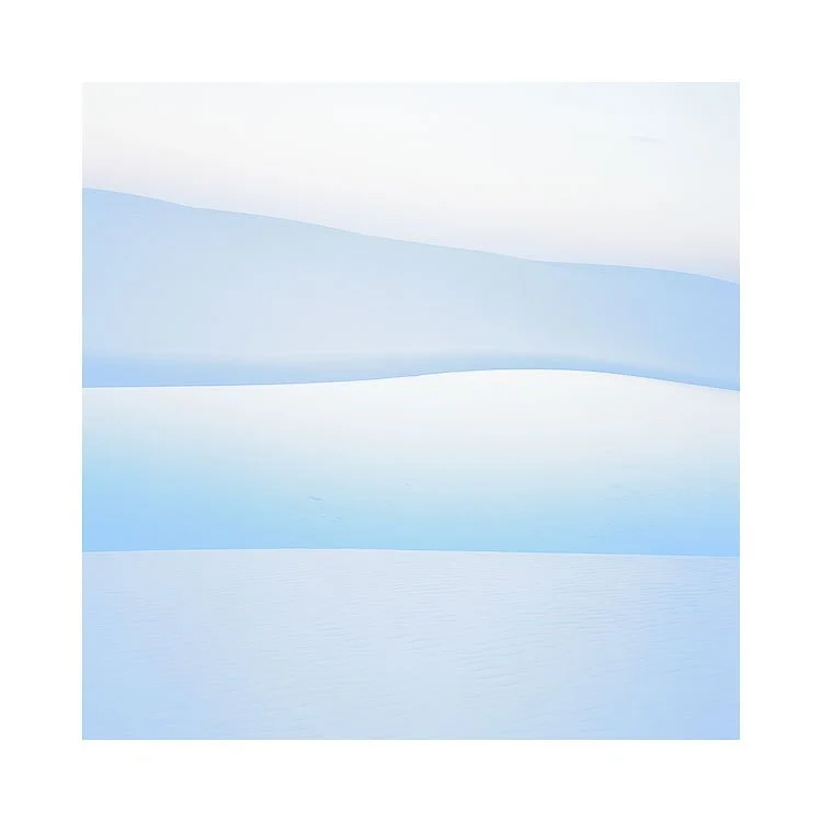
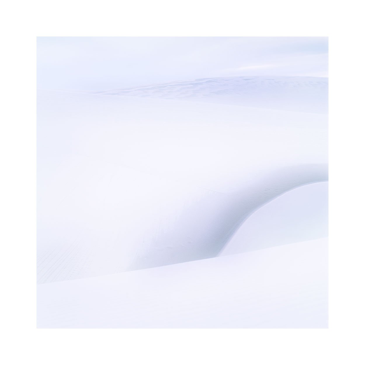
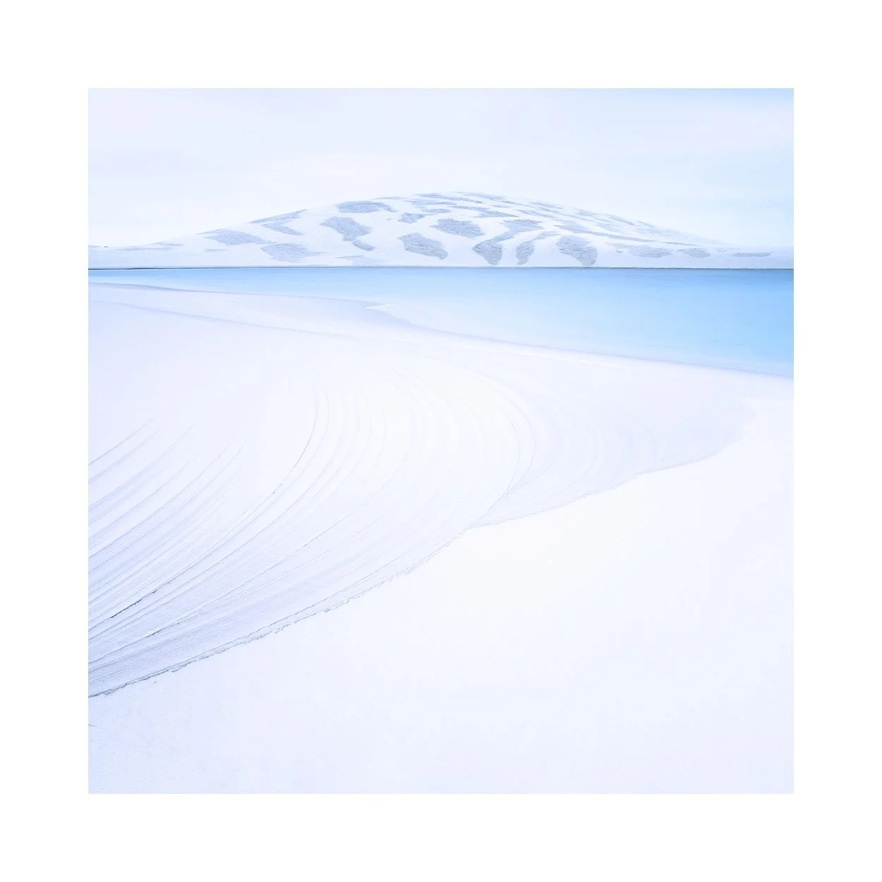
I’ve been photographing the isle of Harris since around 2007. So almost twenty years now, and I’ve never tired of it.

To me, it’s not really about subject matter - mountains or beaches whilst here. It’s about the quality of the light and how to play around with it in a more abstract manner. Rather than literal imagery, Harris invites you to work in a more abstract manner.

These images were made around two years ago. Over a two week period we had foggy conditions for the first week. The second week we had snow come in. Most unusual in Scotland now to get snow - except for higher elevations such as the top of mountains.

I’m always keen to see something new, or to experience a well known place in unusual conditions. This was not my regular Harris imagery and I would also say it’s not representative of what one would ordinarily see whilst there. I just enjoyed very much seeing the place in different conditions. And I discovered that sometimes, just sometimes, you have have too much fog, or too much snow :-)

Subject Studies

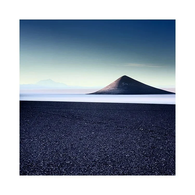
When I first found out about the Cono de Arita in Argentina, I knew I had to go there. The first image I saw of it was not remarkable - it had been made in the middle of the day and was front facing. It still looked unearthly, and was sufficiently different enough for me to know I had to visit the Puna de Atacama.

These images were made between 2015 and 2024. I don’t go back every year. The Puna trip is too niche to offer it every single year, so I have been back maybe around five times so far. Always enjoying visiting the region very much.

And often, coming home finding that out of all the subjects I photographed, the Cono de Arita always seems to dominate my editing and final portfolios.

To me, it’s a gravitating subject. Especially when I discovered that it was much more interesting to shoot it backlit. What now may appear to be a rather obvious way to shoot it, wasn’t the case before I made my silhouette photo that you see top right.

As I’ve returned, I seem to have developed the idea more, often focussing in on the Cono de Aritas shape. It is less subject and more ‘line and contrast’. Graphic shape, rather than volcano.

I will be returning to the Puna next year, so I’m wondering if I will shoot it differently, how the light will interact with it, and whether the images to come, will be a continuation of this theme?

I think it’s fine to have subjects that you gravitate towards, and keep returning to make new images of. We of course all know that a photo of a subject isn’t enough (don’t we?). We all know that landscape photography has so many variables to it - from composition, placement in the frame and the kind of light that one is working in. We could not repeat the shot exactly, even if we tried. So even if one feels that they have ‘already done it’, the truth is that we haven’t. There’s always another way the same subject can be interpreted, and that is what photography is all about.

Abstraction or Subject related? Which is it?

I've been coming to Iceland for a very very long time now, first visiting in 2004.

Around a decade ago I started to venture into the interior of the island with assistance from my guide and 4WD expert Haukur - @nature_explorer_iceland. He was the one who said to me  “Bruce, there is a part of the country that turns into black brush strokes on a white canvas”. As soon as he described it to me like that, I knew I had to go.

He was talking about the interior during the winter time. And we have ran adventure tours into the interior many times since 2016. Which is quite something because the roads can be two metres under the snow, and there is literally ‘nothing’ out there. No infrastructure, except for mountain cabins. Which we have stayed in. Very warm, cozy even, but no running water and you have to go out to collect snow in a pan to melt down.

When we have gone into the interior, it’s been really amazingly beautiful to see how minimal and empty it can get. The mountain cabins are also a nice environment for the group as we all ‘contribute’, help out, as no one wants to be ‘the guy who didn’t help out’ :-)

Anyway, these images were shot around 3 years ago now. There are several mountains in Iceland that I love, but perhaps none more than Þóristindur (Thoristindur).

I’m attracted to graphic elements more so in my imagery than actual ‘subjects’, but I guess this is maybe a graphic portfolio set, of a particular subject?

Re-Imaging your older work - noticing how far you've come

Sometimes the shoot goes well, but I struggle to edit the work to my satisfaction. In those moments, I often find myself asking the question: Is it simply that the work isn’t any good? Or it is more a case that I simply lack the skills at this present time to bring the images to a successful conclusion?

Knowing the difference between a bad idea, and a good one that has been poorly executed, is never easy to know at the time of the edit.  For if I lack the skill to execute it, then I may lack the ability to judge it correctly.

My original edits of these images of the Taj Mahal were just like that. Originally shot in 2009, the images lay dormant, filed away, because I had never been entirely happy with them. I couldn’t figure out at the time if the work was wanting, or whether I just lacked the skills to bring them to a successful outcome.

Looking back now, I could clearly see that the work held promise, but I had lacked the skills and experience to bring the images to a satisfactory conclusion. My use of contrasts and general tonality back in 2009 was rather rudimentary. To my inexperienced eye, I thought that by adding darker contrasts to the images, I would impart a sense of drama. Instead of drama, I got muddy images that lacked any focus.

I’ve learned over the intervening years that working in foggy conditions where definition is reduced, can be advantageous. Indeed, I often like to play with the edge of definition and deliberately lose it in my edits by pushing my images towards a more hi-key look. 

Foggy locations, seem to excel at being edited with this approach in mind.

As I reworked the images to give them the treatment I now felt was more appropriate, I found myself looking over my original edits as one might look over some historical documents.

I had a sense that I was being given an opportunity, to see who I was back in 2009, and to notice how far I have come in the intervening years. Where the original edits had been full of uncertainty, I was aware that my new edits were more immediate. They had a clarity of intention, that only confidence from working on similar imagery, over many years can bring.

It is my view that clarity of intention and good execution can only come through practice and experience. I had 17 years’ worth.

Yes, I was much happier with the new interpretations of the work. But what I got out of the exercise the most, was an understanding of just how far I had come in the intervening years.

Progress is often subtle, invisible even. We need the passage of time – often many years – to see that our progress has been more substantial than we first assumed.

Concrete, Fibreglass & Steel

Can we find beauty in industrial places? Places we would ordinarily pass over, because we tend to relate to them as purely functional in purpose.

Often, I’ve thought, that there is no room in our minds, for beauty or art, with such places.

Zeeland, like many other parts of the Netherland’s coastal polders and dikes is reclaimed land. Over the centuries engineers have heavily fortified, straightened, and dammed sections of the Dutch coastline.

I doubt that beauty was ever in the hearts of the engineers that reclaimed this land. And yet, beauty is what I found here. In concrete, fibreglass and steel.

Who would have thought, this landscape to be worthy of a photographic portfolio? Especially from someone who has spent most of his time photographing natural landscapes.

I would not have guessed that I would enjoy so much photographing a world built for function and purpose. A place that no one frequents.

I was intrigued that our world can have vast areas of land, dedicated to the design and function, of engineering structures that no one goes to, or lives in. Where catering for human presence, if done, was done almost with a grievance. If done at all.

A landscape that is stark and austere of human ornamentation.

And yet, I still found much beauty. Beauty in the austerity of the technical design. Tower and blade. Abrasive concrete. Fibreglass and steel.

-

Many thanks to my friend Frank Hoogeboom
www.frankhoogeboom.com for showing me around.

Lightroom Curves, Precision Tonal Adjustment

I’ve finally published my adaption of my Photoshop Curves e-Book for Lightroom users.

This book is a deep dive into Lightroom’s Curves tool. A hugely powerful tool for creative and surgical tonal control.

Please note that this is e-book is an adaption of my Photoshop Advanced Curves e-Book.

It teaches:

  • The theory behind curves (how tones are mapped and manipulated)

  • How to use curves for specific tonal regions (shadows, midtones, highlights)

  • Both simple adjustments (like contrast or brightness tweaks) and advanced techniques (like lifting shadows without affecting contrast)

  • Practical workflows using masking + curves together

  • Subtle but critical topics like:

    • Contrast vs saturation relationships

    • Avoiding highlight/shadow clipping

    • Precision control using the histogram and “adjust” tool

  • Real examples with before/after images + exact curve setups

  • Plus: included Lightroom catalog + video tutorials for hands-on learning

New Podcast Video

The summer time is my ‘time off’ from my intensive yearly workshop and tour schedule. To be able to recharge my batteries, it’s best I spend my time away from photography. But it is in my core. It is part of who I am.

I enjoy making these videos very much, as they allow me to crystallise my thoughts on what I do, and why I do it. But also, I am someone who creatively speaking, loves to work with sound as well as vision. My photographs are always concerned with creating atmospheres, and so too, are my little vignettes.

These are very time intensive to create. I have the utmost respect for folks who create high-quality documentary style video that is over 5 minutes. The level of detail and work required to do this is immense. I struggle to get a sentence out without falling over my own words….. So creating these short videos over the past while has been a humbling experience for me. Making high quality videos is a lot of effort. As the saying goes - ‘professionals make hard work look easy’.

One last thing: if you like these vignettes, I’d really appreciate it if you could let your friends know about them.