Drawing or constructing Gradients?

I got asked recently whether there was a way to use the gradient tool in Photoshop in the same way the gradient tool works in Lightroom. The observation was that with Light room, you are able to reposition the start and end points of the gradient by dragging them, whereas with Photoshop you cannot do this - instead you have to redraw the gradient until you finally get it right. Each time you redraw the gradient, you overwrite the last effort.

grad.jpg

It was a question I had not been asked before, but it led me to think about the pros and cons of using a gradient tool that allows precision re-adjustment (Lightroom) or one where you are forced to redraw it if the positioning isn’t right (Photoshop).

My preference is for the Photoshop way. I admit that since Photoshop’s way of drawing grads was the first way I learned, I may be biased because I’m simply used to working that way. But I think there is an important difference between the two methods.

Are you an Artist?

Painters in general don’t use precision tools to reposition their paint on the canvas. Indeed, I think that part of the artistic effort of painting is that you respond to how the brush strokes surface on the canvas as you brush. Painting is very much an emotional response between the hand and the eye. And indeed, I would suggest that sometimes painting a brush stroke a way that was not intended can be highly surprising and creative, leading you in directions you had not envisaged.

To me, that’s what the Photoshop gradient tool is like. You draw with it and wait to see what result it gives you. If you’re not happy, you re-draw until you get the right emotional response.

In my view, it’s about going with an emotional feeling and just applying the tool until it feels right. It’s more ‘creative flow’ than ‘analytical’.

Are you an architect?

Architects on the other hand, want to create work that is exacting. They need things to line up and the precision part of it is less ‘creative flow’ and more ‘analytical’.

That’s how Lightroom’s gradient tool is for me. It displays scaffolding around its start and end points so you can be precise and reposition the grad exactly where you want it to go.

But I feel that by staring at the scaffolding - the start and end points, you’re no longer looking at the photo. An analogy I’d put forward is that you’re so busy driving the car that you’re not seeing the scenery.

So for me, I’d much rather work with the Photoshop gradient tool. Because each time I draw with it, I don’t really know exactly what I’ll get with it, and that can lead me in directions and results that I had not imagined. I also think that the act of drawing is much akin to painting, and less about being an architect. It’s about emotional engagement more than precision engineering.

If I had a choice

I would have both modes of operation available:

  • Grads that you just draw with your hand

  • Grads that you can reposition.

The first is artistic and emotional. The second is analytical and maybe the process is that we start with the first, and then perfect with the 2nd.

I love mistakes in my work. I love not knowing where things are going exactly. That to me, is the definition of what art is. It is not about control, nor is it about perfection. It is about feeling and emotion, and each time I draw or paint with brushes and gradients I get an emotional response immediately. So I’d personally prefer to work with Photoshop’s Gradient tool, than a tool I have to set the start and end points. There’s too much ‘context switching’ from ‘creative flow’ to ‘analysis’ with the later whereas the former just keeps you in the ‘creative flow’ mode.
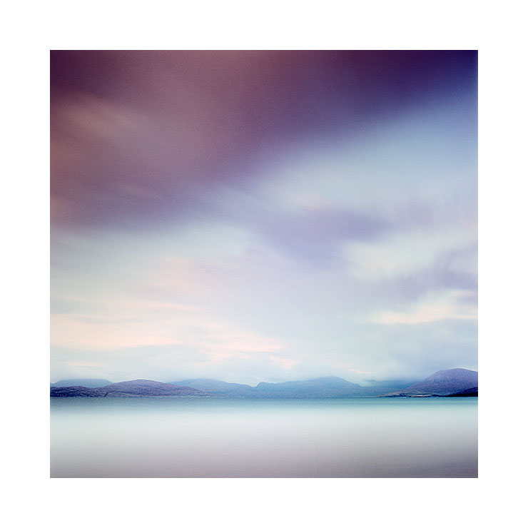
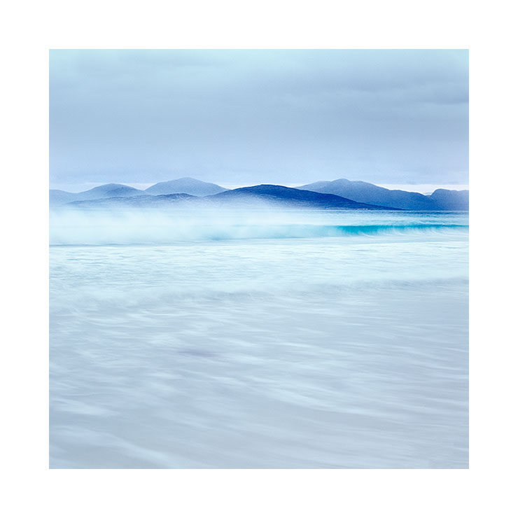
Printing's role as the final stage in image verification

Back in the days when I didn’t print, and asked a pro lab to do it for me, I always had a nagging feeling that I’d lost control of my baby.

I’m a self-confessed control freak when it comes to what I do. A few days ago I wrote a blog post about appetite because I think I know appetite well: whatever I get into, I never seem to get into it in half measures.

Screenshot+2019-03-17+at+09.53.56.jpg

Knowing this about me, you may be surprised to find out that at the beginning of my photographic journey, I often got my images printed by a lab. Indeed, I only started printing about 10 years ago.

For a long time I shied away from tackling what seemed like a formidable mountain because colour management was like a black art to me.

So I stayed away.

I’ve been extremely fortunate to have this blog. It has allowed me to meet people who have helped me and I put out a request about a decade ago for some help and suggestions about printing. Not one person left an entry on the blog, but instead chose to email me privately about it. The emails usually had this format to them:

“I don’t want to get flamed for my opinion, but this is how I do printing”.

It seemed that printing was a religion and to say you had a different way of doing it to someone else’s way was often contentious. A point of view is just that, and yet I am often surprised that we feel threatened when someone has a different view from ourselves.

Well, I welcomed the input but the message I got from the replies was this: everyone has their own way of working.

I doubt things have changed much in that regard over the past decade. There is still a lot of ways you can slice an onion, and there is always going to be a huge amount of fact vs personal preference.

So it’s now a decade further on, and I feel I know a thing or two about printing now. Indeed, I feel that everyone who loves photography should print. For one very simple reason: to validate your edits.

Even with a well calibrated and profiled computer monitor, I have learned that I cannot 100% trust it. I think it has something to do with how the eye interprets transmitted light compared to reflected light.

The fact is: I often notice areas that need further work when I study a printed version of an image. Stranger still, I often find that once I notice the error on the print, I can now see it on the monitor also. But the opposite is not true.

So printing is your last verification stage, and to paraphrase the wonderful Charlie Cramer :

“images that look good on a computer monitor aren’t guaranteed to look good in print,
but good prints are guaranteed to look good on a computer monitor”

Well, the issue for most who don’t print is: how to get started? It seems like such a black art. Yes, it is difficult to get started. There is so much contradictory advice out there. There is no one single way to do this correctly (even if I think my process is good).

I think this is why I’ve chosen to attempt to write an ebook about it. If I can reduce the information down to what you need, rather than getting too lost in the technology, then maybe I might be able to help you get a head start with this. I’ll see how it goes, but so far I’m feeling good about how much I’ve written. I think it’s coming together really well.

No sitting on the fence

I've made some headway with my new e-book and I hope to have it published in a month or two from now.

This is really part 2 of of my tonal adjustment series.

Part one ' Tonal Relationships' was 'software agnostic'; I deliberately left out any 'how to' in the text and focussed more on the 'why' because image editing is an interpretive process where understanding tones and relationships is more important than figuring out which slider to adjust. Indeed the technical is something anyone can master, but the artistic interpretive side is a life-long artistic endeavour tied in with improving one's own visual awareness. Being able to 'see' what is in the image is paramount in achieving the most from your edits.

But there does need to be some kind of technical instruction if one wants to push things as far as they can. In my forthcoming new e-Book 'Photoshop Curves', I now take a look at the technical: in particular, I take you through the most powerful tonal editing tool available: Photoshop Curves.

Forthcoming e-book about Photoshop's Curves tool. The Curves tool is, in my view, the most powerful tool for tonal adjustment available.

Forthcoming e-book about Photoshop's Curves tool. The Curves tool is, in my view, the most powerful tool for tonal adjustment available.

I know this will be highly contentious to many: but it is my view that Lightroom does not offer the fine degree of tonal adjustment / control required (at the time of writing) that Photoshop's Curve tool offers.

Lightroom is a good editing tool. It is intuitive and offers most of what we need. At present though, the tonal adjustment side of it isn't as powerful as it could be. I know many love Lightroom and feel it is all they need for photo editing, but to me, it's a bit like saying 'I'm happy with what I know, even though there may something out there that can offer a whole lot more'. If you're serious about improving your photographic editing, and thus upping your photographic style, you need to get to grips with Photoshop and in particular its curves tool. That is where all your future growth as an editor lies. Believe me.

But I realise that Photoshop isn't an easy program to learn. It isn't intuitive and this may be a reason why you will choose not to learn Photoshop. However, this point shouldn't stop you if you are faced with the knowledge of what it can provide you with in terms of tonal adjustment. There is nothing better out there.

Over the past few years that I've been running my Digital Darkroom workshop, many participants who start the course as Lightroom users often end the course wishing to defect from Lightroom to Photoshop once they have seen what I can do with the curves tool. Even with seasoned Photoshop users I still find room for improvement in their knowledge of curves and how to utilise it to really tune individual tones.

So with this in mind, I have decided to write specifically about curves. It really is the most powerful tool available to image editors.

I appreciate and anticipate that my point of view will be highly contentious to many, but since my blog is all about my point of view, that's what I'm giving you, after all, you didn't come here to hear me sit on the fence, now did you?   ;-)

Photoshop's Curve tool Primer

Input-output-graph.jpg

Photoshop's Curve tool is no mystery to me, and if you are a frequent user of Photoshop then it shouldn't be to you either. That being said, I have found over the time I have been running my Digital-Darkroom workshop that many participants have a very basic understanding of the tool. Indeed, due to the non-intuitive nature of Photoshop I find that most think that the Curve tool is a mysterious thing.

The Curve tool is really a tone re-plotting tool. You can transpose a range of tones to being another range of tones by way of an input/output graph. The X axis (highlighted in green) conveys what the tone is before the transposition while the Y axis (highlighted in red) conveys what the tone will become.

In the curve example here, you can see that the anchor point in the middle of the graph is transposing mid-tones to upper-mid tones. In fact, any tone that is of value 128 (black = 0, white = 256) will be transposed to an upper tone of 192.

The curve (as the name suggests) is non-linear: meaning that although I have transposed tones in the middle region, I have altered tones elsewhere but to a lesser degree. More specifically, tones near the anchor point in the middle of the graph are transposed the most, while tones towards the black and white points (far left, far right) are transposed the least. This is illustrated by the blue area underneath the curve: the diagonal line in the graph is the 'no-change' waterline and the further away the curve moves from it, the larger the tonal-transposition. Where the wedge is thickest we get the most alteration in tone, and where the wedge is the thinnest we get the least change in tone. But ultimately tones throughout the entire image are being altered.

The Curve tool is really quite simple. It's just that we expect it to be quite difficult because it looks complicated.

New e-Book announcement


I'm pleased to announce that today I have released a new e-book - part 1 in a 2 part series:

In this e-book, I aim to give you some thoughts with regards to tone, and its use in photographs to strengthen and weaken relationships between areas in the frame. 

In essence you will learn that subjects may be related to one another through tonal similarities. By ‘tuning’ the tones of one subject to be more similar to the tones of another subject, you can introduce, or strengthen an existing relationship further. 

By using the principles discussed in this ebook selectively during your editing sessions, you can reduce tonal distractions, help emphasise the right areas of the frame and aid in balancing the overall feel of your images. 

The book is split into the following sections:

Section 1 - Tonal Relationship Examples

By giving you some real-world examples of how Bruce chose to edit his work, you will gain a clearer insight into the power of tonal relationships.

Section 2 - Tonal Evaluation Techniques

These Techniques will aid you in developing your own visual awareness of tonal relationship. They also help you in finding areas of conflict in the image and also of correcting / adjusting tonal properties to the right degree.

This one has been a while in the making and  It could only come about because of the work I've done holding my twice-yearly Digital Darkroom workshop. I hope you enjoy it. 

Part 2 isn't far away :-)

Editing is an art, not a process

I think there is power in the written word. In fact, the decision to use one word or term over another can have profound implications for the way we think. I mention this, because for a long while now, I've really grown to dislike the term 'post-processing'. I'll explain why, but before I do, let's consider what the editing stage of a photograph actually involves.

From left to right: Left: Original Image © Dave BowmanMiddle: Dave Bowman's interpretationRight: Bruce Percy's interpretation

From left to right: 
Left: Original Image © Dave Bowman
Middle: Dave Bowman's interpretation
Right: Bruce Percy's interpretation

Firstly, I consider the editing stage as interpretive. Just as you chose which composition to shoot and therefore give the viewer a particular angle or story, so to does editing your image give you another level of conveying your story. Often I find that by darkening and brightening areas of the frame, I choose how the reader's eye should be led through the frame.

Secondly, I think of the editing stage very much as an art. I've been editing work now for more than 15 years and I still learn new ways to approach editing my work every week I work at it. So to me, not only is it an art, but as art forms go, it is a life long journey of discovery in visual awareness skills, interpretation skills and above all, developing one's own style.

So let's get down to why I dislike the phrase 'post-process'.

Dave Bowman's edit (higher resolution). Image © Dave Bowman

Dave Bowman's edit (higher resolution). Image © Dave Bowman

Firstly, it does not encourage one to think of this stage of creativity as anything but a process, rather than an art. As an extreme example of this, I've met one or two photographers who apply the same template or 'processing' to every image they have.

Secondly and perhaps most important to me, the word 'post' encourages us to separate the editing stage of our work from the image capture, and I have a real problem with that. You see, I often think that it's easy to consider image capture and editing as two very different things, when in fact they are highly related and often use the same skills: for example, when you crop in your editing application, you are re-composing, and when you compose out in the field you are in effect cropping the landscape. Similarly, when we edit our work, we consider how the tones and shapes in the frame interact with each other (if you’re not doing this, then you should be). The same should apply to when we are out in the field. I now find myself thinking more about shapes and tones while out in the field than I did years ago and I know this is because of what I've learned during my image editing time.

So although the first stage is done behind a camera and the second is done behind a computer screen, they both utilise the same awareness skills. Only problem is, I think many of us don’t see it that way and tend to approach each stage as if they are completely separate. They’re not.

Fieldwork to Digital Darkroom Workshop

This year I conducted my first Digital Darkroom workshop here in the north west of Scotland. I had specifically set this up to work on awareness skills while out in the field and while behind the computer. I made a point of saying that the course' purpose was not to teach the participants software programs such as Photoshop or Lightroom (although some techniques and tools are learned as a matter of getting to a result during the week), but more to help participants consider what is actually in the frame of the image and how to interpret it during image capture and editing stages and hopefully see the relationships between the two.

It was a very informative week for me, as this was a new area to teach in my workshop schedule. I feel I learned a lot, specifically when it came down to ‘how far does one go with the edit’. I feel there is no answer to this, other than ‘it’s a matter of taste’. Some participants I felt were far too light on their approach while others may have suffered from overworking the work. I often feel this is a balancing act that can only be corrected by leaving the work for a few days and looking at it again later. Distance gives objectivity, but with a lack of experience, we can still end up with images that either haven't gone far enough, or have gone too far.

One of my participants during the week is a very proficient photographer in his own right. Dave Bowman has been making images for over 30 years and is represented by galleries in the US, Canada and the UK. I found his skills as a photographer to be already highly developed. So much so, that I found it particularly hard to contribute anything to Dave’s work because he has such a developed sense of awareness and skill. But during an e-mail after the workshop, Dave said he might have learned a lot more about my approach if had edited one of his images from scratch, rather than contribute to what he had edited. I thought this was a great idea.

At the top of this post are three images. The first is the original image straight out of Dave’s camera. You can see that his sense of composition is well developed. The second image is Dave’s edit and the third and last image is my edit - done this week without any consultation or referencing Dave’s own edit.

Bruce's edit (higher resolution). Image © Dave Bowman

Bruce's edit (higher resolution). Image © Dave Bowman

There is never a definitive edit

Firstly, and even though I will say this, I’m sure it will be overlooked: this is not a test of which is better. That I feel, will always be highly subjective. But I include both edits here to show that ultimately, two photographers editing the same image can convey a different aesthetic / mood and style. Both images are successful in different ways and ultimately, both are highly personal interpretations.

When I spoke to Dave about my edit, he felt i'd move it along further than he would be comfortable with. Likewise, I felt his edit was far too subtle and that he hadn’t gone far enough. All this proves really, is that both Dave and I have different tastes and we are looking for different things.

I find that I always learn new things in looking at a different interpretation of the same work. And I also feel that being a good editor of one’s work is mostly about objectivity. If I am too close to it, then I find my ideas about the image are often out of sync with what is really there.

I’ve also found that if I try to edit the same picture from scratch on a different day, I always go somewhere new with it. Like a band that plays the same song, each rendition is different in some way and presents a different flavour. Which is why I think image interpretation is an art form. It's a life long journey into personal interpretation and self expression.


The editing stage

I never like to work on images piece meal. I'm much more interested in a collection of images that work together as a whole. For me, that means that when I edit images, I'm focus my attention on images shot during one shoot. For example, last week I edited work from the isle of Harris only, even though I have plenty of images from other places I could have worked on or switched between.

I think these four images work well together, and the truth is; maybe the originals didn't. But with a bit of editing work, I was able to bring them in-line with each other.

I think these four images work well together, and the truth is; maybe the originals didn't. But with a bit of editing work, I was able to bring them in-line with each other.

I prefer to stick to this approach because I find that I can immerse myself in the colours and tonal responses of one place and get to know and understand them, which I feel is vital if I'm going to get the best out of the work I've shot.

You see, I think the editing stage is really important, as I think it's possible to screw up good work simply by not understanding it. It's possible to murder a collection of good images by tackling it the wrong way.

So I prefer to work on images from the same shoot. It allows me to get into the atmospheres and embedded feelings that were there when I made the work and it also allows me to see and feel the emotional messages in the resulting film transparencies. After all, if you spend a week or two in the outer hebrides shooting beaches, you will get into a certain theme or frame of mind while there. So too, the editing stage should have the same approach.

But I also like to focus on the same collection of images for a few other reasons:

1. it often takes me a while to find the theme in the work. I can sometimes have some false starts by taking up the wrong approach to the work, and I've been known to stop and retreat back to square one because I feel where I'm going with the work isn't right. I may find the first few images I work on don't seem to gel. I find it takes a while to get the right 'groove' for the work i'm looking at, and that can only happen if I let myself relive the experiences - the sights, the smells, the atmospheres of the place. I also find that after a few days of working, I start to find a theme in the work that kind of dictates how the rest of the work should be edited, and more specifically, which images out of all the ones I've shot - I should select to be worked on.

2. Different places have different qualities of light. If I move from editing images shot in a place where the light is soft and the tones are bright, to working on images from a high contrast location where the tones are dark, I loose my rhythm. I can't context switch between the two and I lose focus. It's best to remain with one theme and one body of work until the edits are complete.

I think these four images work well together. It was only after a few days that I realised there were some darker images in the collection that worked well together and as often is the case: one successful edit seems to lead the way forward for how …

I think these four images work well together. It was only after a few days that I realised there were some darker images in the collection that worked well together and as often is the case: one successful edit seems to lead the way forward for how the remaining should be edited.

3. Tonal responses are important. I'm always thinking about how the tones between images relate, not just within the image, but within the collection. It's important to see parallels and work with those hints. Just slapping on some grad in the sky and cranking up the contrast for all your work will reduce the possibilities of what your work could be, or the new heights it could reach by a sloppy approach. By working on images from a location, you remember the qualities of the light, and how you thought it should be conveyed, but more importantly, you should be tapping into your understanding of the tones that are present in the final images and be leveraging it. 
There should be a lot of care and consideration taken during the editing stage, just as much as the care and consideration that was made at the time of capture. Both the shoot and the edit are interrelated and rely on the same skill sets.

I tend to take many days, if not weeks working on a new collection of images. The editing times per image are quite short (a few minutes) because I like to go with how I feel and respond to the edits I put in, and I'm aware that working on them for longer than that means I'll lose objectivity in the work. But as I go on and edit other work, I find I often return to the earlier work to 'tune it' in so that all the work sits well together. Some days I find some edits look good only to find the next day that I hadn't gone far enough, or had gone too far, so there's a reiterative process there where I return and keep tuning images until the entire collection sit well as a whole.

My final edit of my Harris shoot from last November.

My final edit of my Harris shoot from last November.

My first Digital Darkroom Workshop

I'm just home from leading my first ever "Fieldwork to Digital-Darkroom" workshop, which entails marrying what is done out in the field with the post-edit stage. My course is based on my e-book - 'The Digital Darkroom - Image Interpretation Techniques'

Still very much a work-in-progress e-book, but I feel I'm getting a better sense of what should be included now that I'm teaching digital-darkroom interpretation skills.

Still very much a work-in-progress e-book, but I feel I'm getting a better sense of what should be included now that I'm teaching digital-darkroom interpretation skills.

The course was run at Adrian Hollister's Open Studio environment in the north-west of Scotland. Adrian runs many workshops with such notables as Joe Cornish, David Ward, Eddie Euphramus and the wonderful Paul Wakefield. His studio has six iMac computers, all colour calibrated and it's on the door-step of some wonderful landscapes which are within a 30 minute drive. Perfect venue for running such a workshop.

I've been wanting to run a course like this for a very long time, because I feel that the editing stage is often considered as an almost secondary, isolated task, something that is unrelated to the capture stage. 

Adrian Hollister's Digital Darkroom Studio, Mellon Charles, Wester Ross, Scotland

Adrian Hollister's Digital Darkroom Studio, Mellon Charles, Wester Ross, Scotland

I firmly believe that the fieldwork and editing stages are interrelated. Our editing sessions teach us about things we didn't notice at the time of capture and they illustrate to us what we need to be more aware of in future - if we choose to make the connection! Similarly, once we know how far we can push and pull images in the digital-darkroom, we are in a more informed position whilst choosing certain subjects, contrasts and qualities of light. There is a symbiotic nature between the two, and so for me, the word 'post' as in 'post-process' discourages our thinking into believing both tasks are unrelated, when they are not.

In fact, I abhor the phrase 'post-process' because it makes the entire editing stage sound like a functional, emotionless act. Images become something you could just stick in a washing machine, turn a few dials and let it run on auto. Which isn't the case. Editing requires much awareness - of tonal relationships, of competing elements, of flow throughout the image.

And adjustments made in the digital-darkroom should be made whilst noticing how our emotional response is affected when we change tones and contrasts in the work. It is much to do about 'feel' as it is to do about technology.

So I made a point that this week's workshop would not be about teaching photoshop, or teaching Lightroom. Anyone can do that in their own time, and that kind of knowledge is easy to get. No, what I wanted to teach was how to interpret what you've captured - to see and take advantage of themes present within the composition, to notice tonal relationships between subjects within the frame, to see that each image has an underlying structure that almost spells out how it should be edited to bring these motifs further forward. 

The digital darkroom is a creative space, one where we can bring out the essence of the motifs we discover in the image. That's its primary function for me. I do not see this as a way for fixing bad images. A bad image is always a bad image. We have an expression here 'you can't polish a turd'. Instead, I see it as a way to bring out the beauty and essence that can, with a bit of interpretation, be found in a good image.

But interpretation is a skill, and like composition, has to be earned and improved over the lifespan of our involvement with photography. There is no manual for this, just an improved ability to read an image, to understand what is going on, and to know your toolkit (software) well enough to be able to bring forward your interpretation.

So I was curious to see how my group of participants would edit their work after five days of guidance and continuous feedback. I definitely saw improvements in most participants work. Certainly in the daily reviews I would notice that all of the participants had observations and awareness of what might be done to help remove distractions, or bring out themes within the work, but what I had not envisaged was that some of the group would be far too subtle with their edits and I think there are a few reasons for this.

Firstly, each one of us has our own aesthetic. We have our own tastes. Some photographers are more interested in the verbatim. What they see out in the landscape is what they want to capture, and so the edits will be done with a lot of sympathy for how they perceived their reality.

Secondly, some will under-edit because of a lack of objectivity. Ideally we need a few weeks between capture and edit. I always find that if trying to edit work straight away is hard because we're so often attached to an idea of what we wanted to convey and if the image is not successful in this regard, we may feel it is not a success. Leave it for a few weeks and you will come back to it with a fresh eye. If there are any motifs of themes within the image - you're more likely to work with those because you're more open to see other things where you were not at the point of capture.

Thirdly, I think under-editing happens through a lack of confidence. Too scared to adjust the image too much because the photographer feels they don't have enough skill to know what to do. But I also think it may be because they feel they may lose something in the process, and could be holding onto how the image looks now, and can't see beyond that to another destination.

It's this that interests me most and I must confess that I feel there is no clear answer. Editing is a skill that is derived from many years of self-improvement. If I look back at my own editing abilities, and consider images I shot 10 years ago, I can see that often I knew there was something missing in an image, but I couldn't put my finger on what it might be. I see tonal errors in them where at the time of edit, my abilities were so untuned I thought I saw beauty. Where I was perhaps overcome by the strong colours of my chosen film, I now see a clumsy edit.

Digital-darkroom skills take a lifetime of continuous self-improvement. We have to put the work in. But we also have to be smart about it. Simply cranking up contrasts or saturation across the board is a clumsy way to edit work, and it should be something that doesn't happen so much as it did when you began your editing career. But things only change if you take the time to consider and reflect on what might be the best way forward to edit your work, and self-awareness is something that has to be built upon over time.

I found my Digital-Darkroom workshop did help my participants. There were moments where I felt I had led my horses to water, only they were unable to drink, because if they can't see it themselves, then I can't force them to. Improving editing skills can't be rushed, but certainly a week in the field and behind a computer with a photographer you like the work of, may help bring about an improved sense of awareness, and that's what I believe happened this week.


The Evolution of a Contact Sheet

When I'm busy editing my work, as I have been for the past few weeks, I like to collate all the edited work together and periodically do a review of it, to see how the portfolio is shaping up as I add newly scanned and edited work.

Some images from Fjallabak and also the north east of Iceland, taken this summer and autumn. Images © Bruce Percy. Mamiya 7 camera, Fuji Velvia RVP 50 film.

Some images from Fjallabak and also the north east of Iceland, taken this summer and autumn. Images © Bruce Percy. Mamiya 7 camera, Fuji Velvia RVP 50 film.

This has many benefits as I see it:

1) I'm able to see how new images added to the portfolio contribute by either enhancing or sometimes weakening the overall character of the collection.

2)  I can spot themes in the work which might suggest a direction that the work and future edits should take.

3) It helps me see when some images don't work because of colour problems and also tonal inconsistencies with the other images in the collection

4) The creation of a portfolio is an evolutionary process. As images are added to it, it grows and its character becomes richer. Sometimes a new story is unfolded in the process and what I thought the portfolio was going to look like, is radically changed.

It's also immensely satisfying to watch how the portfolio evolves. Like the act of making the images in the first place, there is a deep satisfaction in watching the work reach full completion.

Some portfolios come together very easily and quickly. Sometimes it's clear that there is a theme to the work before I start to edit, and other times, it's really not obvious to me at all.

I find the scanning and editing in the digital darkroom to be a fluid and iterative process. I may feel that certain images are finished, only to find several days later that they need to be re-tuned to fit with the colour palette or tonal response that the other images are dictating.

In order to let the portfolio evolve, I've got to keep an open mind, and be willing to go back and review an image I previously thought was done.

Images © Bruce Percy. Mamiya 7 camera, Fuji Velvia RVP 50 film.

Images © Bruce Percy. Mamiya 7 camera, Fuji Velvia RVP 50 film.

Some artists say their work is never done, and I tend to agree with this. Images that we work on this week are really more a statement of who we were or how we were feeling at that moment in time. Edit the work months or years later and we may find we come up with a different interpretation.

But still, I don't like to look back too often. Although there is value in revisiting one's work from time to time I'm wary of falling into a hole that I can't get back out of: revisit your work, but don't endlessly rework it. That way lies an unhealthy obsession with perfectionism.

There is a lot of freedom to be gained by accepting that your older work is a statement of who you were at that time. Being able to let go of the past is healthy as it makes room for the future and in a sense, invites new work into your creative life.

The black deserts and volcanos of the central highlands of Iceland. Images © Bruce Percy. Mamiya 7 camera, Fuji Velvia RVP 50 film.

The black deserts and volcanos of the central highlands of Iceland. Images © Bruce Percy. Mamiya 7 camera, Fuji Velvia RVP 50 film.

These images are my new work, and as such, it's too soon for me to be objective about them. I'm going to need some distance and that means some time away from them.

All I can tell you is that the images didn't come easily to me. The central highlands of Iceland is a difficult, wild place. I'm always looking for a graphic element to any place I visit and in this instance it was often not so easy to find.  I think this says more about me and my own approach (read that as criticism of my own limitations).

To add to the complexity of the place, the light was not easy to work with. The deserts are black and often times it felt as though the sun was bleeding out of the corner of my eye. Contrast is a massive issue here. 

Yet I feel that this is exactly what is so compelling about the central highlands of Iceland. Some landscapes are beautiful because of their awkwardness. They are complex and challenging and they are captivating because of these qualities. 

A landscape like the central highlands of Iceland is a defiant one. It will not submit to you. Rather, you have to submit to it. 

I feel I have only just scratched the surface of this intriguing place.

What should we be asking?

A few days ago, I sent out my monthly newsletter. I got several replies back asking me to provide more technical data or technical workflow to my images. It was interesting to see these emails come through, as I've never had this kind of response before to my newsletter.


So I thought about why this might be. I came up with a few conclusions. One was that I had recently released a few e-books which are more technical than my usual offerings. One is about how to interpret images using Photoshop as your image editor of choice. The other e-book is more about how to look for clues in the structure of an image, as this will often guide the way forward in how you choose to edit your work. Both e-books attracted a lot of attention and there were a lot of sign up's to my newsletter.

So I wondered if the reason why I got emails asking me for more information on what ISO i'd used, exposure time and aperture, were maybe tied to the recent interest in my technical e-books.

I've been thinking about how much use it would be to provide ISO and exposure times for the readers of my newsletter. I believe  the answer is 'not much'. This of course is partly a reaction on my part to not wanting the technical side of  photography be the emphasis. I believe photography is first and foremost an emotional response to our surroundings. I see it as an emotional pursuit.

So I've been thinking about what I could possibly offer in the way of information about the images contained in my newsletters, that might aid in helping others gain better understanding. What I think we should be asking when we want to know more about a photograph, is 'what motivated you to make this image?', 'what did you latch onto?'. Was it the subject matter? or was it the speed of the clouds racing over the landscape? Was it perhaps the quality of the light in that particular area of the scene? We should be asking about the photographer's motivation.

I do feel that when others ask for technical info, they're really trying to get underneath the construction of the image. They wish to know how it came about, and an emotional language is often at a loss to do that. For example, me telling you that I thought the light was very soft and beautiful, and that I felt there were elegant curves and shapes in the scene drew me to that particular are of the scene - doesn't translate well. On the other side of the coin, being able to talk in a language that we all understand - such as 'I used a 30 second exposure and f22' certainly provides clarity and fact to an image (if I could remember the technical details - which I don't because I use film, so meta data isn't recorded). But it's missing the mark entirely.

I think language about emotions can be too broad, too intangible at best when describing the creative process. That is why I think people ask for technical data. It is at least a common language that we all understand. It is factual, and although on the surface it may appear to give answers to our questions, the real questions are often still left unsaid and as a result, unanswered.