Now Taking Advanced Orders

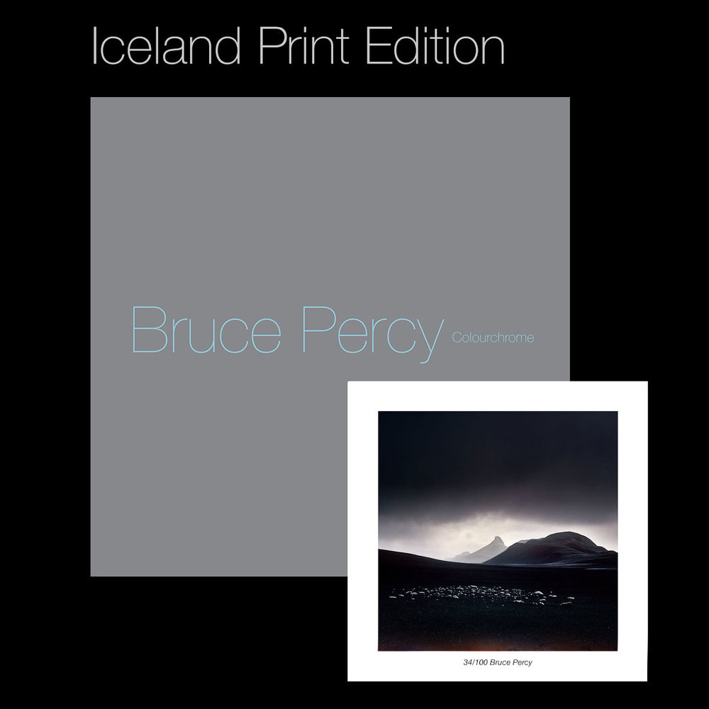
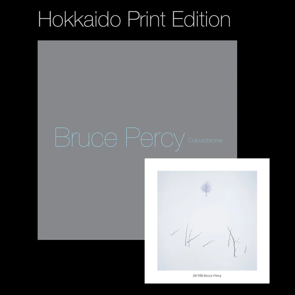
On Friday night I announced the publication of my 3rd book, which is limited to 300 copies only. Since then, we have sold over a half of the copies. Which is terrific to see and I can only say a big THANK YOU to you if you have supported me and my art.

I love publishing books, and I love putting them together with my friend Darren Ciolli-Leach. Darren is really great to work with. A great designer is capable of listening to what you want, but also of telling you what will and won't work. Putting together a good design takes skill and experience and that's just what Darren brings to the design table for me. So THANK YOU Darren !

I'm hoping to publish more books in this kind of format. I can envisage one strictly about Hokkaido and another about Bolivia.... time will tell. But it's good to have projects to work on and to see where they will take me.

Anyway, if you're wanting to find out more about the book, or perhaps order a copy, here is the blurb for you. It also comes with the choice of three limited edition prints :-)

Book Proofs

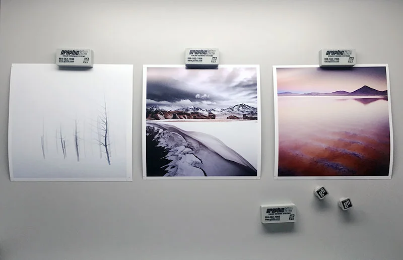
Today I received three proofs for the book I'm publishing this summer.

Here are the three proofs displayed inside my viewing booth in my home studio. More about the book very soon!

Upcoming

Just a short heads up that I am publishing a new book this August. Keep an eye out for an announcement for a special edition. This book is limited to 200 standard copies and 100 special edition copies. More soon.

Colourchrome Monograph

90 pages, 25.4cm x 25.4cm
Published by Half-Light Press August 2017

Delving deeper

It's good to get to know a landscape. Well.

Cono de Arita, Puna de Atacama, April 2017
Image taken by my guide on his Samsung phone. My films won't be ready until the very end of May !

I've been back in the Puna de Atacama region of Argentina this past week making some new photographs. My first visit here was two years ago. It was only a fleeting six day visit to the area where I felt I was often in the wrong place at sunrise and sunset. Despite being pleased with my first efforts, the experience left me feeling I had only scraped the surface of this amazing place. So many locations were wonderful but I was often there during the middle of the day when the light wasn't good. This is often the way with visits to new places: the first visit is more about finding out what it is I want to photograph and the second visit is about photographing it!

I like to get to know a place well, and repeated visits are the only way to do that. I see photographing a place like a continual learning experience where I hopefully grow in terms of my understanding of the place, as well as in my photography.

Logistics are often the biggest obstacle in getting to photograph a place well. With the Puna de Atacama, the region is vast. So vast in fact that my first visit left me feeling frustrated because in the space of a mile or so, there would be so many locations that would be suitable for the brief 20 minutes of beautiful light at either side of the day. With only 20 minutes to play with before the light would be bleached out at sunrise, and only 20 minutes to play with before the light was gone in the evening, it made choosing locations very tough indeed.

On location in the Puna de Atacama desert, Argentina, April 2017

So this visit was more about finding those special locations, areas where I wouldn't have to move so much to capture different aspects of the landscape before the 20 minutes of beautiful light was gone. That meant a lot of day-time scouting and many hills were climbed to find vantage points where I would have better luck when the light was good.

Spot-metering the desert in Argentina, April 2017

Location scouting seems to be a trial of errors. Working out where the sun is going to be and how it might react with the landscape can be done to some degree with Stephen Trainor's wonderful TPE application, but there still needs to be a lot of walking and climbing done to find those beautiful compositions where shapes in the landscape form the symmetry and balance I'm seeking.

Indeed, standing still in one location that is (hopefully) the best spot I can find, sometimes reaps dividends. With the Cono de Arita (the volcano shot at the top of this post (made by my guide on his Samsung phone), it was a learning experience to see how the shadows of the surrounding mountains interplayed with the salt flat and the silhouette of the cone as the sun dropped behind the horizon.

I believe it is only by spending time, and observing how the light interplays with the landscape that I can truly learn to be a better photographer. To obtain the images I want, I need to put the effort in, and that often means re-visiting a landscape many times over. Indeed, any landscape that I fall in love with will often become a regular part of my yearly photography because it has the capacity to teach me so much.

Working out exposure for transparency film

 I was asked if I'd write a blog entry about how I work out my exposures. Bear in mind this is just my own take on it, and although it works for me, there are many other ways of doing this. So I'm not suggesting this is the only way, or the correct way, but it works for me. Also, before I begin, please know that I am 100% a film shooter. This is how I work out my exposures for Fuji Velvia film only (it's the only transparency film stock I use).

Velvia 50 transparences on my light table.

Velvia 50 transparences on my light table.

So here goes. Before I discuss exposures, let's do a bit of ground work and cover some basics. Here we go:

  • When you add 1 stop of exposure, you double the amount of light hitting the sensor / film.
  • When you subtract 1 stop of exposure, you half the amount of light hitting the sensor / film.
  • Therefore, exposure is a case of doubling or halving values.
  • Ansel Adams had the zone system (10 zones) which mapped to 10 stops.
  • With Velvia transparency film, the latitude of the film is only maybe around 3 to 5 stops. In those 3 or 5 stops you get 10 zones. So the way I work it out, is I assume that Velvia has a latitude of 3 stops, and that means I roughly allocate three zones of Ansel's system to one stop. I've never found that adding +3 stops to make snow white has every worked for me. It's always a case of adding +1 stop only.

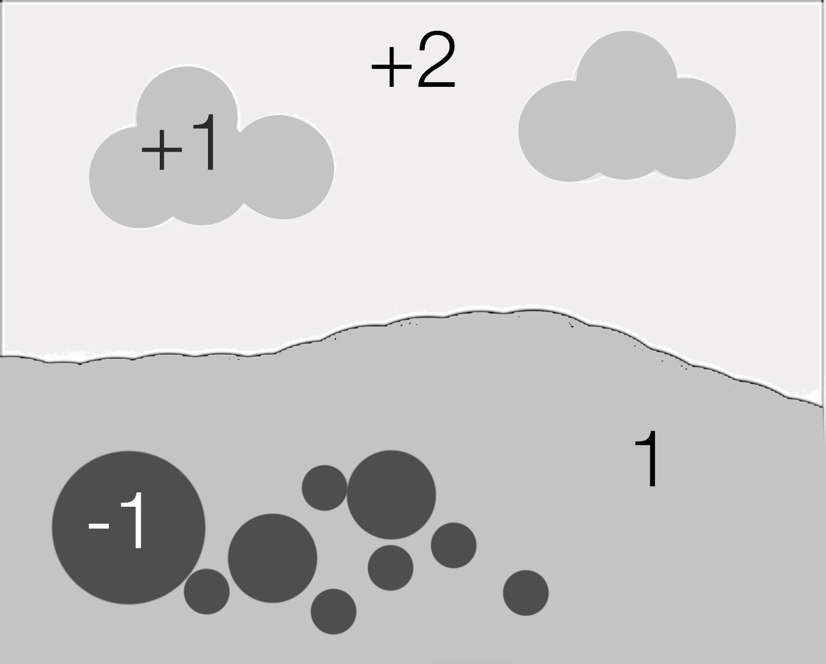
I've constructed a simplified diagram below of a landscape. In it, we have the ground (I've chosen to use this as my  exposure point (18% mid grey) and therefore it has zero stop difference. Everything else in the diagram has it's difference in stops detailed - in comparison to the ground. In effect, the ground is our 'reference' point for everything else in the scene. This is pretty much what I do most of the time - assume my ground wants to be exposed at 18% grey, and work out where everything else is in relation to that, and also how much grad I will require to ensure the sky does not blow out.

About metering - 18% Grey

With metering, you should also know that the reading you get, is what it takes to make whatever you measured mid-grey (18%). Meter a white door and the reading you get is what it will take to turn that white door mid-grey. Meter a black door, and the meter will tell you what it takes to turn that black door mid-grey. So whatever you point the meter at - it's telling what exposure you need to turn the subject mid-grey, and you need to apply a degree of compensation to it to make it turn out how you think it looks.

For example, if I want a white door to be white, I will apply +1 stop exposure compensation (with Velvia, that's sort of like zone 8 in Ansel's terms). To turn the black door black, I will need to underexpose by -1 stop (turning zone 5 into zone 2).

Spot Metering a Scene

In the following illustration, I've broken down a scene into it's exposure components by stops.

Scene as is, before doing anything.

Scene as is, before doing anything.

In it, I have:

Ground, used to set the exposure so there is zero stops difference here.
Sky +3 stops brighter than the ground
Clouds +2 stops brighter then the ground
Black rocks -2 stops darker than the ground.

Grading the Sky to similar luminance as ground

I've worked out that I want the clouds to appear the same tone as the ground, so I'm going to grad the whole sky by -2 stops, therefore reducing the clouds to the same luminance as the ground, and also reducing everything in the sky by 2:

After applying a 2-stop grad

After applying a 2-stop grad

In the above diagram I have graded the sky by 2 stops. The white areas of the sky are still at +1 compared to the ground and that is fine with me, as I know Velvia can handle this. 

Where to set the mid-tone?

But what you should be asking yourself is whether setting the exposure for the scene on the ground values is correct. Depending on the luminance of the ground, I may wish to apply some exposure compensation to render the ground the way I perceive it.

Bear in mind that when taking a reading, you are asking the meter to tell you what exposure setting to use to turn the subject 18% grey. I've found that the following ground conditions require different amounts of compensation:

  • Sand (+1 exposure compensation)

Although it looks grey in colour or may appear mid-grey, Sand is actually brighter than 18% grey so if I meter sand and want it to come out the way I see it, I have to apply +1 stop exposure compensation.

  • Grass ( 0 exposure compensation)

Grass is 18% grey, so metering it gives me the correct value to render it the way I see it.

  • Stones (+1 exposure compensation to -1 exposure compensation)

Stones vary in luminance. Black stones need to be rendered at -1 exposure compensation while most 'mid-grey' stones require +1. We tend to perceive brighter objects as less bright. So a stone that is brighter than 18% grey is often perceived as 18% mid grey when it's not.

So to set the exposure on my scene, I really need to consider the luminance values of the ground, and I will often use grass as a correct reference point, but if there isn't any available, I know that sand will require +1 exposure compensation.

Applying +1 exposure compensation. Everything is transposed +1 stop

Applying +1 exposure compensation. Everything is transposed +1 stop

In the above diagram I've applied +1 exposure compensation, which means the entire scene has been brightened. This means that the ground is +1 over 18% grey, and the black rocks in the foreground are now -1 stop below 18% grey. The sky is +2 stops over mid-grey which is fine as i know Velvia has enough latitude to record this.

Re-balancing the scene - applying different graduation

However, I'm now thinking that since I have:

  1. Applied a 2 stop grad
  2. Applied +1 exposure compensation

The grad is not as effective as I would like it to be. Pushing the exposure +1 has reduced the strength of the grad from 2 stops to 1, from where we started. So I'm going to take out the 2 stop grad and replace it with a 3 stop grad:

Replacing the 2 stop grad for a 3 stop grad.

Replacing the 2 stop grad for a 3 stop grad.

So I've left the ground exposure untouched. It is still at +1 exposure compensation, but i have brought the luminance of the sky down by a further stop so it is now -3 from its original position. But bear in mind although it is graded 3 stops, I have applied exposure compensation to the entire scene of +1 which means the grad is only really reducing by 2 stops (-3 stops +1  = -2 stops).

Before and After

So let's now compare what we started with, and where we needed up. In the two diagrams below, I do just that:

Initial scene with exposure set to the ground.

Initial scene with exposure set to the ground.

Final exposure with 3 stop grad applied and +1 exposure compensation applied to whole scene.

Final exposure with 3 stop grad applied and +1 exposure compensation applied to whole scene.

A word about histograms and exposure

Before we begin to look at the difference between the initial exposure and the final one, we must first consider how the human eye sees tones.

In a nutshell: we perceive every tone out there as a mid tone. To test this out, if you point your camera at the ground so it fils the entire area of the image and take a shot, the ground should look correctly exposed. The histogram will show you an exposure right in the middle, which suggests we perceive the ground as an 18% tone. Now do the same for the sky - point the camera completely up into the sky and take a picture. It too will look correct even though the histogram is in the middle and the sky is now 18% grey.

We perceive everything more or less as sitting in the middle of the tonal range. In fact, human vision is incapable of seeing true luminosity and we tend to compress the higher tones so we see the same thing.

When I am making exposures, I am attempting to move the ground towards the mid-tones of the histogram and I am trying to move the sky towards the mid-tones of the histogram too.

This is very important and I would read this again:

"When I am making exposures, I am attempting to move the ground towards the mid-tones of the histogram and I am trying to move the sky towards the mid-tones of the histogram too."

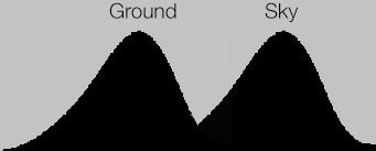
If we look at the scene after I've applied my 3 stop grad and added +1 exposure compensation, this is exactly what I've done: I've lifted the tones in the ground by +1 stop and reduced the sky tones by -2 stops. This can be seen in the following histograms:

Original exposure with no grad or exposure compensation applied. Ground is underexposed, Sky is overexposed.

Original exposure with no grad or exposure compensation applied. Ground is underexposed, Sky is overexposed.

After applying a 3 stop grad and adding +1 exposure compensation, I've brought the ground and sky tones towards the middle.

After applying a 3 stop grad and adding +1 exposure compensation, I've brought the ground and sky tones towards the middle.

The histogram on the right is what we should be aiming for. This is for a few reasons:

1) The ground has been moved towards the mid tones
2) The sky has been moved towards the mid tones
3) The scene is now 'balanced' and looks like what we see with our own eyes

But also, here are a few important things to consider that you get with your histogram on the right, which you lose with the histogram on the left:

1) You open up the shadow detail. There's more tonal information in the shadows
2) You open up the highlight detail. There's more room for the brighter tones to stretch out across the histogram.

When you don't do this, and end up with a histogram as you see on the left (I call it a double humper), you get the following problems:

1) You lose shadow detail because all your lower tones are squashed into the bottom left of the histogram and quantisation occurs - many tones become compressed into one single tone. You lose tonal detail and no amount of correction later on is going to recover that for you.
2) You lose highlight detail because all your higher tones are squashed into the top right side of the histogram.
3) You have to do more drastic editing when you return home and scan the films.

So when someone says 'I've got it all in the histogram', this may be OK for digital capture (well, it's not really), but for film it's not ideal at all. You still go home with an underexposed ground and an overexposed sky. Trying to recover shadow detail in film is a nightmare (and almost impossible with transparency film) and likewise turning down the overexposed sky brings out funky crossover effects and often I find the grain in the film becomes very evident due to drastic curves adjustments.

You need to balance the exposure in-camera. Even if you are a digital shooter this is still what you have to do and I don't subscribe to the idea that digital cameras have 12 stops of dynamic range so grads aren't required. They are still required for all the  reasons pointed out above.

To finish up

Working out exposures in the field for film using a spot meter may sound complicated, but it really isn't. It's just a case of practicing.

I love spot metering my scenes. I also love not seeing what I'm getting. Using film means I have to construct the image in my mind's eye. What I like about this approach, is that it has taught me to really think about what tones are present in the scene. Through practice, I now know that black rocks are hard to record, and that I really need to lift the tones in the ground up towards the mid-tone or above it, and reduce the sky down towards the mid. This is not simply because the dynamic range of my film is limited (it's is a concern, but not the main reason). The reason is that in order for the scene to be truly balanced the way my eye sees it, I need to move everything towards the middle of the histogram. That means reducing dynamic range and shifting the ground to the right and the sky to the left.

The simplified version

Ok, that was quite long, and perhaps quite difficult to take in. So here's a simplified version:

  1. Meter the foreground and then meter the sky and work out how many stops difference there is and apply a grad for those number of stops.
  2. If the foreground is brighter than 18% grey, apply +1 exposure compensation

Or....

  1. Work out the difference in stops between ground and sky and apply a grad for the difference.
  2. Make  two exposures. One with no exposure compensation and a second one with +1 exposure compensation applied.
  3. Go home and study the films.

Symmetry

This is beautiful. Right to the very end, it just gets better and better. It's what all art should do.

The Validity of a deliberate construction

What is the purpose of landscape  photography? Is it the act of capturing the natural world? Or is it the act of creating art? Is it perhaps both?

I think that many of us come to landscape photography through an appreciation for the outdoors and the quality of the light we enjoy. Photography seems to be a natural progression to want to be able to capture what we saw and felt.

Some of us, like myself,  come to photography through art. As a young kid, I was always drawing and painting, and when I was around eight years old, I was dabbling with charcoal pencils and paper and oil paints that my aunt Helen would send me (she married a famous painter). So for me, the art world had been part of my creative outlet from an early age and when I came to photography, it was through a love of the beautiful art that Ansel Adams created.  In his pictures I saw the same application to composition as I had studied while drawing still life's and painting pictures. Photography was a new way of painting pictures. I was drawn to the interpretive side of it from the beginning.

(Close) Christmas tree, Biei, Hokkaido, January 2017Image © Bruce Percy 2017

(Close) Christmas tree, Biei, Hokkaido, January 2017
Image © Bruce Percy 2017

Even though many of us come to landscape photography through an appreciation for nature, I believe there is still space in our lives for the manufactured landscape.

Although I do love nature, and think that there is so much beauty in nature's 'randomness', I do however think that manufactured landscapes can also possess beauty. even though they are deliberate (read contrived) constructions.

In the case of my two photographs shown in today's post, there is very little about this scene that is natural.  The tree has been carefully planted in a farmers field. It has been manicured to be a precise shape. I think why this location works is because of its contrived-ness rather than in spite of it.  There is symmetry present, and I would go as far as to suggest that somehow, we all picture Christmas tree's as having perfectly symmetrical shapes. I think we would also like to believe that out there somewhere is the perfect Christmas tree, sitting in its own space. Well, now you know it exists: this place is indeed called the Christmas tree of Biei, Hokkaido.

But there is still one more aspect to this scene which makes it appealing. Despite it being a manufactured landscape, there is still a degree of nature at play here: the properties of light are at play here and the atmosphere of the location is wonderful as a result. It was an overcast morning with very very soft light. While I was there, I could not discern any difference between the ground and the sky as both were full of snow. With such soft wonderful light, the tree cast a diffused shadow on the ground. It was as if I was being shown the basic properties of shadow and light.

And so, I can't help but think that the reason why I love images like these, is because they are an interesting mix of the manufactured and the natural. They blur boundaries and make me look again. To the viewer who knows nothing about this location, it could simply be a rare occasion where nature has produced something so aesthetically pleasing, and I think the uncertainty of how natural a scene this is, intrigues us.

Isn't there space in our lives for images where the landscape has been constructed?

I think so.

 In fact, I think that if an image is compelling in some way, perhaps because it is at odds with nature, then that can be a good thing.

( Distant ) Christmas tree, Biei, Hokkaido, January 2017Image © Bruce Percy 2017

( Distant ) Christmas tree, Biei, Hokkaido, January 2017
Image © Bruce Percy 2017

This week is "write a new book" week

How do you write about 40 images that have been shot over the past eight or so years? How does one begin such a task, and should there be a theme to it (yes, of course!). 

Book No.3

Book No.3

Eight years is quite a while. For most photographers it can see the evolution of a style, or maybe just the amassing of images made to mark one's life. But what if you are doing this full time? What if you saw your own style of imagery change over so many years, fuelled on by teaching others?

I know for sure that my own style of photography has moved on a lot in the past few years particularly, and I am very aware that teaching and guiding participants in the landscape has forced me to think more about what I do and answer questions I thought I knew, only I really didn't.

I do know one thing: if I had not left IT back in 2008 to do this for a vocation, my photography wouldn't be what it is today. I feel that being a workshop teacher and tour leader has really propelled me forward in what I do.

More about this book in the coming months.

Workshop Practices: reviewing previous work vs reviewing current work

Before I begin this post today, I wish to make a distinction between workshops and tours. For me, workshops are teaching environments where the primary focus is on giving feedback and teaching people. Making great photos is of secondary importance.

Tours are on the other hand, all about getting participants to great locations, and less about teaching. Although you may learn on tours, this is not the primary objective. They are about getting you round a landscape and taking you to the best places for the best light.

I make this diasctintion, because I feel that many 'tours' masquerade as 'workshops', when  in fact they are tours.

How much work was put into these images? What limitations and obstacles did I encounter? How much post editing was done, and why did I choose to do what I did? All these questions are very hard to ask a participant on a workshop when they show me wo…

How much work was put into these images? What limitations and obstacles did I encounter? How much post editing was done, and why did I choose to do what I did? All these questions are very hard to ask a participant on a workshop when they show me work created elsewhere, at a different moment in time.

Today I was asked by a participant if they should bring along copies of their previous work for review during one of my mentoring workshops here in Scotland.

Over the years that I have been teaching in a mentoring situation, I've found very little merit in looking over what someone did before spending time with me.  Instead, what I find more valuable is to spend time with the participants on the workshop. I'm able to  get a clearer picture of where they are technically and artistically, and more importantly who they are.

I would like to go into in detail today on this post for my reasons why I feel reviews of past work aren't of much value.  I know this may go against the grain for some of you -  particularly with USA clients as I hear bringing along portfolios for review is a common component of many workshops in the states. But if you can bear with me, I'd like to spell out my views on the value of critiquing work created *during* a workshop, rather than relying on work created elsewhere.

In general, I don't find looking over past work to have much value for the following reasons:

There is no audit trail

When I mean 'no audit trail', I mean that it is very hard to get an understanding of what limitations and conditions the images were made under. Why did the participant choose a certain composition and what obstacles did they encounter at the time? If something clashes in the landscape, I do not know if this was noticed at the time of capture but was chosen because it was the only way to make the shot, or if it was chosen because the participant did not notice the error at the time of capture. 

Further to this, in the case of edited (post-processed) work, it is doubly difficult to give advice because the original unedited raw material is not available for comparison.  It's important to see the journey the image made from capture to final edit and if the unedited work is available  I can see what choices were made, or how different the final edit is from the original capture. But this is rarely provided.

Also...

Past images show no indication of current abilities

Indeed, it is often hard when looking at the finished work to get a sense of what the participants abilities were at the time of capture, and more importantly, where they are presently. It is not uncommon for me to be shown images that were made a year or several years previously.

It is however, possible for me to draw up a rudimentary idea of the participants current ability. But only to a point. It is very easy to see if the work is accomplished, but other than that, I am left with a lot of unanswered questions, such as:

1) Was the participant shown the composition or did they choose it themselves?

2) Did they understand the value of the quality of light they shot in, or again, were they shown it?

3) Are these images the best they've made over the past few years? and do they truly represent their current ability? What a participant may think of as important work to show me may not be. I am often surprised to find out that participants have shown me work I have very little to contribute towards, only to find out later there was other work they did not show me which may have provided more value as a critique session.

4) Have these images been reviewed and edited several times before by other workshop leaders? Is what I am seeing now, an amalgamation of other people's ideas? or is this an accurate view of the participants own ideas?

I really have no idea.

So I believe that looking at previous work is of little value. I don't know what choices were made and why they were made. Which leads me on to my next point;

I was not there, I do not know the limitations the participant was under

Giving composition advice of 'if you stood two feel to the left', is invalid because I wasn't there. There may have been a pool of alligators to the left, or something distracting that the participant managed to remove. I do not understand what limitations were placed upon the participant at the time of capture. 

Which is vital to know, as I can gauge what they did and why they did it if I had been there to observe. And observing is a key ingredient of a good workshop leader.

Workshop leaders should be observers

My own view of my job is this:

1) To be able to watch and study my participants and notice how they approach their work

2) To understand how they react to failure

3) To understand how open they are to working with what they are given

4) to understand what their current level of ability is

Point 4 is perhaps the most important because I've had many people downrate themselves only for me to find out they are more competent than they let on. They have talents beyond the scope of any work they may show me from previous outings. On the more negative side, I've had some people talk up what they do and before they begin I'm given a very false idea that they are more accomplished than they turn out to be.

Ultimately, reviews really require an understanding of what motivated the participant, and this can only be drawn upon if I spend time with them in the landscape. Because during this time, I'm able to observe them and notice habits, limitations and aspects of their character that either lend or detract from them making great images.

The value of critiquing present work

Which leads me to why I think turning up at a workshop with a 'clean slate', and getting critiqued on the images you shoot during the workshop is of much better value:

The audit trail exists!

I get to see first-hand what you shot. I get to see the raw data on your memory card. I get a really good picture of what your level of ability is. All this is possible by looking at the images you shoot each day.

Images shot during the workshop show current abilities

I also get to see the most up-to-date impression of your current ability.

I'm able to observe participants and work with them on location

Being there allows me to walk through the process of setting up a shot with the participants, or by stepping in at the last point to see what it is they've set up and to give guidance on what I think can be improved or to point out problems or distractions that they may not have been aware of.

But most importantly, being on location with participants allows me to get more of a direct hands-on feel for what motivates them, and to discuss potential problems at the point of capture, rather than afterwards during the critique sessions when it may be too late.

I was there and I knew the limitations participants were under

Which is kind of similar to the previous point. Simply being there and understanding the weather conditions and physical limitations of a landscape can help me get a better understanding of what was driving the participant to make the images they made.

And lastly.....

I know the person behind the camera

This is perhaps the most important aspect of on-site critiques of current work: during the week I get to know the person behind the camera.

I am able to see how they approach failure, understand their process or notice their good/bad habits. I also get a really good understanding of how much they actually 'see' and what their visual awareness ability is like . Being able to notice these kinds of things about my participants is a skill I believe that all workshop teachers should have.

Being a workshop leader is really about tuning into what each participant is trying to do. There's a fair degree of anticipation involved in trying to work out what each participant is doing and understanding their limitations. It's also about encouraging the participant and trying to be as objective about their work while remaining encouraging.

This can only happen if I am on-site with them, as I get to see them working in the field. It does not happen by reviewing images that were created elsewhere, under circumstances that I am not aware of, or motivations that are now long forgotten or past.

Looking for nuggets

I'm just home from a month away in Norway and just before I left, I had editing my recent Hokkaido work. I only had two days to do the edits before I left for Norway and I knew I had only picked off the obvious contenders for a portfolio before I left.

Now tha I'm back, I have some free time for a few weeks, to review the edits I made, and also to see what I left behind in the pile of over 50 rolls of film I shot whilst in Hokkaido.

It's always interesting revisiting my edits after some time away, and I've noticed some slight luminosity issues in the final work which I have now corrected (but can *you* spot them? Perhaps not, as I think this is the kind of issue that is only apparent to the owner of the work, as perhaps we are often more critical of our work than others would be). 

Lake Kussharo

Lake Kussharo

Looking at some of the remaining transparencies today, it's stuck me that I left a lot of nice images unedited.

Indeed, I often feel that the edit stage should be in iterative process. Just because I have gone through the films a few times during the few days that I concentrated my time on the edit, leaving the work for a further week or so and then coming back to the original images and looking again can yield more images that are worthy of inclusion in my portfolio.

A recently found nugget in my pile of 50 rolls of Velvia.

A recently found nugget in my pile of 50 rolls of Velvia.

I can be too close to the work. Leaving it for a spell allows me to see things in it that I was perhaps blind to at the time of the edit. But it is also worth going back again and again in the coming months and even years to see if there are images that I've missed. What I find uninteresting one day may be interesting to me on another day which can tell me a lot about how my eye is changing and that my skill and perhaps tastes for certain compositions is evolving.

I increasingly feel that photography is a game of awareness. Learning to see what's there that may be hidden in plain sight. It is a constant game of review and reconsideration. Always trying to keep an open mind, always wishing to notice something that I was blind to only a few days ago. Photography is a way of challenging ourselves to opening our eyes, and the more I continue, the more I know that I am only ever seeing a tiny part of what's in front of me.